Söderhavet builds Vie's fertility identity from particles and flora
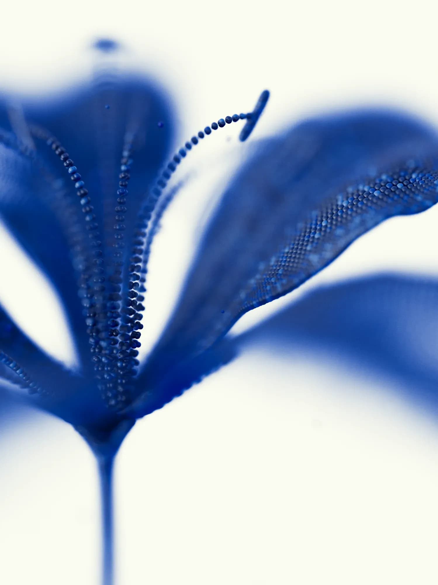
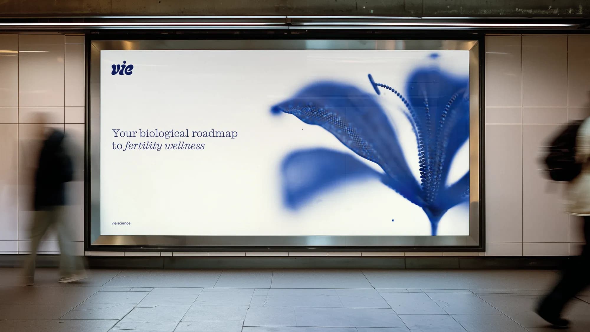
People testing their fertility meet a category that tends to look either clinical and technical or soft and feminine, and neither suited a platform built on science and data. Stockholm studio Söderhavet developed the identity, motion and digital design for Vie, a personalised fertility intelligence platform founded in 2025 by reproductive epidemiologist and former Harvard professor Dr. Carmen Messerlian. At the centre of the identity is a flower built from thousands of individual particles, which the studio describes as a metaphor rather than a data visualisation.
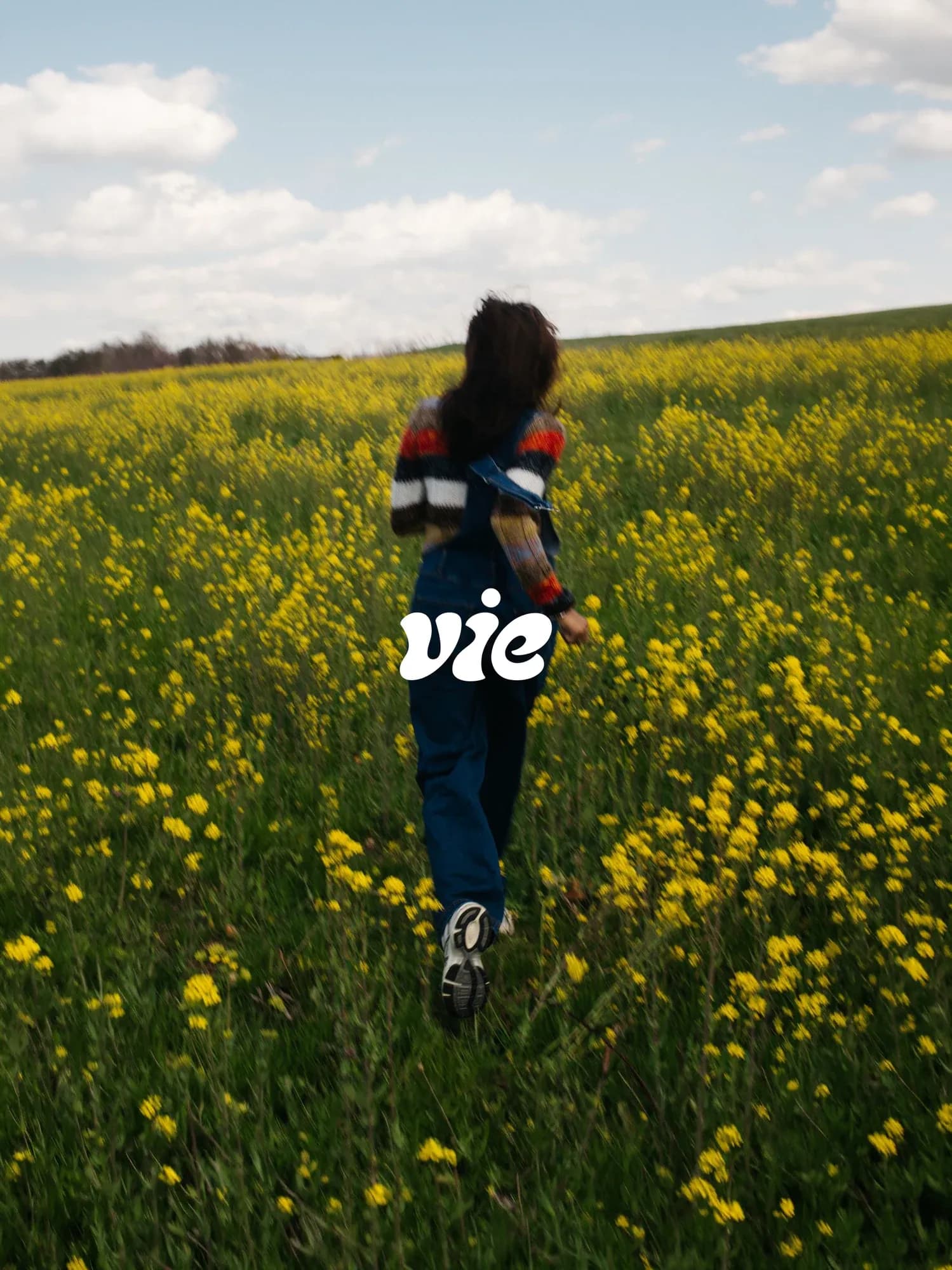
“The ambition was to make science feel human, without losing its credibility.”
Jesper Robinell
Suggesting biology instead of illustrating it
Vie asks people to understand their fertility through a personal, data-driven platform, which is a sensitive moment to design for. According to Jesper Robinell, Creative Director and Partner at Söderhavet, the identity had to avoid two familiar registers in healthcare: the clinical and technical, and the overly soft and feminine. "Fertility is personal, complex and often emotional. We wanted Vie to feel intelligent and reassuring, but also human, optimistic and approachable," he says.
The studio tested biological structures, organic patterns and more abstract visual systems before landing on flora as the reference. "Flowers felt like a natural direction. It suggests growth, transformation and something positive," Robinell says. The form is deliberately open: Robinell says the forms "could be flowers, cells or something entirely abstract".
The flower is made of thousands of particles, but Robinell is clear about what that does and does not mean. "The flower is a visual metaphor rather than a literal data visualisation," he says. "Thousands of individual particles come together to form something larger, reflecting how different biological and lifestyle factors interact to shape fertility."
Soft forms, sharp data, restrained motion
The Vie wordmark is custom-drawn, with inspiration from what Robinell calls "some of the more wonky, organic typefaces out there". The work was in refining proportions, curves and the spacing between letters. "We wanted it to share the same organic character as the identity. Soft, sculptural and distinctive, but still precise," he says. The aim was to keep refining until it felt natural, "almost as if the letters are growing into their shapes. You can almost discover abstract shapes of life within the letterforms."
Typography is split by function. Caslon Iconic is used for storytelling and Instrument Sans for interface and data. "We liked the tension between the two typefaces. Caslon Iconic brings warmth, humanity, personality and an editorial quality, while Instrument Sans adds function, clarity and precision," Robinell says.
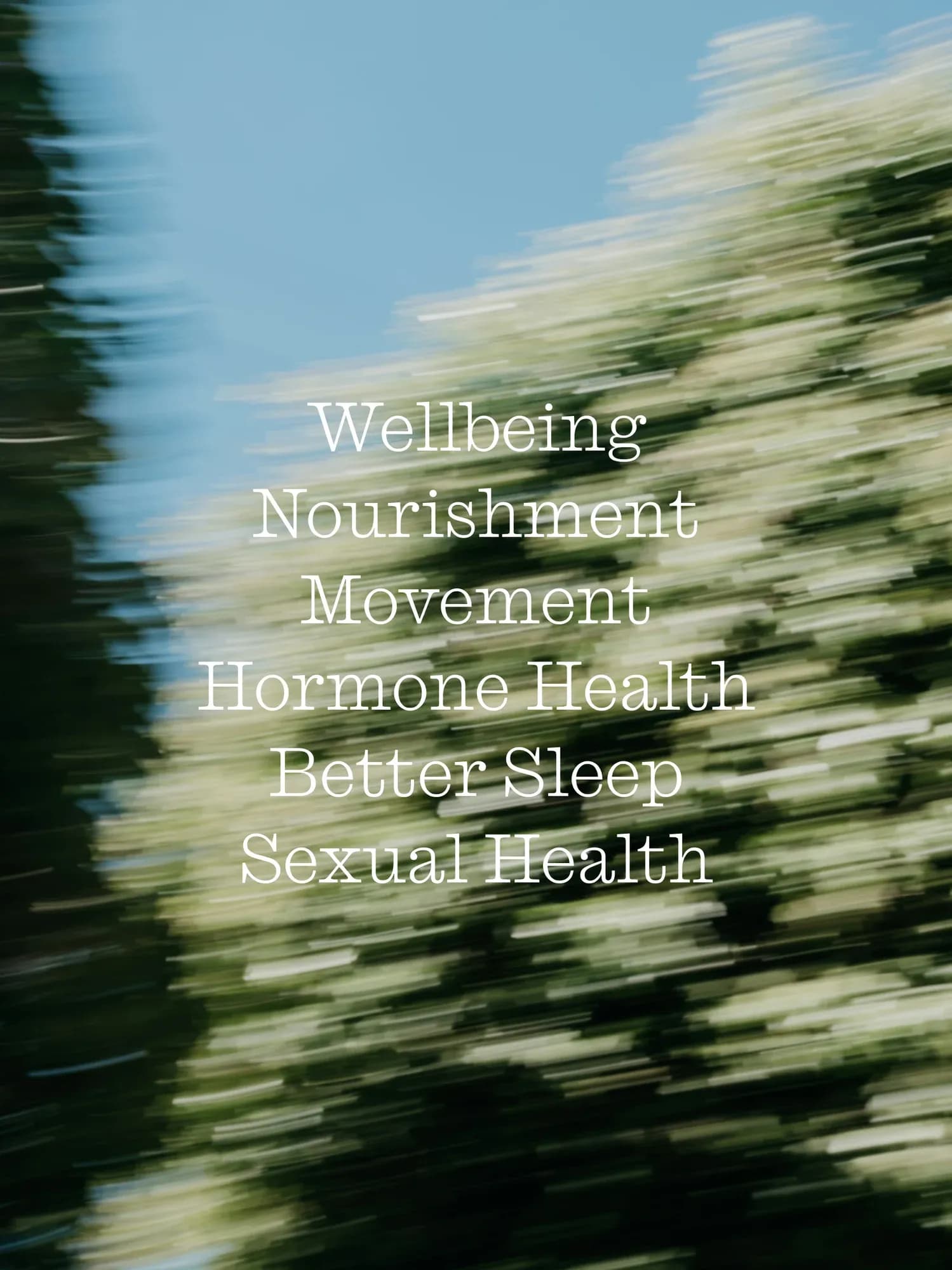
The palette consists of four pale colours named sky, water, milk and wheat. "The naming of the colours is a bit constructed, we know," Robinell says. The aim was colours that felt "natural, light and optimistic", moving away from the usual colours of fertility and healthcare, with references taken from natural elements and light rather than literal objects. Legibility is handled separately: "The softer palette creates atmosphere, while the interface relies on stronger contrast where readability matters."
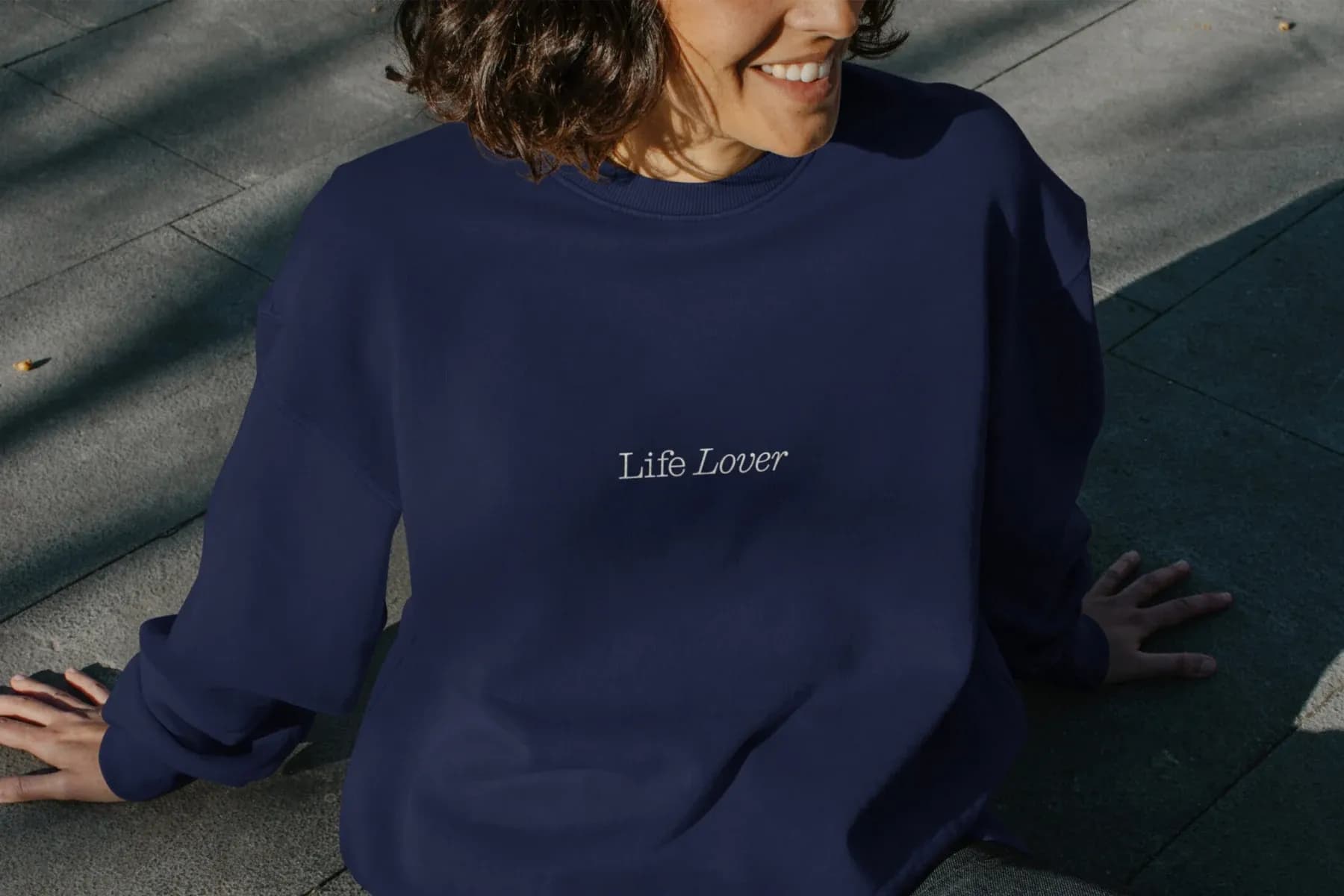
The same split governs softness and sharpness across the system. Organic elements, including the flower, can be soft, while typography, data and interface elements stay sharp and clear. "That contrast became an important principle throughout the identity," Robinell says.
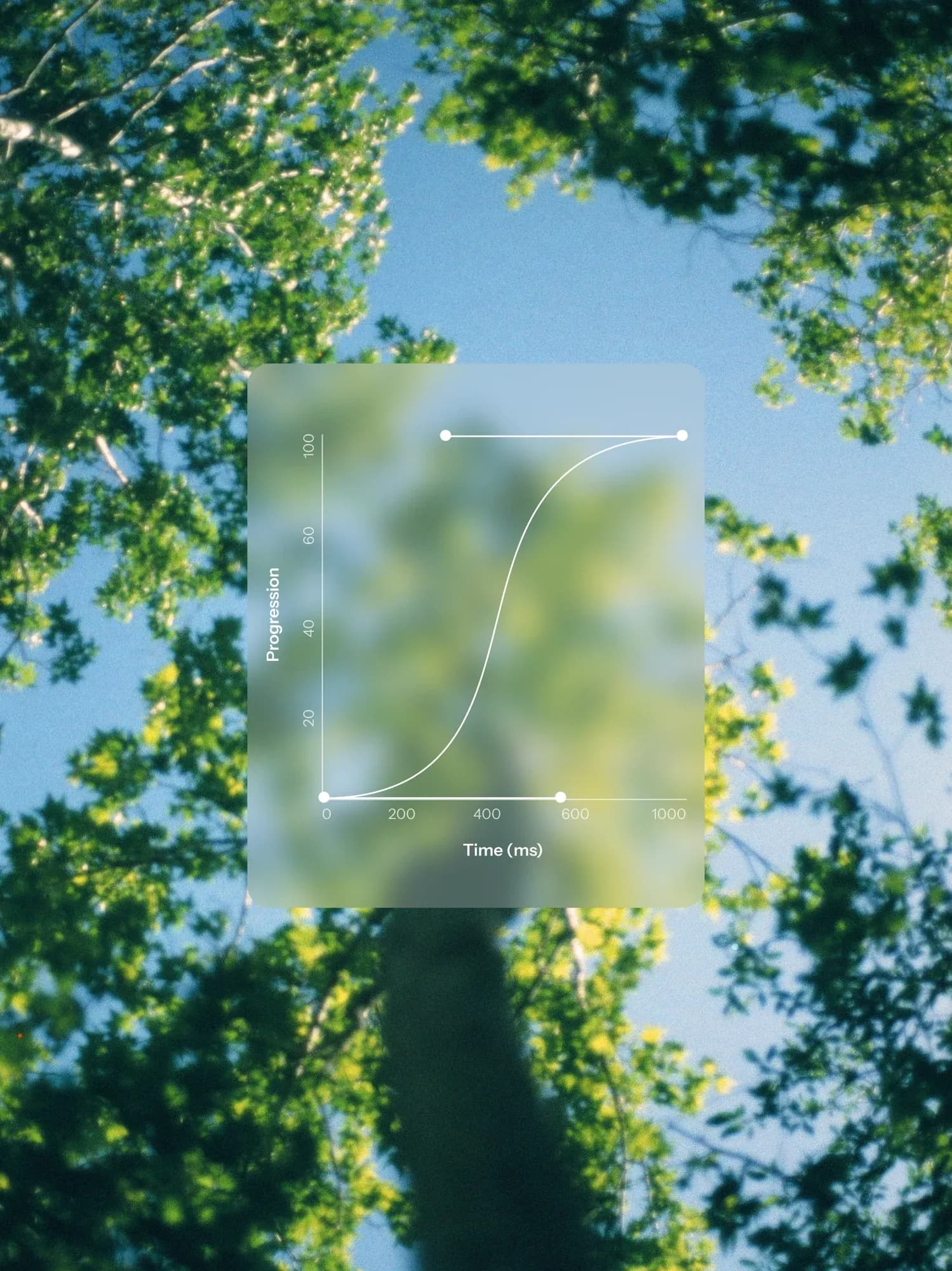
In the motion work, forms expand, divide and settle. Robinell describes the movement as inspired by natural organic processes, where "the forms grow, interact, separate and reconnect". The movements are fluid and deliberately restrained, but not at any cost. "It's a fine balance, sometimes we need more speed and energy, even if that means losing a little of the organic feel," he says.