Gärde Design tests how plain a credit brand can be
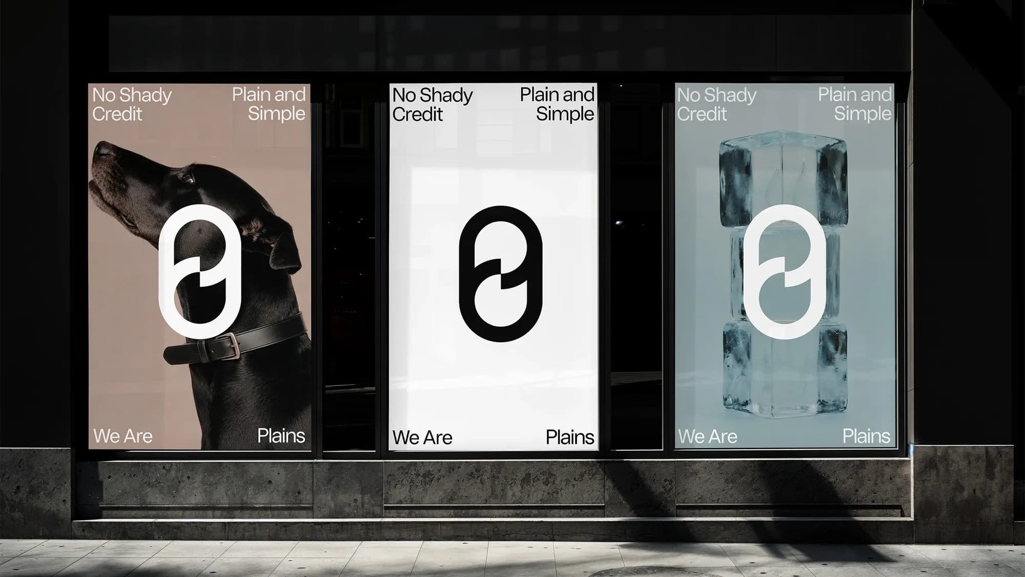
In Swedish consumer credit, words like clear, simple and transparent already appear on several providers' websites, which leaves a brand that wants to be plain with a question: what remains once the decoration is gone? Swedish agency Gärde Design built the identity for credit company Plains from one typeface in one weight, black and white, still-life photography and a symbol that combines a P and a zero. Nordic Brief interviewed founder Marcus Gärde about the concept, the design and why the studio scrapped a week's worth of type work.
A category that already promises plain
Plains promises Swedish consumers no hidden fees and no surprises, a position its brand platform calls "Credit in plain sight". Other Swedish providers use similar language. Fairlo describes its product as "tydlig, ärlig och flexibel kredit" (clear, honest and flexible credit), Brixo advertises "trygga och transparenta villkor" (secure and transparent terms), and Anyfin's rebrand by Kurppa Hosk was built around transparency, empathy and simplicity.
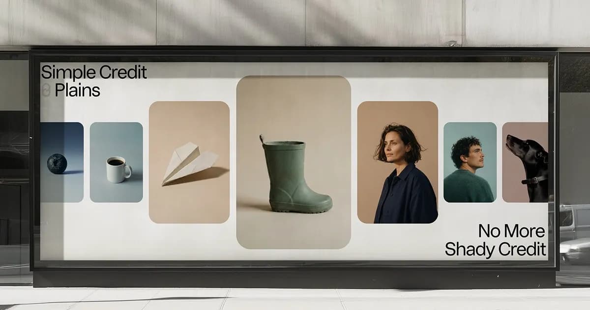
According to Marcus Gärde, most credit brands go one of two ways: bank-style reassurance or glossy fintech with gradients and loud contrasts. "Both dress things up. We saw room for Plains to own the opposite: black and white, calm still lifes and copy that says exactly what it means. In a category built on promises, the most distinctive thing you can do is promise less and show more."
What did the brief say before "plain" became the creative principle?
The word was there from the start. Plains' brand platform positioned the company as "Credit in plain sight": credit, nothing more, nothing less, with no hidden fees and no surprises. But the same platform also asked for the brand to be creatively engaging, something people would actually enjoy and talk about. That tension was the real brief. Looking simple and trustworthy is easy. Being plain without becoming forgettable is the hard part.
At what point does plain turn generic, and what can never be removed?
Plain turns generic when nothing is left that has a point of view. What can't be removed is the idea of zero: the symbol, the motion that always returns to its starting point, and the honesty in the copy. Every element is allowed to be simple, but every element has to mean something. That's the difference between plain and empty.
Built to return to zero
The idea of zero runs through four parts of the Plains identity. The symbol joins a P and a zero. The still lifes show ordinary objects without styling. The motion sends elements out in one of six directions and brings them back to where they started. The copy closes each statement on a short second sentence, as in "En glödlampa. Punkt." (One lightbulb. Period.)
The wordmark is neutral, so the symbol is the one element allowed to break the typographic rule. "A purely typographic identity would have been honest, but it wouldn't have been memorable," says Marcus Gärde. "So we went beyond typography and let the symbol be the one element allowed to stand out. Even then, it had to earn its place by meaning something."
How did the P/0 symbol come about?
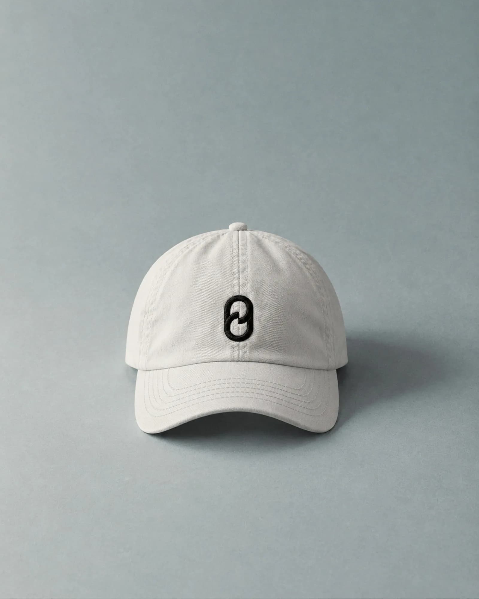
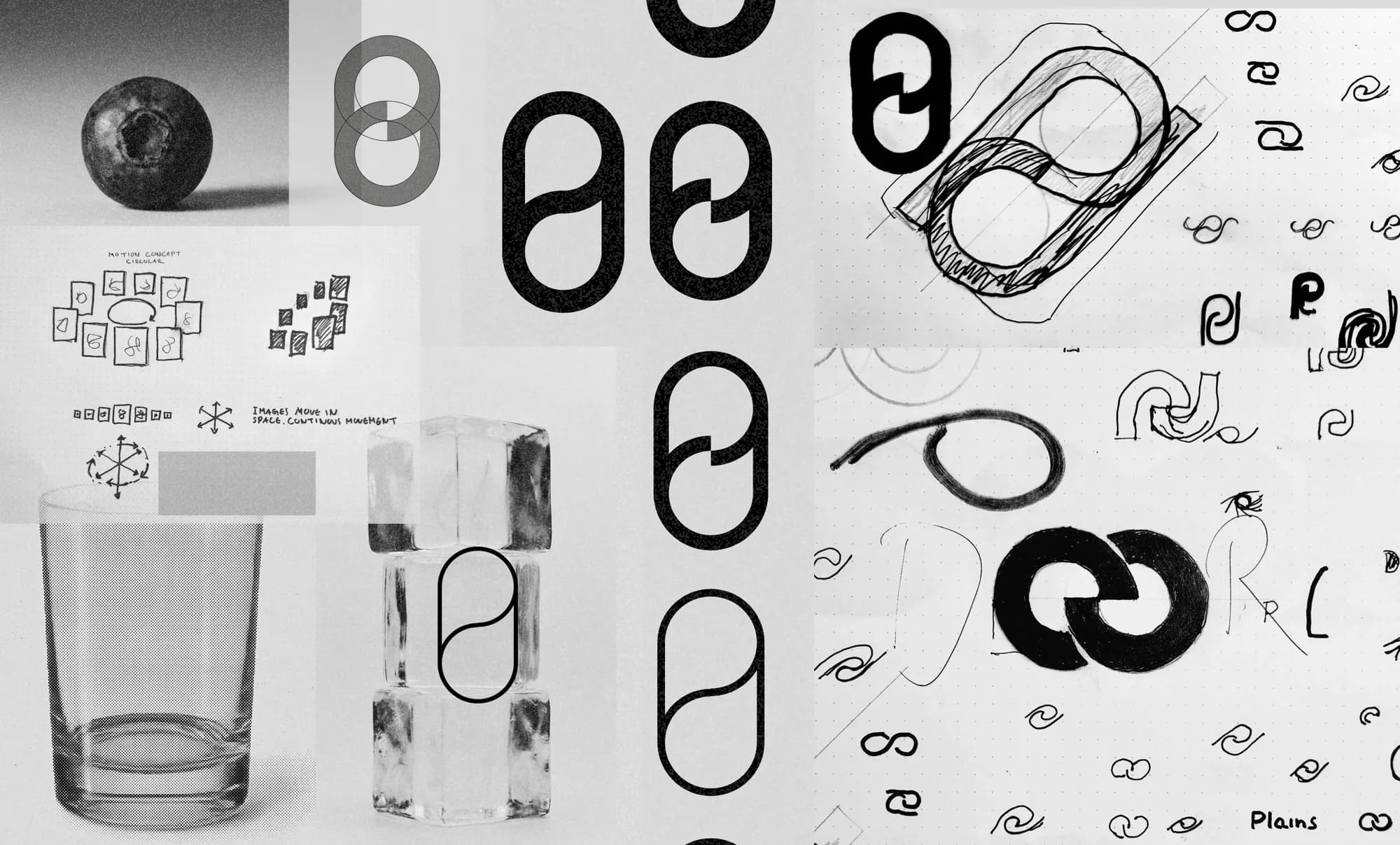
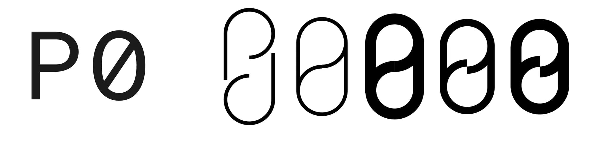
It started from three ideas: zero, the infinity loop and the letter P. Zero is the goal, the loop is money that keeps moving, and the P ties it all to the name. Our first sketches were open, thin-line drawings where the P and the zero only just touched, almost like a continuous line. Then we tried outlined and solid versions to see how much weight the symbol could carry. Finally we landed on a bold form where the two shapes lock into each other in the middle. The early versions were elegant but too fragile to work as an app icon or at small sizes. The final one is simple enough to read instantly and strong enough to hold the whole story. P meets zero, Plains meets its purpose.
Was "back to zero" part of the business strategy from the start?
It came out of the design process. The platform talks about credit that never leaves you stressed, and while we were working on the symbol we found the image for that: zero. Zero is where Plains wants its customers to be, back where they started as quickly as possible. Once we had it, it shaped the symbol, the motion and the tone.
How does the return-to-zero motion work in short formats, UI feedback and reduced-motion settings?
The principle is the same everywhere. Elements move out in one of six directions (up, down, left, right, towards the viewer or away) and always come back to where they started. Whatever moves away from zero finds its way back.
In short formats, one cycle or a single flip is enough to tell the whole story. Because every movement ends where it began, it also loops seamlessly. In the UI, motion is calmer and only used when it helps, like showing that something happened or where you are in a process. With reduced motion, elements simply go straight to their resting state. Nothing is lost, because the idea is also carried by the symbol, the copy and the layout.
How did the "One lightbulb. Period." copy format develop?
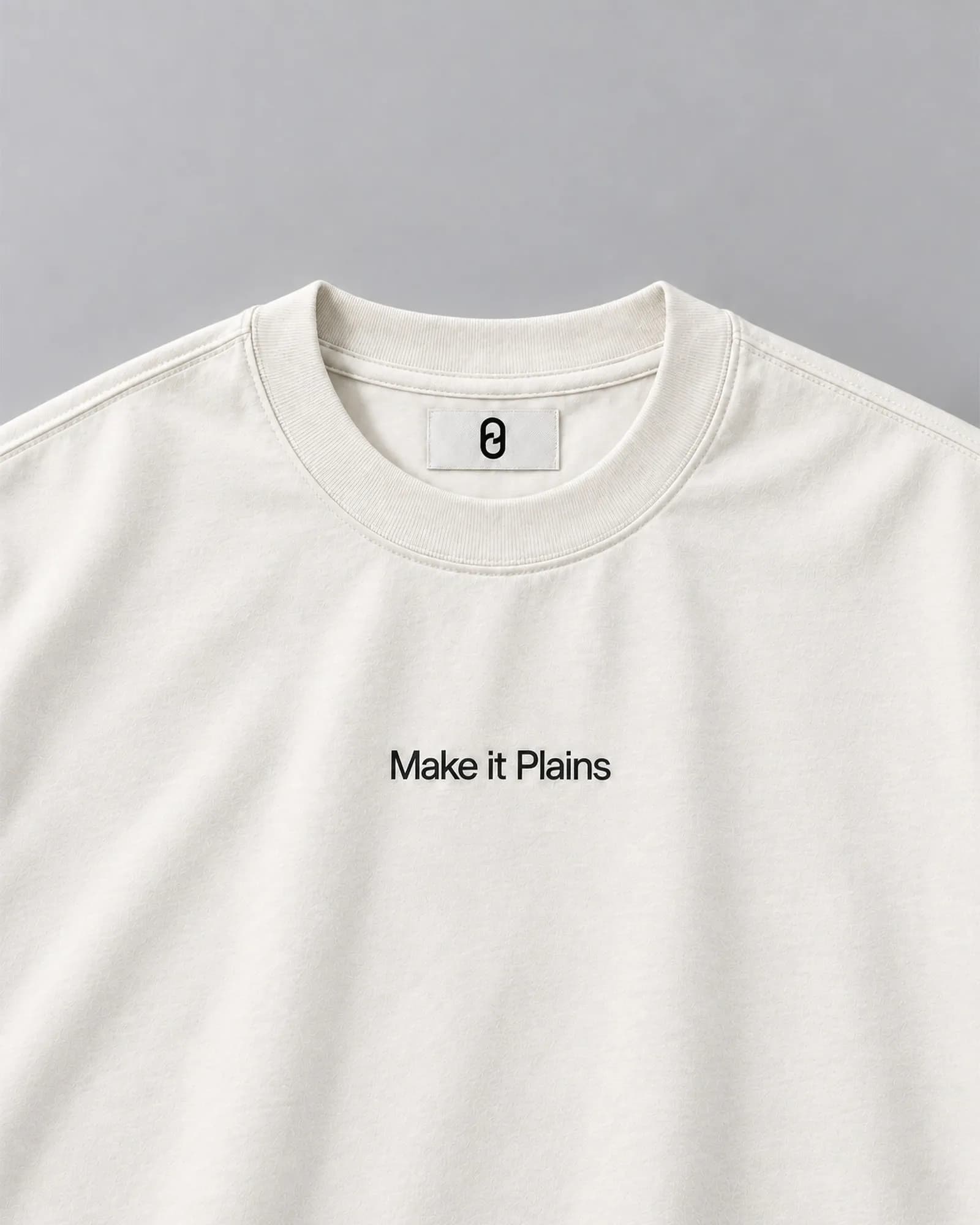
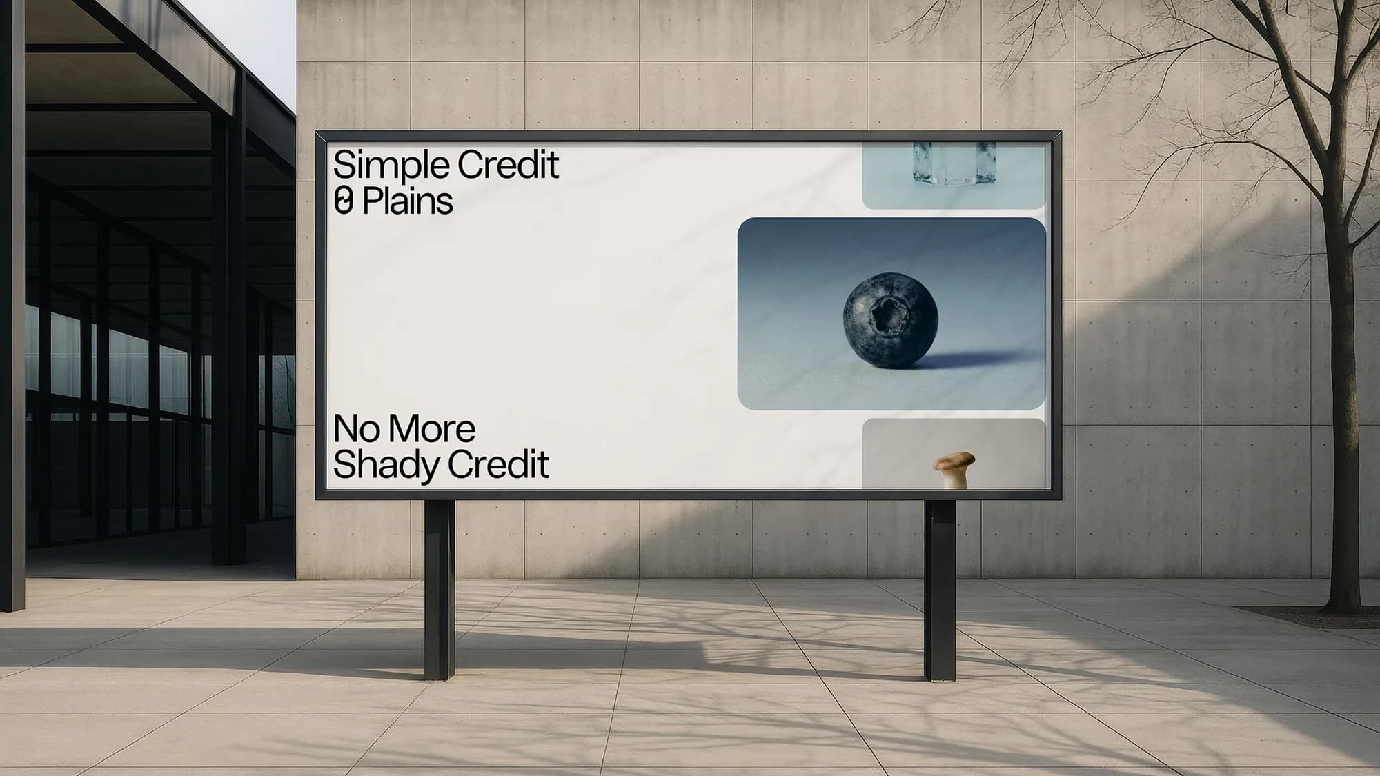
It grew directly out of the imagery. The platform's communication idea was "What you see is what you get / It is what it is", and the still lifes already did that visually. The copy just says the same thing out loud: "En glödlampa. Punkt." (One lightbulb. Period.) "En hund. Helt enkelt." (A dog. Simple as that.) And then: "Ett lån. Kort och gott." (A loan. Short and sweet.) The loan gets the same treatment as a lightbulb or a blueberry, nothing more, nothing less. That's the whole brand in one line.
“The system should be simple enough to disappear and structured enough to guide.”
Marcus Gärde
What was drawn, tested and removed
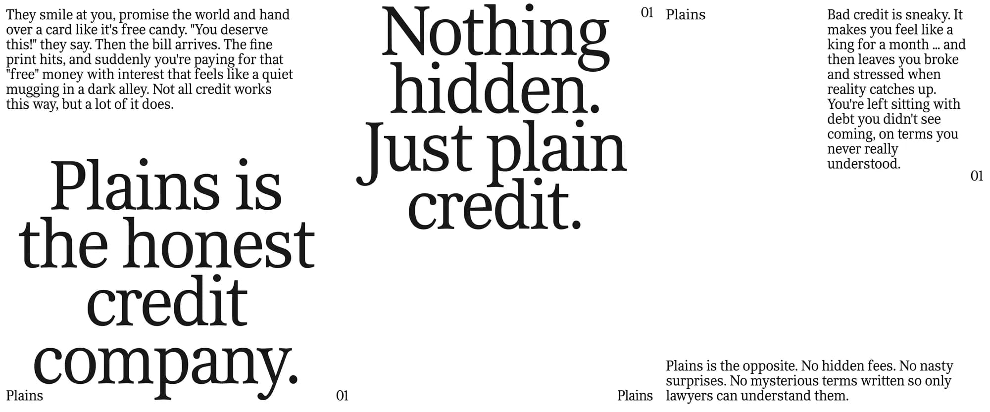
Gärde Design started with a bespoke typeface. The team spent a full week drawing a custom typeface for Plains, a plain serif meant to bring warmth and a more human voice to the brand. As they got closer to the finish line, they felt it had too much personality. "A typeface trying to look plain started to feel constructed, and that's the opposite of honest," says Marcus Gärde.
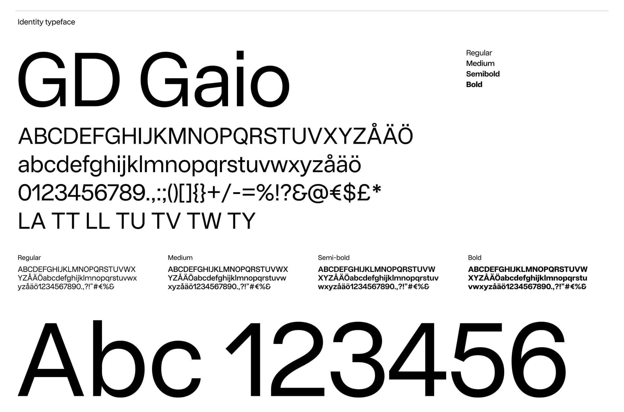
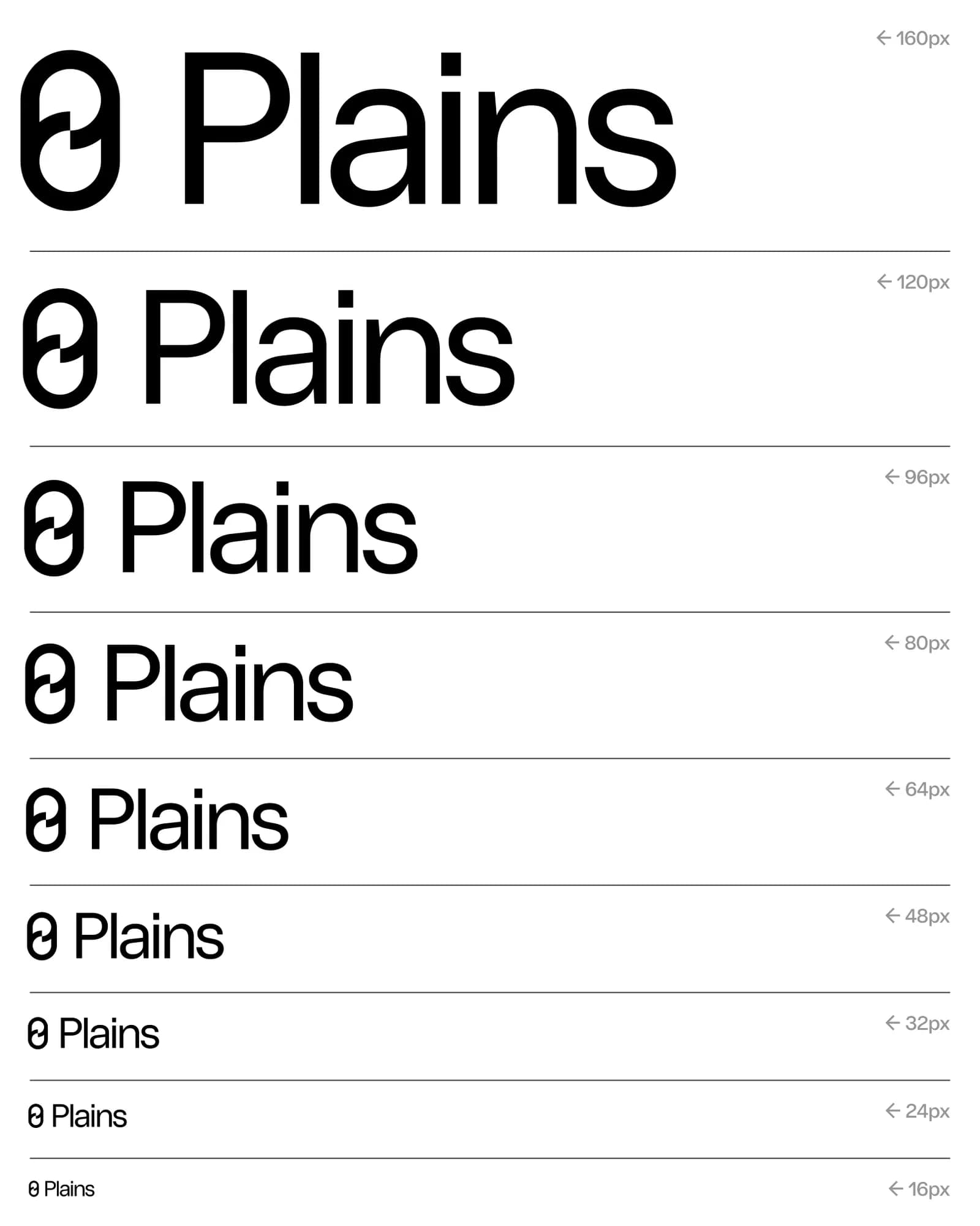
Instead, they tested the identity with GD Gaio, a sans serif the studio had previously designed with neutrality as its brief, and kept it. "Everything got cleaner and simpler at once. GD Gaio is highly legible, with open forms and balanced proportions, and it gets out of the way so the information can speak. That's exactly what Plains needed."
One typeface, one size, one weight: does that apply across all touchpoints?
As far as it possibly can. The idea is to keep communication as simple as possible, and in external communication (campaigns, social) we really try to hold on to the rule: one typeface, one size, one weight. That's where the idea is at its strongest, and where it does the most to set Plains apart.
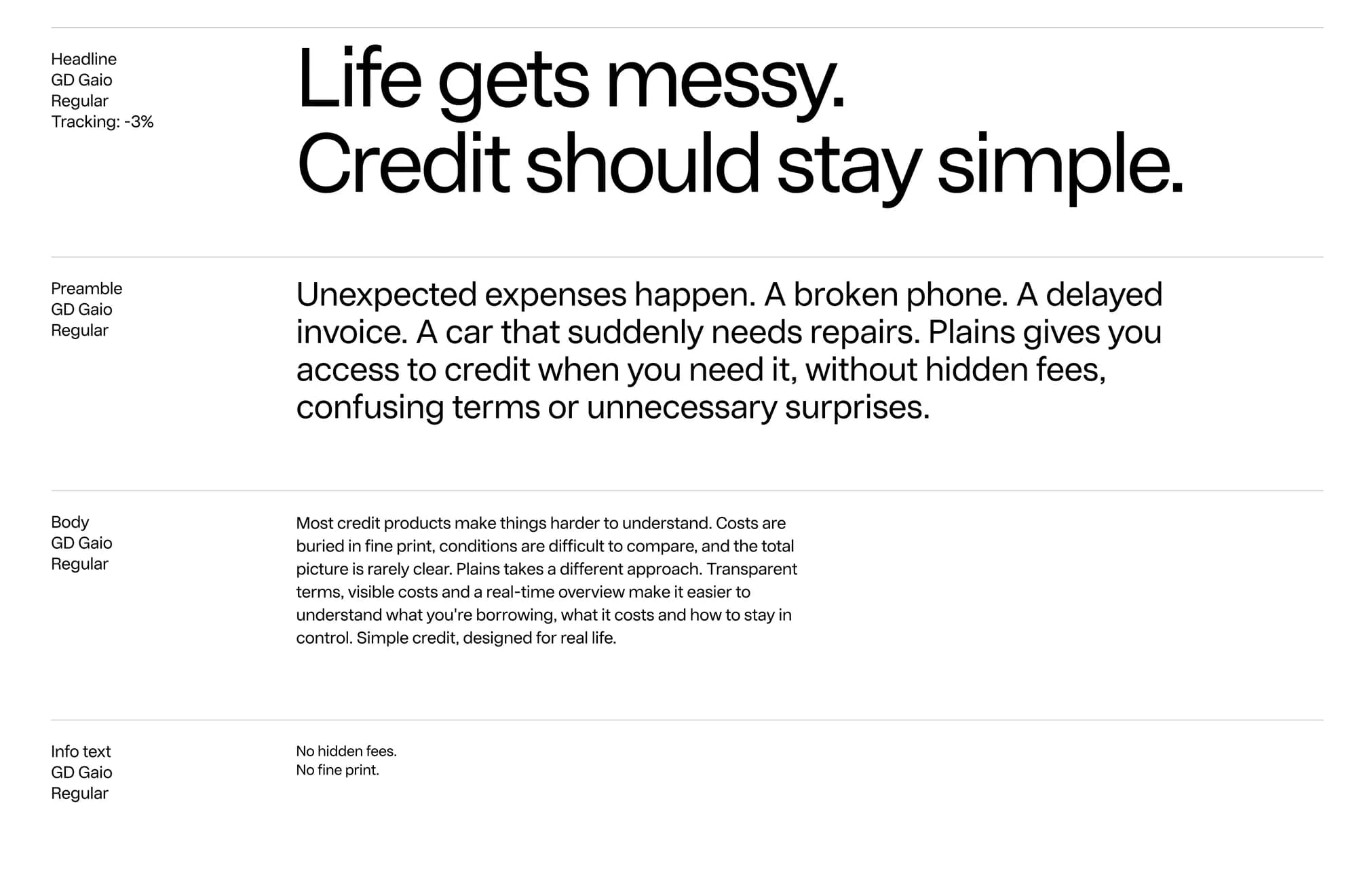
Of course, you can't run a website or more informative content on a single size. Someone applying for a loan needs to find the headline, read the terms and spot the small details, so there we adjust. But even then the system stays tight. The manual defines just four text levels (headline, preamble, body and info text), all in GD Gaio Regular. GD Gaio comes in four weights, but Plains only uses one. Size is allowed to change when it has to. Weight never does.
We see it as a principle rather than a law. Every time you add a size, you should be able to explain why.
How do you build hierarchy when size and weight can't do the work?
Through spacing, rhythm and structure. Position on the grid, white space and line breaks do the work that size usually does. Functional colors come in only when they have a job to do, like guiding attention or highlighting something important. The system should be simple enough to disappear and structured enough to guide.