Tobias Jacobsen breaks the rules of Gothic typefaces for Krater.Objects' identity
Scandinavian furniture branding tends toward clean, minimalist lettering, leaving little room for ornament or asymmetry. For Krater.Objects, the Copenhagen-based sculptural furniture and ceramics practice founded by architect and artist Lea Pyndt Beiskjær, graphic designer Tobias Jacobsen built a visual identity around ornamental letterforms constructed entirely from straight lines and polygons. The approach mirrors the process behind Krater's own pieces, which begin as 3D-rendered polygon meshes before taking sculptural form.
Ornamental letterforms built from points, not curves
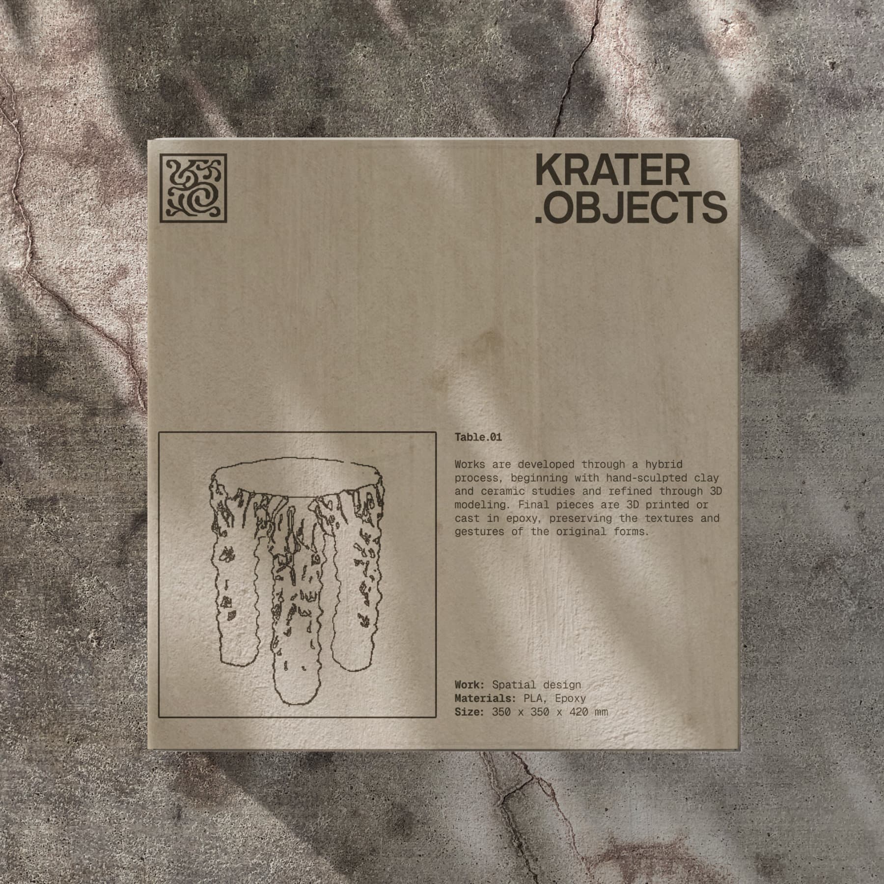
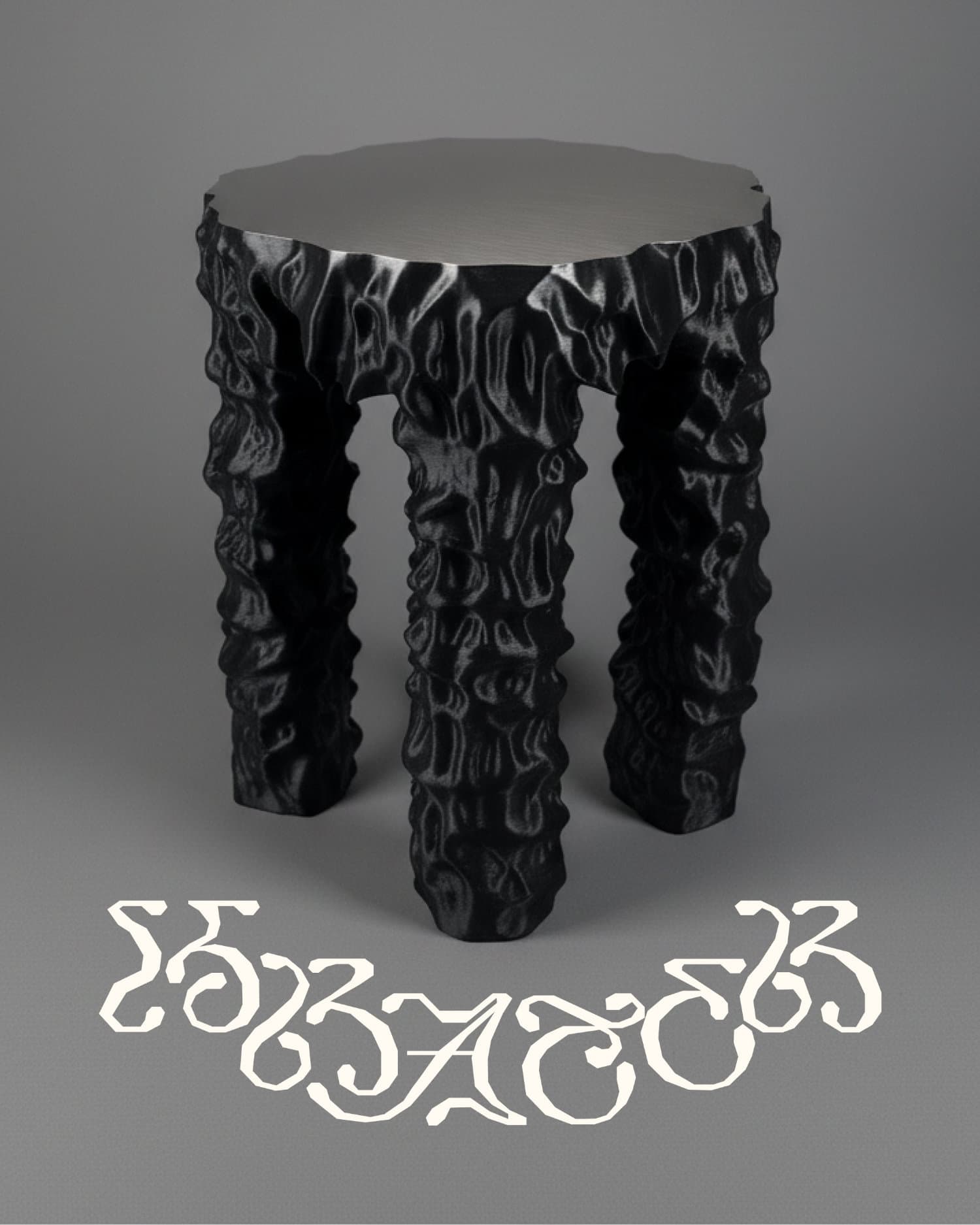
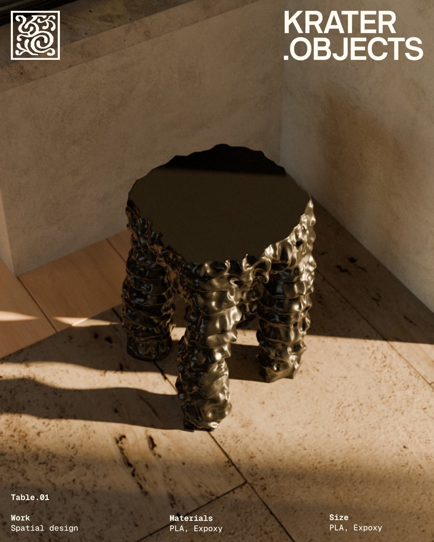
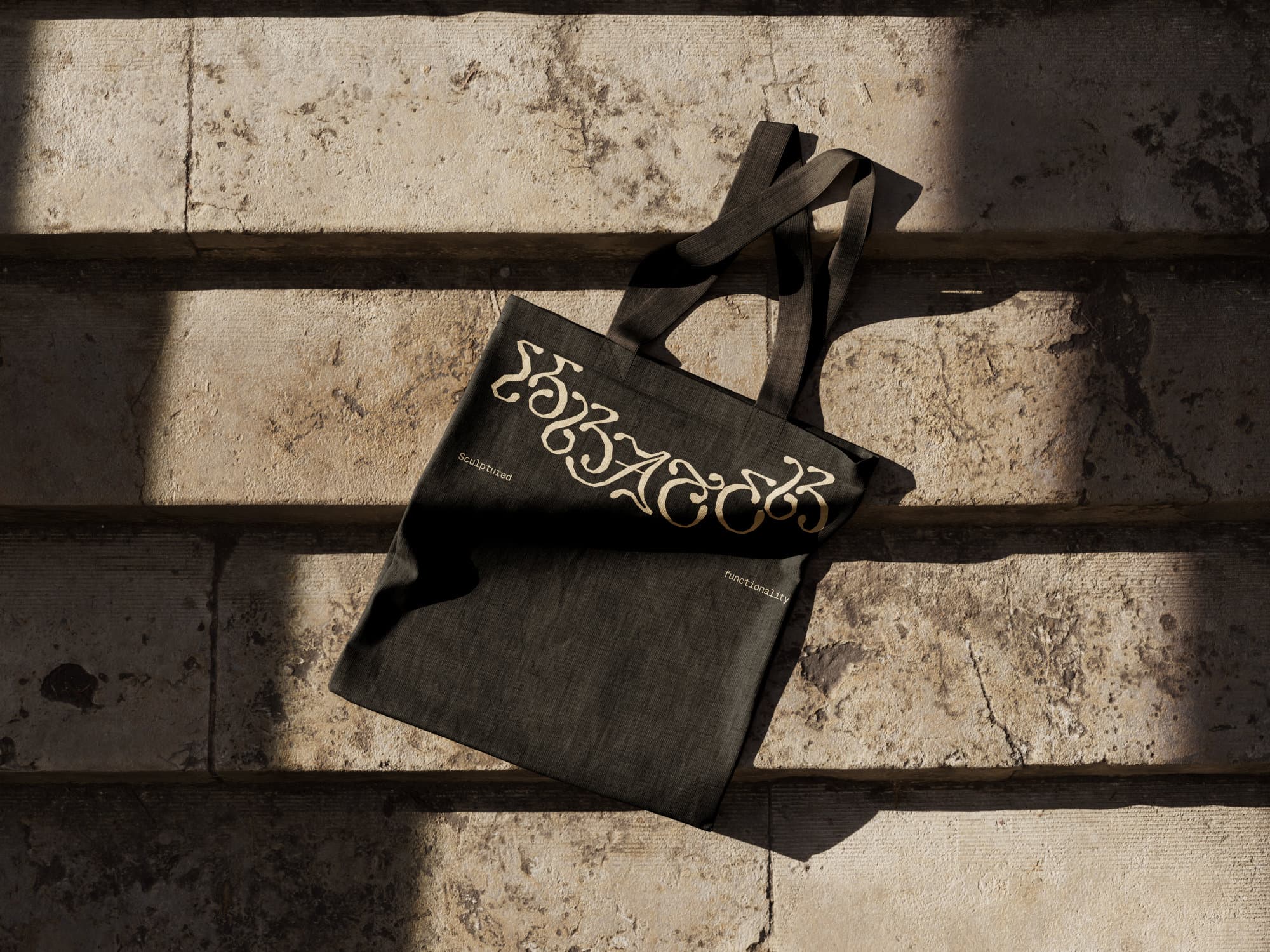
Krater.Objects builds its furniture in two stages: pieces start as hand-sculpted clay and ceramic studies, then get digitized into 3D models before being 3D-printed or cast in epoxy. Jacobsen applied the same logic to the graphic identity – first organic, then digital, then angular. The result is a logotype and custom lettering that reads at a glance as classic ornamental type, curved and stamp-like, but is constructed entirely from hard edges and polygon facets rather than traditional curves.
The system separates a compact, symmetrical emblem mark from the ornamented wordmark, and both carry across the brand's touchpoints. Jacobsen departed from strict Gothic type conventions, cherry-picking individual letterforms across historical periods and adjusting each one for legibility.
Where did the idea come from to build the lettering entirely out of straight lines and polygons?
From the start, our conversations revolved around what we called "constructed nature," which sparked a lot of ideas for the visual concept. Krater also has a rather unconventional approach to furniture design, and I liked the idea of challenging the ordinary clichés within the field. We chose to pursue something that pushed against the usual clean-lined modernist tendencies and trends — we wanted a brand that looked and felt like the objects themselves.
How was the expression shaped by the contrast between 3D-digital construction and organic form?
The objects are digitally rendered in 3D, which means the body is first built from cornered polygons — something most of us recognise from early PlayStation 1 graphics. I wanted to use that naive expression both as a visual constraint and as a representation of Krater's three-dimensional side. On the other end of the spectrum sits the second constraint: ornamental letterforms known for organic curves and floral expression. Krater's objects have an asymmetric, biomorphic, sculptural quality that draws parallels to the Gothic period and the Jugend style, which made it natural to draw letterforms from those movements. Organic letterforms built from polygons. Constructed nature.
What did you do differently from classical ornamental logotypes and lettermarks, which are normally built on curves?
Because of the constraint of creating an ornamented logotype, I spent a lot of time studying Gothic letterforms combined with the calligraphic, ornamented type usually seen in the Jugend style, while keeping legibility in mind. The process was about finding a balance between ornamentation and legibility, since that's the most vital part of creating a custom logotype. I broke some of the rules of Gothic typefaces and cherry-picked letterforms from different periods to adjust each individual letter into something legible. The hard-pointed curvature gave the logotype a raw, tactile expression — unusual, but aligned with the visuals of the objects. The system varies on a scale from the fully ornamented logotype to a secondary maker's mark and a neutral wordmark, so the amount of ornamentation can adjust across formats and compositions. It was important that the system was scalable across dimensions, tone of voice and media.
How did you relate to the fact that the furniture is 3D-printed? Did you use that in the design?
Knowing that Krater's designs exist as 3D renderings opened up the opportunity to use that to our advantage. It made it possible to place the objects inside unlimited environments and let visitors to the website inspect them in full rotation. The three-dimensional objects became a natural element of the visual identity.
What was the biggest design challenge in getting an "angular" typeface to still signal craft and warmth, the way Krater's furniture does?
Drawing letterforms from only hard points requires solid decisions and clear rules on the number of anchor points and the amount of contrast. Too few anchor points make the letterforms look robotic and square, while too many just look like a bad vector trace. The discipline lay in finding the right balance — enough anchor points to control the contrast between horizontal and vertical lines, especially in curved forms. It's a completely different way of designing type, but a rewarding one once it works.
How does Krater.Objects' visual language differentiate itself from other furniture and sculpture brands?
What I like most about the Krater project is that it feels like a break from what can sometimes seem like a modernist vacuum in furniture design. Krater is a rebellious newcomer in a landscape of simplicity and clean lines, both in the visual identity and the objects themselves. I was schooled in the Scandinavian approach to modernism and the use of neo-grotesque typefaces, but there's satisfaction in challenging those rules on a project like this.
You've worked with Lea Pyndt before. How did working on a physical product compare to architecture and a service business?
Lea Pyndt works both in architecture and art, and our ongoing collaboration is built on a mutual understanding of each other's crafts. Whether she's working on large-scale architecture or sculptural ceramics, I always have a clear sense of how to transform her work into graphic design. A physical product, compared to architecture or a service business, allows for more freedom in style. Architecture is strictly a communication between professionals, which means certain rules apply. Krater.Objects, on the other hand, communicates a feeling and a vibe, so the spectrum of visual variation is broader and more experimental.