Manyone designs Heartland Festival a mark it can own
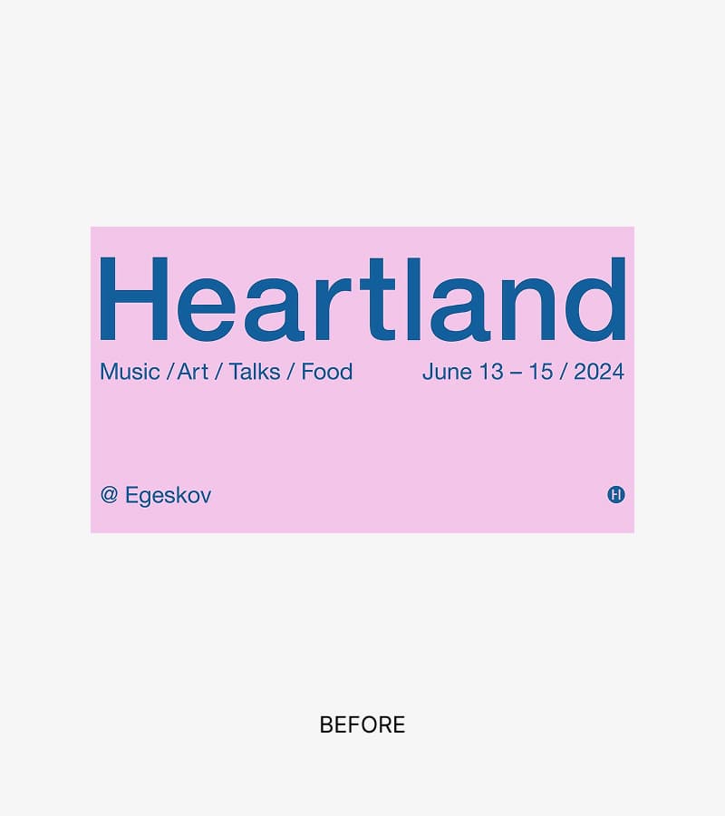
2026 marks the tenth anniversary of Danish cultural festival Heartland. The event used the milestone to create a new identity system for a festival that had grown in both ambition and range since its previous identity was introduced in 2022, spanning live music, contemporary art, talks and Michelin gastronomy in the grounds of a Renaissance castle.
Manyone, the global strategy and design agency, was brought in for a full redesign. Nordic Brief spoke with Casper Riis Jensen, Senior Brand Designer at Manyone, about what the studio kept, what it dropped, and how it landed on a mark and fifth element subtly inspired by H.C. Andersen.
An identity to hold all of it at once
Heartland's previous identity, made by Copenhagen-based Ironflag Studio in 2022, was built on Helvetica, black and white, and a set of RGB colours chosen anew each year. It was restrained by design. The task for Manyone was to build something that could carry every part of the programme, sit naturally in its Funen surroundings without being about them, and still develop what came before rather than discard it.
How much did you build on what already existed, and how much needed to start fresh?
When Heartland came to us, they had a very simple visual identity. We spent time with Heartland understanding what worked and what didn't. They came to us with a strategic direction already in place, and our role was to help strengthen it and translate it into a more distinctive visual identity. One thing that worked well in the old identity was the simplicity. It was very clean and restrained, which also gave Heartland a certain calm and a more curated expression than many other festivals. Even though we tested many different directions — including more historical and characterful typefaces — we found together with Heartland that they still had a fairly strong attachment to the simple, sans-serif-based expression. So the solution didn't end up breaking completely with the old one, but developing it in a direction with more character, warmth and distinctiveness. What didn't work as well in relation to the new ambition and strategy was that the identity lacked more distinctive, recognisable elements of its own. It could feel a little too neutral and hard to own, especially when Heartland wanted to stand more clearly as an independent brand and create a more sensory, living and flexible universe across the festival's many formats.
How did you ensure the identity didn't favour one art form instead of supporting all of them?
We had a longer initial phase with Heartland where we tested different approaches to the strategy. Here, we also worked visually with what the different directions could mean for Heartland as a combined festival universe. It was important that the identity didn't point too clearly to one art form or one area. It had to be able to hold art, music, talks and food without favouring one over the others. So we worked with a more mood-driven and flexible visual system, where colours, patterns and movement could create a shared feeling rather than locking the identity to one discipline.
Heartland takes place at Egeskov, a Renaissance castle with a park. Why didn't the architecture or the park become the starting point?
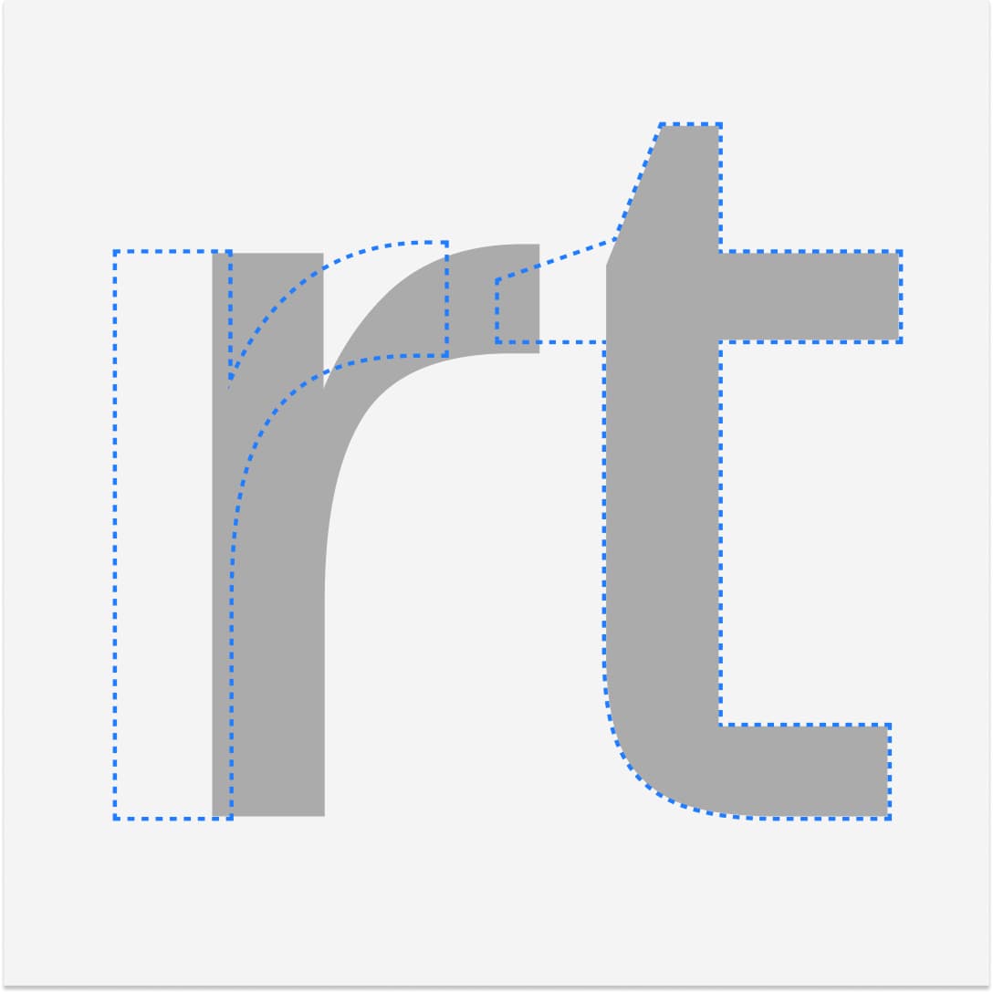
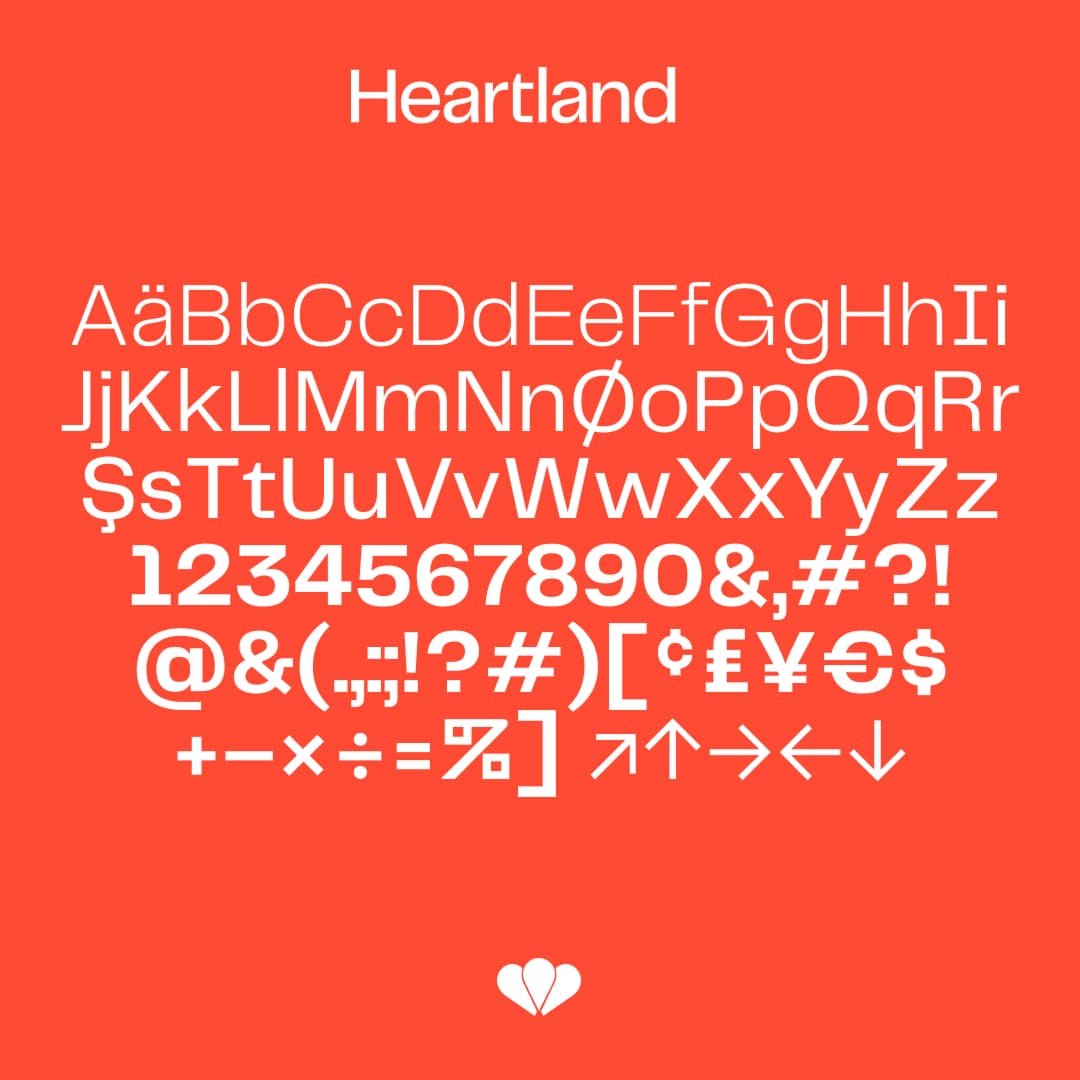
Egeskov Castle gives Heartland a very particular setting, with a strong sense of history, atmosphere and wonder. But Heartland is its own festival. It takes place at Egeskov, but the identity should not feel like it belongs to the castle. So the task was not to turn the architecture or the park into direct visual references. It was more about creating an identity that could live naturally in that context. Something that could connect to the atmosphere of the place, while still feeling like a contemporary festival identity across music, art, talks and food. At the same time, Heartland is rooted in Funen, and that sense of place matters. We explored different ways of acknowledging the local context without making the identity too narrow or too literal. That also included testing typefaces with more historical or Renaissance-inspired references. But in the end, Heartland wanted to stay closer to the simplicity of what they already had, just with more life, warmth and character. So we chose a sans serif with a stronger personality rather than going in a more directly historical or architectural direction.
Shapes you can sit and decode
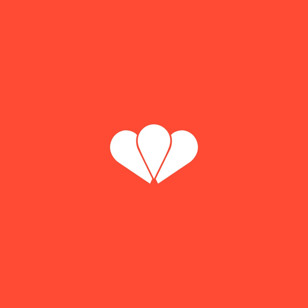
The redesigns most concrete outputs are three linked pieces. Heartland's first standalone brandmark, named Hjerterum; a flexible pattern system meant to work where there is no image; and a motion engine that keeps its subtle H.C. Andersen inspiration deliberately abstract.
It's the festival's first independent mark in 10 years. What could the text-based logo not do, that the mark needs to be able to do?
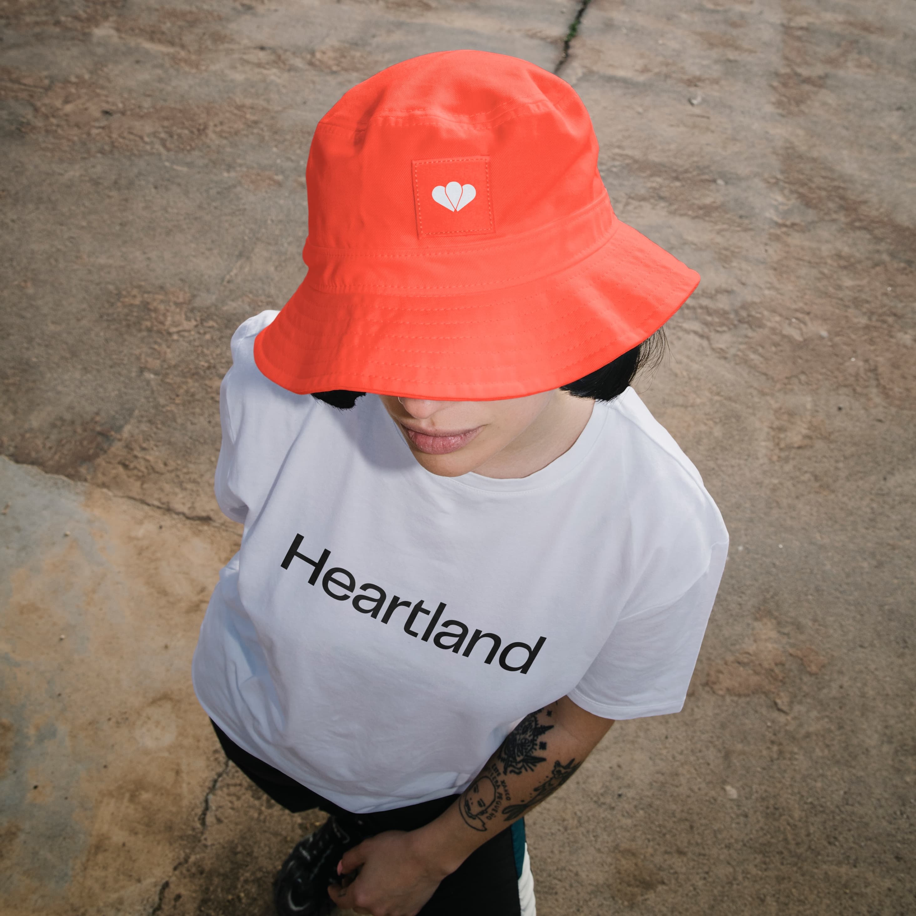
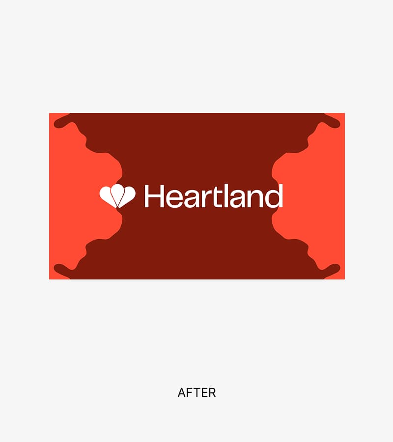
An independent mark can help Heartland in many situations where the text-based logo becomes too long, too informative or too dependent on context. The mark can function more directly, more emotionally and more flexibly, digitally, physically, in motion, on merchandise and in collaborations. Previously Heartland had used an H as a kind of mark, but the wish was to work with a heart, even though everyone was aware that a heart is a shape that's hard to own. So we went through many different versions of hearts and other logomarks, which were tested and discarded along the way. There is a subtle message to be found in the logo itself. It is composed of two overlapping hearts, and where they meet, a shape emerges that can be interpreted as a location pin. It wasn’t our intention to create a literal map symbol, but it provided a nice additional interpretation: Heartland as a place, a meeting point and a marker of the festival’s roots.
What's the logic behind the patterns? Should they adapt to the subject, the medium, or something else?
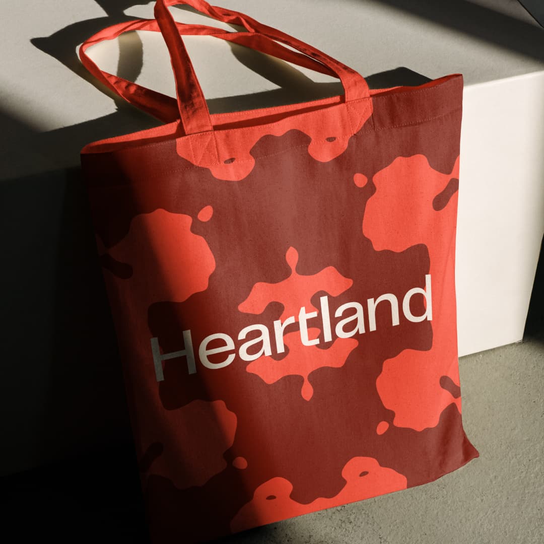
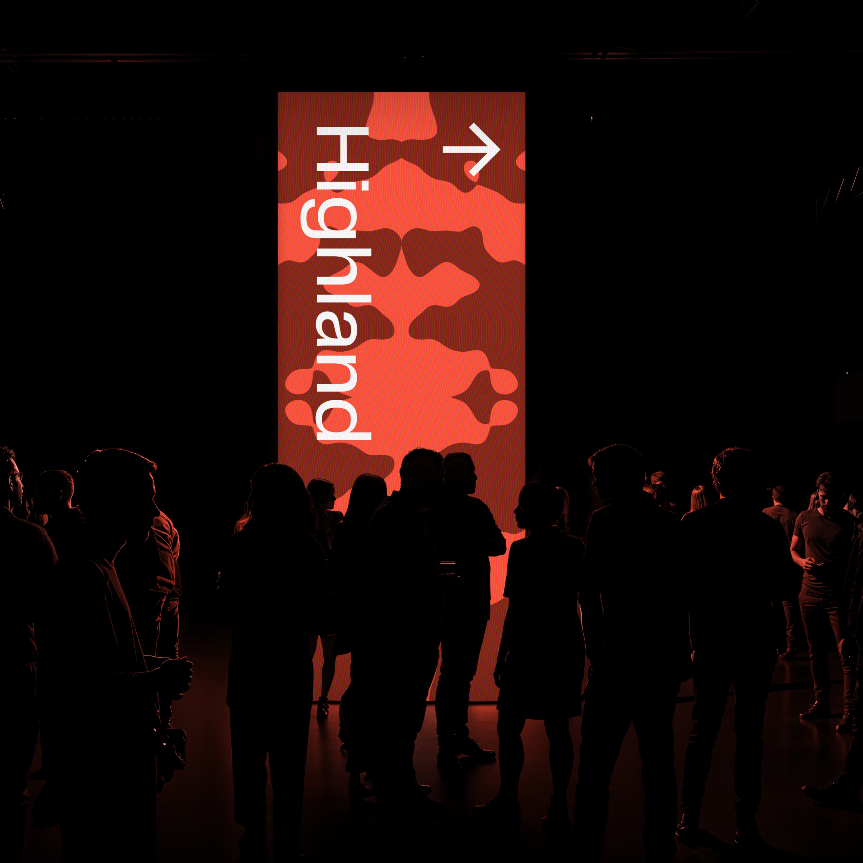
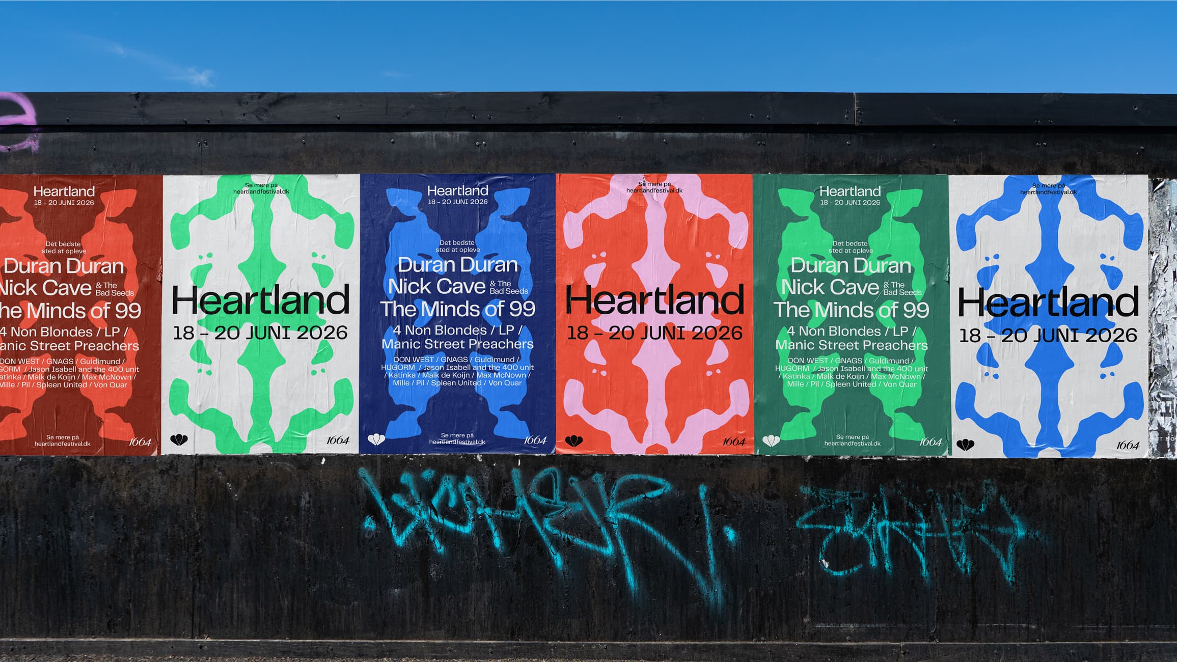
The patterns work as a pulsing, playful and fairytale-like backdrop. They work as a flexible graphic layer across the identity, one that can be used across all surfaces and formats, especially where you don't necessarily have an image, but still need to create identity and recognition. We've deliberately kept them abstract and flexible, so they don't become too locked to one particular subject. They can be adapted to medium, format and mood, but first and foremost they should create a recognisable Heartland universe. The flexibility also means the patterns can be used to create new marks or graphic moments. You can see that, among other places, in the collaboration between Heartland and Selected for this year's merchandise, where the graphic system can step forward and take on an almost logo-like function of its own.
H.C. Andersen inspired your motion design engine. But why the paper clippings and not the fairytales or the text?
It was a fine balance. We also had directions along the way that played even more directly on the fairytale than the final direction does. But we wanted to find a place where the pulsing, the heart and the closeness could meet something more fairytale-like and alluring, without it becoming too literal. The paper clippings gave us a visual and movement-based reference that could be abstract, playful and open to interpretation. They have a quality where the longer you look, the more you start to see. A bit like looking at clouds, or a Rorschach test. That quality was harder to find in the fairytales or the texts, which would quickly become more narrative and specific. In that way the paper clippings became a good balance. They point toward something fairytale-like and cultural, but without binding the identity to a particular story.