Grebban redesigns Fogia's identity around contrast and heritage
Fogia's furniture had moved on from its own visual identity. Grebban was brought in to rebuild the Swedish furniture brand's visual language and website, its first project for a company that has supplied private buyers, architects and public spaces since 1981. The brief arrived after eight years of identity work by Note Design Studio, who stayed on through the transition to hand over context.
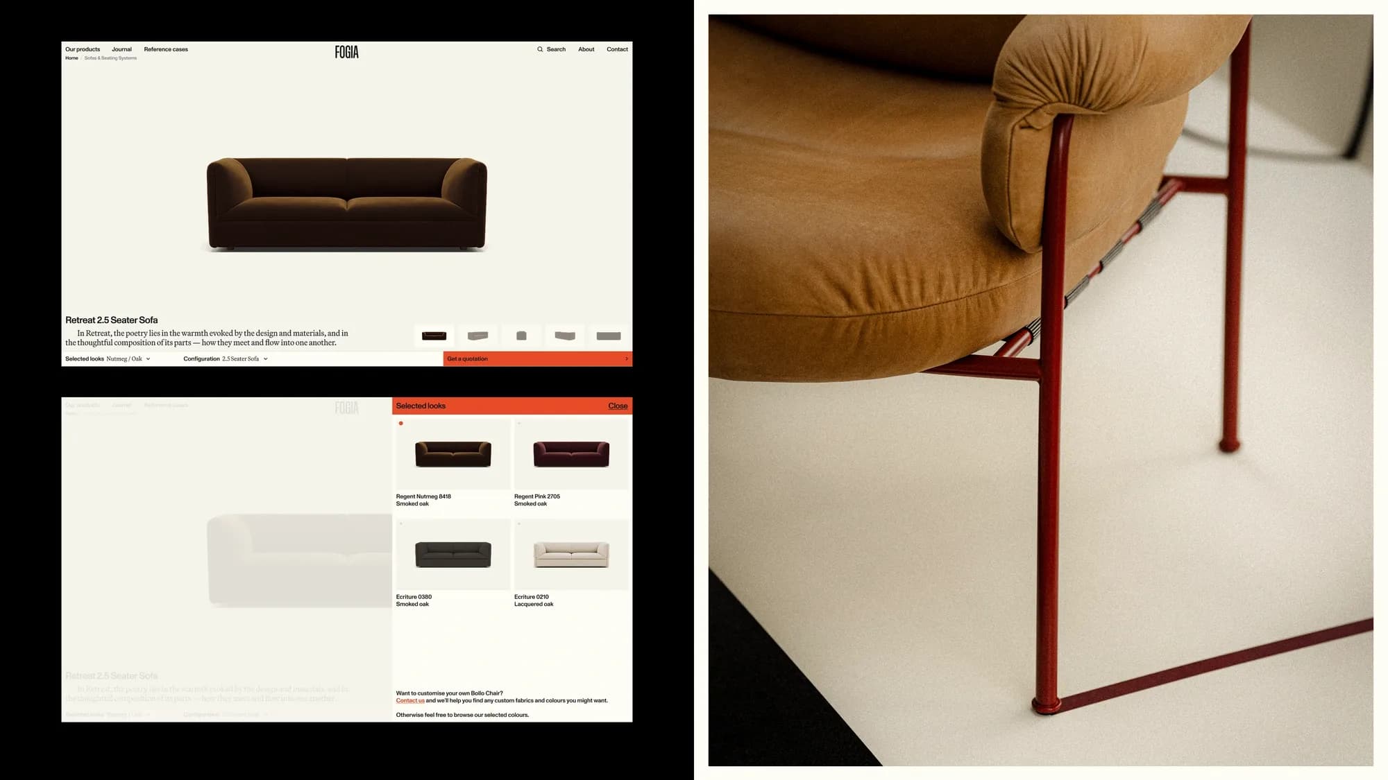
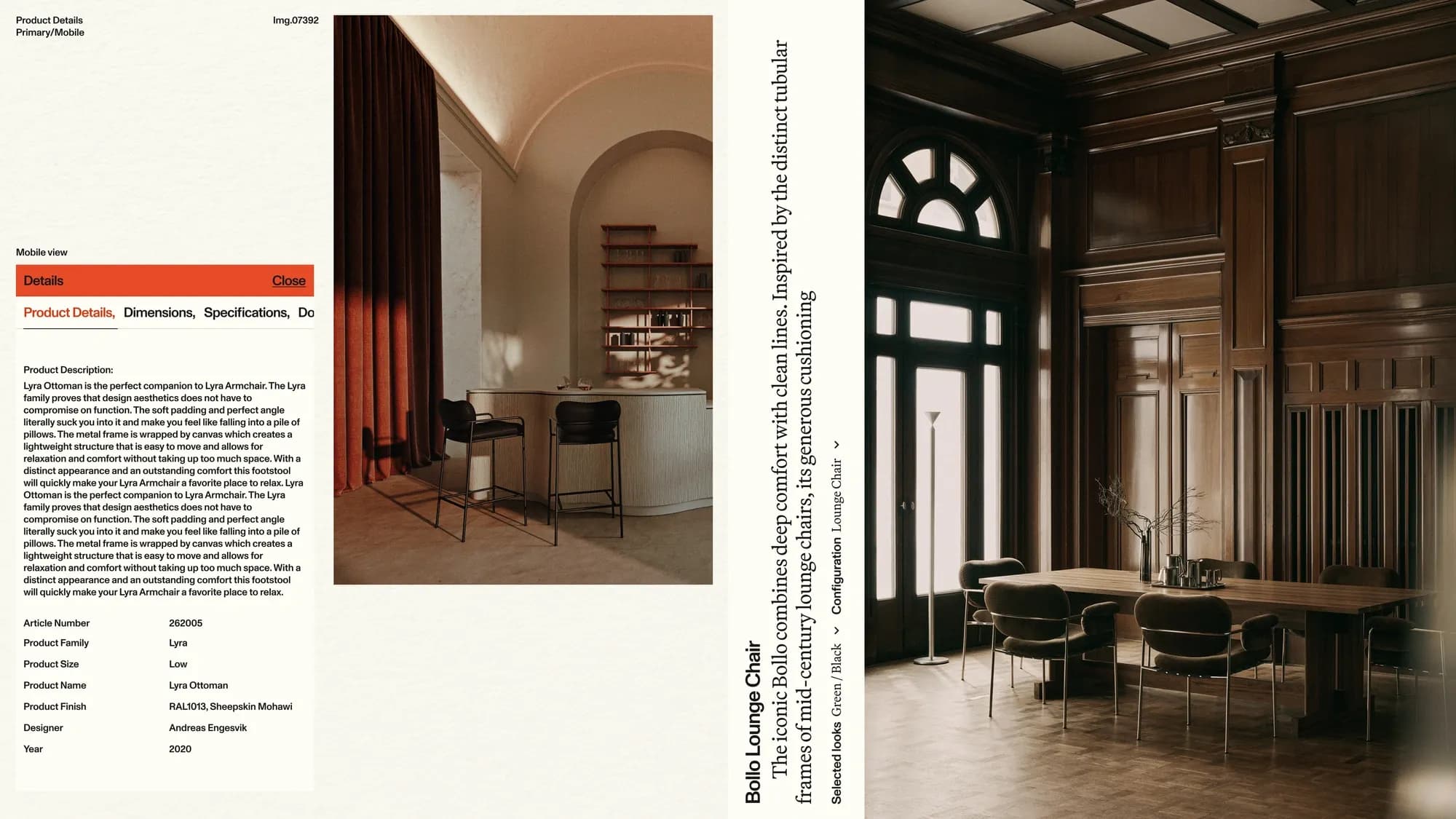
A site problem that became an identity brief
The project didn't start as a rebrand. Grebban was initially brought in to address a site that had become difficult to manage and no longer matched Fogia's digital needs; the identity question surfaced only once that work was underway. Fellow Swedish agency, Note Design Studio, who has been assisting on Fogia's visual language since 2014, was brought in on the project to provide context.
"The main issue going in was a site that was aging, hard to manage, and which did not provide the digital presence the brand needed," says Petter Mild of Grebban. "But as we kept exploring it eventually became clear that the visual identity was in need of a refresh as well, so the project kind of grew from there."
That shift set the terms for the design brief: keep enough of Fogia's existing visual language to preserve recognition, while building a system that could serve two different audiences — architects and private customers — through one site rather than two.
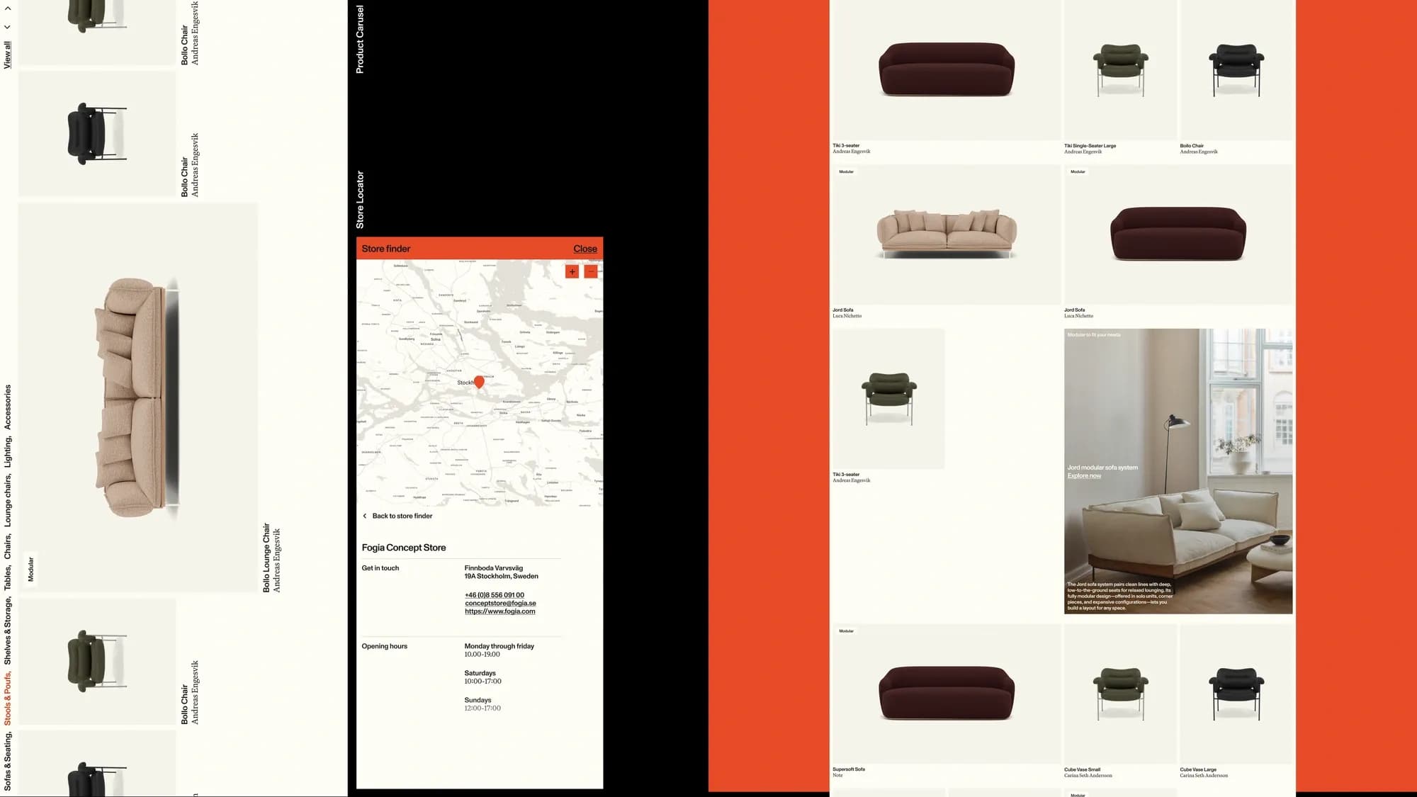
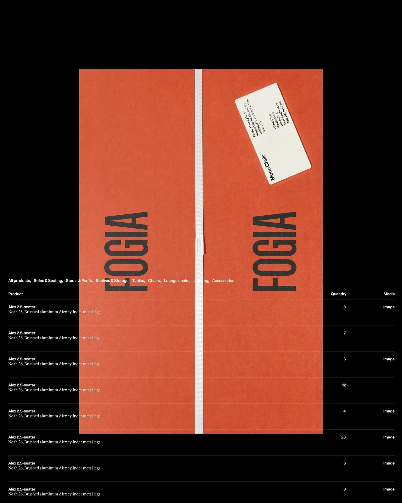
Contrast built from Fogia's own history
The brief called for stepping away from the neutral, muted palette associated with traditional Scandinavian design, without losing what made Fogia recognizable to begin with. Fogia had told Grebban it didn't want to be read as a purely Scandinavian brand.
"Fogia were clear that they did not want to be associated as a purely Scandinavian brand, but instead appeal to a more international audience," says Christopher Goos, Art Director at Grebban. "As such we wanted to both honour the Scandinavian roots, but also create something that stood out from the crowd."
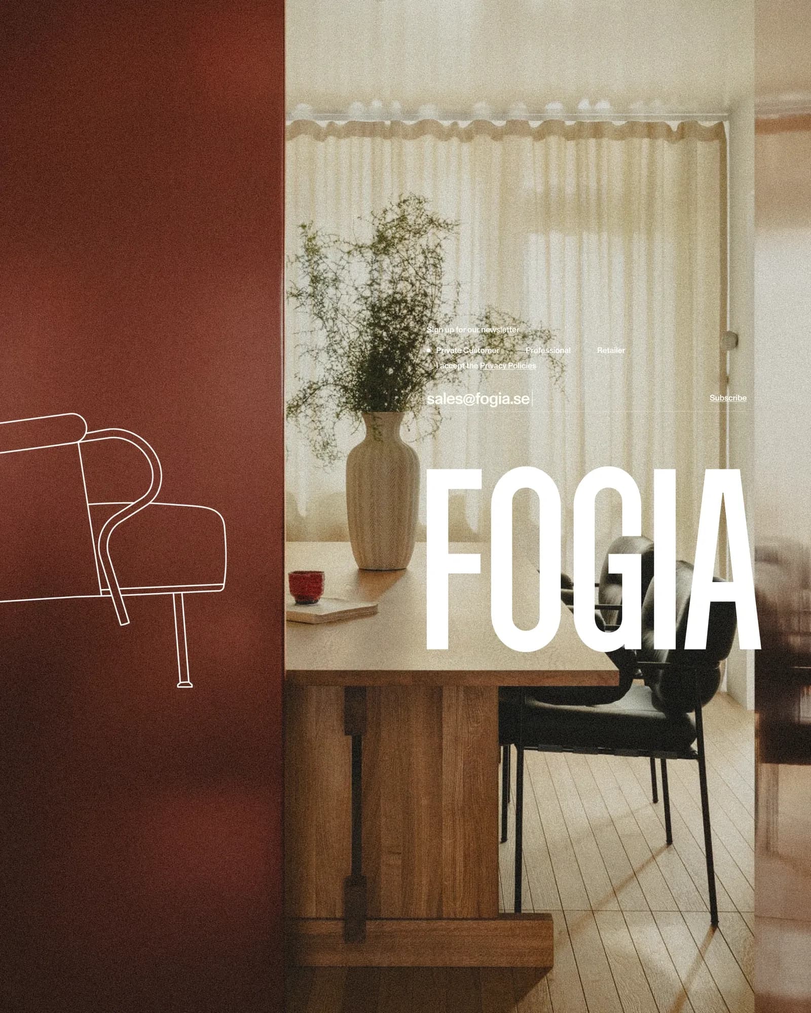
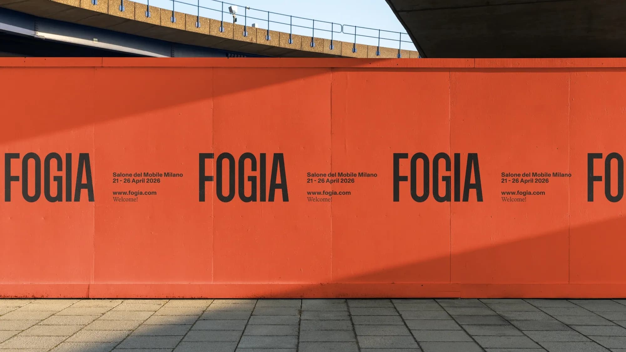
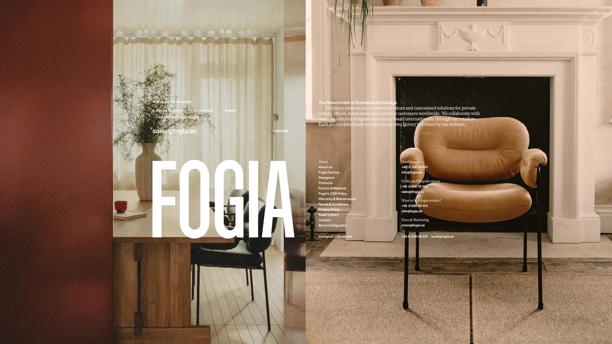
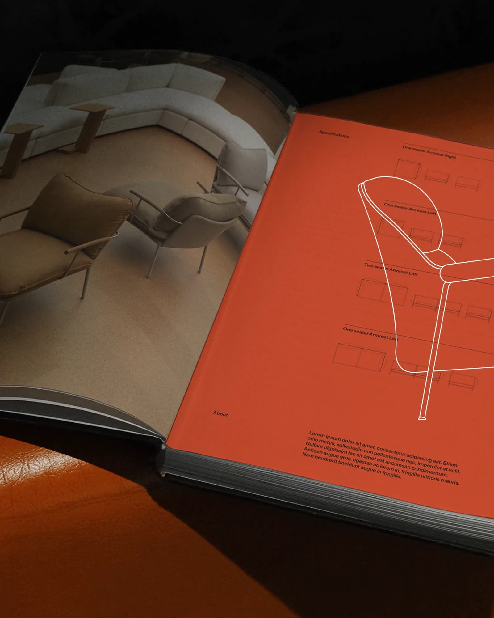
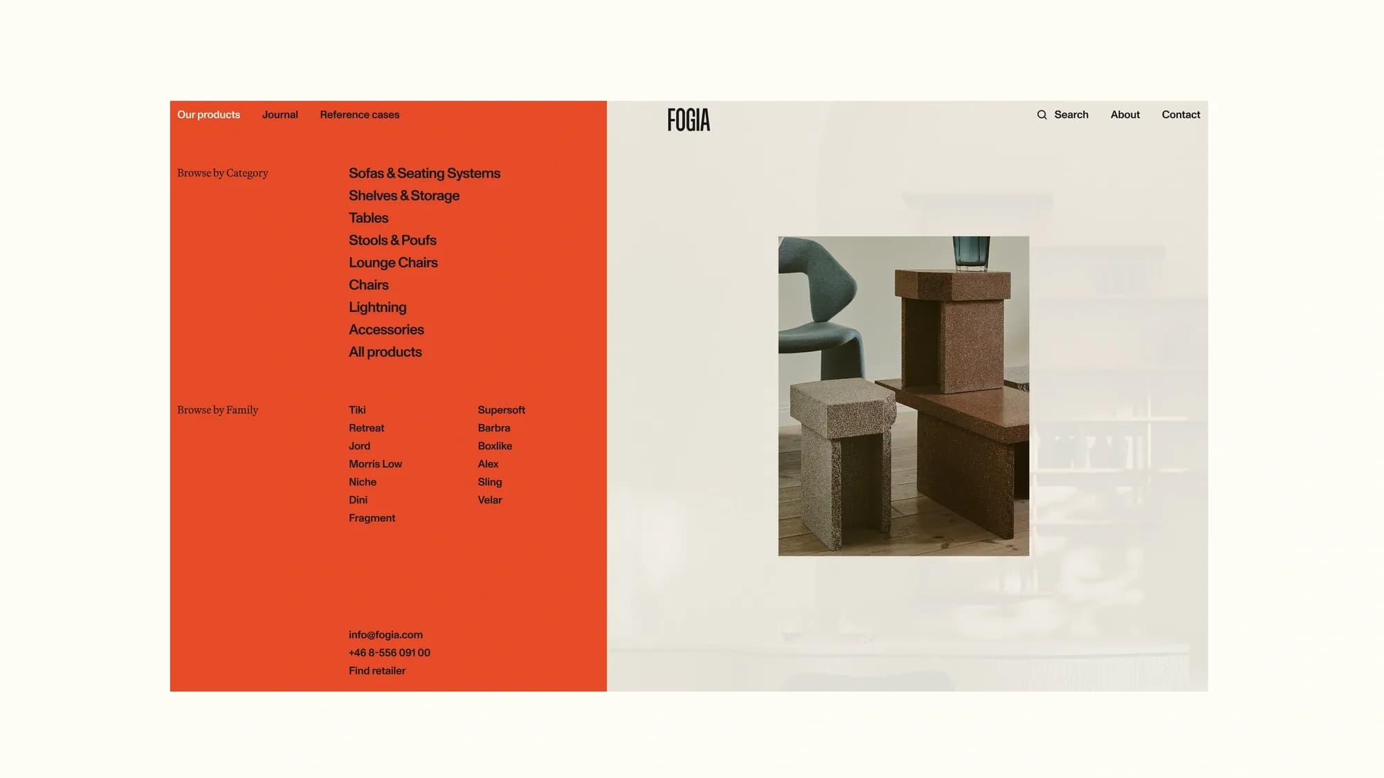
A single fiery orange, pulled from one of Fogia's earliest logos, became the anchor color, appearing against an otherwise black-and-white base. The wordmark inherited from Note Design Studio's identity was kept rather than replaced — Grebban judged it carried too much existing recognition to redraw from scratch — though it was reworked to be less condensed, improving legibility at smaller sizes. For typography, Grebban paired Monument Grotesk, a variable-weight sans-serif from Dinamo, with Martina Plantijn, a serif from Klim Type Foundry.
"We wanted something that would work well interchangeably in the same font size in order to keep a minimalist layout but still create that dynamic shift between the two," Goos says. "In the end we decided on Monument Grotesk from Dinamo... and paired it with Martina Plantijn from Klim Type, to provide that character and warmth to balance everything out."
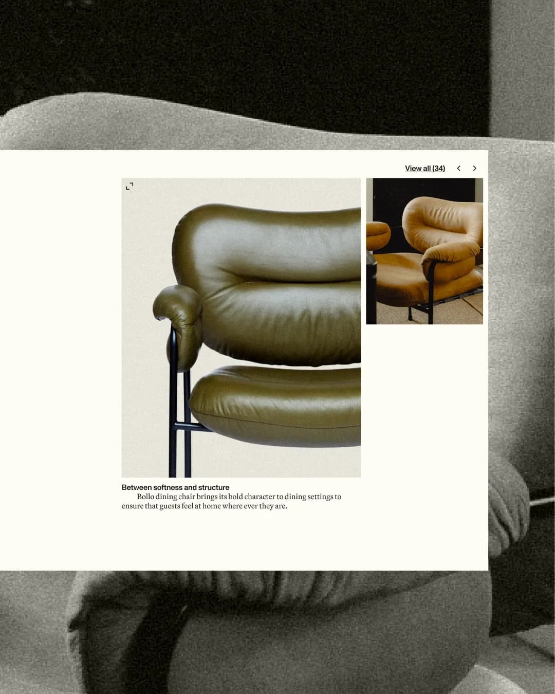
The same logic of contrast traces back to Fogia's furniture. Variants of the brand's Bollo chair range from black leather to sheepskin to a beetroot-red edition made for the Stockholm restaurant Tjoget — a pattern of unexpected combination that shaped how the orange is used across the new system, surfacing without warning against an otherwise controlled grid. On the live site, Grebban positions the result as a digital gallery rather than a product catalogue — built to give Fogia's collections, design philosophy and brand stories room, rather than list items for sale; the site currently routes shoppers to a quote-request form rather than a cart, so browsing and inspiration carry more weight than checkout.