Inside Kontrapunkt's 3D world for Novo Nordisk Foundation, mapping all of its work
The Novo Nordisk Foundation funds work across health, sustainability, and the life science ecosystem — a scope broad enough that a conventional org chart or website structure risks flattening it into jargon. Kontrapunkt was brought in to translate that scope into something explorable: an interactive 3D experience that lets stakeholders move through the Foundation's strategic focus areas at whatever depth they need.
Nordic Brief spoke with Halle Jarvi, Senior Copywriter & Strategist, and Laurits Hanak, Creative Director, from Kontrapunkt about how the map was built and why it uses 3D figures instead of illustration or photography.
Three strategic pillars, rendered as islands that don't touch
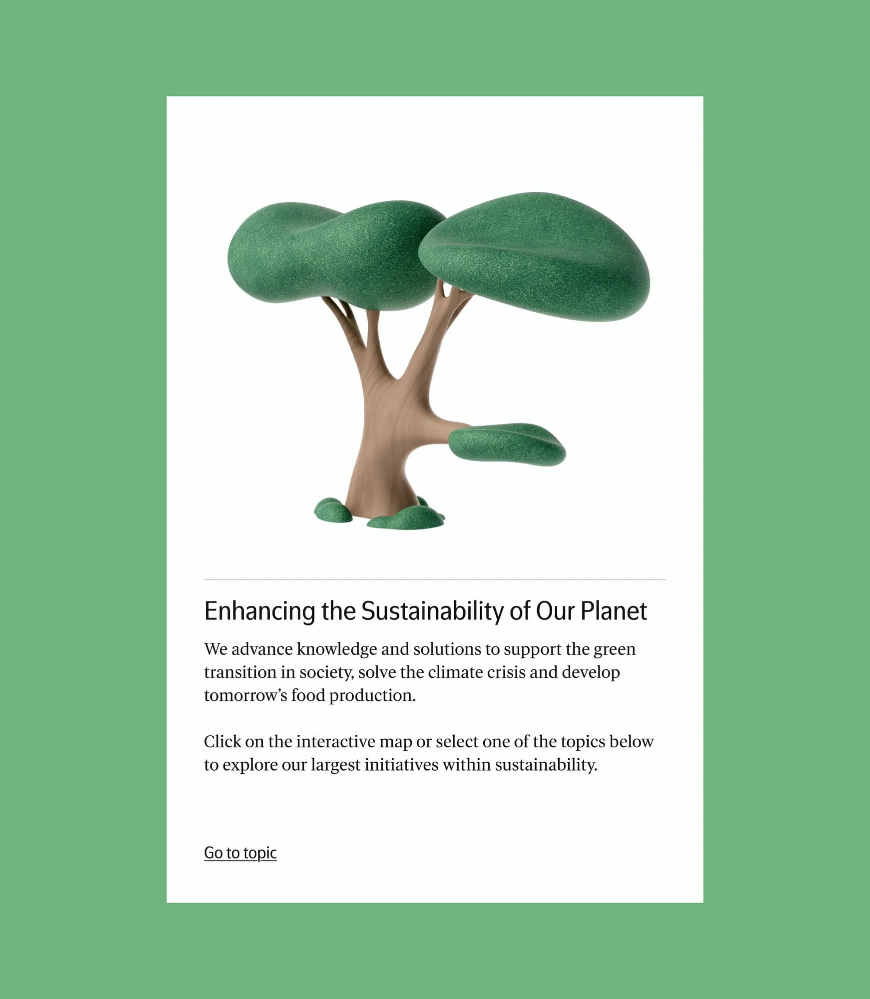
The experience organises the Foundation's work around three strategic pillars, rendered as three distinct "islands" within a navigable 3D space. Visitors can zoom from a broad overview down to individual programmes and the organisations they support, without the categorisation implying tighter relationships between initiatives than actually exist. Kontrapunkt mapped each initiative and its research field individually, then tested multiple categorisation models with the client before settling on the three-pillar structure — a process aimed at reflecting the Foundation's own institutional priorities rather than imposing an external taxonomy.
What was the specific communication problem that made a spatial, interactive 3D experience more appropriate than a conventional 2D diagram or website structure for the Novo Nordisk Foundation?
The Novo Nordisk Foundation is one of the world's biggest foundations. They fund countless initiatives based on their strategic focus areas of health, sustainability and the life science ecosystem. This project was also about translating that overview for external audiences. To make it engaging and relatable, we chose to explore an interactive 3D world so that visitors who maybe have a limited knowledge of the Foundation or their focus areas could discover at a depth that suits them. Free from the jargon or confusion of corporate org charts. At the same time, we didn't want to exclude the deeper level of understanding for those who might be looking for concrete information. Hence our decision to design it as a 3D digital experience where users can zoom in and out.
How did you translate a complex system of strategic focus areas, programmes, initiatives and supported organisations into a spatial model without implying relationships that do not actually exist?
We had to map each initiative and dive into the different research fields. This allowed us to see how things were related, or not. Together with the client, we tested multiple categorisation models that could reflect their institutional priorities. In the end the organising idea was centred around their strategy, which has three distinct pillars. Visually we made them three distinct "islands" so as to show their relationship as related but not necessarily interconnected.
A figure surveying farmland, not an icon for agriculture
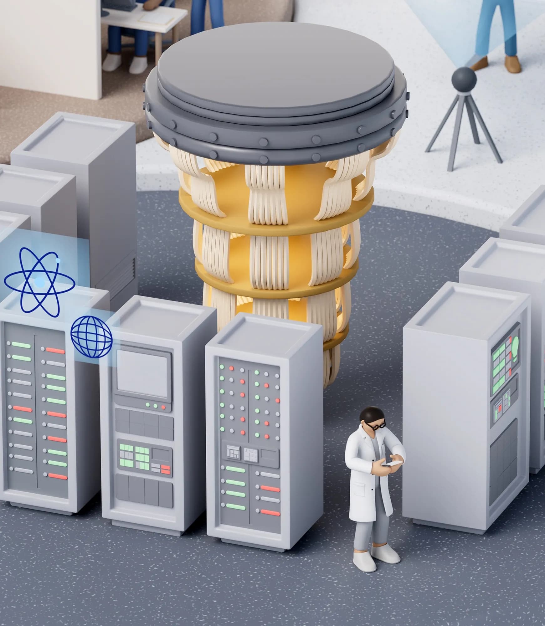
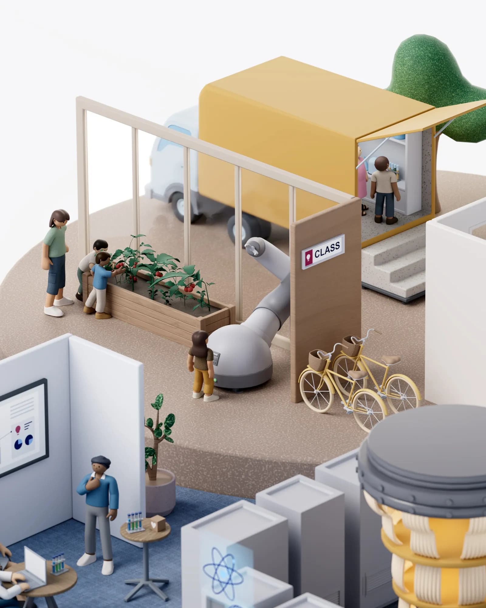
Rather than flat icons or photography, the experience uses 3D-rendered figures and objects to depict the Foundation's initiatives in action — a figure surveying farmland, for instance, standing in for an agricultural research programme. The choice was made to give abstract funding categories a physical, legible form: motion and scale, Kontrapunkt argues, register more concretely with audiences than a static image can.
Beyond the interactive map itself, the experience also uses 3D-rendered figures and objects rather than flat illustrations or photography. What drove that choice, and what does a 3D figure communicate that a 2D icon or illustration cannot?
3D was a key choice in making these initiatives as tangible as possible for audiences, in a way that illustrations or even photography can't achieve. Our figures actually act out the work and impact of the initiatives, making them easier to imagine and understand. Seeing our figures in motion, for example surveying farmlands, will always be more emotionally effective as communication, making it more likely our audience also remembers concrete examples of the Foundation's initiatives.
3D-rendered figures and objects have become a broader visual trend recently. Do you see this as a meaningful shift in how organisations should visualise people and ideas, or as an aesthetic trend that risks becoming formulaic?
It's bigger than a trend, it's a manifestation of the responsibility large institutions have to be understandable to larger audiences. While the visual manifestations we're seeing lately might be a trend, Kontrapunkt has always worked with helping large companies communicate clearly and effectively to their wider, social stakeholders. Our approach always takes outset in the specific touchpoints and audience, and varies across reports, experiences, videos, etc.