Uncle Grey solves stadium scale without losing simplicity of The Minds of 99
A stadium tour multiplies the touchpoints an identity has to work across, and the usual answer is more control, not less. The Minds of 99, a Danish rock band that broke through in 2014 and packed Copenhagen's Parken stadium for three nights in 2024, faced that problem ahead of four stadium concerts in Horsens and Parken in June 2027, Denmark's first stadium tour by a domestic act.
Copenhagen studio Uncle Grey built the tour identity with photographer Oliver Knauer and darkroom Silverlab. Rather than adding a new symbol or system, the agency reduced the identity to the band's name in custom typography, with a color palette that came not from a brief but from a Stockholm aura-photography session where each band member's aura measured yellow-orange. Nordic Brief talked to Uncle Grey's Executive Creative Director Lars Dyhr about the first visible layer of a larger visual story still to come.
A new chapter, not an entirely new story
Uncle Grey and the band both describe the new identity as a shedding of skin, rather than a break with what came before. The tour system is the first expression of a larger visual story that continues with the band's upcoming album, working title Sjælens Alkymi, where the typography and photography introduced here will carry more symbolism and a wider visual universe.
"The band sees it primarily as a molting. They've been very clear that the upcoming release should mark the beginning of something new, and it's been important that the identity supports that feeling," says Lars Dyhr, Executive Creative Director at Uncle Grey. What carries over isn't a specific graphic solution but a working principle the band's identities have shared since Solkongen and Infinity Action: "The strength of the previous album identities has been their ability to reduce a complex universe to one strong visual principle. That's a principle I think is interesting to carry forward, without repeating the specific solutions."
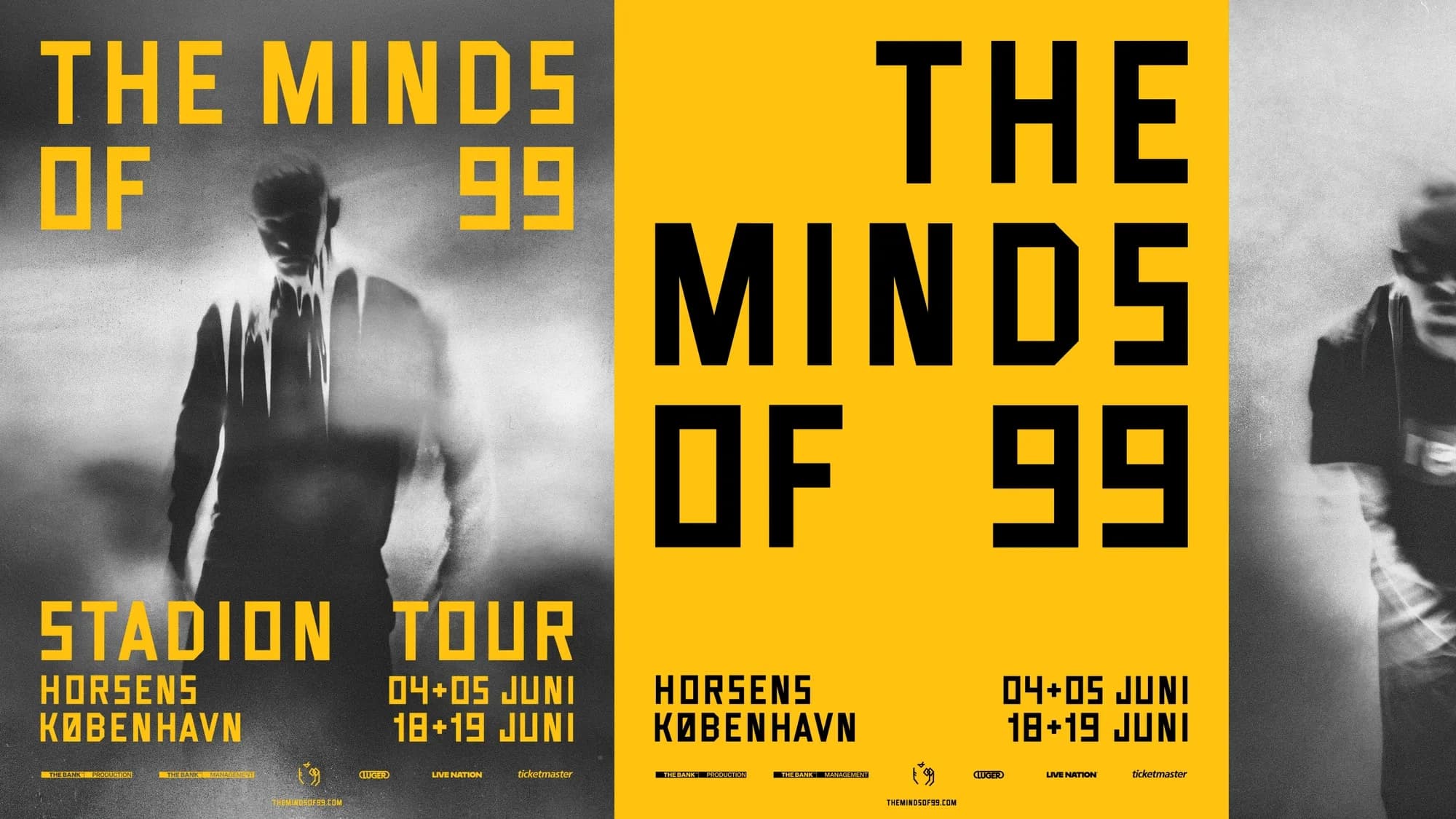
That same instinct toward reduction shaped why the tour identity leans on the band's name rather than a new symbol. "The identity has to work extremely effectively in a tour context, so I've been interested in reducing rather than adding," Dyhr says. "By making the typography the central graphic device, we can create recognition without depending on a separate symbol."
Previous album covers


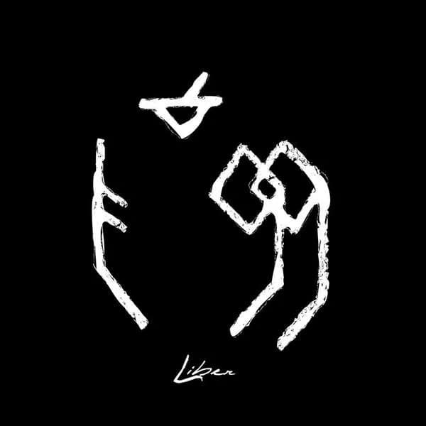
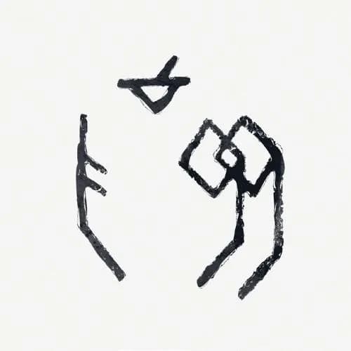
Portraits made with an aura camera
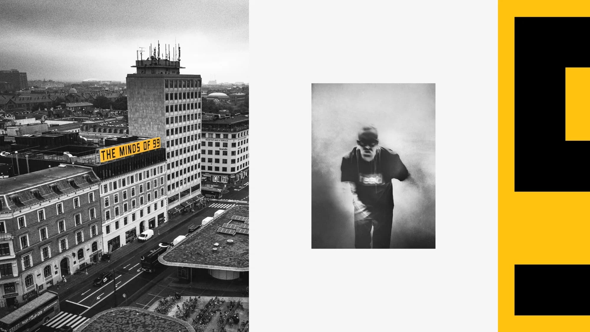
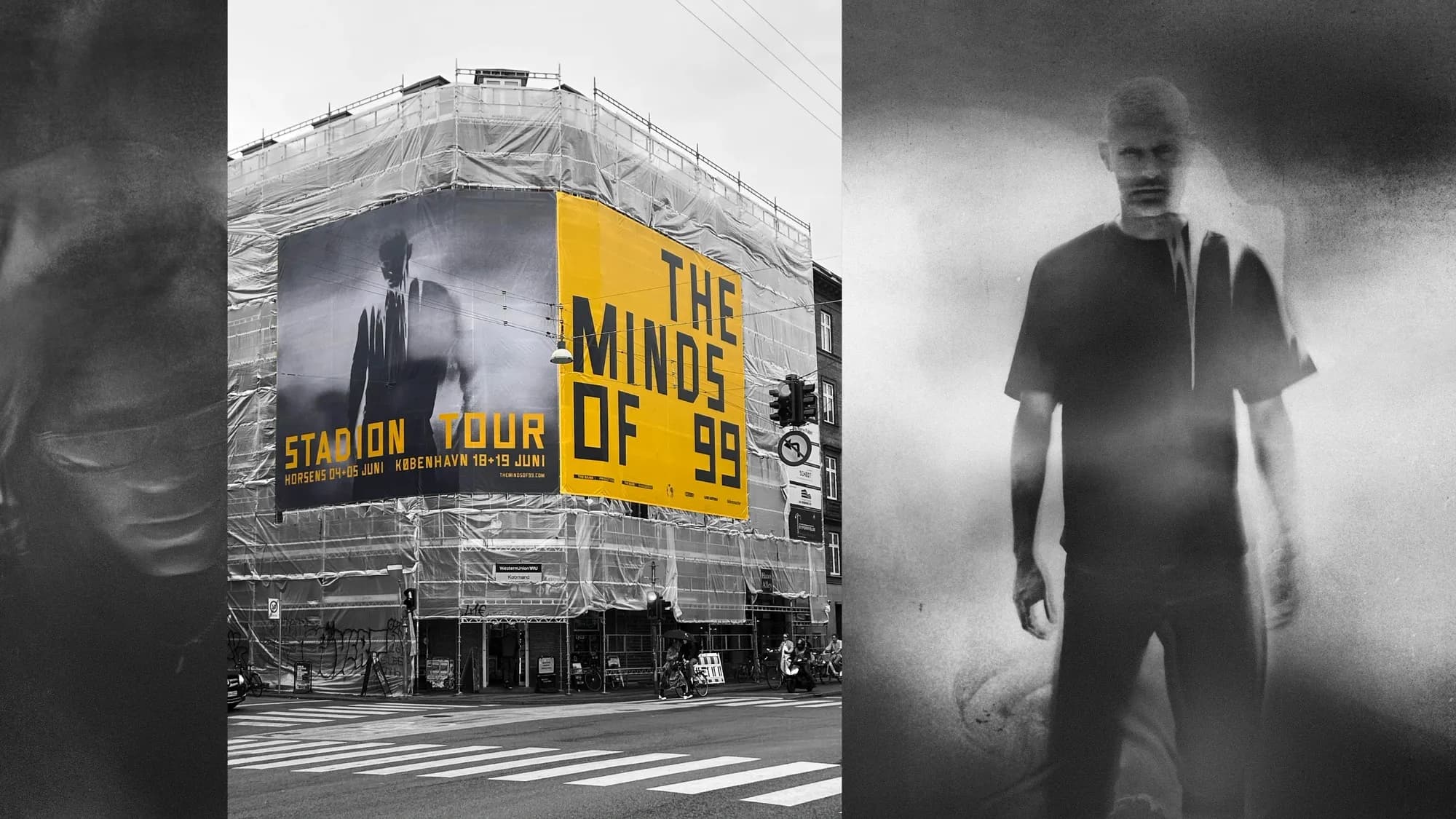
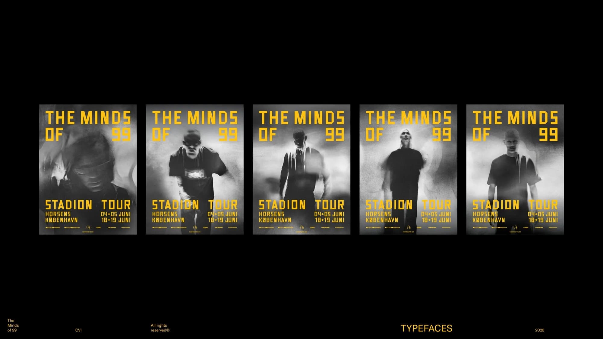
The photography set out to do more than picture four band members. "The photography is just as central to the identity as the typography. It's been important that the photographs don't just function as portraits of the band members, but as a visual material with its own materiality and character," Dyhr says. Everything is shot analog, on old film and Polaroid, by photographer Oliver Knauer — a process the agency chose precisely because it can't be controlled the way a digital image can, so errors, variation and grain become part of the material.
An aura camera, used during a session with a team from Stockholm, added a further layer to that process. "We tried, in a way, to photograph something you can't normally photograph — the band members' energy," Dyhr says, a thread that also runs into the working title of the coming album. The color that resulted wasn't chosen from a palette: "The color didn't start as a classic strategic choice — it came out of the actual process around the photographs. All of them turned out to have a yellow-orange tone." Copenhagen darkroom Silverlab, part of The Lab, then spent extensive hours developing the film to arrive at the final image.
A typeface built from three letters
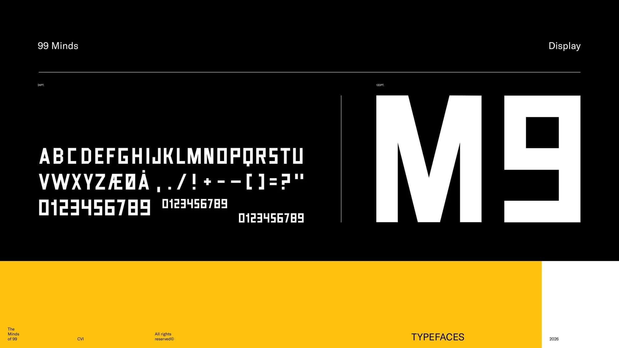
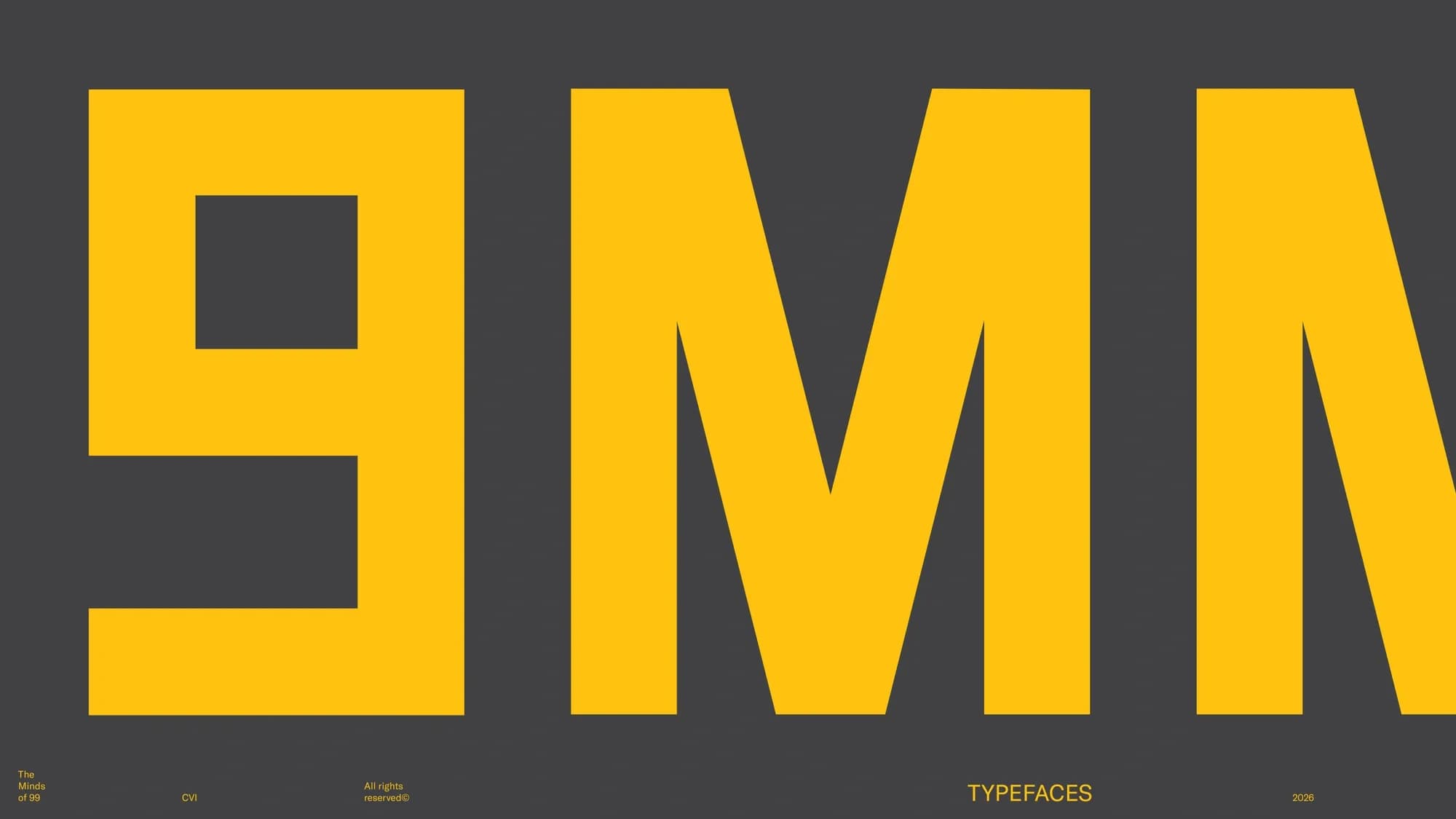
The typeface running through the identity is custom-drawn rather than an existing font. Dyhr found its starting point on an old Italian sign, of which only three letters remained legible. "Those three letters became the DNA for the rest of the alphabet," he says. The full alphabet was drawn by hand before being digitized, so the finished, digital typeface still carries small irregularities from that process.
The intent was for the typeface to work on two levels at once. "I was interested in a typography that on the surface could appear industrial and almost banal, but that on closer look had something more personal to it. It shouldn't be decorative. It should function as a tool," Dyhr says. That tool has to do more than hold a headline: built as the identity's central graphic device, it carries the band's name across posters, facades and screens while still, in Dyhr's words, needing to "carry some of the band's personality" — a mix he describes as "something unpolished, punk, and something very human and present."