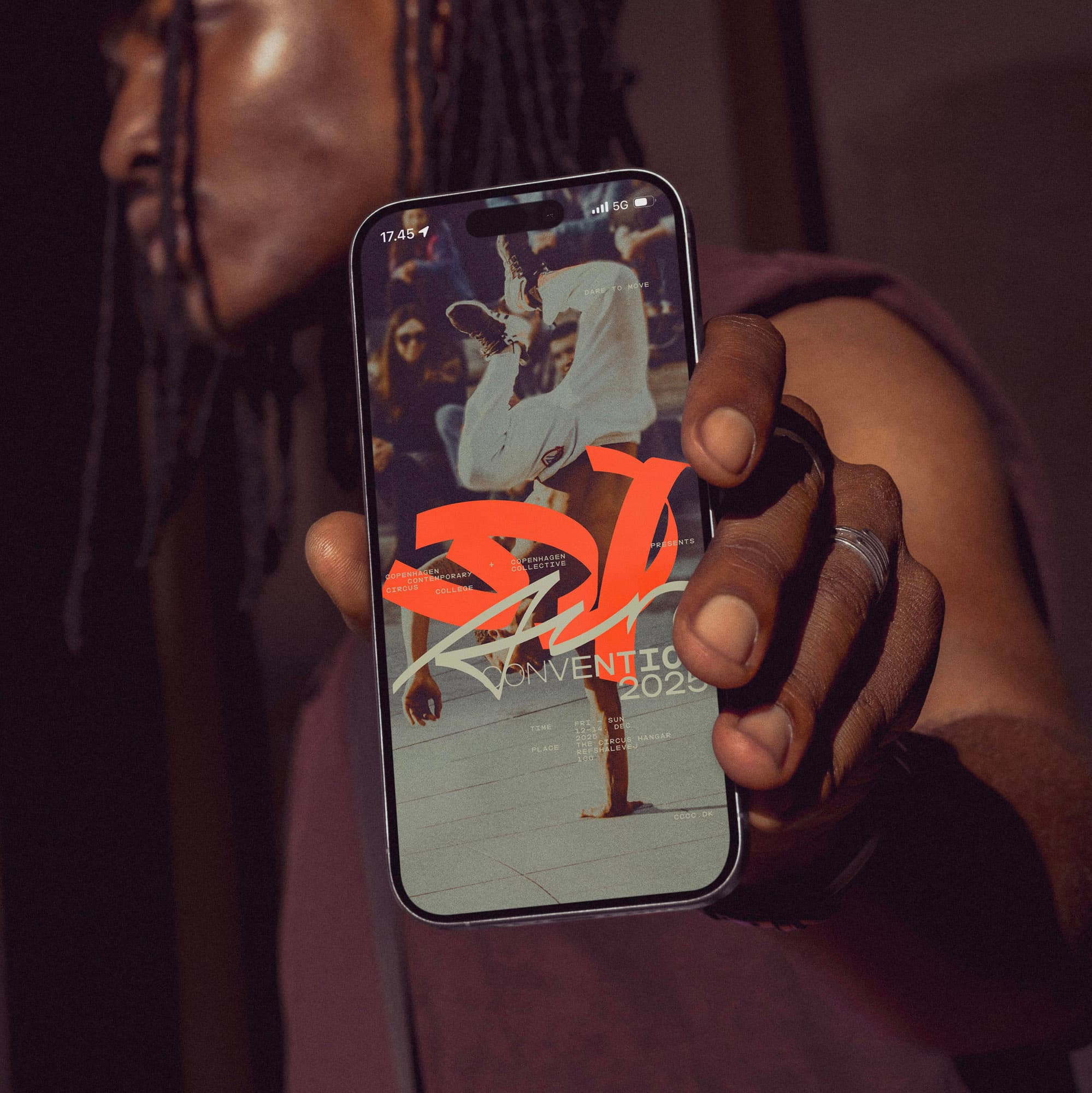
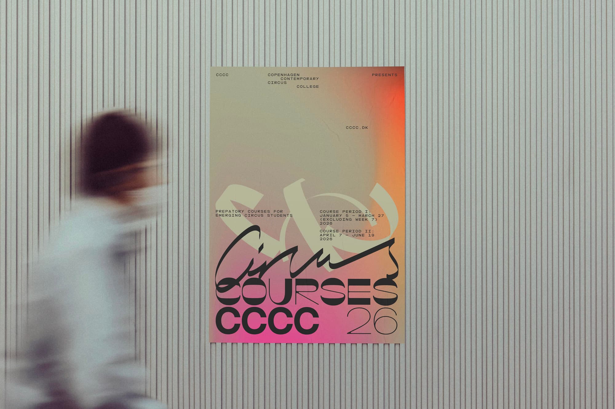
The circus tent stripe is a design cliché, but In Your Dreams made it the logo anyway.
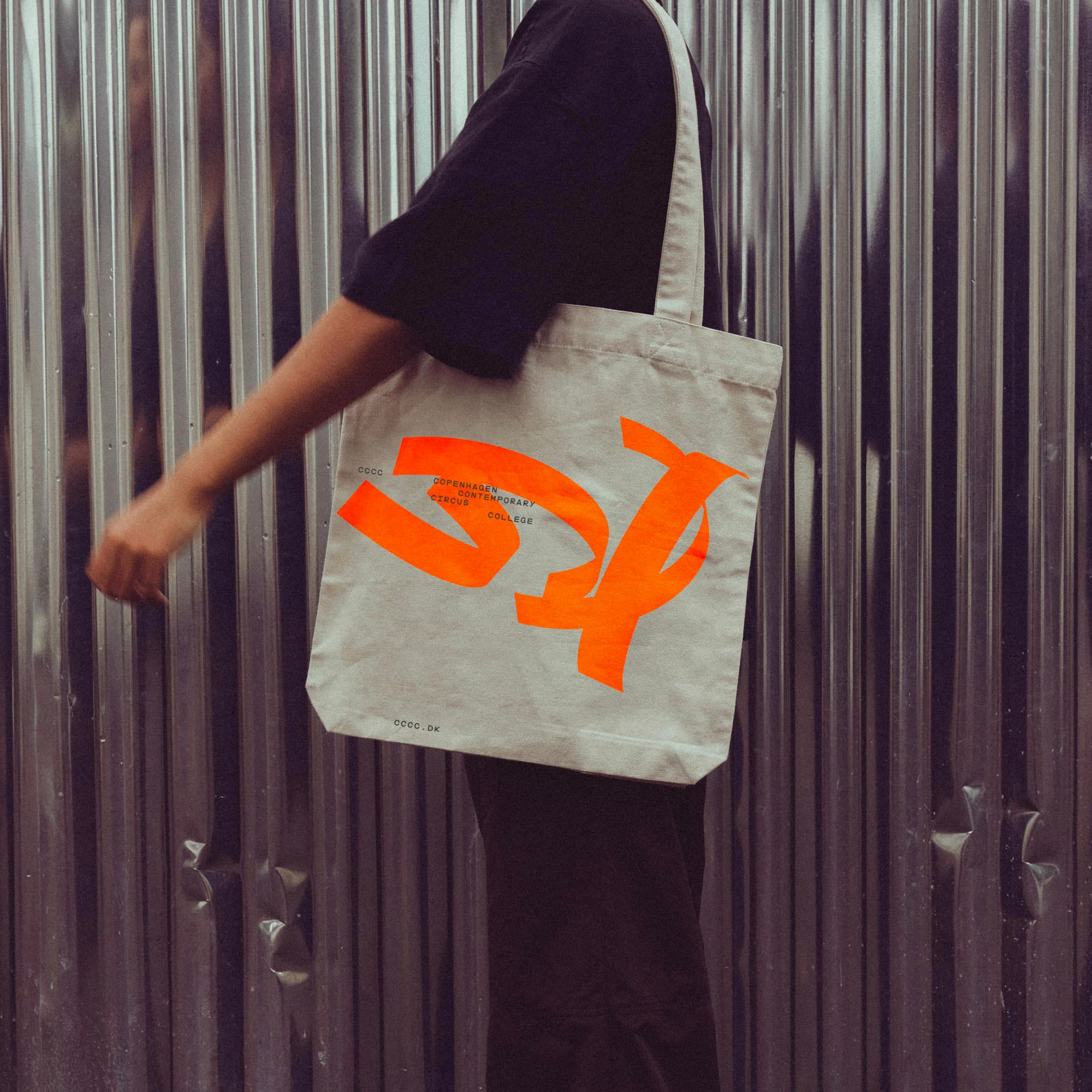
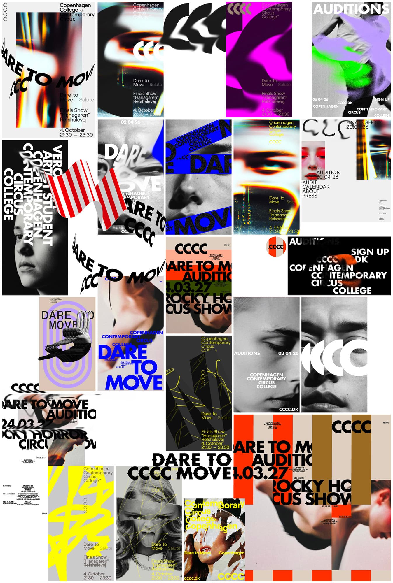
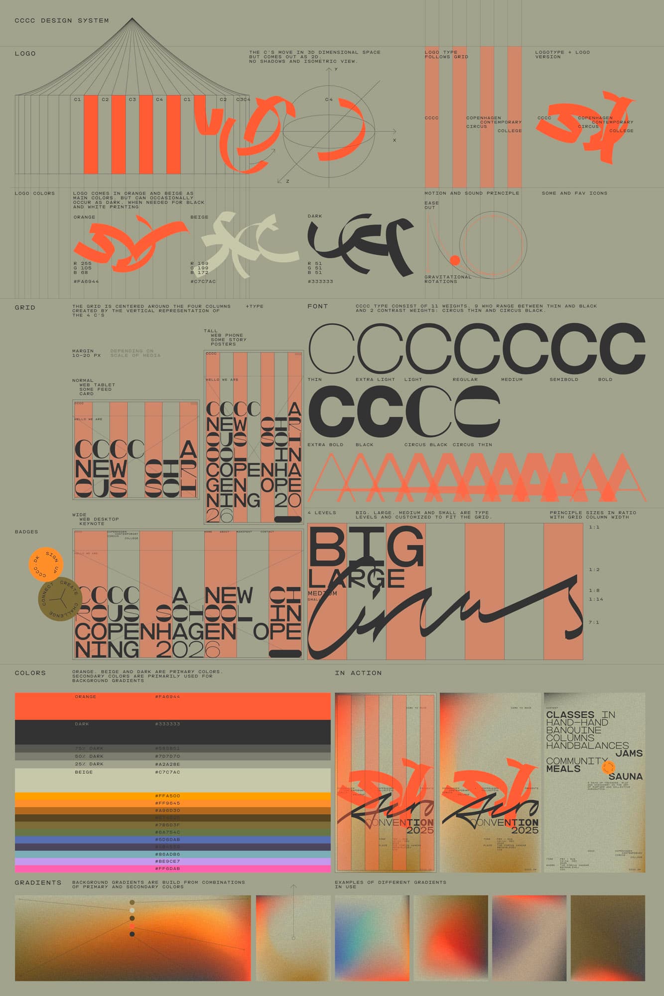
The striped circus tent is one of design's most over-referenced symbols. For Copenhagen Contemporary Circus College – Denmark's first higher education programme in contemporary circus, opening for applications in 2026 – Copenhagen studio In Your Dreams worked the reference into a logo built on three-dimensional Cs. The form emerged from a brand strategy built on a single phrase, Dare to Move, and from interviews the studio ran with circus students across Europe.
A reference that only worked once it moved
Before settling on a direction, In Your Dreams interviewed circus students to understand what the school's first applicants might respond to. One answer kept surfacing in the studio's sketching phase. "On the subject of 'what do you think is cool in circus?', one student, Markus, responded with admiration on performances that take parts from the old idea of circus and create something new. Something powerful," says Tore Rosbo, designer and founder of In Your Dreams. "This response stuck in our heads while sketching up the identity design. We didn't desire a solution that was too literally a reference to circus."
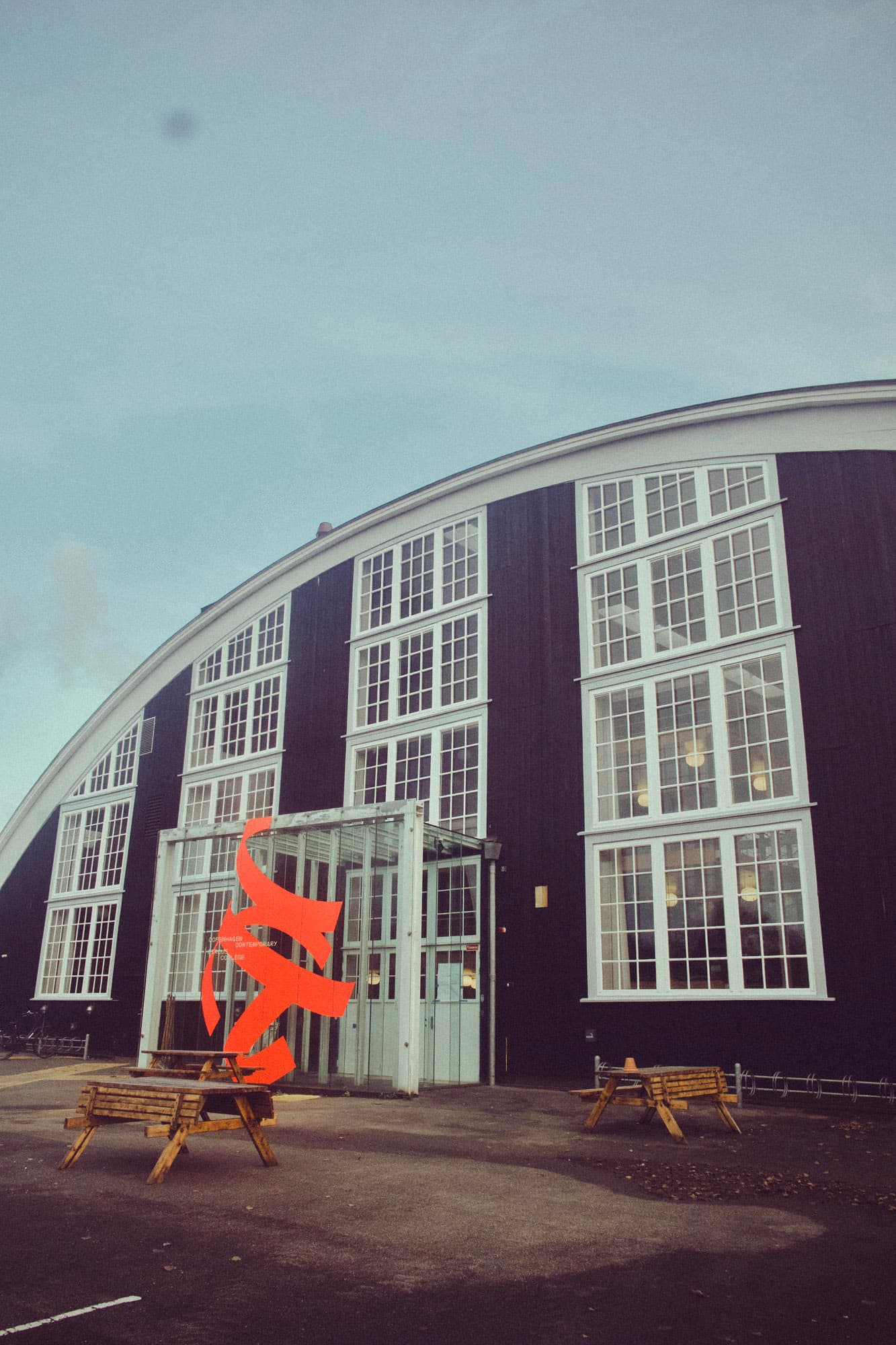
The studio tested the tent stripe early as a layout device and a super graphic, but the element refused to land on its own. The breakthrough came when the stripe was connected to the brand strategy's central idea, Dare to Move. "Looking into the movement of the circus performance, we got inspired by the physical, three-dimensional movement," Rosbo says. "This was when the moment of clarity occurred: what if the stripes could be three-dimensional Cs?"
That move reframed the brief. Rather than treat the tent stripe as iconography to be avoided or ironised, the studio took it as raw material and gave it a new figurative job, wrapping a flat pattern around the school's initial.
The poster reference, applied the same way as the stripe
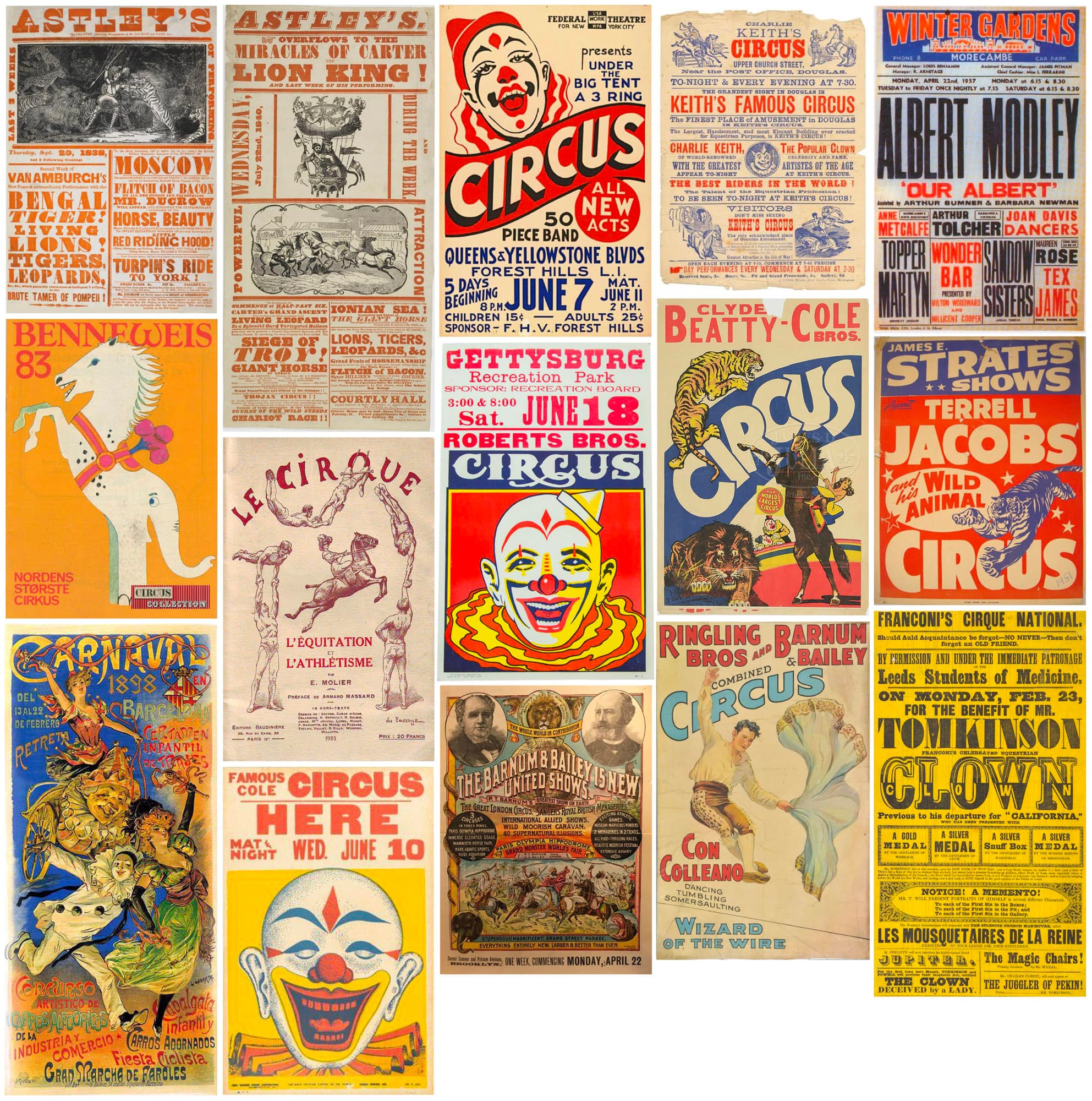
The custom typeface arrived through a similar route, an existing reference reworked rather than discarded. "Historic circus posters served as an inspiration for layout and typography, eventually," Rosbo says. "Initially we didn't give it much attention, apart from the boldness and Futura-like type look that inspired some early layouts. It wasn't before the idea of the logo deriving from the circus tent striped pattern that finding historic references for other elements became a thing."
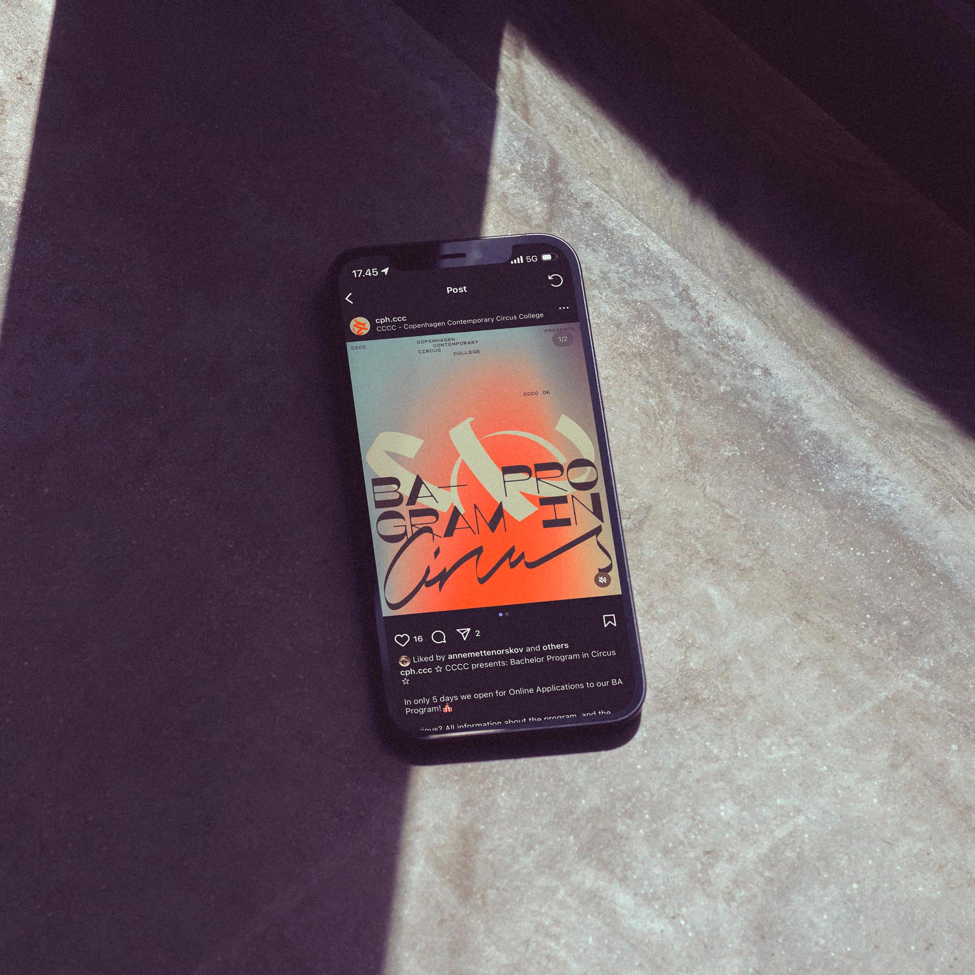
What the studio took from the posters was the block layout and the playful mix of contrasting type styles. Those were consolidated into a single variable monospaced font, where the historical contrast between display weights becomes an axis inside one typeface rather than a typographic shouting match across many. Dare to Move served as a guide for pushing distinctiveness in the type design rather than a literal brief, though Rosbo notes that the interpolations between the font's axes could themselves be read as a kind of movement.
The colour palette pairs a bright orange with warm sand and a downtoned black, supplemented by yellow, brown, green, blue and purple. "We had a desire to combine something powerful and attention seeking with a welcoming warmth," Rosbo says. On the question of whether nostalgia was actively avoided: "We didn't try to avoid nostalgia. We actually sought it on this area."