Schnitler&Co goes below and above the surface with new visual identity for The Whale
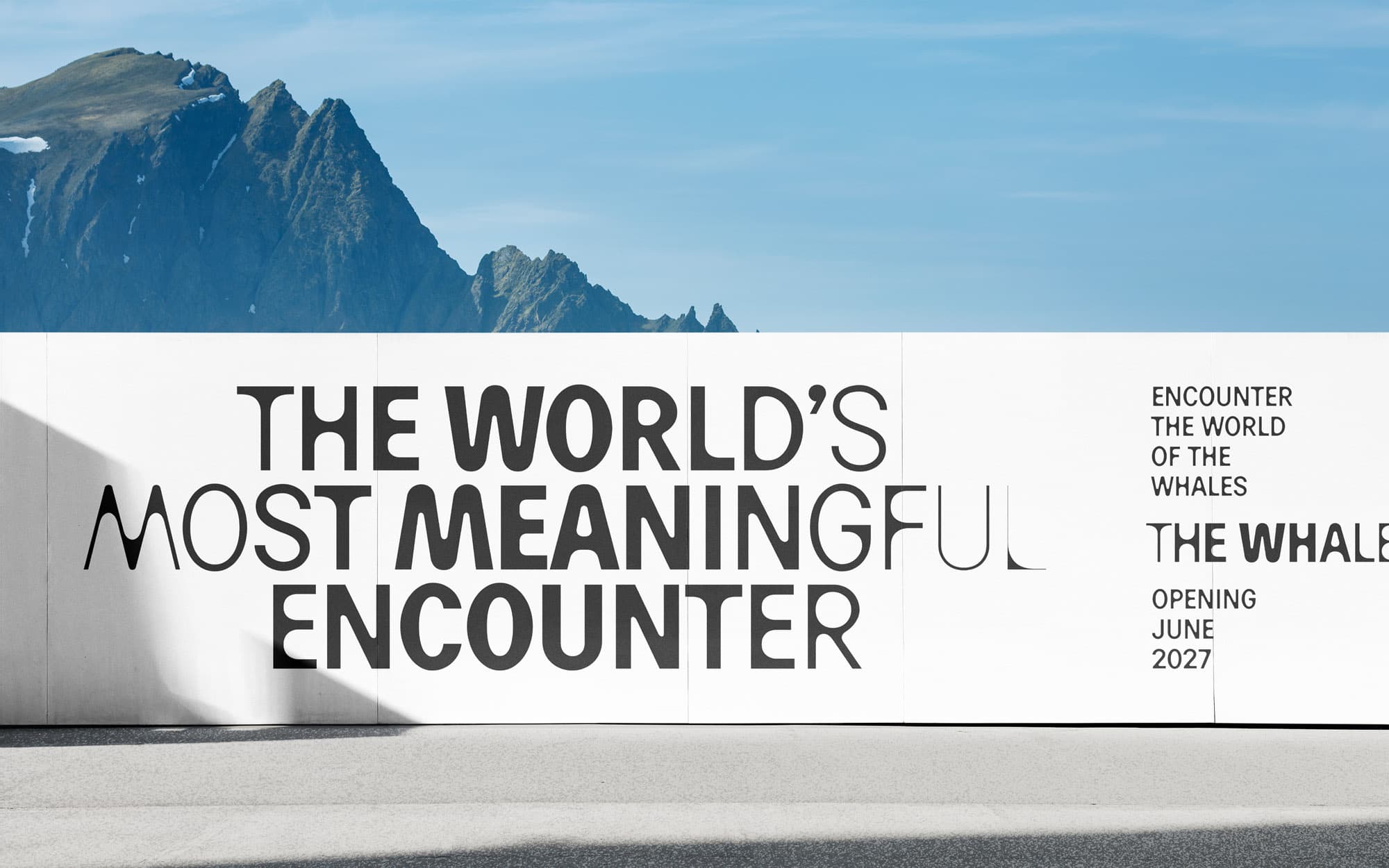
The world’s most meaningful encounter between humans and whales. That was the starting for The Whale, a new knowledge and experience centre opening in Northern Norway in 2027. Early on, the team decided to avoid clichees like a logo with a whale tail. The identity needed to represent something broader than the safari experience, as the centre brings together science, art, storytelling, sound, architecture, whales and the oceans they inhabit.
Christian Schnitler, Creative Director and founder of Schnitler&Co, worked on the new visual identity. Nordic Brief got to ask him a few questions about the visual identity, exploring among others how a custom typeface could carry both language and concept at every scale.
Why the moment the whale breaks the surface, rather than the deep, the migration, or the safari experience itself?
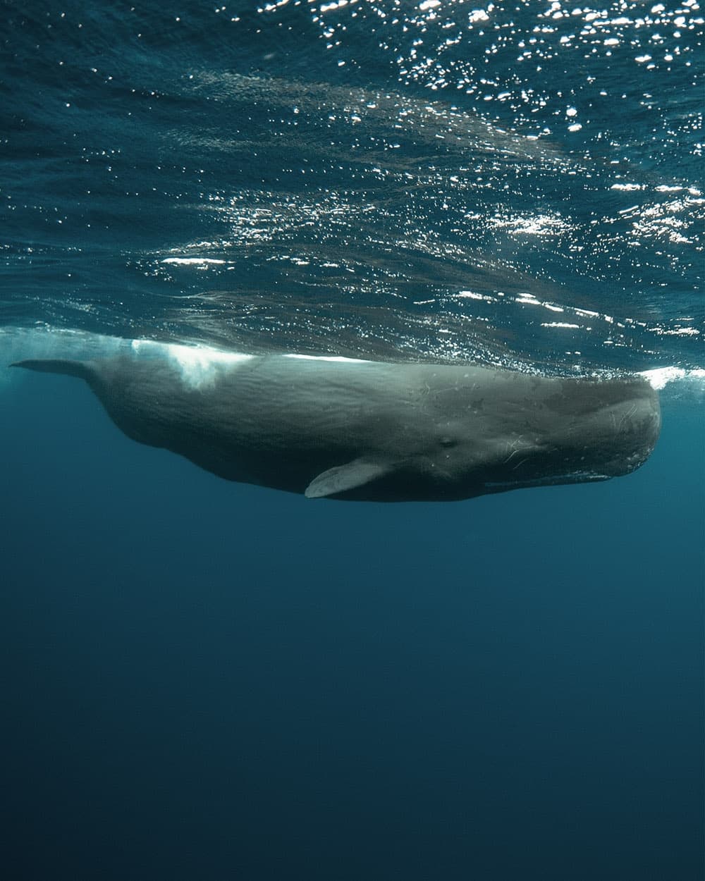
We explored themes connected to the deep, migration, scale, movement and the surrounding landscape. But the moment a whale breaks the surface brought all of these ideas together in one powerful image. It is the threshold where sea meets air, where the unseen becomes visible and where something quiet suddenly becomes present. That moment is both physical and emotional. It represents the whale coming up for air, but also the human experience of discovery and encounter. The other ideas were not necessarily wrong, but none of them contained the whole project as clearly.
How did you translate that single moment into a working system, what became design logic?
That was the most challenging part of the process. The Whale brings together enormous scale, strong emotions, organic movement, dramatic contrasts and one of the most beautiful natural environments in the world. All of that had to be translated into a functional visual identity—not simply an expressive image. The design logic became a transition from below to above, from subtle to defined, from quiet to present and from unseen to visible. We translated that transition into changes in weight, contrast, clarity and visual volume. The elements can therefore adapt to the needs of the communication. They can be restrained and atmospheric in one context, or bold and highly visible in another, while still belonging to the same system. The aim was to create simple, graphic forms that retained something organic and dynamic.
When did it become clear you needed a custom variable font rather than a grotesk off the shelf?
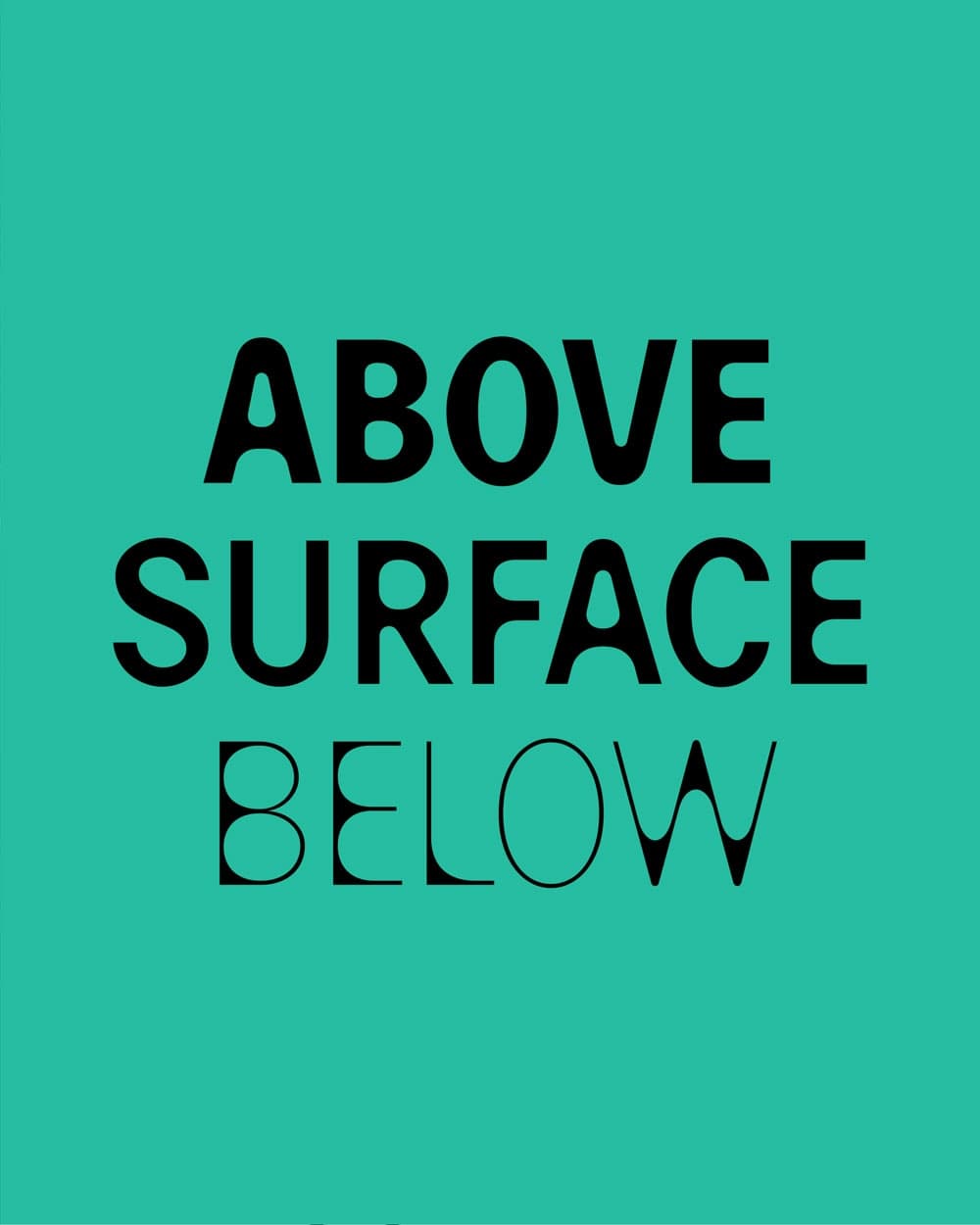
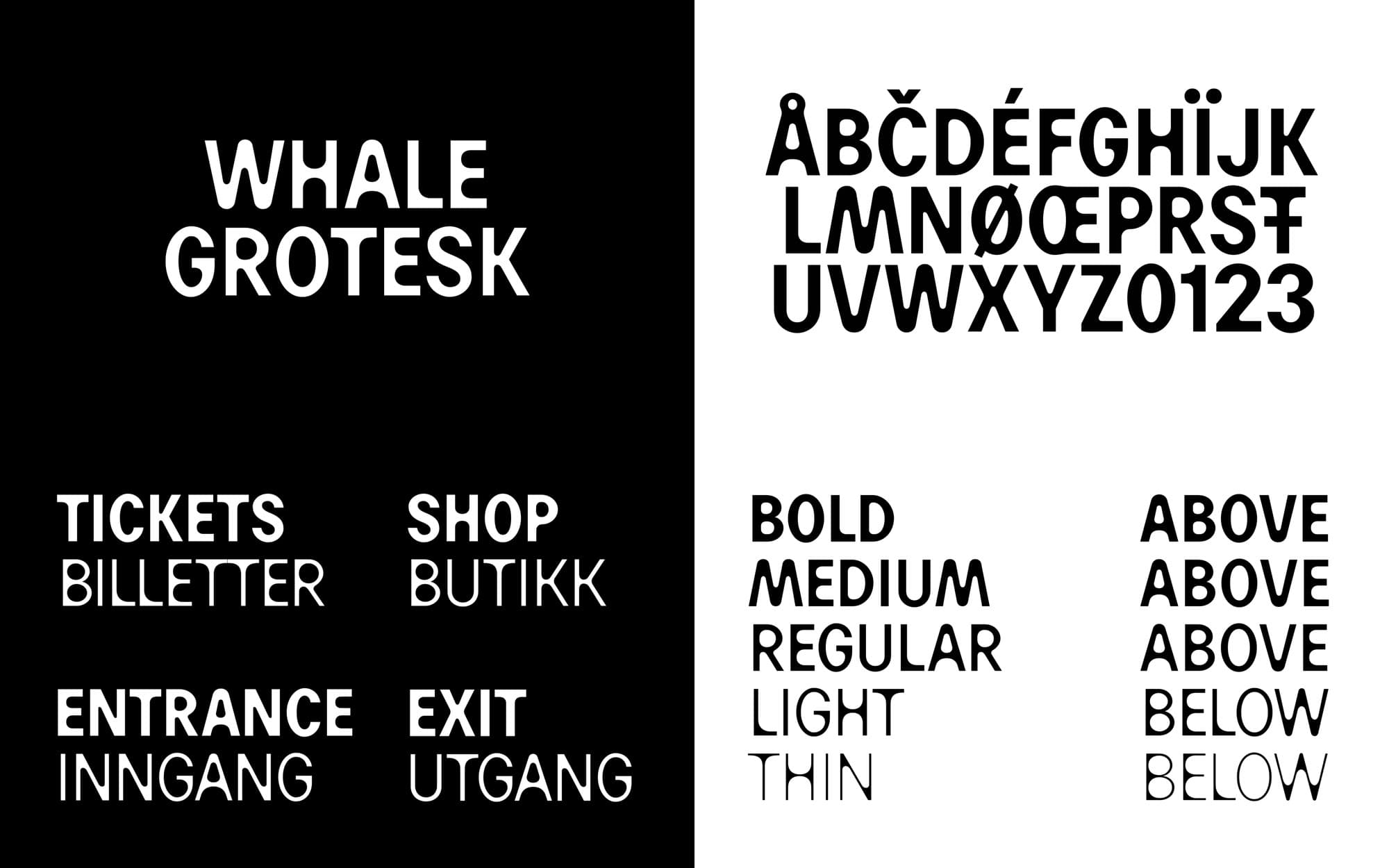
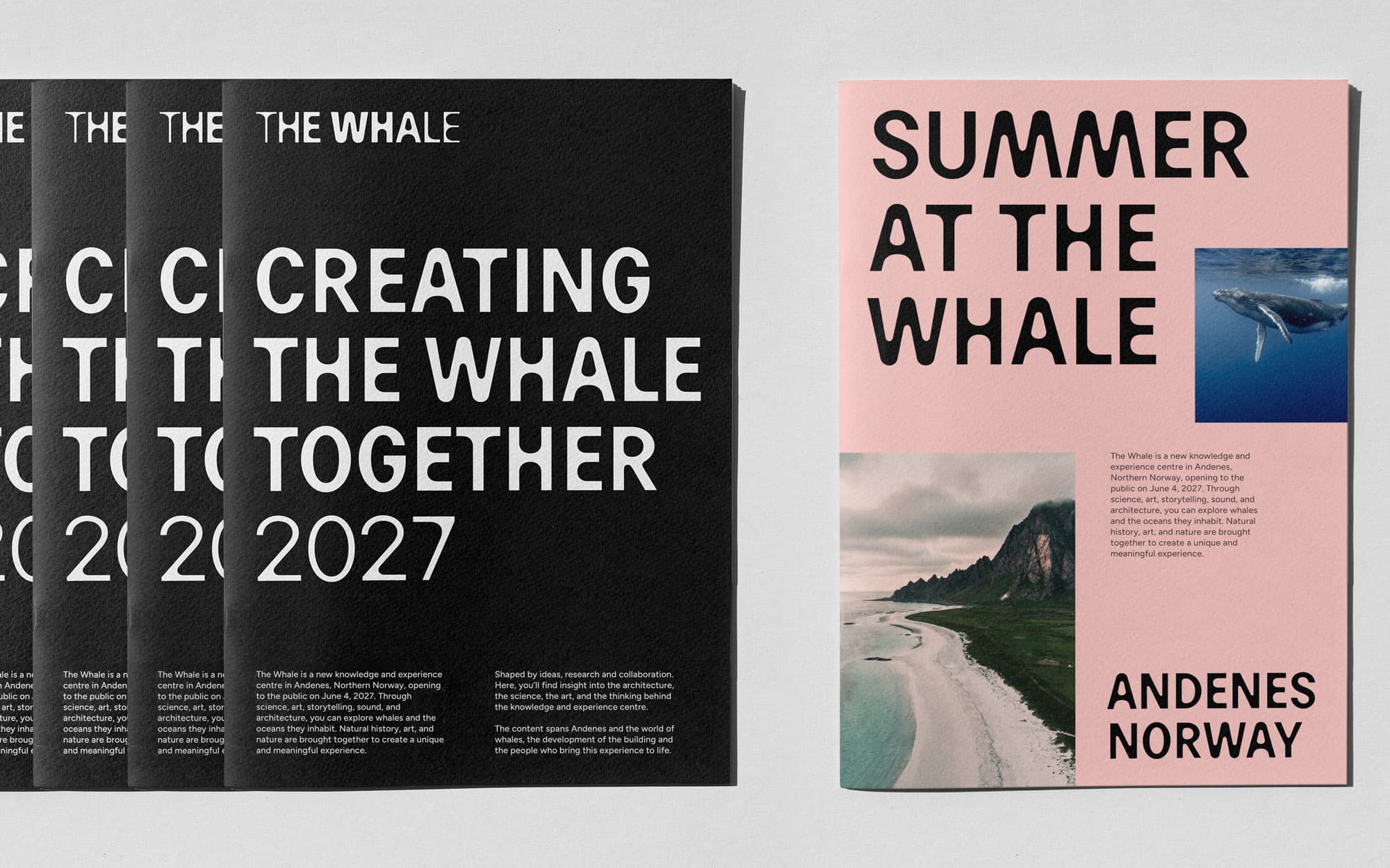
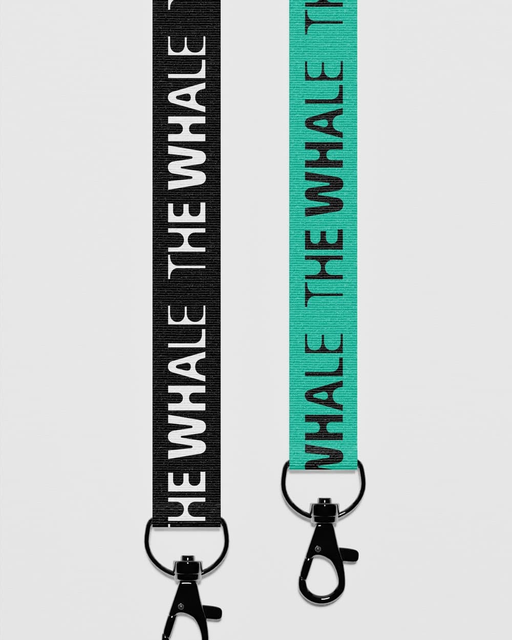
Typography was central to the concept from an early stage. We needed the letterforms themselves to embody the movement of breaking the surface. An existing grotesk could have provided a strong and functional typographic voice, but it could not express this particular organic transition in a way that was native to the identity. We wanted the typography to move from something submerged, light and restrained to something surfaced, bold and fully present. Variable-font technology made it possible to build that transformation directly into the typeface. Developed with type designer Maciek Marc, Whale Grotesk has a variable axis that allows the forms to shift continuously in weight and expression. The concept is therefore not applied to the typography; it lives within it.
What do the other elements carry, and was letting type do so much of the work a deliberate restraint?
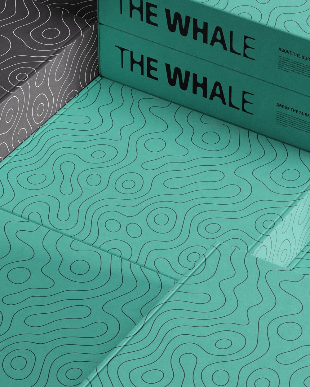
Yes, it was deliberate. Typography is often one of the most important components of a visual identity, and in this case it became the core element because it could carry both language and concept at every scale. By embedding the idea of the encounter within the custom typeface, the identity remains recognisable across everything from a small digital message to a large architectural surface. It does not depend on a decorative graphic being added every time. The other elements each have a supporting role. The logo establishes the central idea in a concentrated form. Colour connects the identity to the landscape, sea and changing light of Andenes. The graphic patterns have a more illustrative function. Imagery brings in the physical reality and emotional scale of the place. Motion allows the transition from below to above to unfold over time. Allowing the typography to do so much of the work gave the system greater clarity and restraint. It also made it more flexible and durable.
What in the architecture became decisive for the identity?
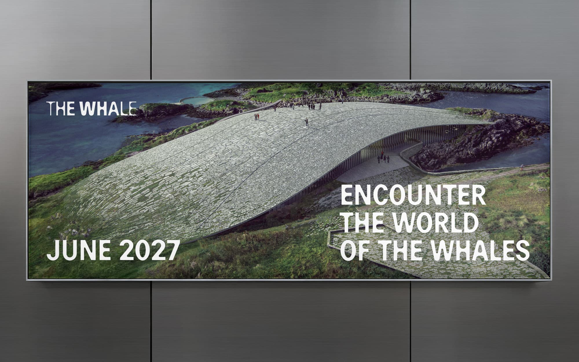
Dorte Mandrup’s building is iconic and was a major source of inspiration throughout the research and development process. Its relationship to the terrain, its organic form and the care taken in responding to the geography and environment were particularly important. At the same time, we did not want the visual identity simply to imitate the architecture. The building and the identity have different roles. The architecture creates the physical experience of The Whale, while the visual identity must communicate, position and market the project across a much wider range of contexts. Because the building has such a strong identity of its own, the visual system can be more restrained within the architecture and more expressive in external communication. The relationship is complementary rather than competitive. We have also maintained a very good dialogue with Dorte Mandrup’s team throughout the process.
What inspired the colour palette?
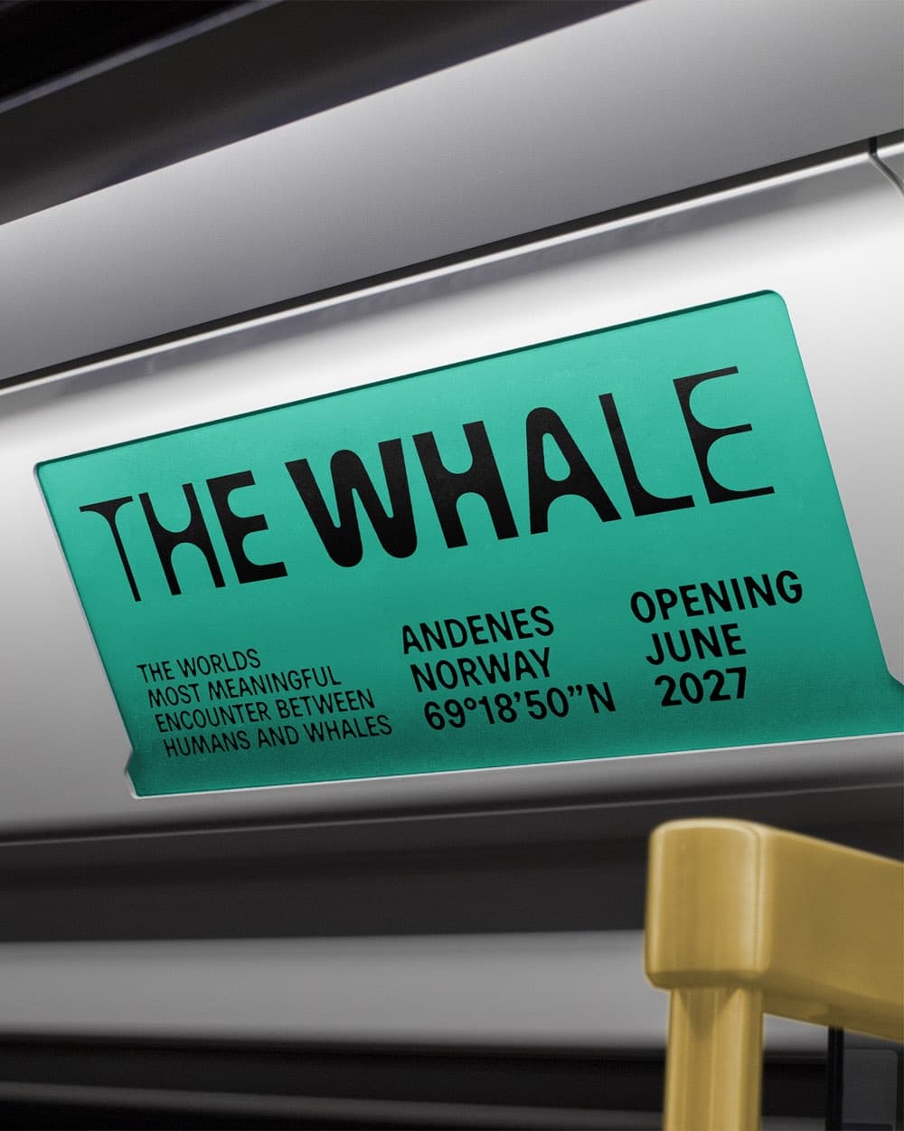
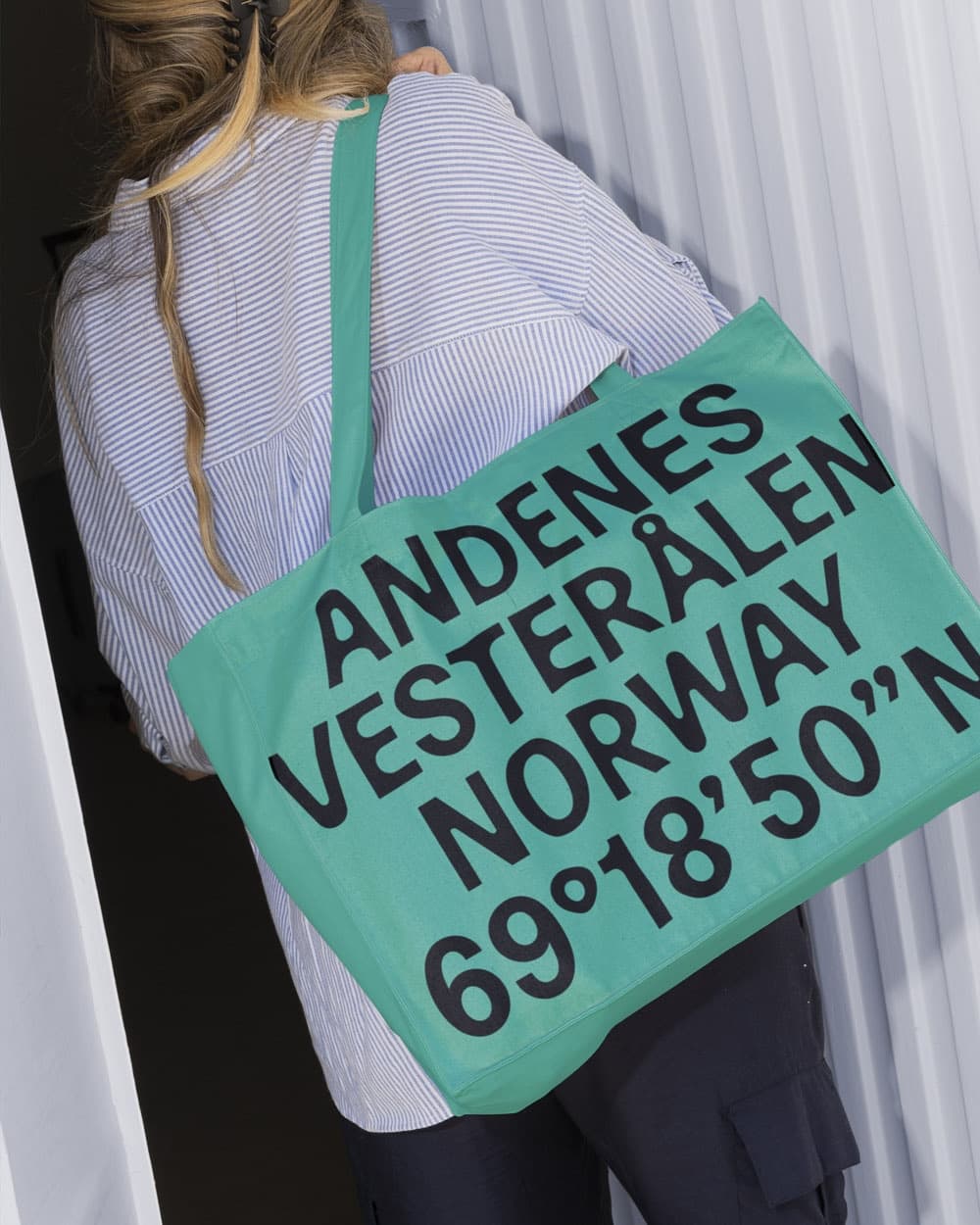
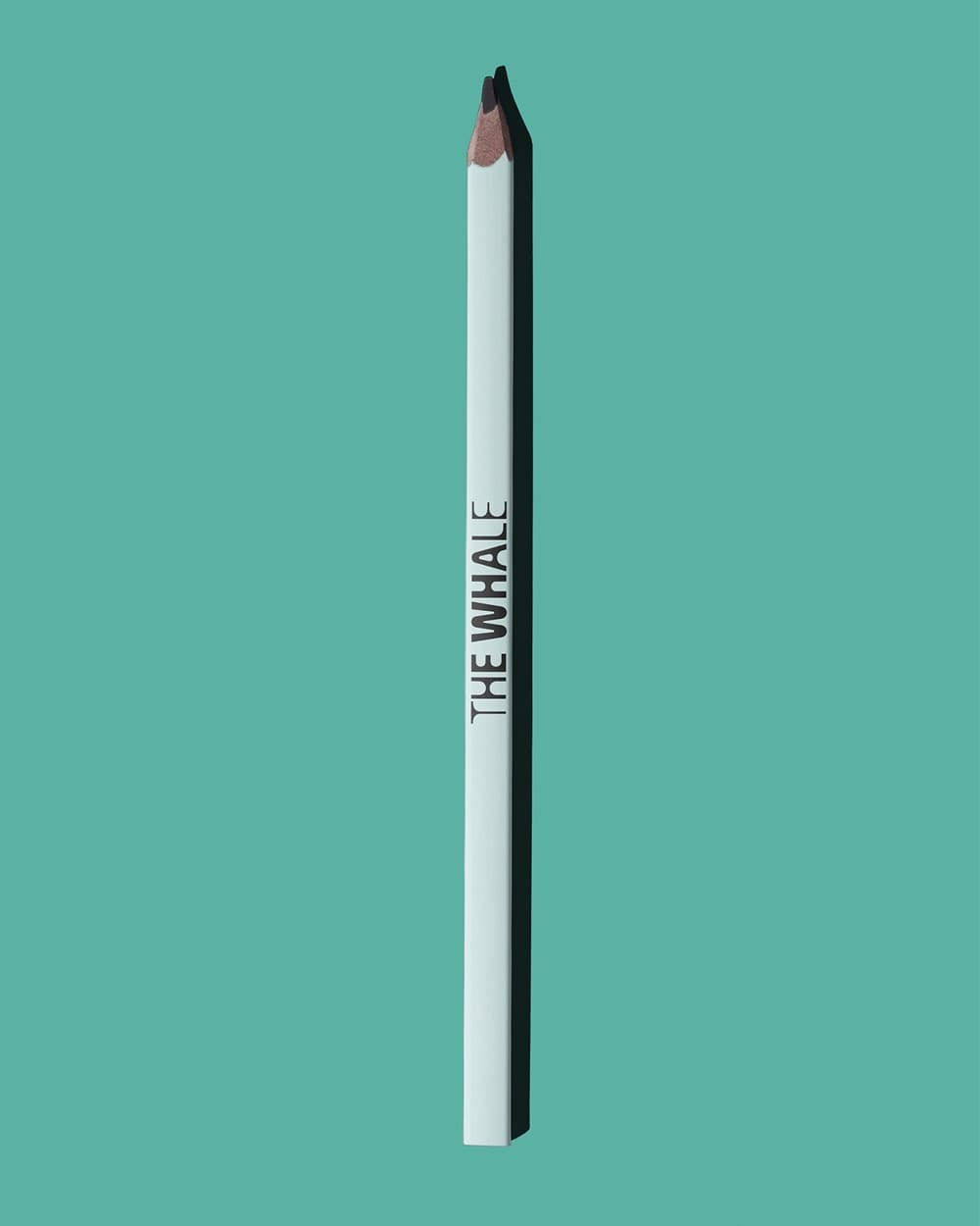
The palette was drawn from the distinctive natural light and landscape of Andenes. The green is based on the particular blue-green quality of the sea, but also connects to the vegetation and the shifting colours of the northern lights. It feels rooted in the place without becoming a conventional maritime blue. The pink comes from the sky when the low sun meets the horizon between land and sea. It introduces warmth and captures another kind of encounter: daylight meeting darkness, and sky meeting water. Together with black and white, these colours create a limited but flexible palette.
Share Your Work, or Your Take
Nordic Brief covers the projects shaping Nordic design, branding, and technology. Working on something you think we should know about? Disagree with how the industry talks about identity systems, design ops, or AI in brand work? We want to hear from practitioners and encourage Nordic agencies and designers to send in project submissions, op-eds, and sharp opinions.