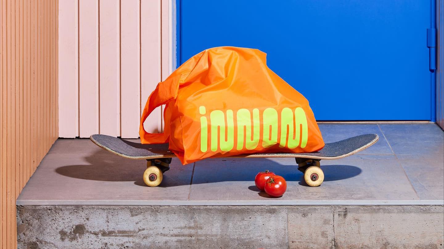
Down on the corner
Innom is a new corner store developed by Norwegian retailer REMA 1000. It’s all about convenience, providing ready to eat meals and healthy snacks for those living in an urban neighbourhood in Oslo. Norwegian design agency Try helped with the new brand identity, aiming to engage a younger audience.
“By mixing fresh colours, expressive typography, untraditional communication and a playful illustration style, we created a brand that not only stands out from the convenience category in Norway but also makes the shopping experience more fun”, adds Try.
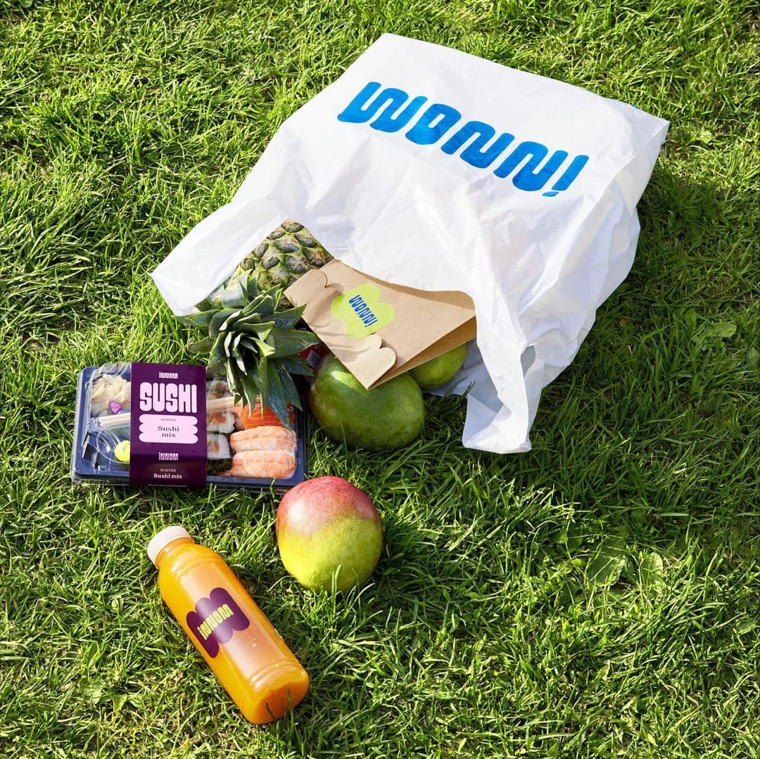

Where did you draw inspiration from?
Innom is a concept that comes from Rema 1000, one of Norway’s largest convenience chains. Our brief was to maintain a link to Rema 1000, but at the same time challenge the category with a younger and bolder approach. Some of the elements in the identity – like the blue color and the circular shapes is based on the visual language for Rema 1000, all other elements are made to build a unique and distinct brand for Innom.
What were some of the thoughts behind the logo?
The name «Innom», means to «stop by», so the logo needed to express a tasteful, efficient and fast-pace-store. We worked with a typography that could be familiar to the mother brand logo Rema 1000, but like a remixed version. We worked with Benoît Bodhuin at bb-bureau, to customise parts of the typeface, to make it even more suitable for Innom.