Why Mint Creatives moved NKI from purple to green
Mint Creatives found early in its work with NKI that the name carried weight while brand recognition was low. For the Norwegian online education provider, the agency developed a new strategy and visual identity, and Nordic Brief interviewed both Mint Creatives and the freelancers behind the visual identity, illustration and photography, respectively Jessie Jones, Cécile Gariepy and Julianne Leikanger. The result replaces a lowercase "nki" in dark purple with a heavy, uppercase black logo on a monochromatic green palette.

A known name with low recognition
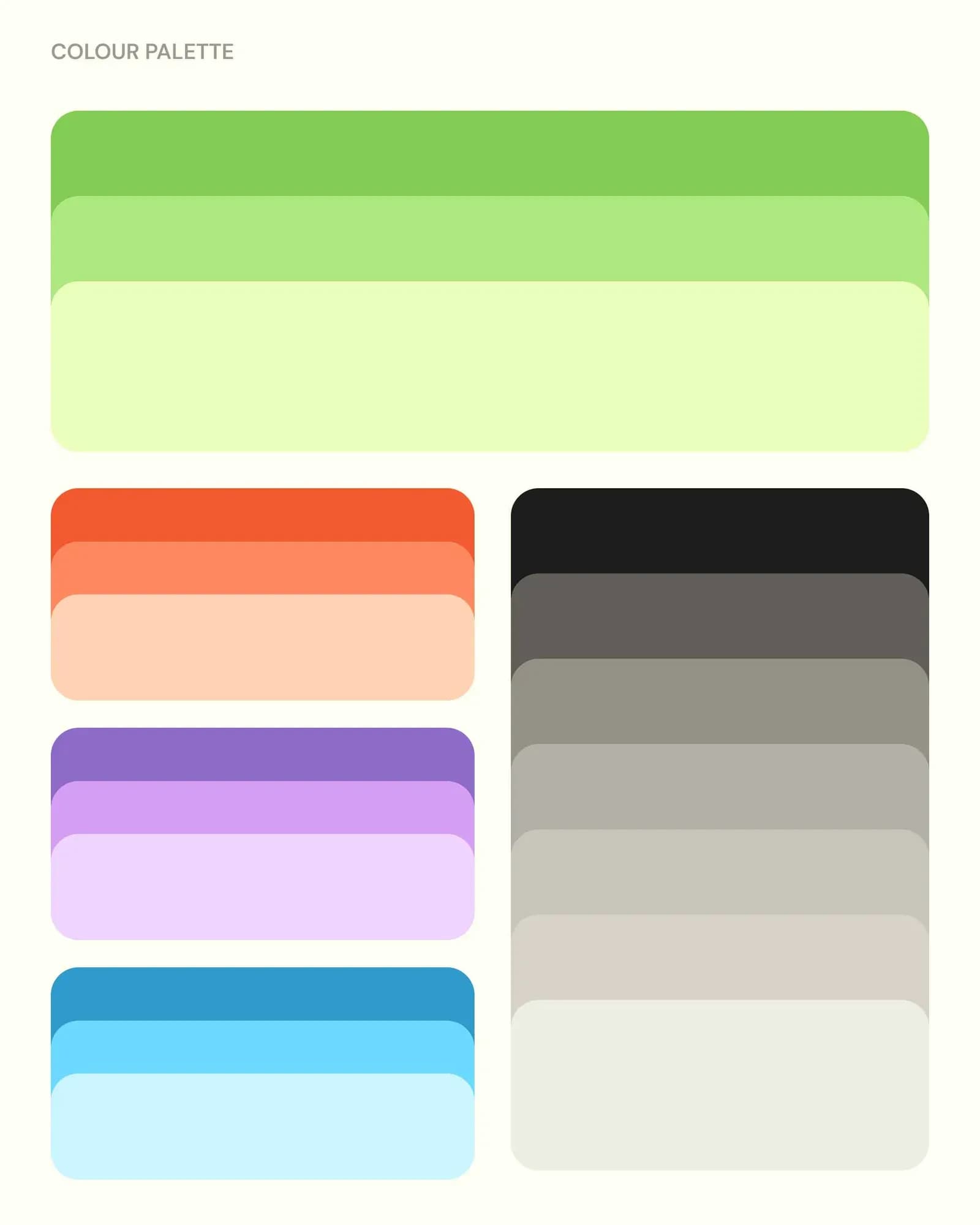
Mint Creatives began with research, workshops and exercises together with key people at NKI, to build a shared language before any design work. The strategy was built around the idea of "a simpler way to learn" and four keywords: simple, human, adaptable and inspiring. In the competitor research, Mint Creatives identified a palette in the market that no one had claimed, and the green that followed came out of that analysis rather than from a visual reference.
"The colour change from deep purple to light green is a bold step. However, when it came down to the competitor landscape research we were presented the opportunity organically. There wasn't any specific reference for this choice, it was rooted in strategy overall, with a touch of good fortune and willingness to take a chance." — Tone Humblen, Art Director, and Ida Fjeldbraaten, Copywriter, Mint Creatives
The brief that followed was for an identity that could carry the new strategy and make NKI more recognisable, and a logo simple enough to support sub-brands such as Privatist and Kurs.
The logo evolution since 2010

Custom uppercase lettering replaces the lowercase mark
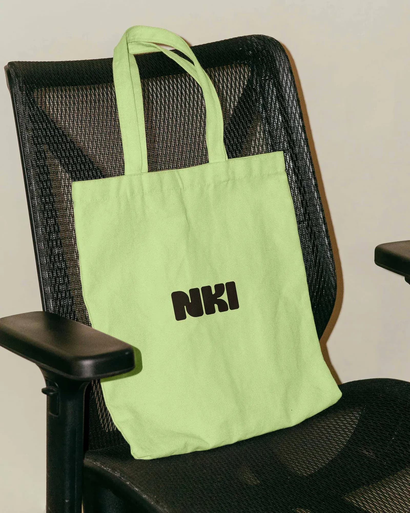
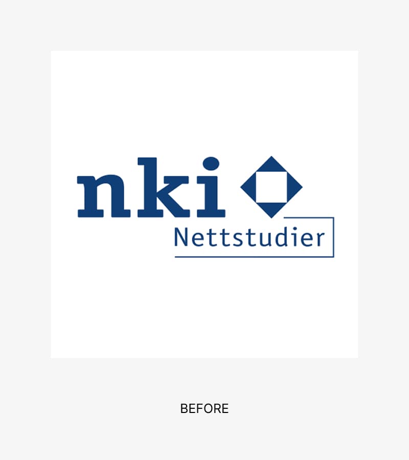
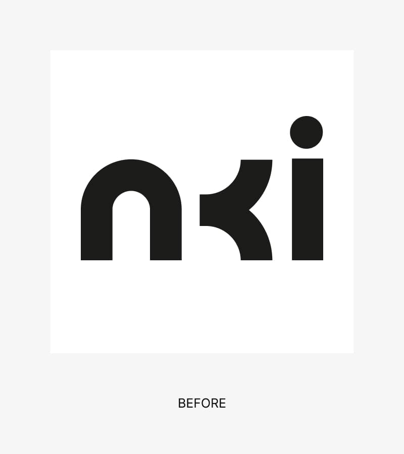
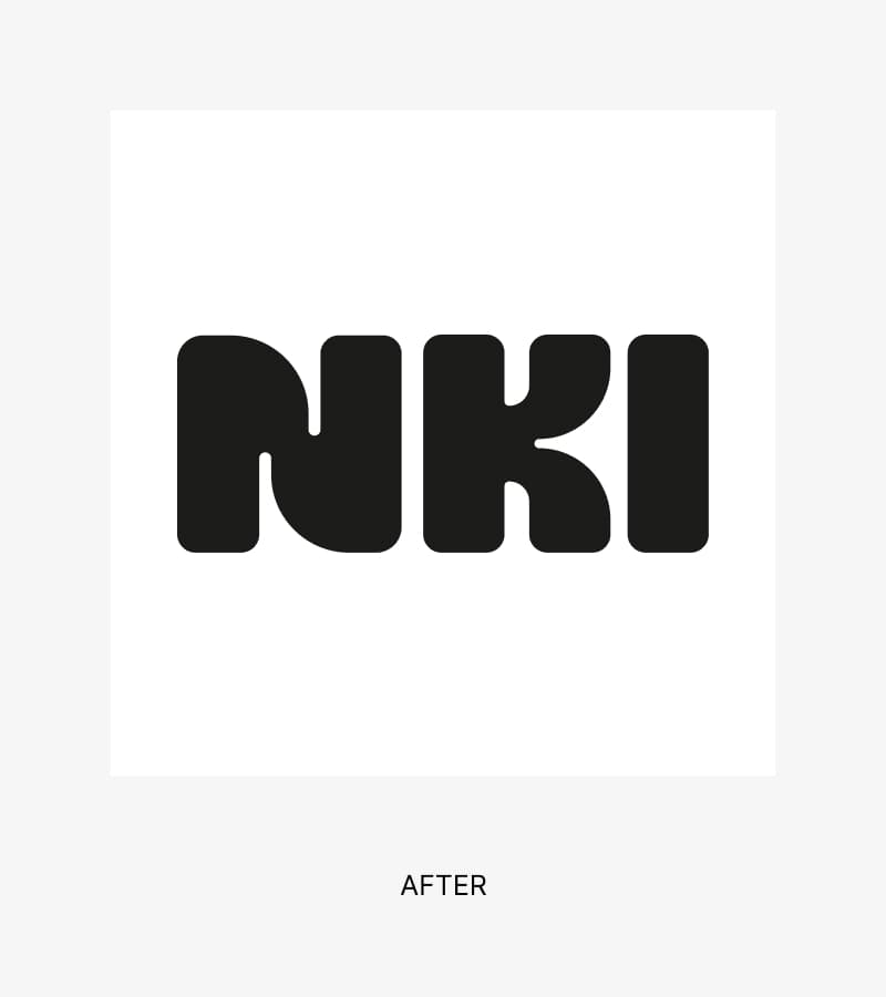
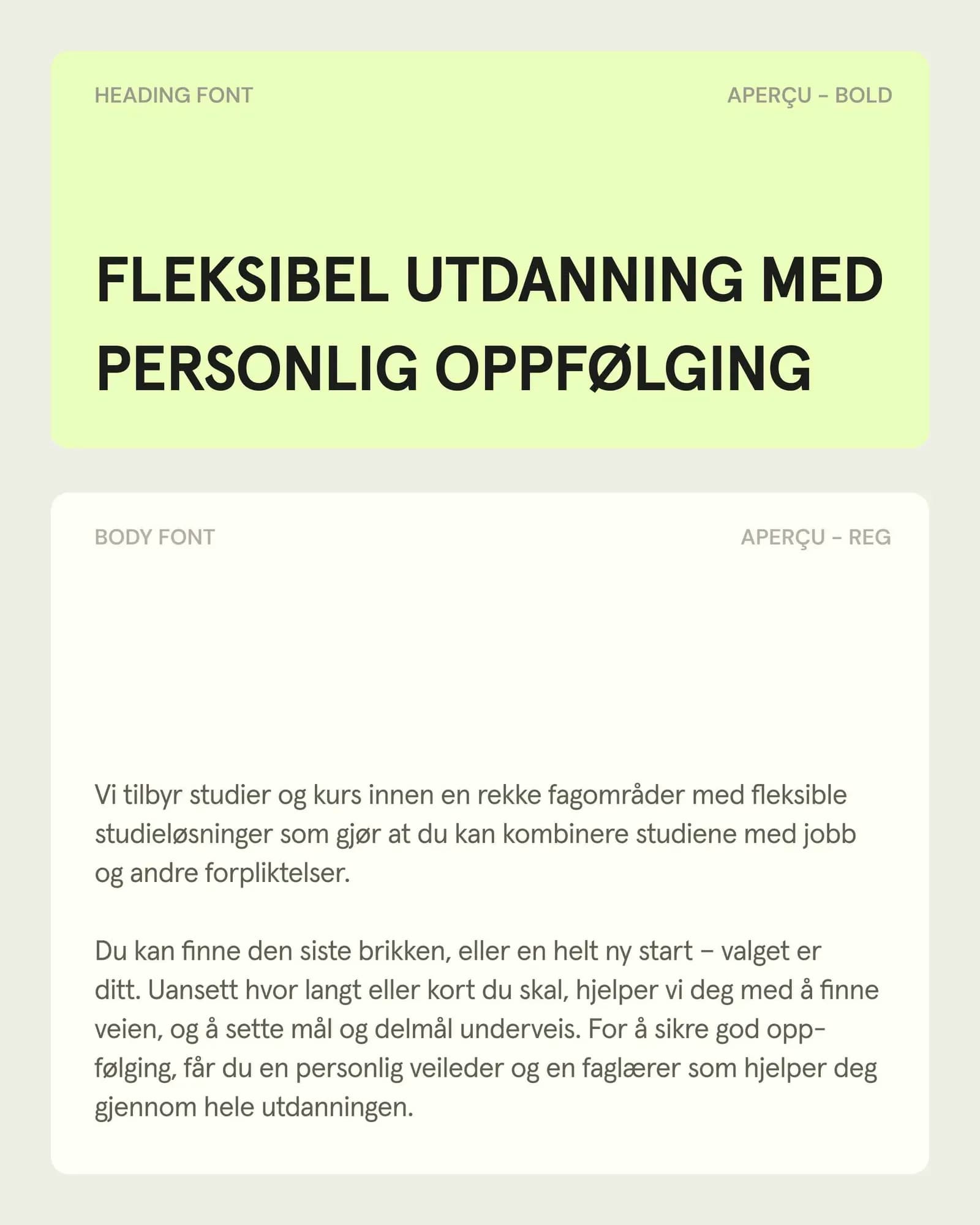
The old logo was a lowercase "nki" in one dark purple with a round dot on the i. It had two technical problems: the k had no stem, which affected readability, and the tagline "Nettstudier" was locked to the logo, which caused scaling issues. The new logo is custom lettering drawn from scratch: uppercase, heavy, set tight, with rounded corners and no dot. It is used mainly in black, set against the light greens and cream of the primary palette. Removing the descriptor from the logo reduced the number of elements and made room for a brand hierarchy with sub-brands such as Privatist and Kurs; "Nettstudier" is kept next to the name on social media profiles.
"The logo leans organic with its soft construction and rounded corners, however, the choice to have the lettering uppercase, bold, and black pulls the logo back towards a sturdy and trustworthy expression." — Tone Humblen, Art Director, and Ida Fjeldbraaten, Copywriter, Mint Creatives
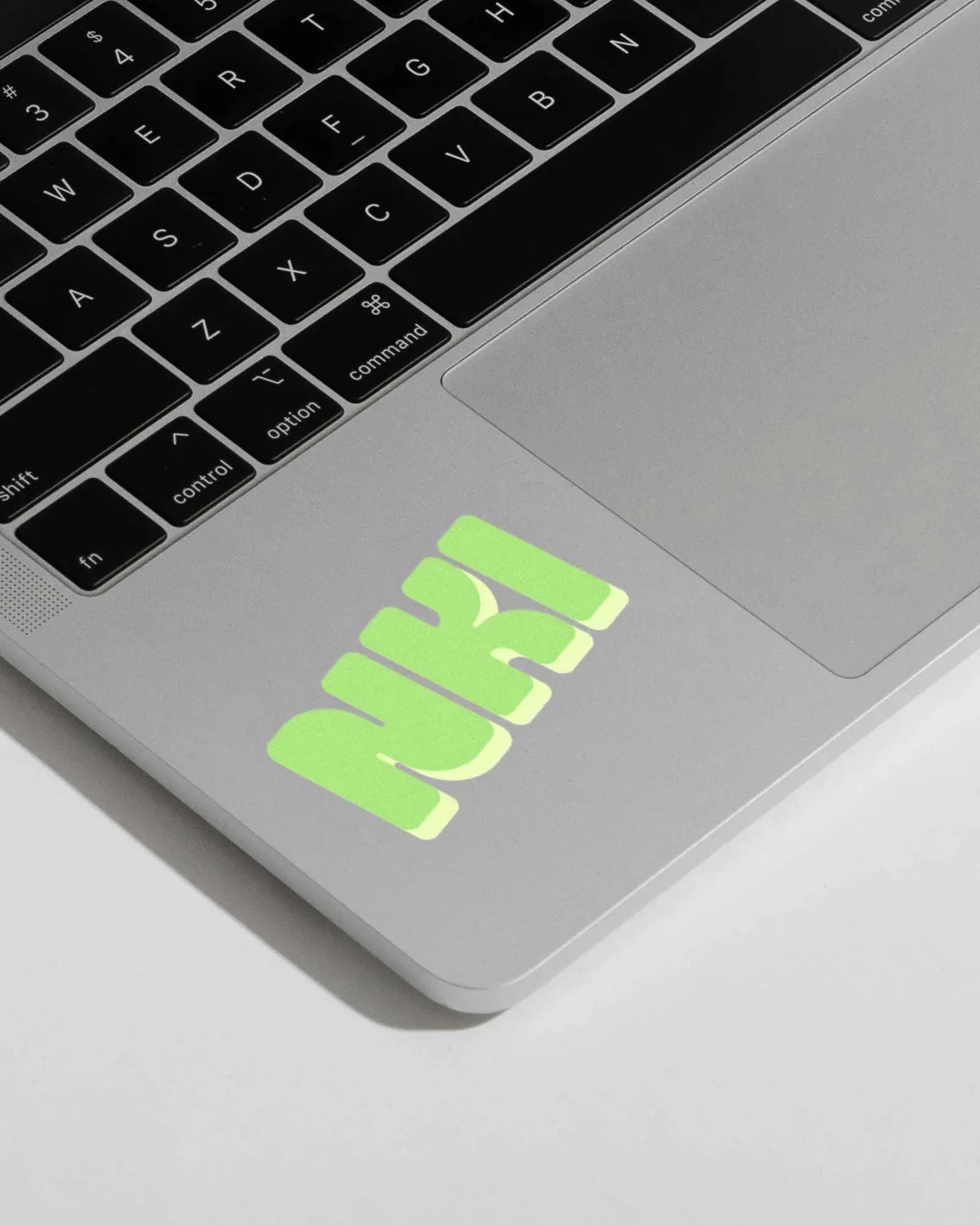
The logo's shapes also serve as a structural element: text boxes, image frames and illustration containers reference its form. A lighter offset layer is applied to these boxes and frames, and occasionally to the logo itself when it works as a graphic element in a composition. The coloured logo, with or without the offset layer, is used where a primary version of the logo is also present, for example as a social media profile icon.

Photography and illustration in the image system
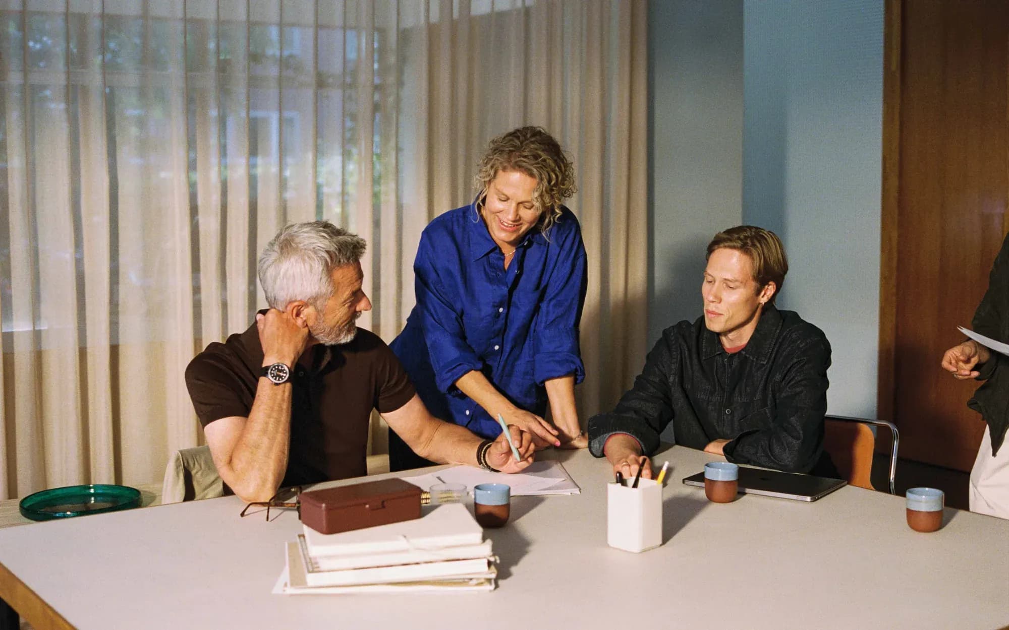
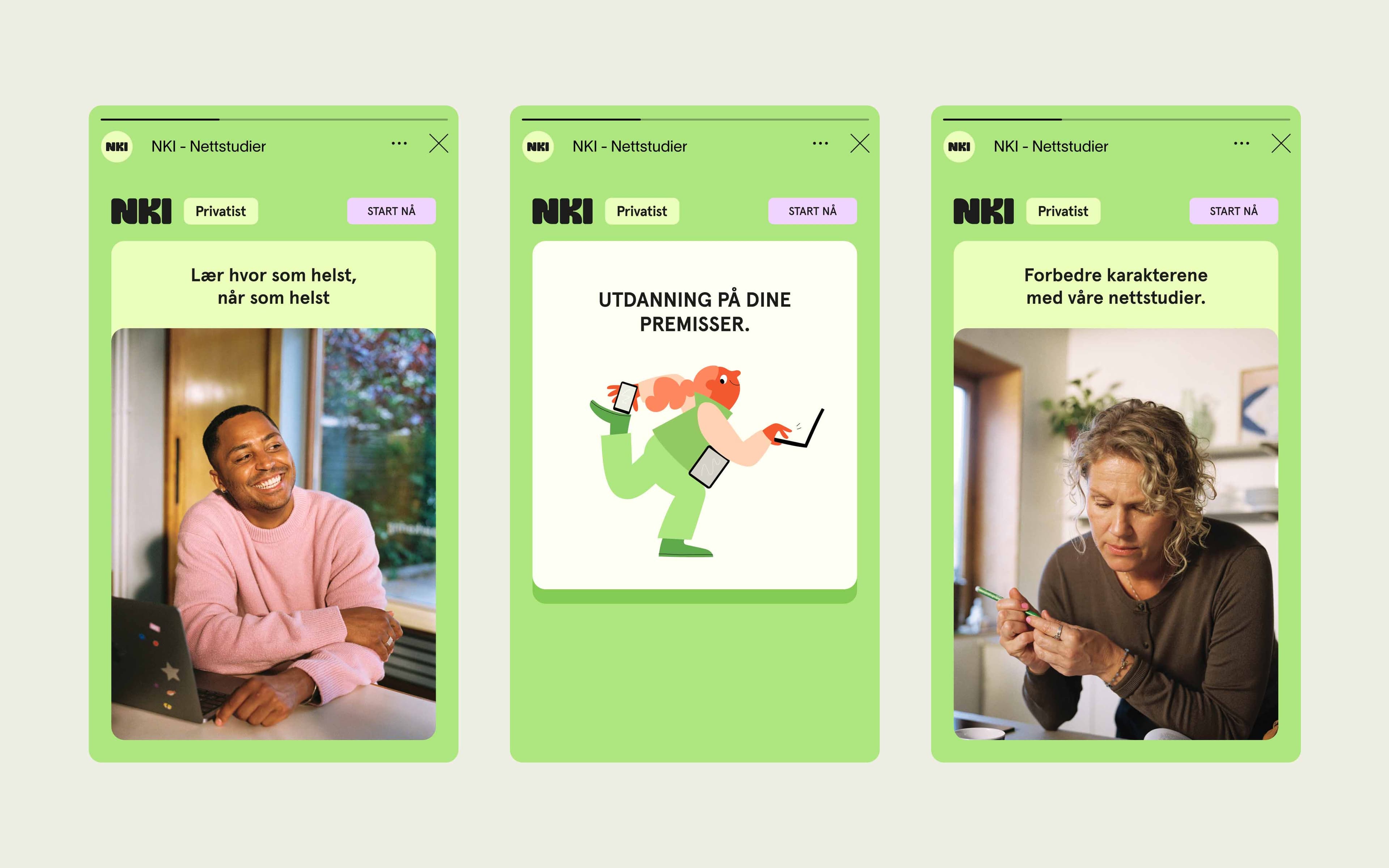
NKI's image language is made by two freelancers. Julianne Leikanger shot the photography analogue, and the texture of the medium is part of the look, together with a natural approach to styling. Cécile Gariepy drew bespoke illustrations for the identity. The illustrations are also animated, alongside logo animations and the bumpers and supers used in video on NKI's learning platform.
According to Mint Creatives, the photography is meant to convey the levity of taking an important step in life and to keep the human element of the brand in focus, while the illustrations are meant to show the adaptability of NKI's offering. The agency also points to the illustrations as a point of difference: competitors, it says, tend to rely on photography with a more institutional feel.
"Cécile's illustrations serve to show a playful optimism in the brand communication. Additionally, the illustrations let NKI communicate flexibility, change, and inspiration in a unique and abstract way. Julianne's photography help NKI show the levity associated with taking the next step by focusing on human emotion and optimism." — Tone Humblen, Art Director, and Ida Fjeldbraaten, Copywriter, Mint Creatives