The Firm turns energy into a rebrand for House 21 without the clichés
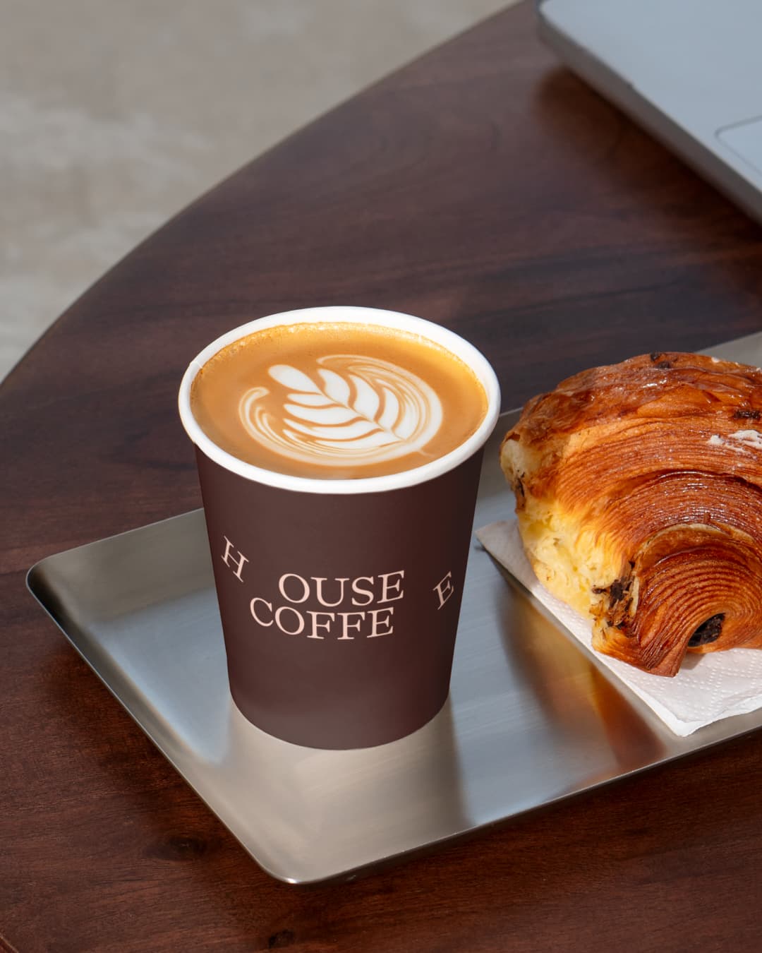
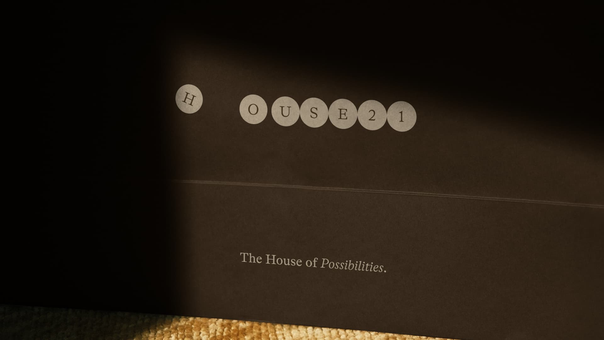
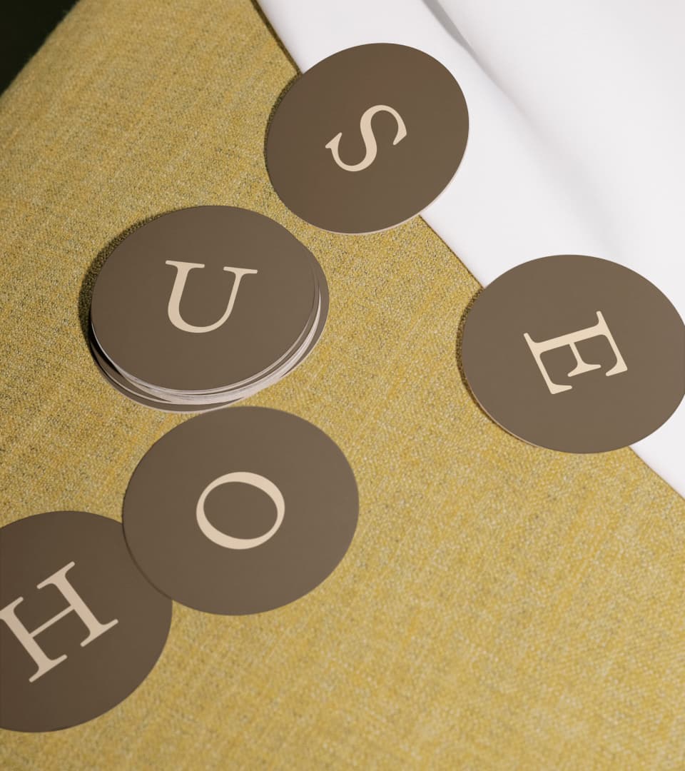
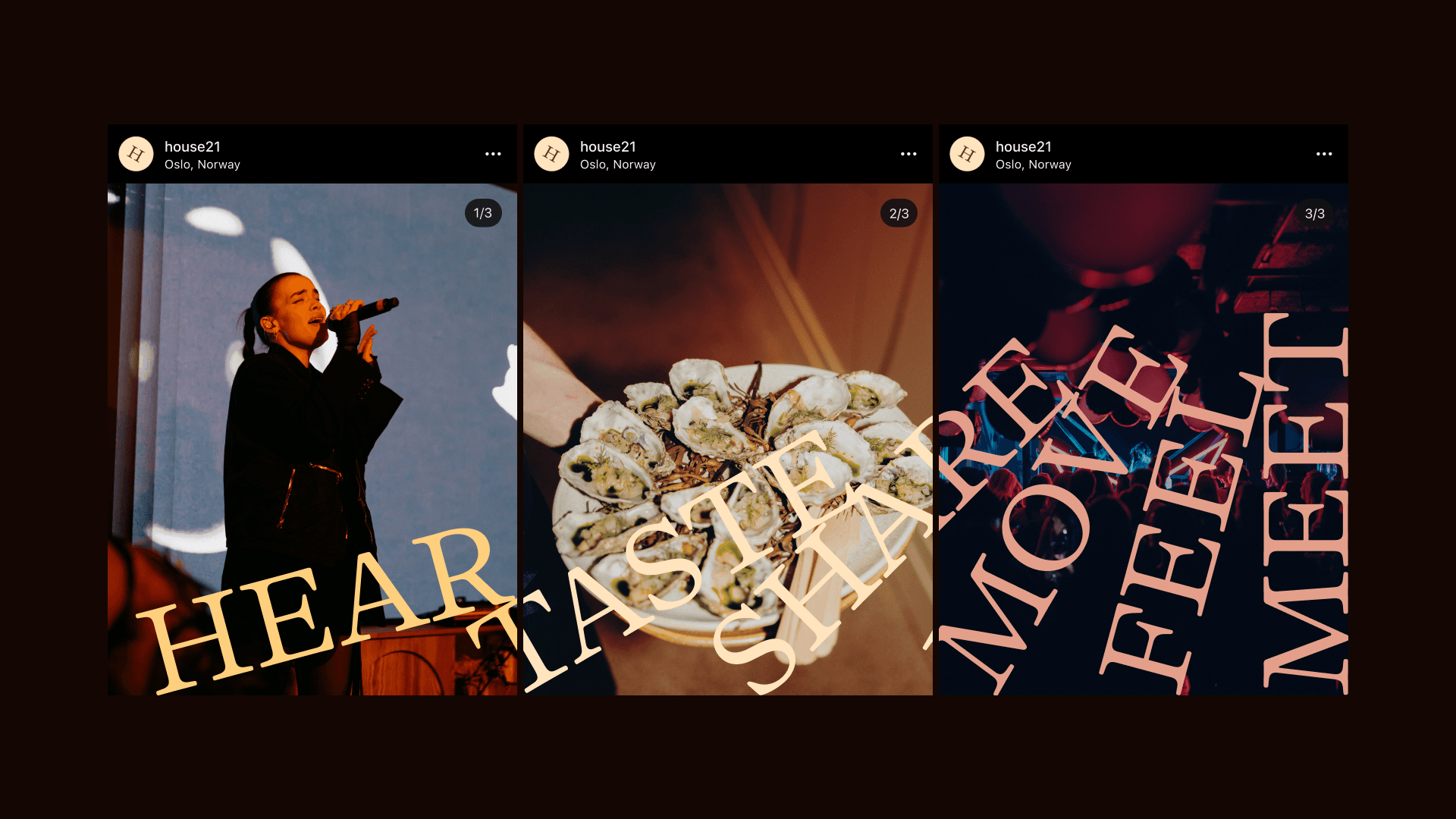
Members' clubs tend to communicate exclusivity by default. When The Conduit went bankrupt, its successor faced the opposite brief: build an identity that invites people in rather than signals who's kept out. The Firm, working with advertising agency Søndre, designed the full visual identity for House 21, the club that took over The Conduit's building and membership base. The result is a system built on the mechanics of a Newton's cradle, where every visual element follows a literal physics of energy transfer.
We spoke with Nicklas Haslestad, Managing Director, Designer & Senior Partner at The Firm, about the two decisions that shaped the identity: how "non-elitist" became a design brief, and why a Newton's cradle beat every other metaphor for energy on the table.
Designing against elitism
The brief didn't start out non-elitist. It got there through conversations with former members of The Conduit, about what the old club got wrong, and what a new one needed to do differently.
Was "non-elitist" part of the brief from the start, or did it emerge as you went along?
That became clear through the conversations we had with former key members of The Conduit. We listened to what they valued, what they felt was missing, and what they wanted more of. The answer was quite clear: less elitism, more action. More collaboration. Less telling people what the club stands for, and more creating opportunities for members to actually do great work. That became an important part of the brief as the work developed.
What does "non-elitist" and "inviting dialogue" mean in concrete design terms? Were there elements you deliberately avoided?
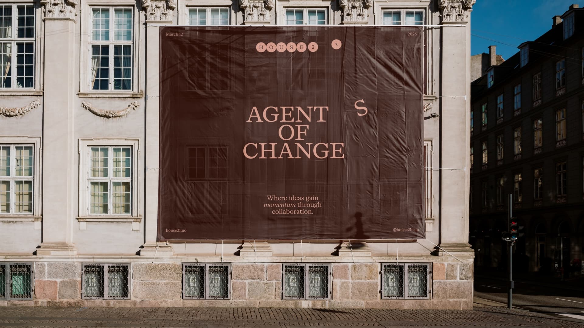
"The concept gave us a system that could work equally well across digital and physical applications. That was important because we wanted the identity to invite conversation rather than simply present a polished facade. When we presented early applications to the board, the work itself immediately became a talking point. That was a good sign. We also deliberately avoided the usual visual clichés around impact and action. No drops in water, ripples, lightbulbs or other familiar metaphors for 'making change happen.' There is a lot of that visual language around, and we wanted House 21 to have its own vocabulary
What was the biggest challenge in getting there, and what surprised you most?
Probably the number of directions we explored before arriving at the right one. There was a lot of iteration, and that was a good thing. We also had to go through that process together with the client. They were understandably familiar with the more elitist visual language associated with traditional members' clubs, so moving towards something fresher and less expected took some adjustment. The interesting part was seeing that shift happen. Once the new direction started to make sense, the conversation changed from 'is this right for us?' to 'what else can we do with this?'
Newton's cradle as a design system
Before landing on Newton's cradle, The Firm tested other ways to visualise energy, including a Rube Goldberg machine. The reason it lost out says as much about the concept as the one that won.
The concept is built on "energy" and kinetics. What led you to Newton's cradle specifically, and what were the alternatives?
The visual world of energy is huge, so we explored quite a few directions early on. One of them was based on a Rube Goldberg machine. It was visually interesting, but the metaphor wasn't quite right. A Rube Goldberg machine is ultimately about creating an unnecessarily complicated way of getting from A to B. That isn't what House 21 was about. The Newton's cradle was a much better fit. It is about energy being transferred from one person, or one element, to another. Visually beautiful and satisfying as well. And importantly, it was simple enough to become a strong, ownable system.
You describe a balance between "the constant and the relative" in the system. Can you give a concrete example?
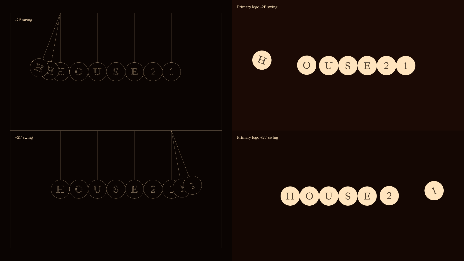
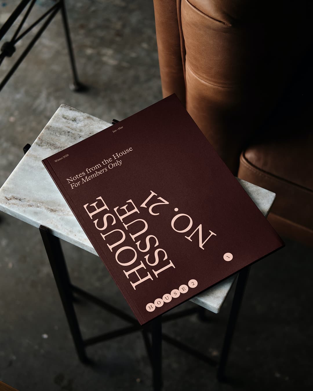
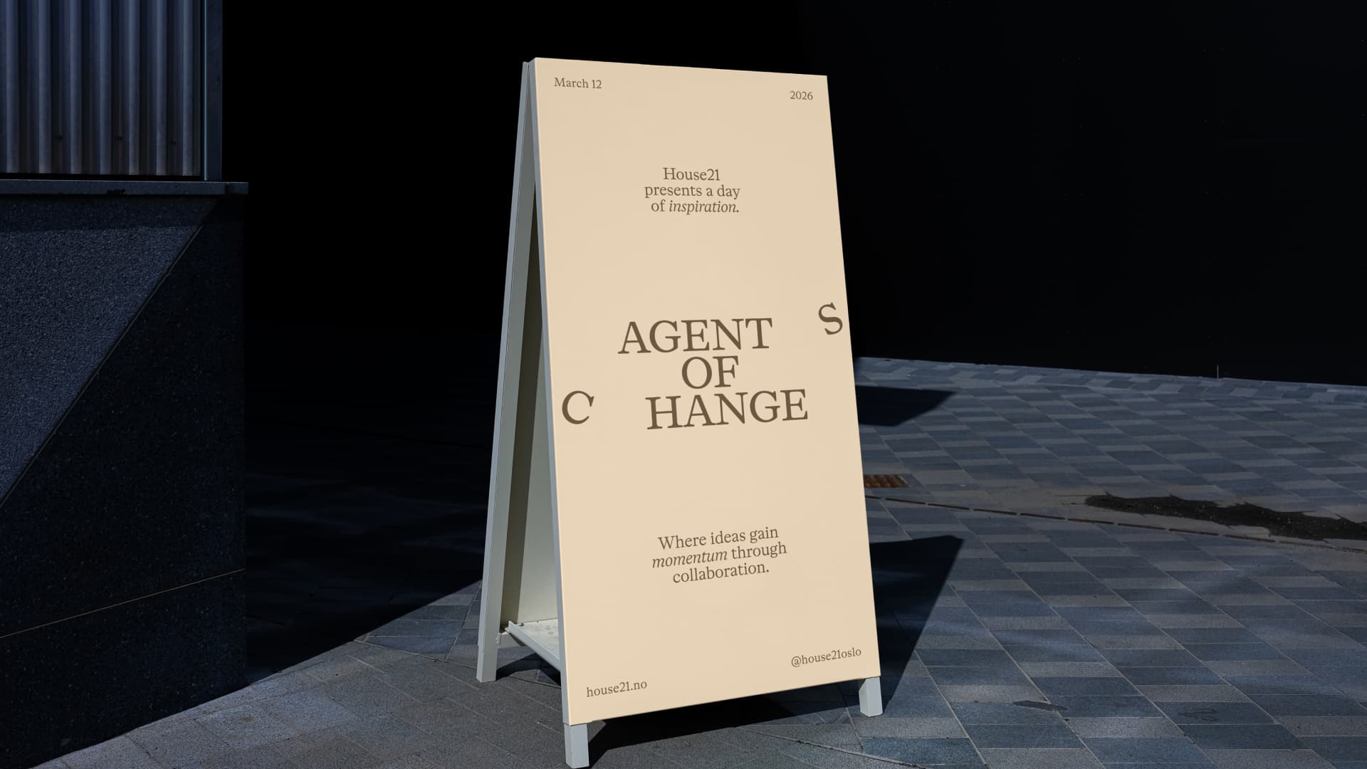
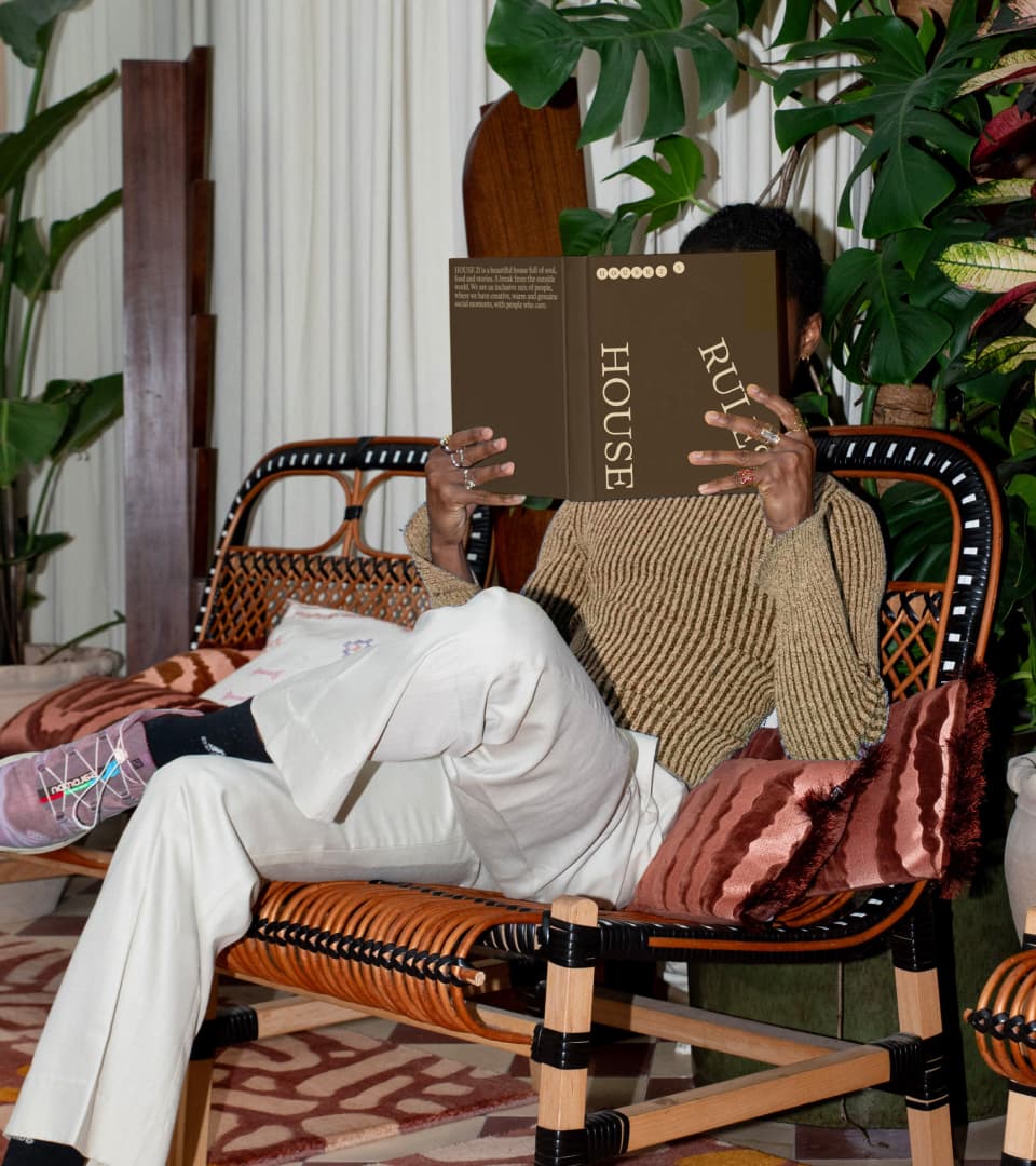
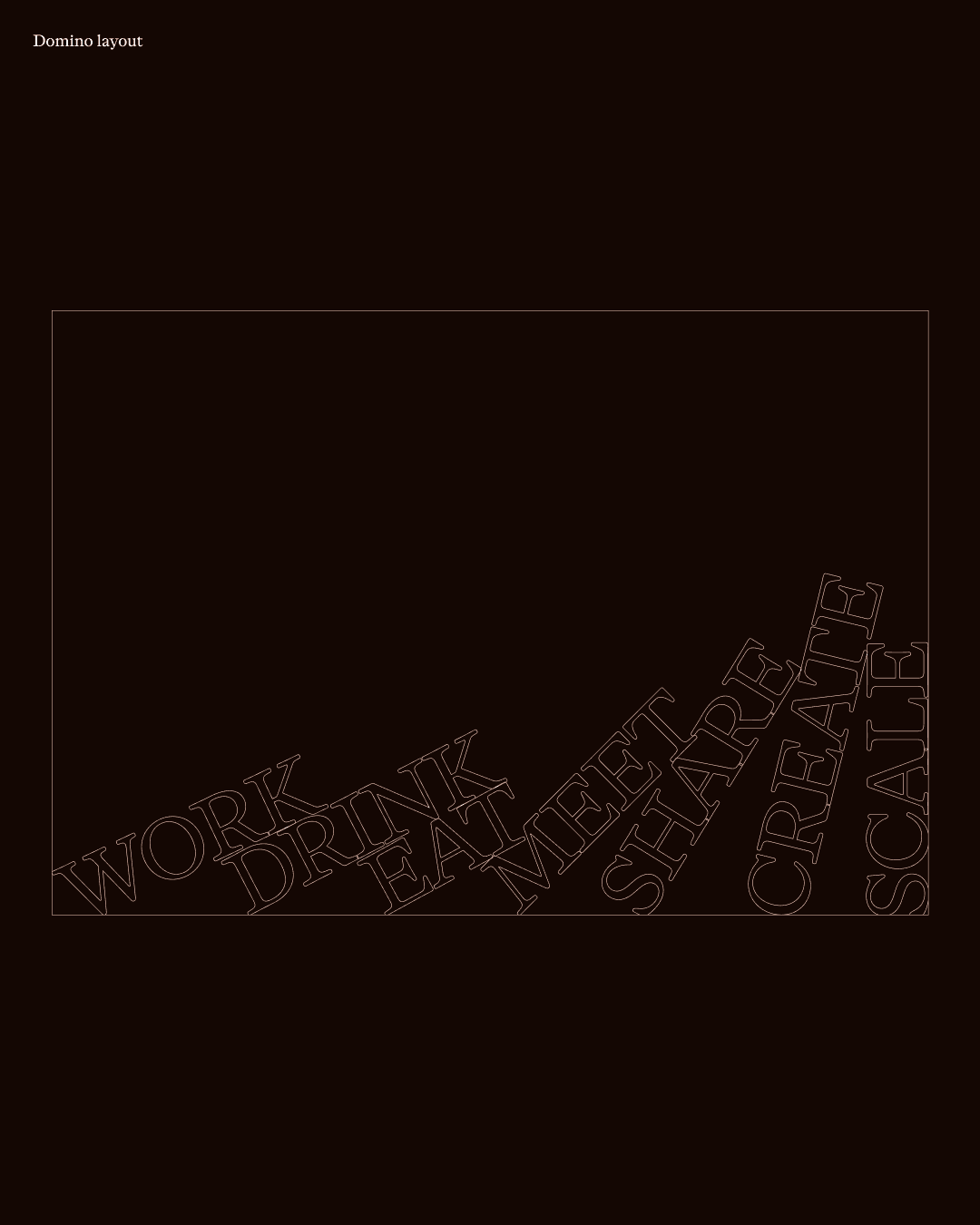
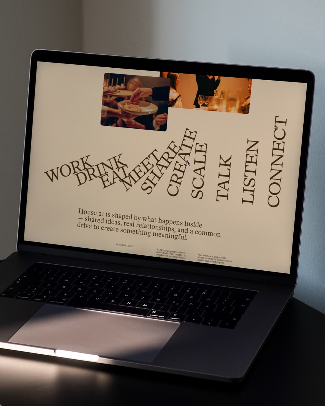
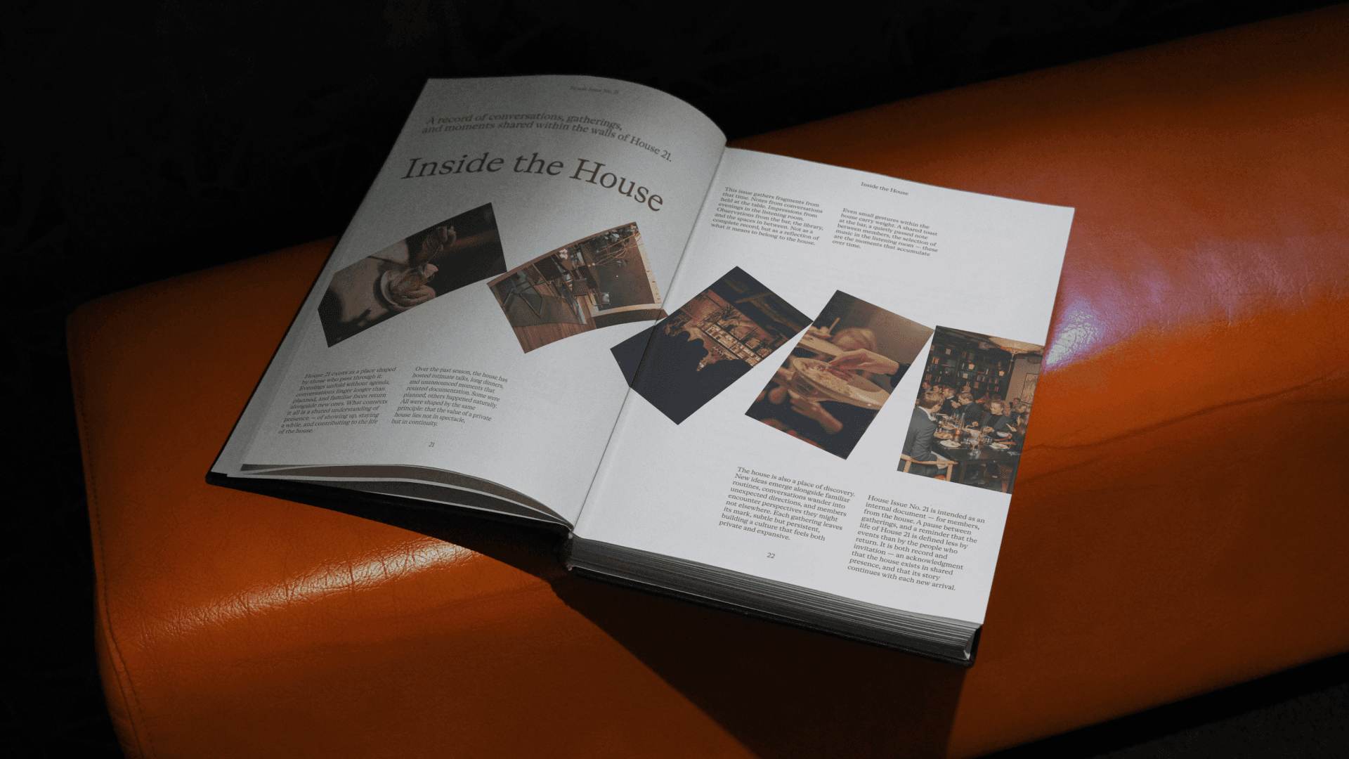
The system is actually quite strict. But within those parameters, there is a lot of room to play. The logo follows the exact mechanics of a real Newton's cradle. If the 21 element moves 21 degrees, for example, the corresponding domino typography treatment should also move exactly 21 degrees. There is a logic behind every movement. So if you look at something like House Issue No. 21, there are clear constants that hold the identity together, but there are also elements that can respond to the content and context around them. That becomes particularly interesting in digital applications, where the system can move, react and adapt while still remaining recognisably House 21.
What was the brief for the logo animation? What did it need to communicate that the static logo couldn't?
It was an application we couldn't not do. The idea is fundamentally about movement and energy, so having a motion-forward logo felt completely natural. At the same time, we were pleased that the logo worked so well as a static mark, it didn't need movement to be recognisable. We wanted the animation to follow the same physics as a real Newton's cradle, rather than simply mimicking the look of one. And we still haven't met anyone who didn't immediately see the reference.