Kontrapunkt evolves Danske Bank's identity it originally designed 25 years ago
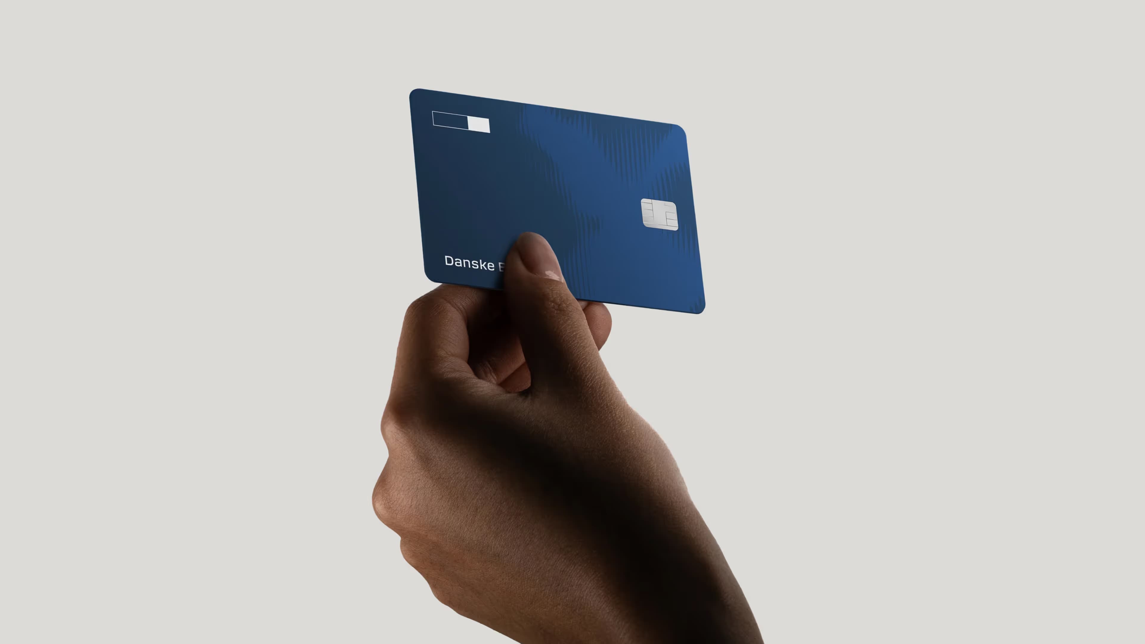
Kontrapunkt has refreshed Danske Bank's visual identity — the same one the agency created in 1999. Rather than starting over, the redesign is an evolution. The core move is structural: separating the bank's name from its logo boxes, introducing a new progress bar symbol, to create a system built for screens.
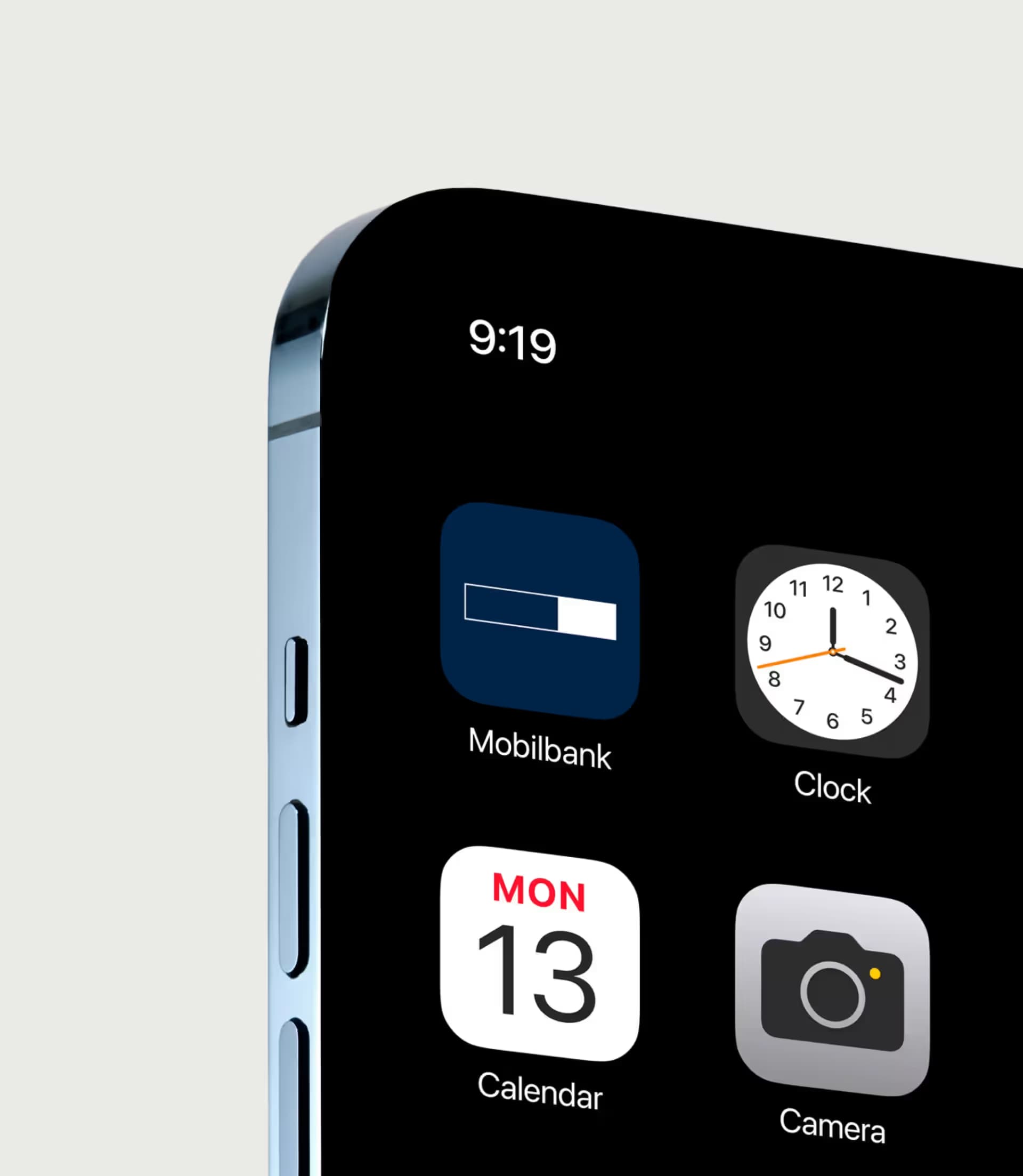
“We have been extremely pleased with our visual identity. It is iconic. That is why we must redesign it with great respect for what has worked so well for many years. It is of great commercial value that we are so widely recognised.”
Jakob Bøss, Head of Group Sustainability, Stakeholder Management, Marketing and Communication at Danske Bank.
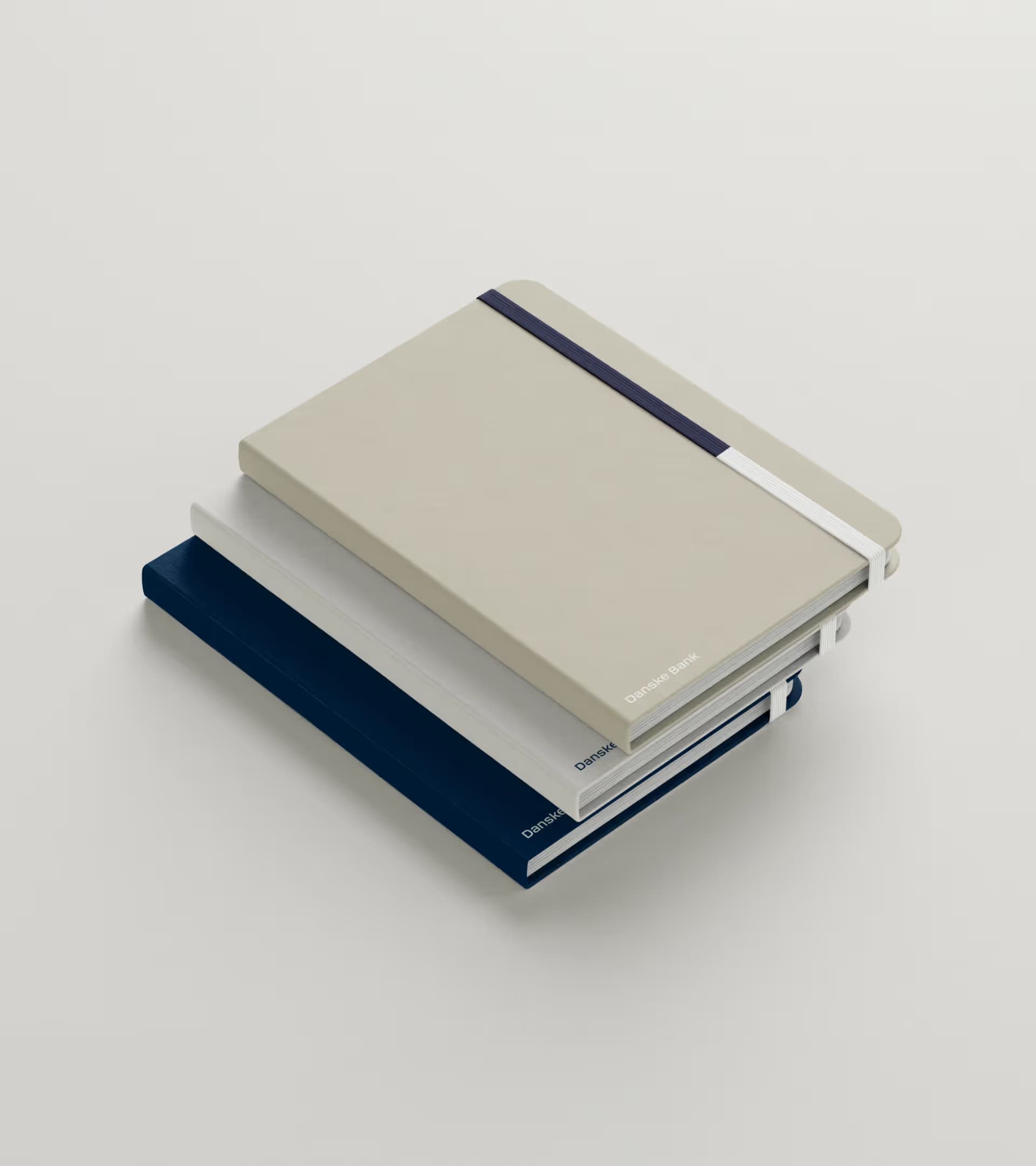
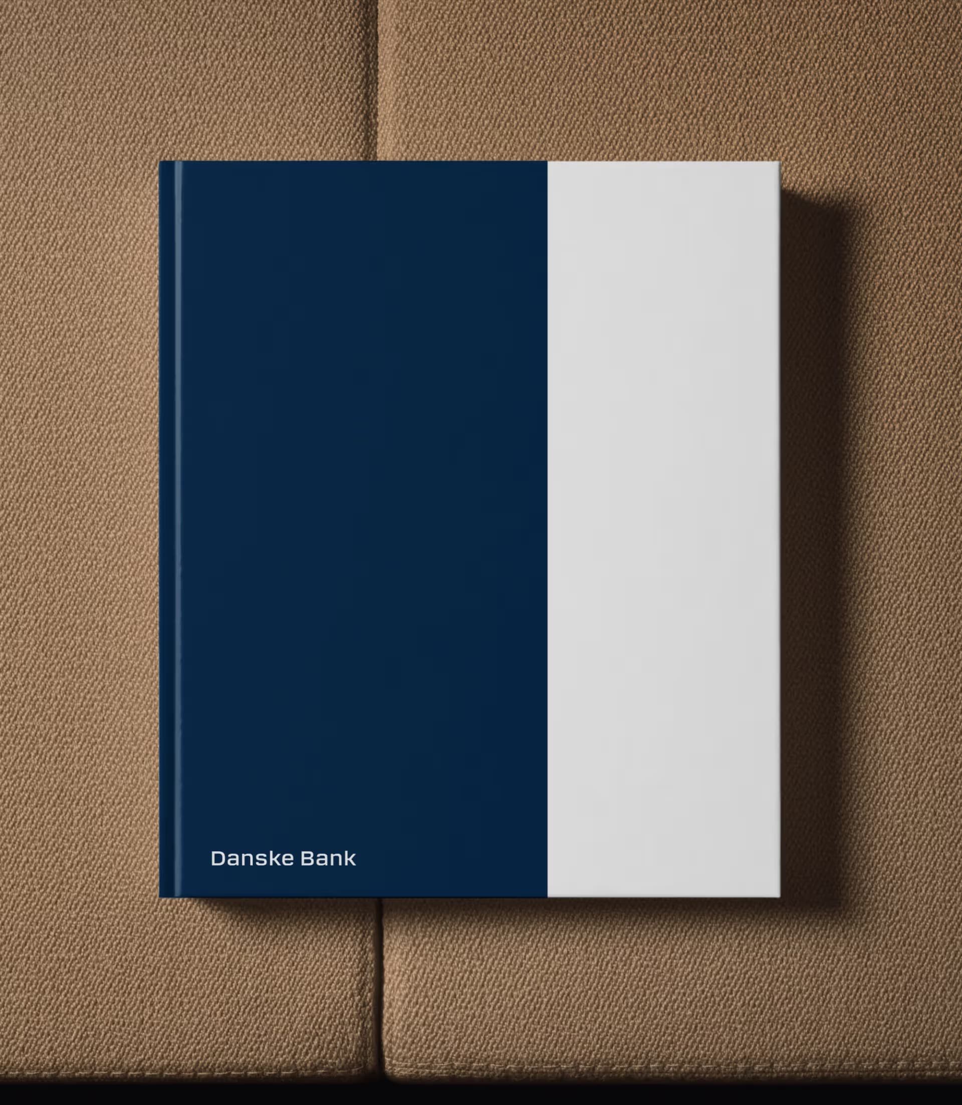
Separating the logo to build a digital design system
Kontrapunkt has decoupled the Danske Bank name from the rectangular boxes in the original logo, so the elements now appear separately across digital touchpoints. The typeface is the same family, sharpened for screen legibility. The blue remains the primary colour, now accompanied by a broader palette based on Nordic seasonal tones. A new symbol — the progress bar — is extracted from the logo's geometry and used as a graphic element in campaigns and communications. The identity also includes a motion design system and updated photography direction.
“It is a historic assignment. To be entrusted with redesigning something you originally created is unique. We approached the task with respect for what is our own work — and with the awareness that it is deeply embedded in Danish consciousness.”
Philip Linnemann, Founding Partner, Kontrapunkt