Inside Werklig's "progressive luxury" fix for CBD skincare brand
CBD skincare has a branding problem: the leaf motif, the homemade-batch look, the coffee-shop association that keeps it off the shelf and under the counter. Helsinki agency Werklig took on Finnish CBD brand Blank& as strategic and creative partner, developing naming, identity, art direction and packaging from the ground up.
A category weighed down by its own image
CBD cosmetics arrived pre-loaded with associations Blank& needed to shed. Most competitors leaned into the leaf as a badge of authenticity and defaulted to an overtly organic, recycled-look aesthetic. Werklig's brief was to move the product out from behind closed doors and onto the bathroom shelf as something worth displaying.
"The business challenge was to get CBD cosmetics out of the seedy image of cannabis smoking. The category was weighed down by low-quality, homemade associations," says Liisa Puolakka, Head of Strategy & Foresight at Werklig. "The job was to move CBD into a world of high and safe quality, and to build an elegant personal brand that a customer would be happy to leave out on the shelf at home."
The naming process worked through several thematic directions in parallel, like a "comfortable in your own skin" register, a "conscious essentials" register, and a more lavish, extravagant one. The team filtered all options against three brand values: game-changing, alluring, upright, and the ones that survived worked on more than one register at once.
Puolakka explains, "Blank& was witty (game-changing in category). Blank gives you simplicity, modernity, empty space as a virtue, and the ampersand adds visual interest while cleverly standing in for the French et, so the name reads as "blanket". That came out of the "comfortable in your own skin" theme. A blanket covers your skin softly and lovingly. It's a comforting, warming word in a distinctive shape."
What was the biggest creative challenge in making CBD feel display-worthy rather than something kept under the counter?
It wasn't really a challenge. The category is still new and emerging, and because almost everyone defaults to the leaf, differentiation came easily. If there was a difficulty, it was calibration: finding the point where the two worlds meet without tipping too far into either. Too much luxury codes and you lose the naturalness and humanness; too much naturalness and you're back in the health-shop sector.
Which trends or reference points shaped your approach?
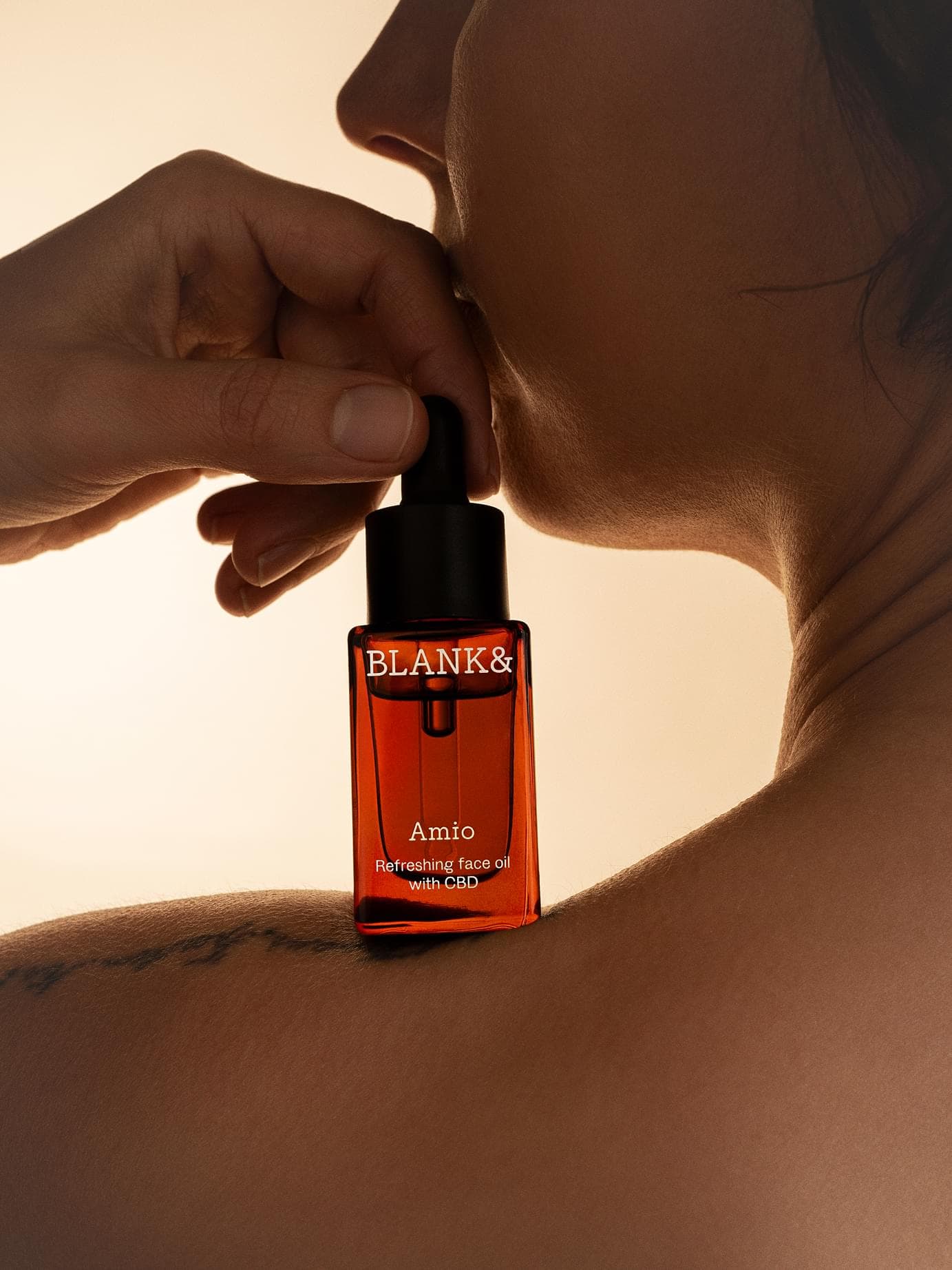
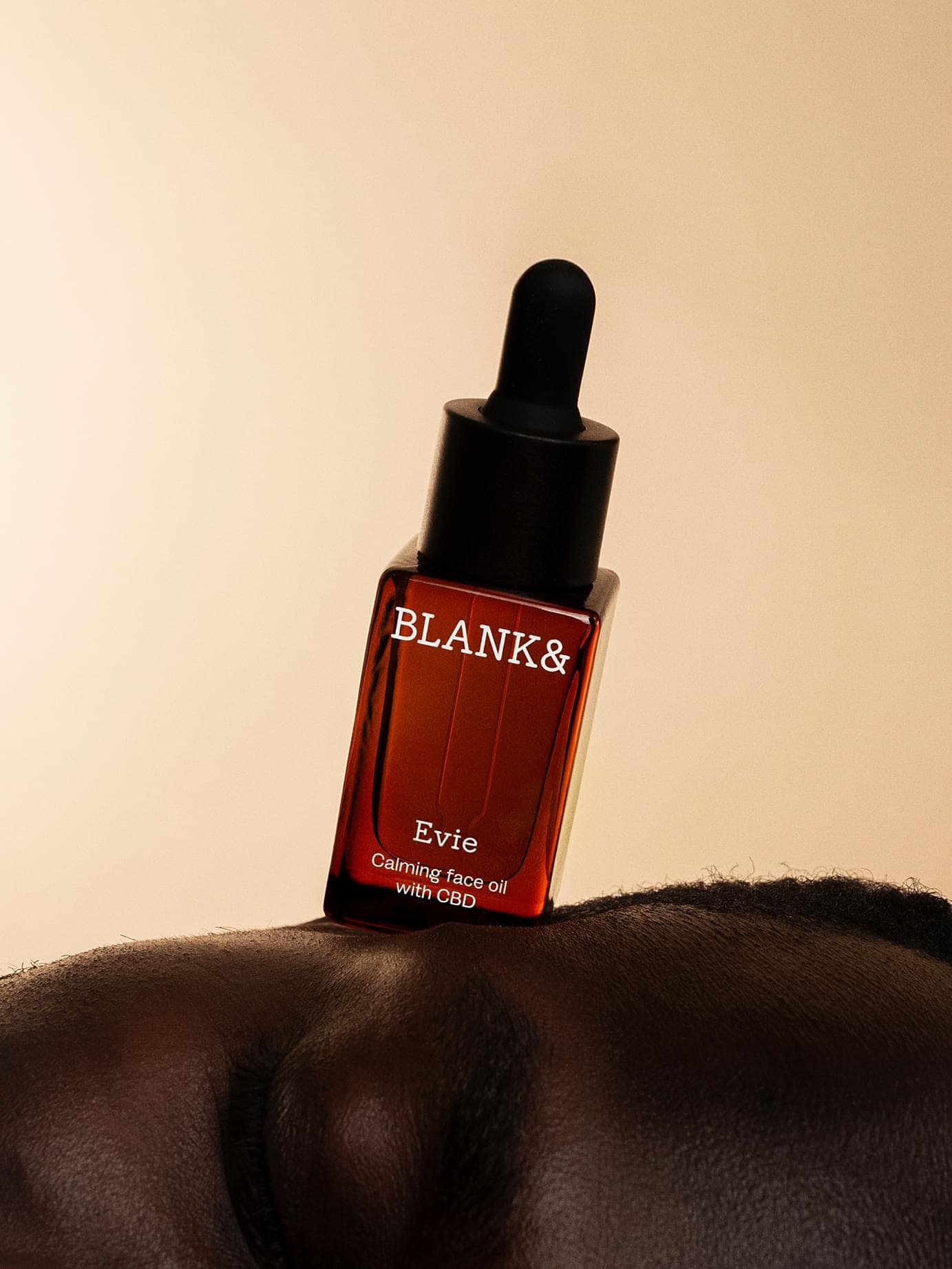
We looked at natural cosmetics and apothecary brands as the obvious benchmarks, then deliberately looked outside beauty. Nordic fashion was a big one — simple silhouettes, strong colour, use of texture for impact and confidence without noise. Architecture too. And fashion photography's way of building a story through presence and considered pose. For product shots we studied for example jewellery photography, where the object is treated as something worth looking at.
Designing toward "progressive luxury"
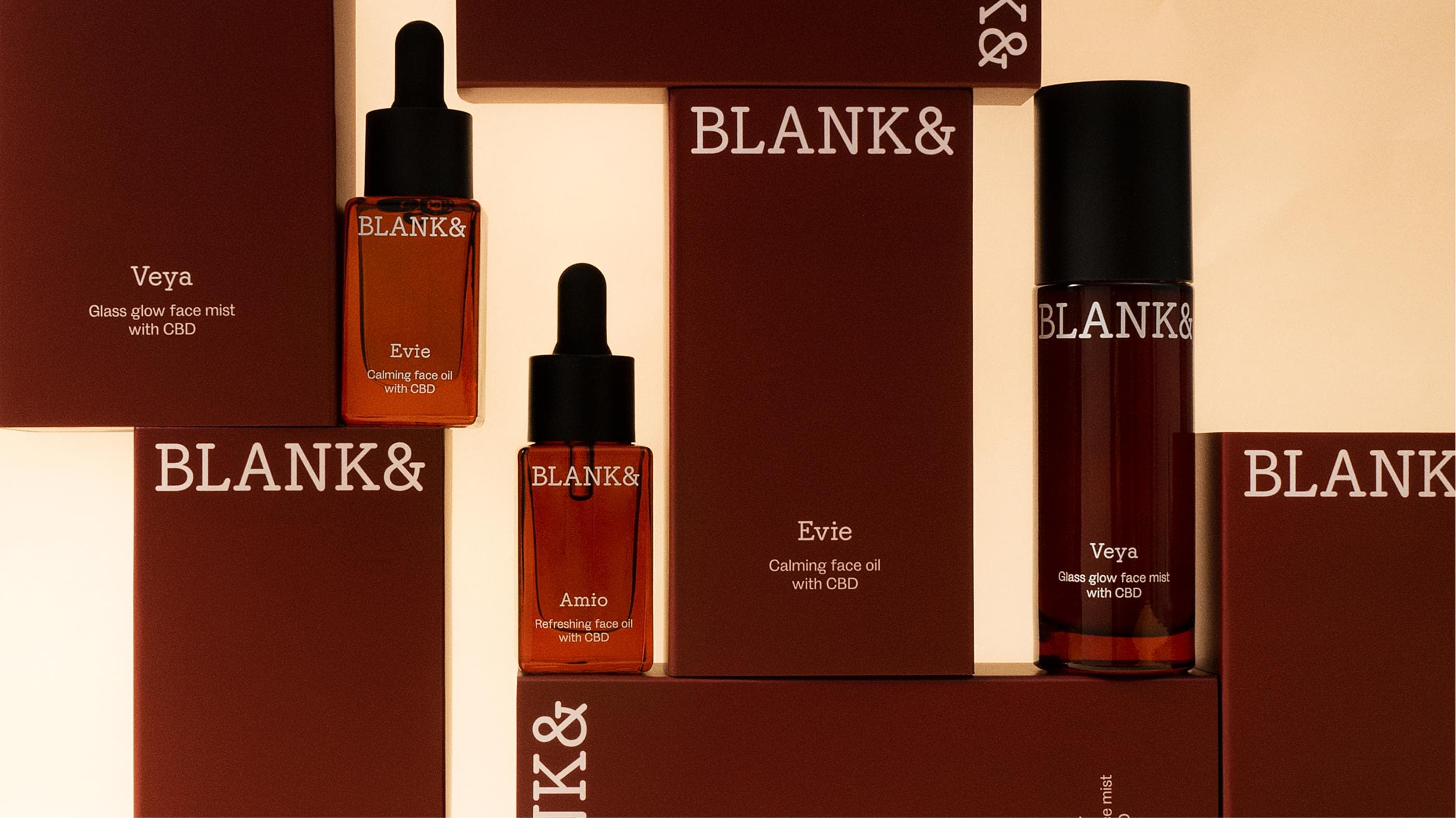
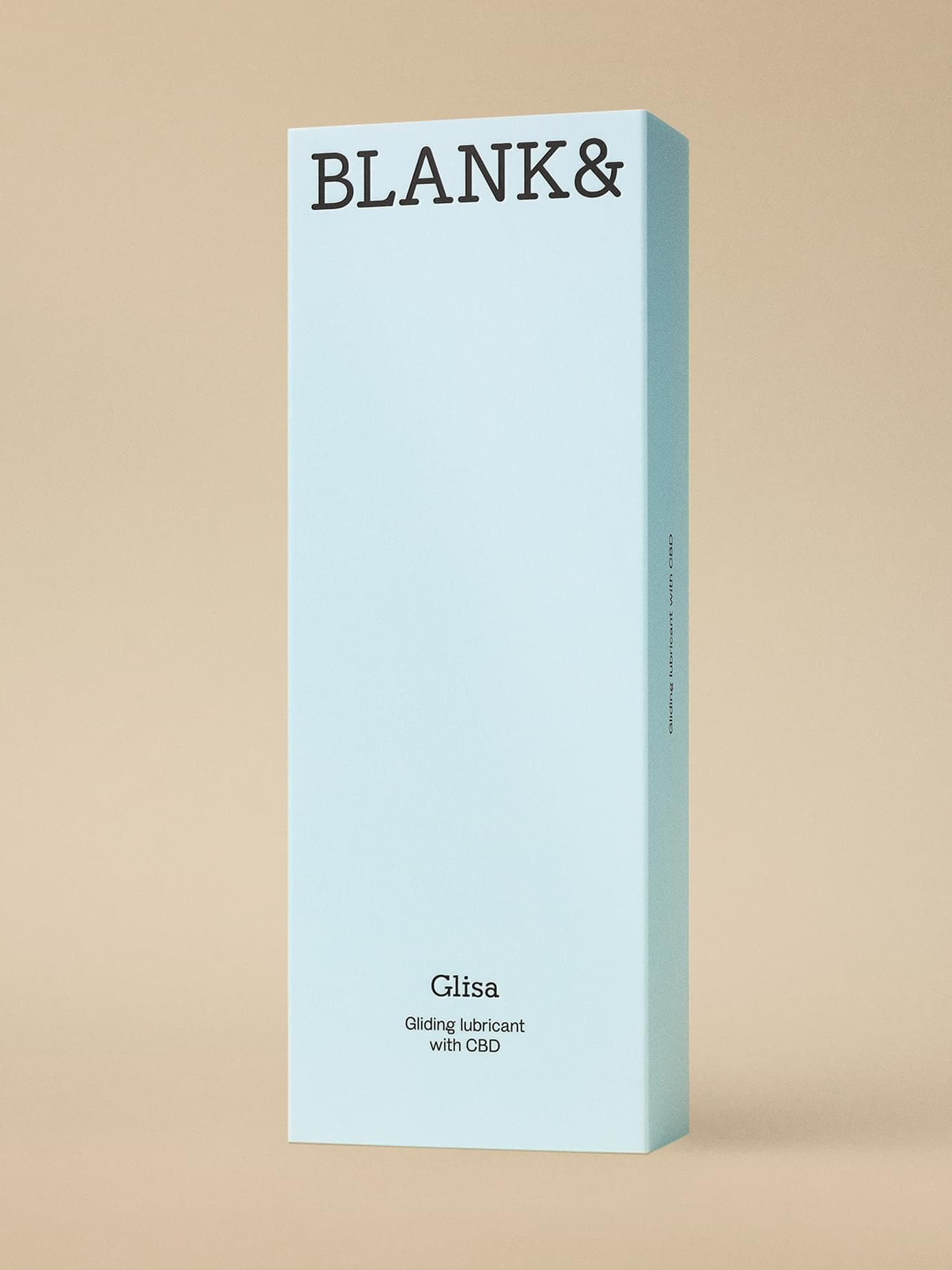
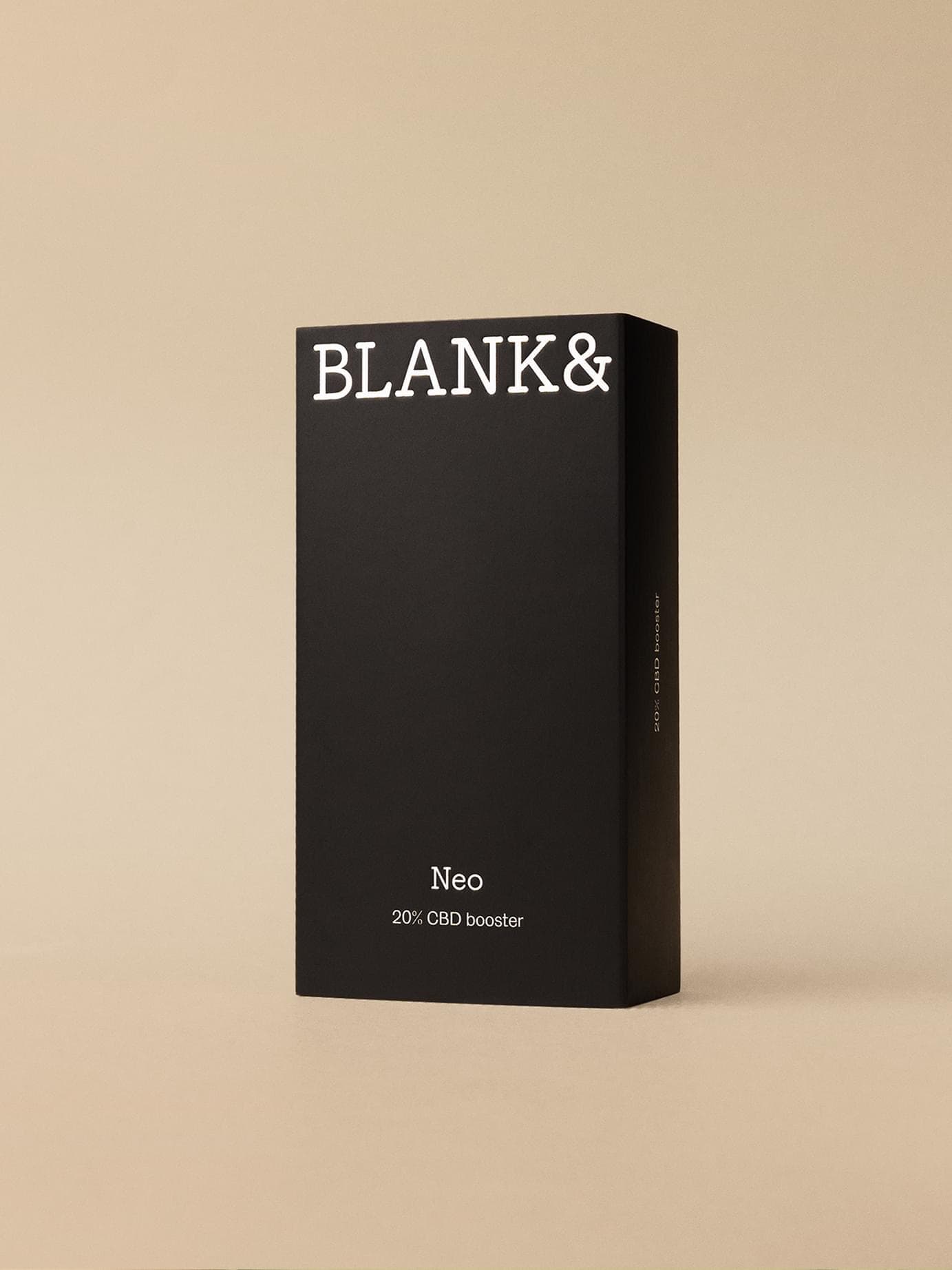
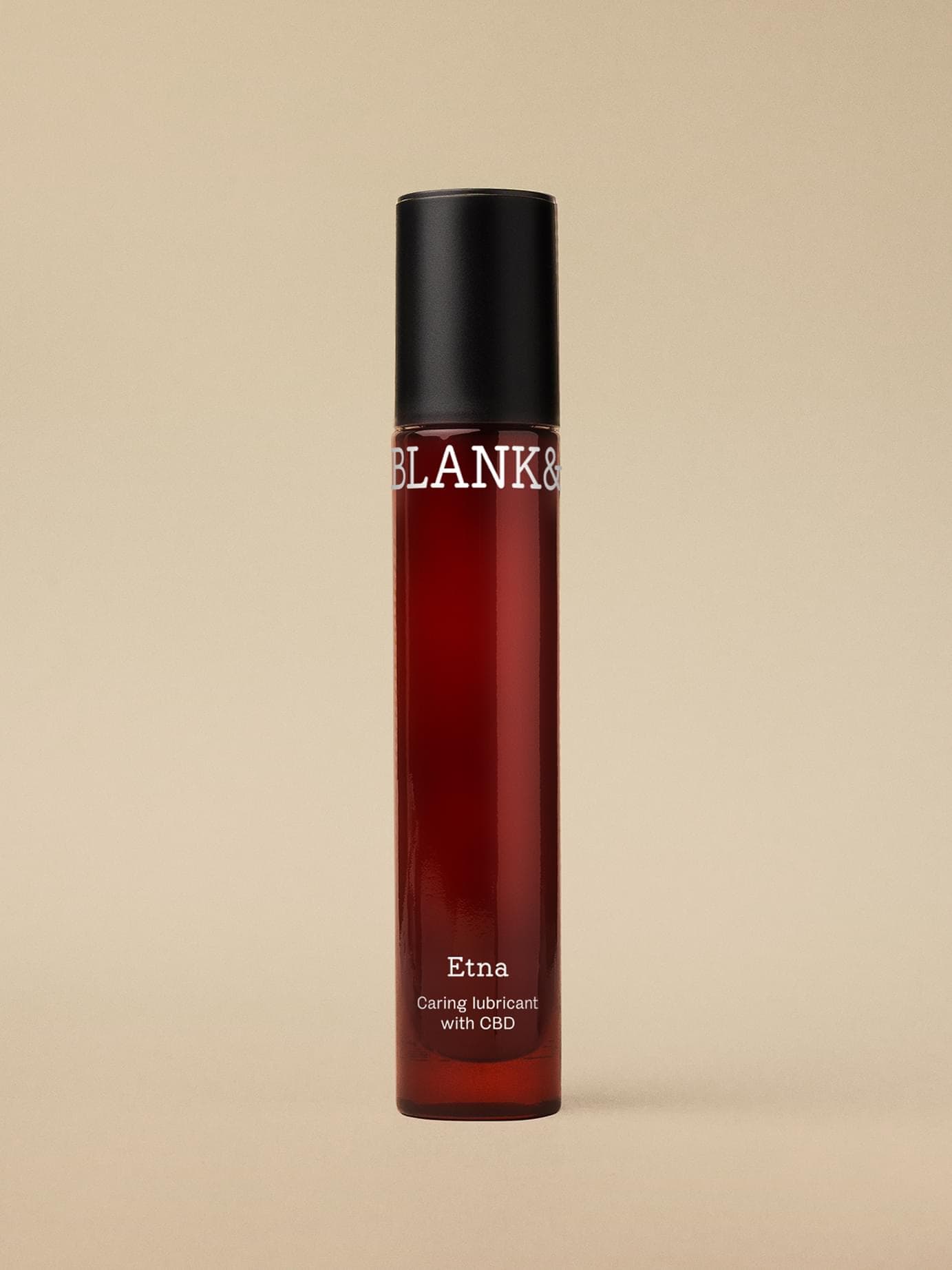
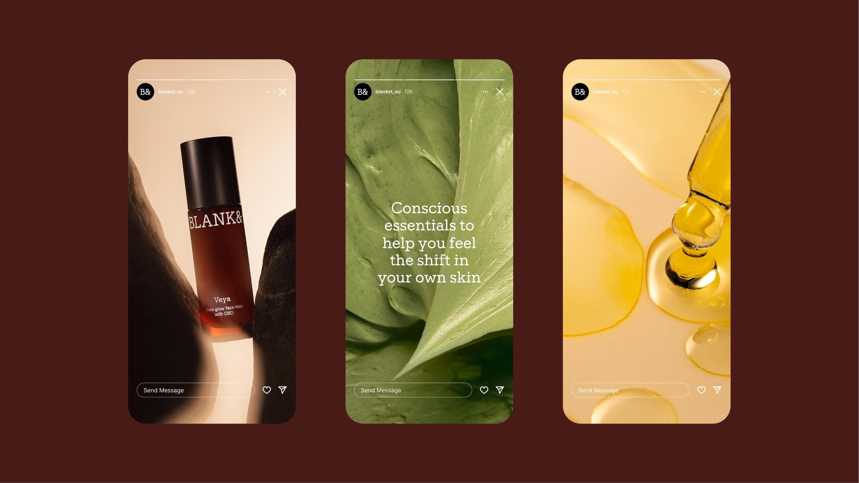
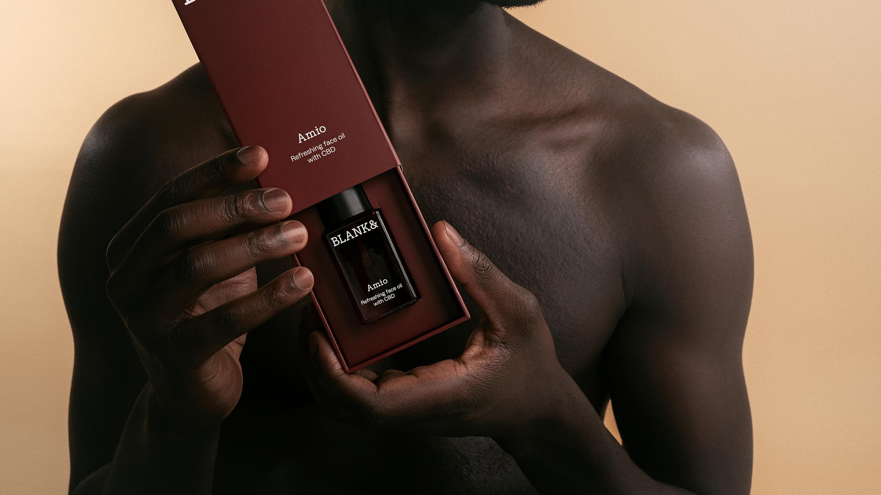
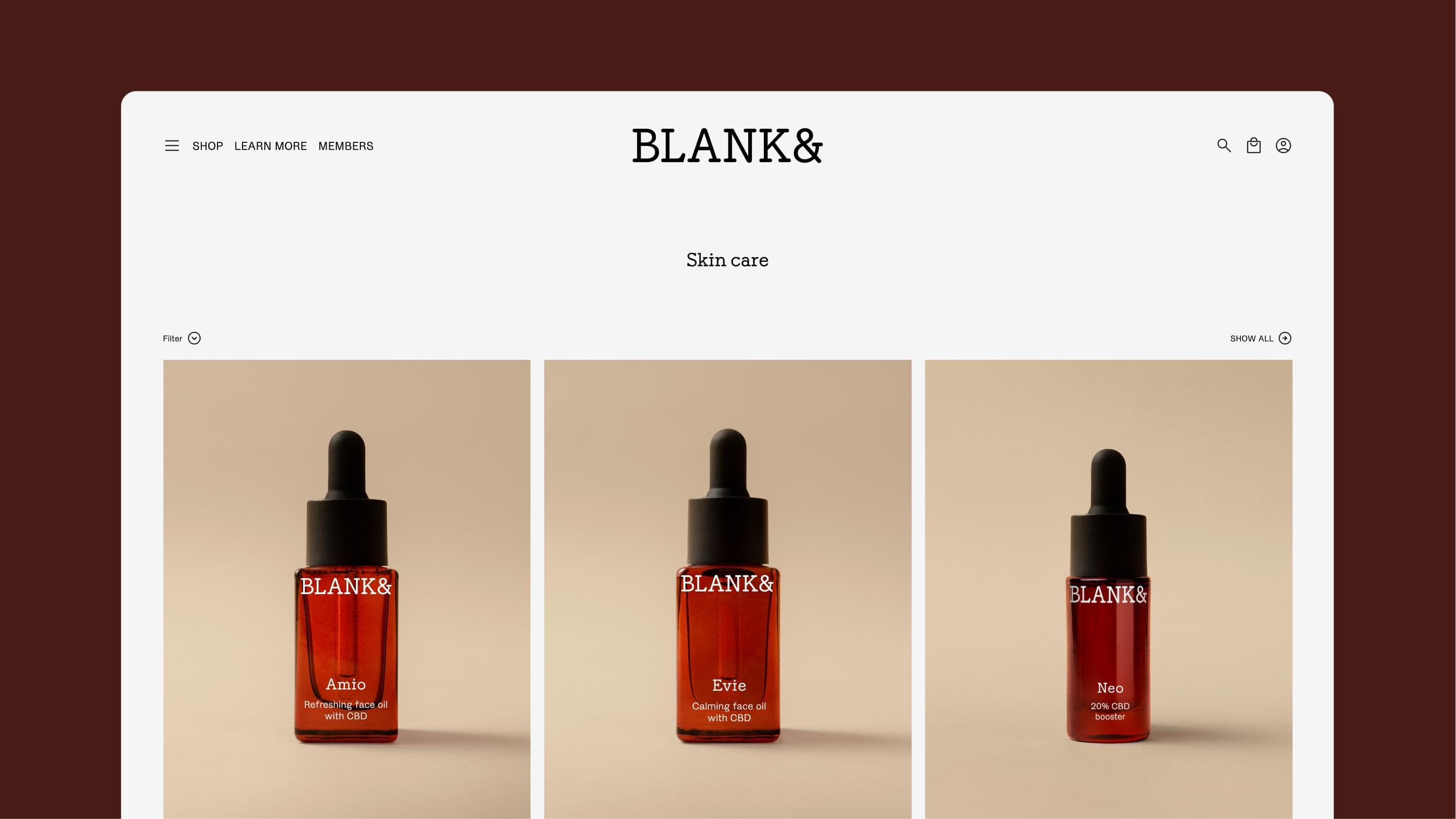
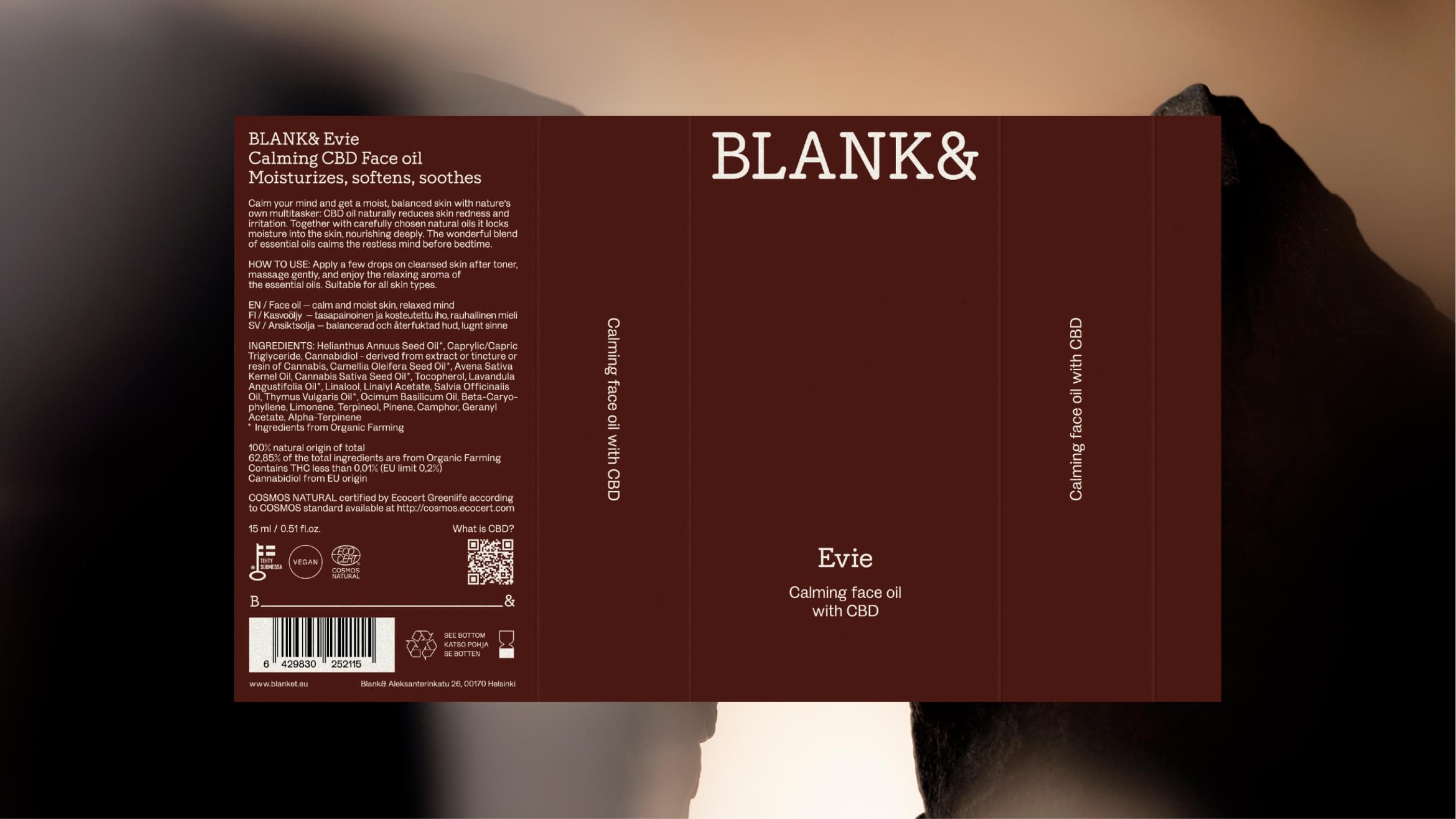
Werklig's design language for Blank& sits between two established codes: natural-cosmetics minimalism and beauty-industry luxury. The palette is drawn directly from the product's ingredients — not only cannabidiol, but lavender, thyme and apricot seed — translated into earth browns, muted yellows, and soft blues and greens. Typography stays restrained, with rounded details that offset the coolness of the minimalist layout. Packaging materials shift away from plastic toward paper and glass, and the leaf motif common to the category is dropped entirely; green appears only as a muted accent rather than a category signal.
"CBD products carry a lot of baggage like the coffee-shop association, the homemade-batch look. Progressive luxury was our way out of that," says Puolakka. "The warmth is held in check by modern minimalism you'd expect from established luxury beauty ranges — a lot of white space and restrained typography. Type's rounded, soft details keep it from feeling too cold."
How did you balance signalling "toxic-free" purity while still feeling luxurious rather than clinical?
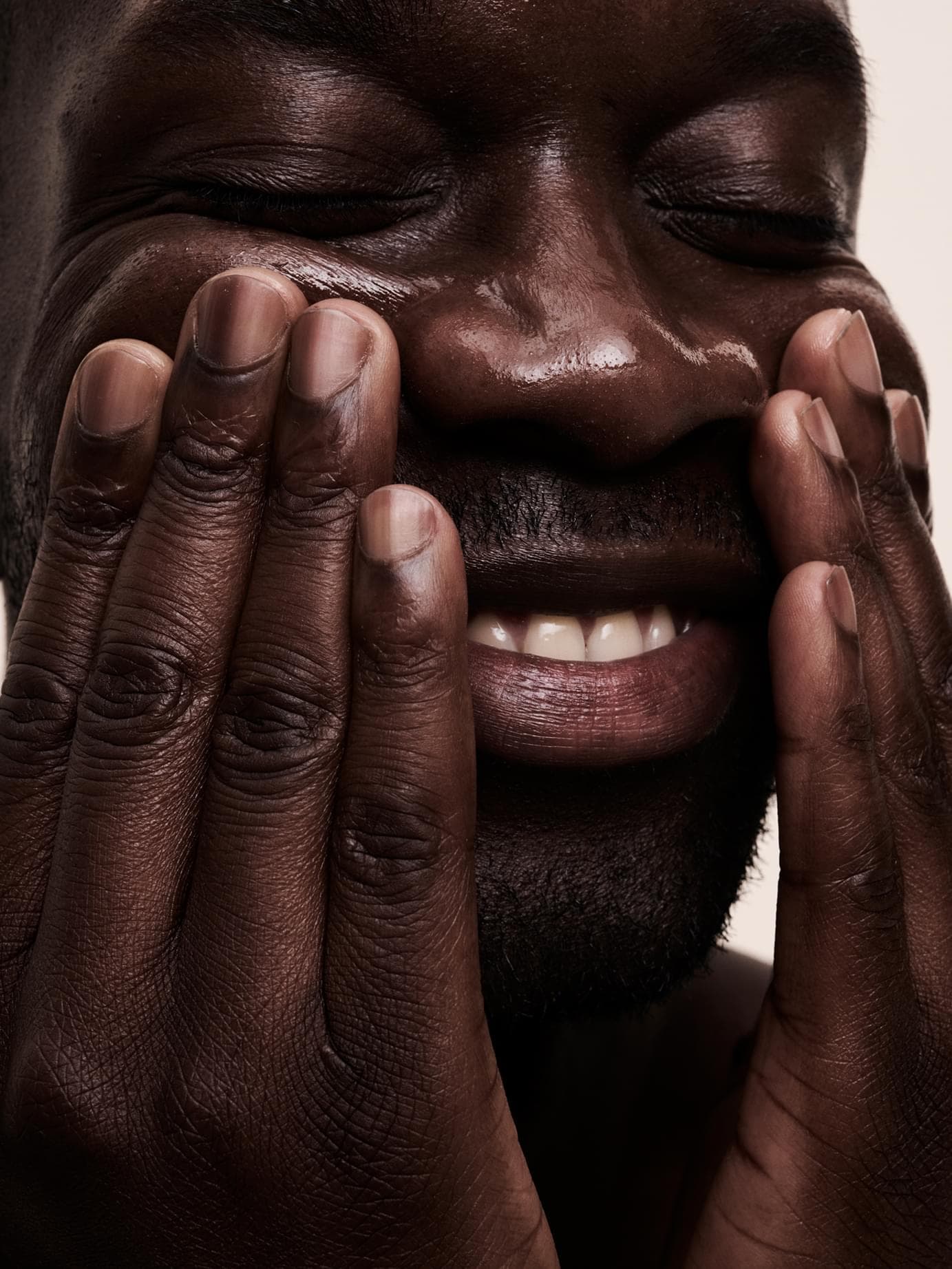
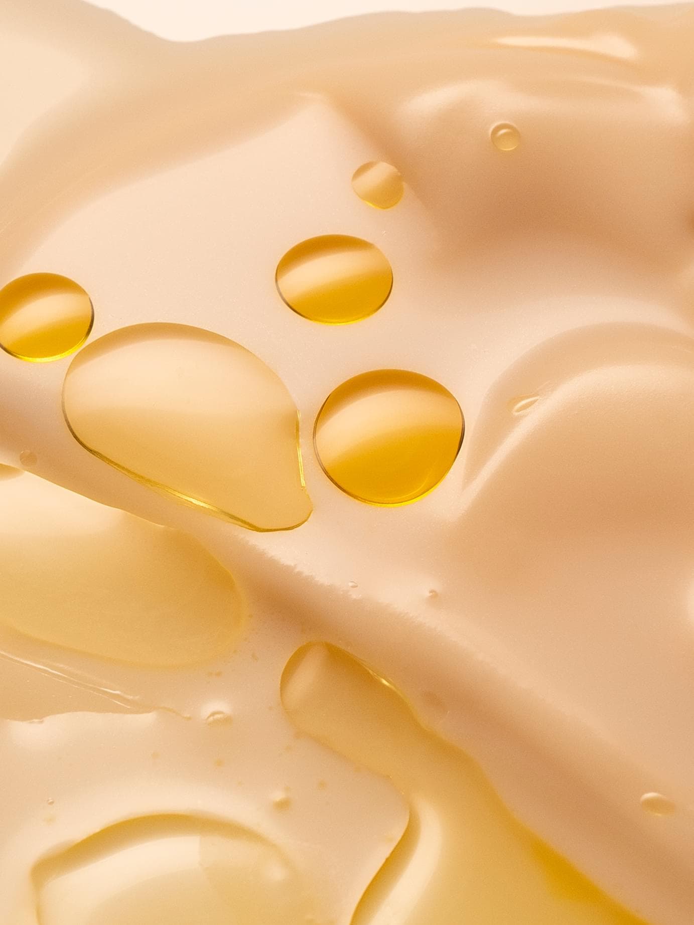
Depth, mostly. A palette built on pigment and warmth rather than white-plus-one-accent. And texture: the photography shows what the products actually feel like – the sheen, the viscosity, how a balm rests on skin. We kept the sensory feel in and styled it carefully.