How Ponder designed an identity for a battery that runs itself
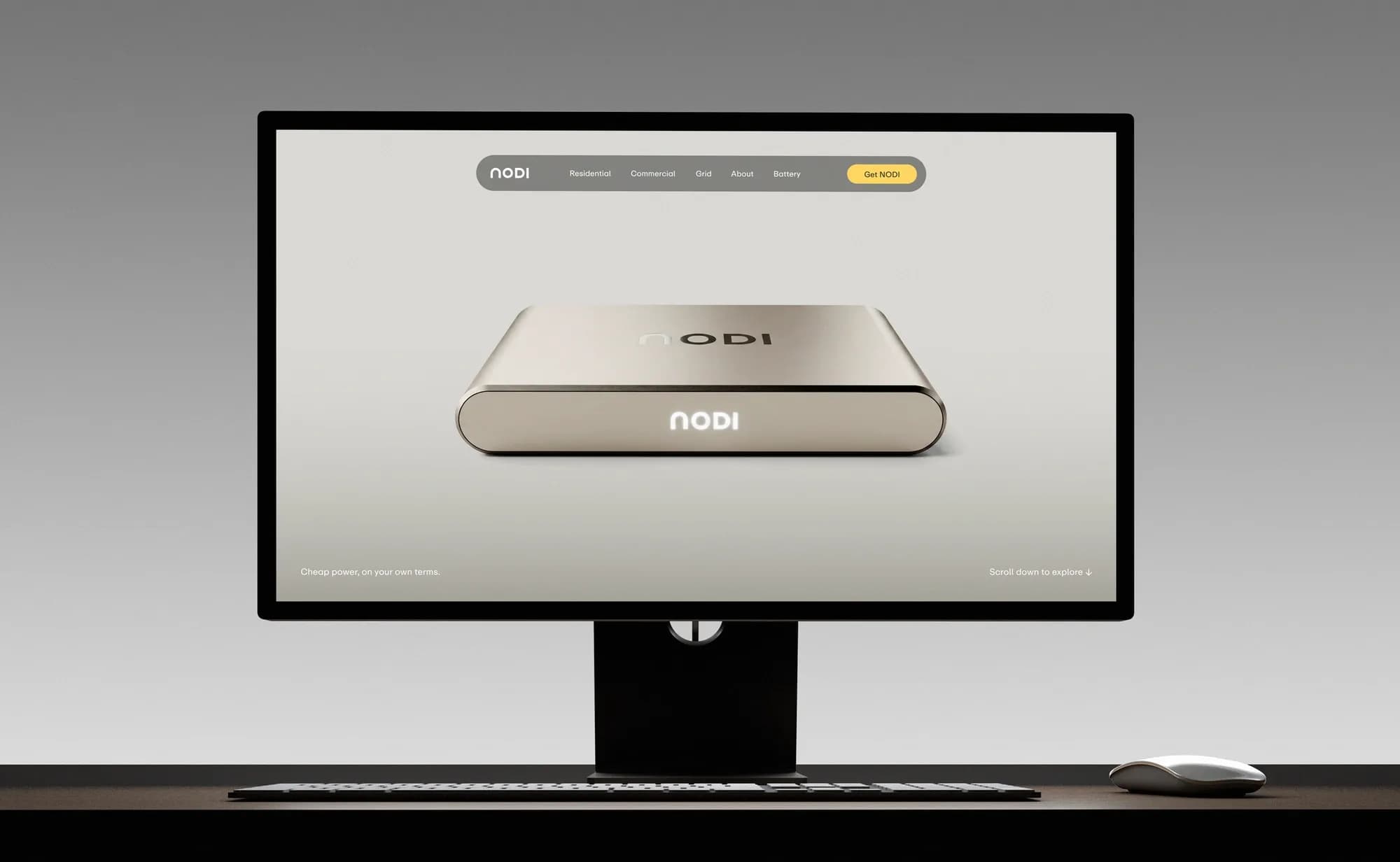
NODI's plug-in home battery charges when electricity is cheap and supplies it when prices rise, so the user has nothing to operate and the identity has no routine to teach. Ponder worked on positioning, brand strategy, tone of voice and visual identity, keeping only the existing wordmark and building the visual side around a product that was already finished. In an interview with Nordic Brief, Thomas Bræstrup, Senior Designer and partner at Ponder, says the agency's benchmark for how the product should work was a kettle.
Home batteries are more common outside the Nordics, and the category is less familiar here. How did that affect how much you had to explain and how much you could assume?
It meant we couldn't assume that people already understood what a home battery does, or why they'd want one. Tesla Powerwall, which I've mentioned before, is typically only accessible to people with a lot of money. The average person, someone like you or me, is not really aware that having a home battery is even an option. So we decided that NODI's role should be to guide people into a new category without overwhelming them with information. We focus on the immediate value: charge when energy is cheap, use it when energy is expensive, and let NODI handle the rest. That is also why the language is deliberately straightforward. We explain the mechanism, but we don't make people learn the energy system before they can understand the product.
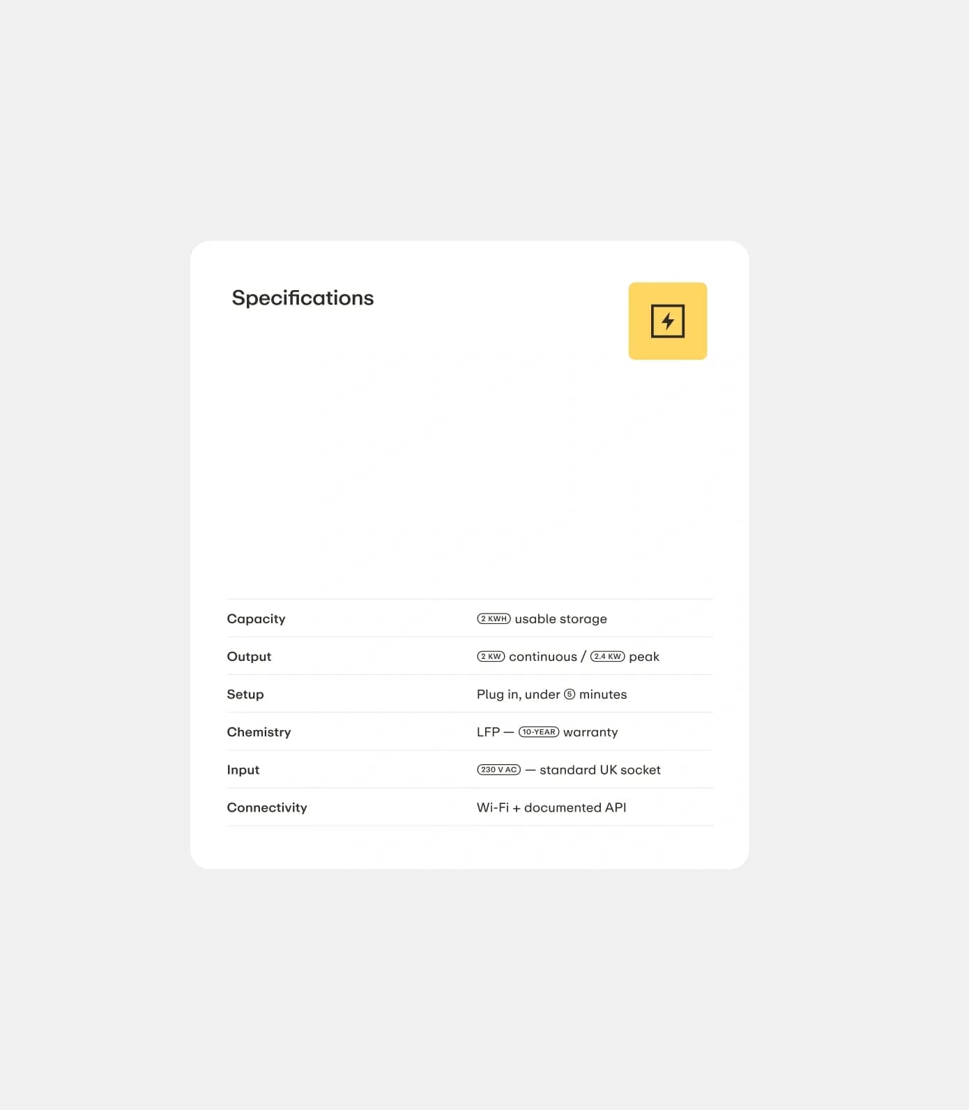
No sharp edges, pixels or green
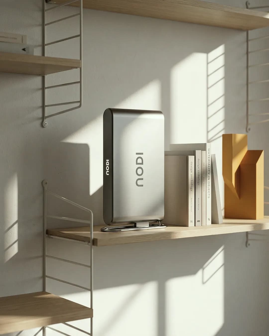
Ponder started by looking at how the technology category presents itself. According to Bræstrup, technical complexity is often expressed through sharp edges, pixels and angular graphic elements in a hard, dark visual universe, and Ponder chose a different direction. The agency used Tesla Powerwall as a reference for what NODI should not look like, and Sonos, which sits between consumer electronics and interior design, as a reference for a product made to be seen in the home.
"Tesla Powerwall quickly became an example of the opposite direction," Thomas Bræstrup, Senior Designer and partner, Ponder, explains. "It leans more heavily into the idea of technical infrastructure. We wanted NODI to feel closer to the world of well-designed consumer products that people are happy to have standing out in the open, and might even be proud to have on display."
Green was considered early on and dropped, because it pushes communication towards sustainability. Ponder describes NODI as being about electricity, money and convenience. And because the category is unfamiliar, the language is built around one mechanism: charge when energy is cheap, use it when energy is expensive.
As simple as a kettle
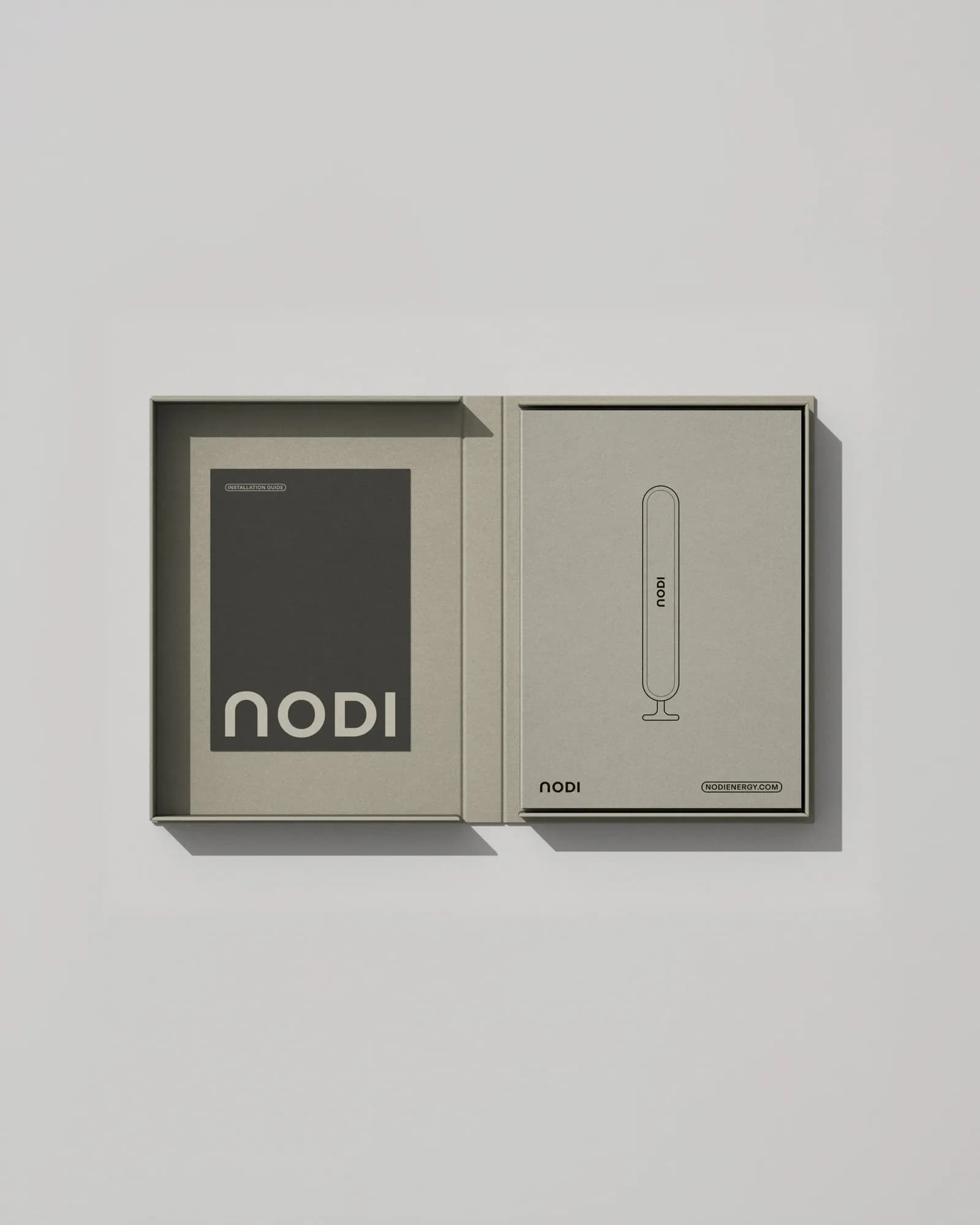
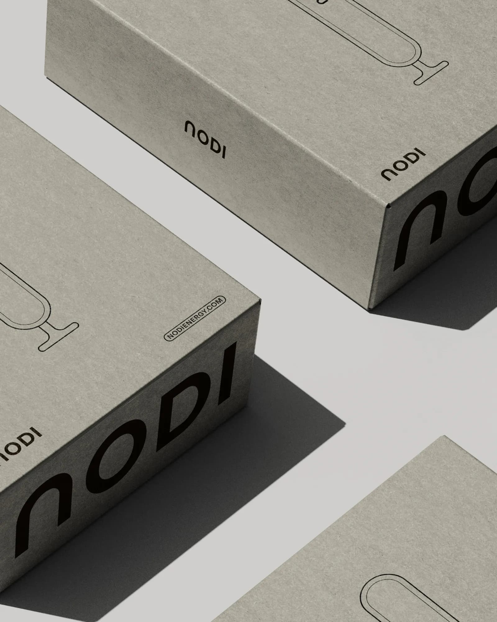
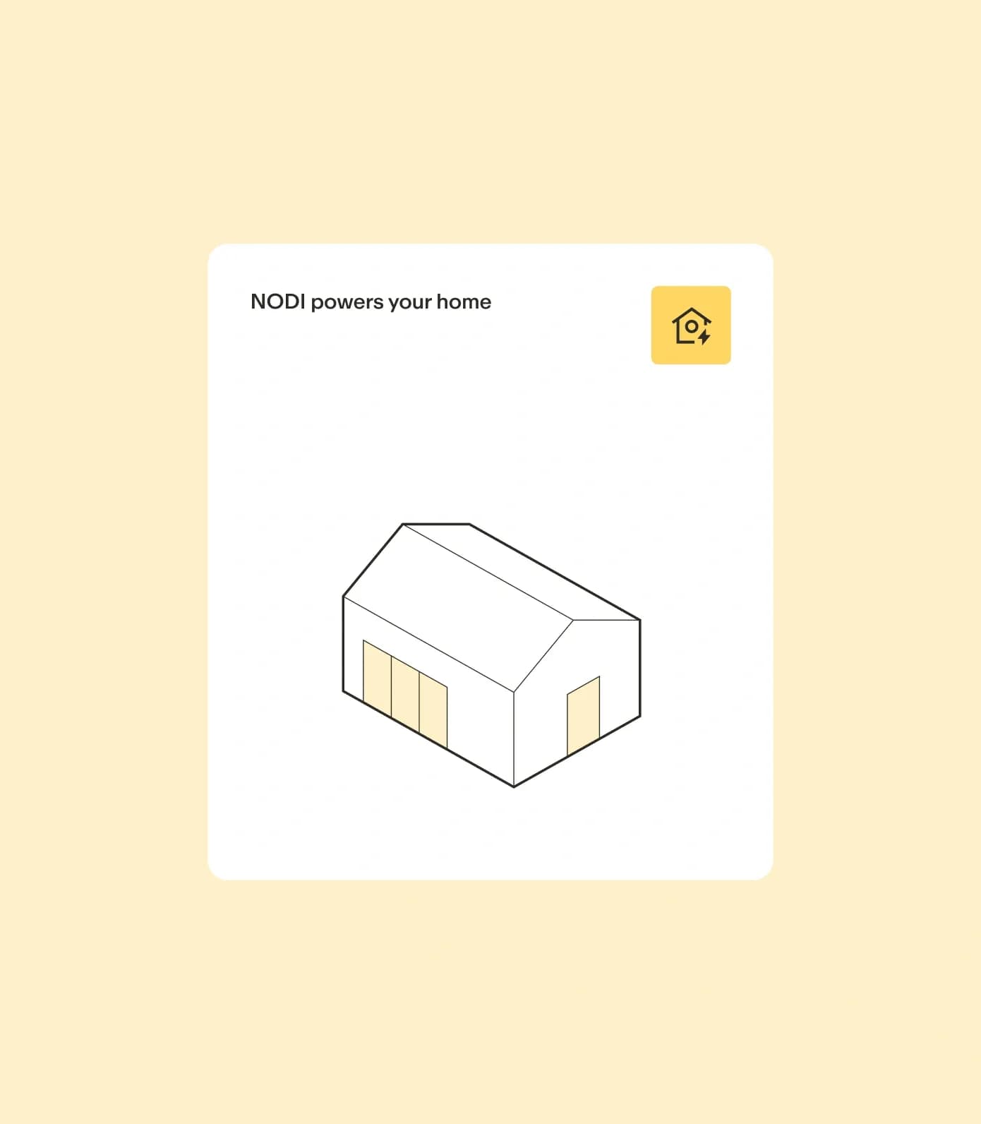
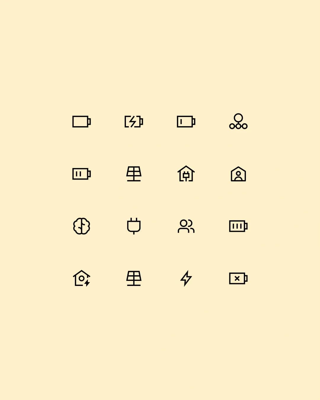
Once NODI is plugged in, it charges and discharges on its own. Ponder kept the design language to a minimum: little decoration, straightforward headlines and illustrations in a simple outline style that Thomas Bræstrup, Senior Designer and partner at Ponder, says can bring IKEA assembly manuals to mind. The team also uses a kettle as a benchmark for how easy NODI should be to use: you plug it in, and it gets on with the job.
"That was quite deliberate. If the product is meant to be easy to understand and easy to use, the communication should feel that way too. You should not have to decode the identity before you understand what NODI does." — Thomas Bræstrup, Senior Designer and partner, Ponder

ABC Repro and word frames from the device
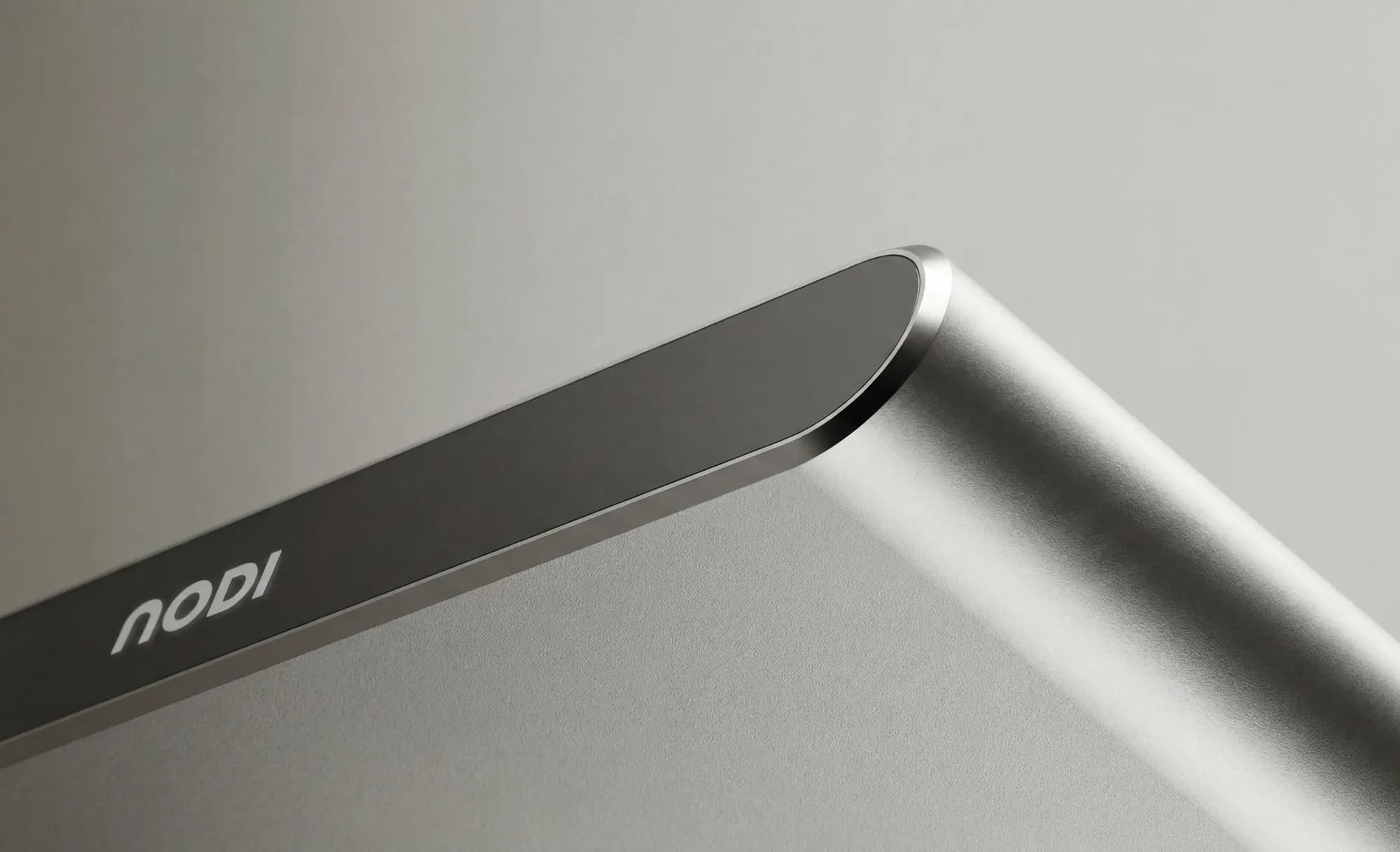
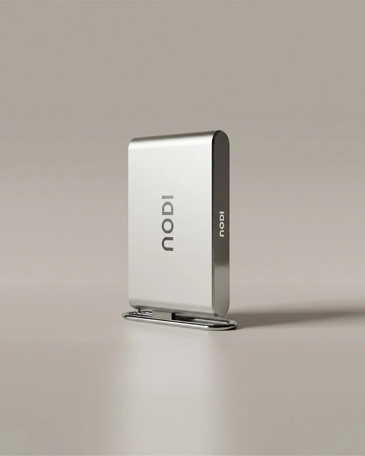
The wordmark is the only element carried over from NODI's previous design. Ponder saw a connection between the logo and the product and developed the identity from that. The product was already designed when Ponder started, so the agency had no influence on its form, but the form became the starting point for the identity: the n in the wordmark references the device, and the frames around highlighted words imitate its rounded shape.
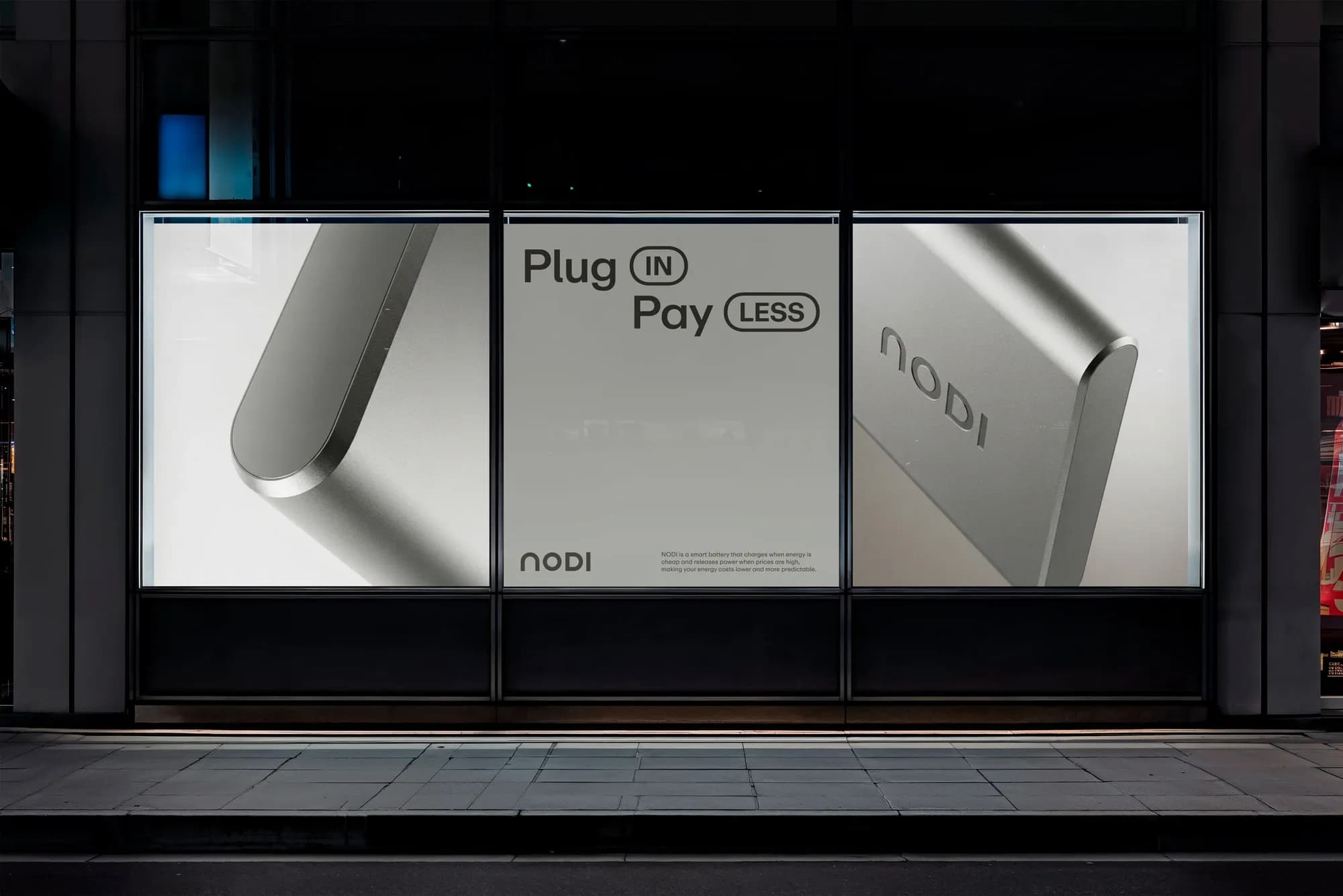
The typeface is ABC Repro, which Ponder describes as built on a geometric foundation and softer and more personal than mechanical sans serifs such as Helvetica and Neue Montreal. ABC Repro includes a stylistic set of circular alternates, which Ponder uses to frame words. Highlighting a word and switching on the set applies the frame, so the treatment is the same every time, including for people working with the brand who are not designers. The rule is to frame one or two words in short headlines, where the framed word carries the key meaning: MONEY in "Power is MONEY", or IN and LESS in "Plug IN. Pay LESS." The colour palette is warm.
"ABC Repro has these circular alternates, which are really handy. Having this stylistic set built into the typeface makes it easy to use and, importantly, ensures that we have the same way of highlighting words every time." — Thomas Bræstrup, Senior Designer and partner, Ponder