A milky dream
“Most Chinese regard Western dairy brands as the most trustworthy and safe”, says Thomas Kjær, Creative Director at Danish design agency Simply. “That’s why our aim was to create a Nordic look and feel for Them 1888’s new organic milk powder product for the Chinese and Asian markets.”
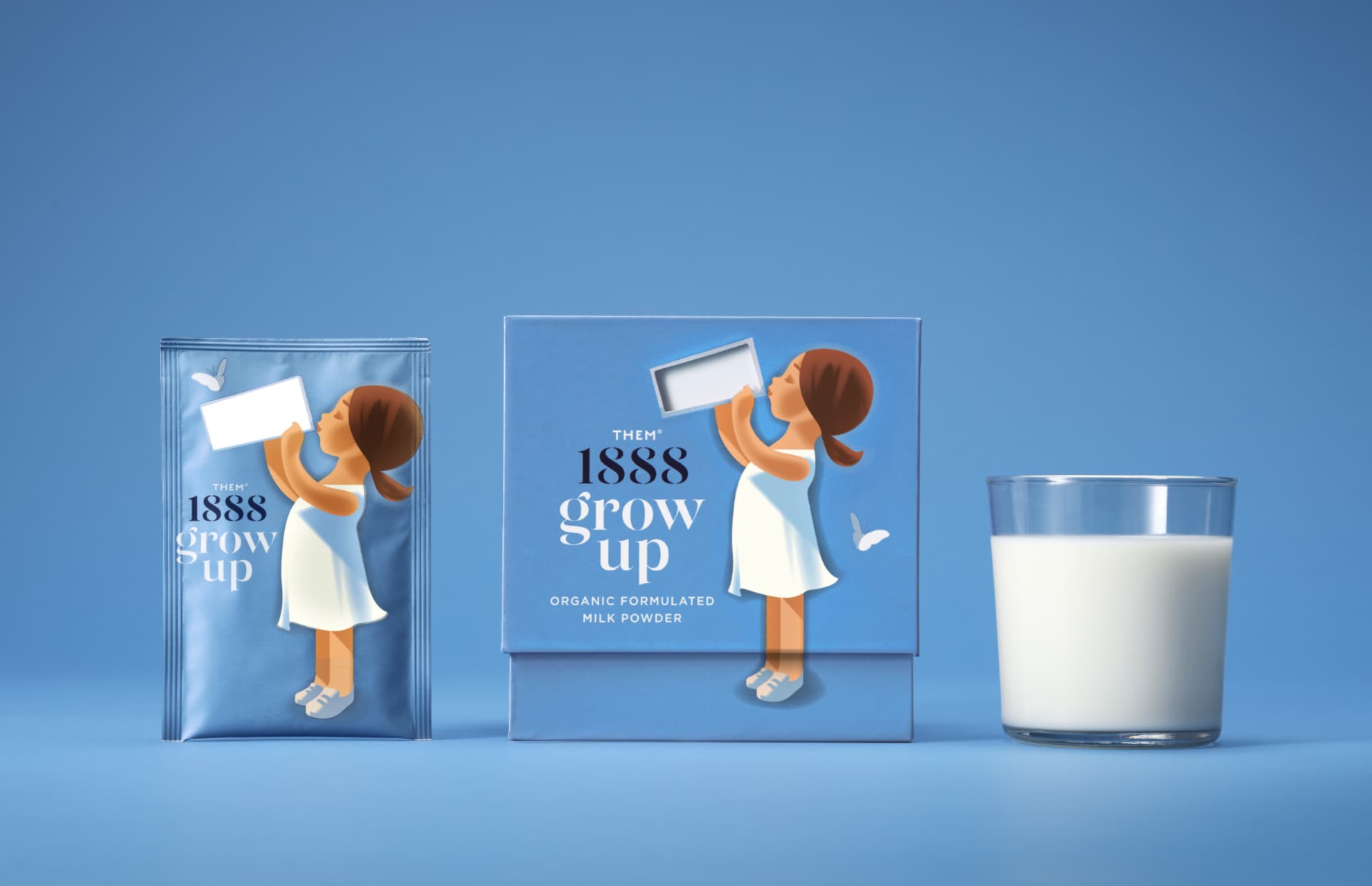
“We chose a colour that signals freshness and fresh air, things often highlighted as particularly Danish,” Thomas Kjær continues. “The blue colour is our base colour when it’s about milk in Denmark.” The added butterfly is a simple element that hints at Mother nature without spelling it out in the shape of green fields, cows and other cliches. “It helps us keep it simple,” as Kjær puts it.
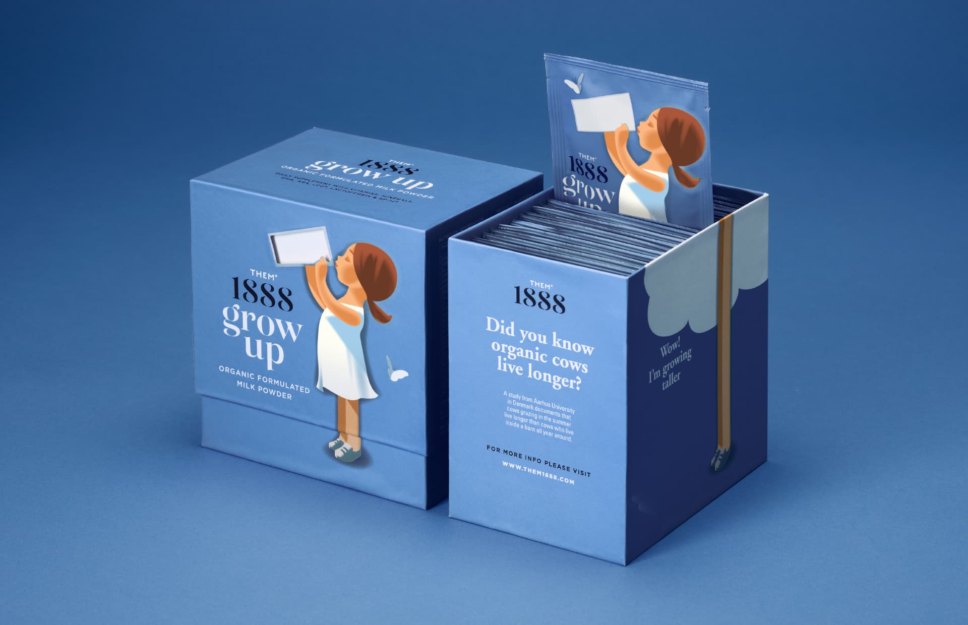
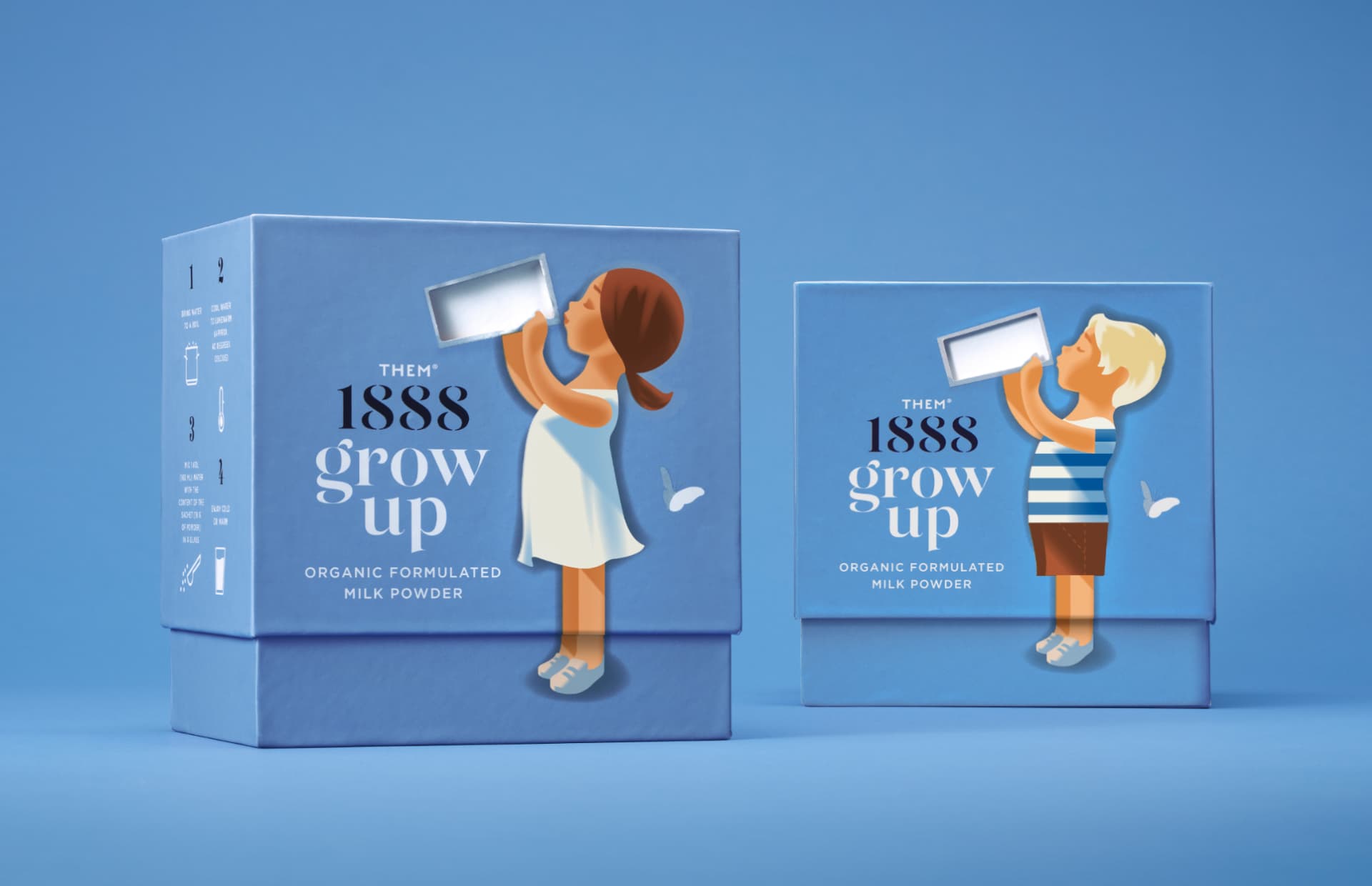
Lid it up
Now, the main attraction of this packaging is the lid. When you lift the lid, the milk in the glass is emptied and simultaneously, the legs of the child get longer. “For Chinese parents, the health and growth of their children are valued assets”, Thomas Kjær explains. So, clever storytelling speaks to this wish. Kjær adds, “And it also makes it a lot funnier for children to ask for another glass of milk.”