Nonspace turns Bergen's old swimming hall into a performing arts brand
Bergen's new performing arts house had to do two things at once: hold two established companies under a single brand, and reach audiences who have never sought out contemporary dance or theatre. Norwegian studio Nonspace developed the brand story and visual identity for Sentralbadet Scenekunsthus, the production and venue house opening in Bergen in March 2027. The house occupies the city's first public swimming hall, a 1960 building whose original facade sign the city antiquarian required be recreated true to the original — so the new identity had to share its front door with the building's past.
_%2520%25C2%25A9Vegard%2520Breie%2520Bergen%2520Internasjonale%2520Teater%252C%2520%25C2%25A9Thor%2520Br%25C3%25B8dreskift%2520Bergen%2520Internasjonale%2520Teater%252C%2520%25C2%25A9Bergen%2520International%2520Theatre.jpg&w=3840&q=75)

Reading the building without quoting it
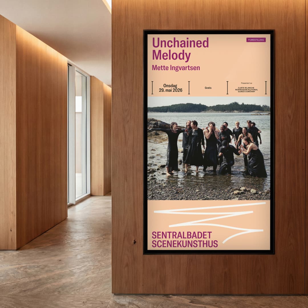
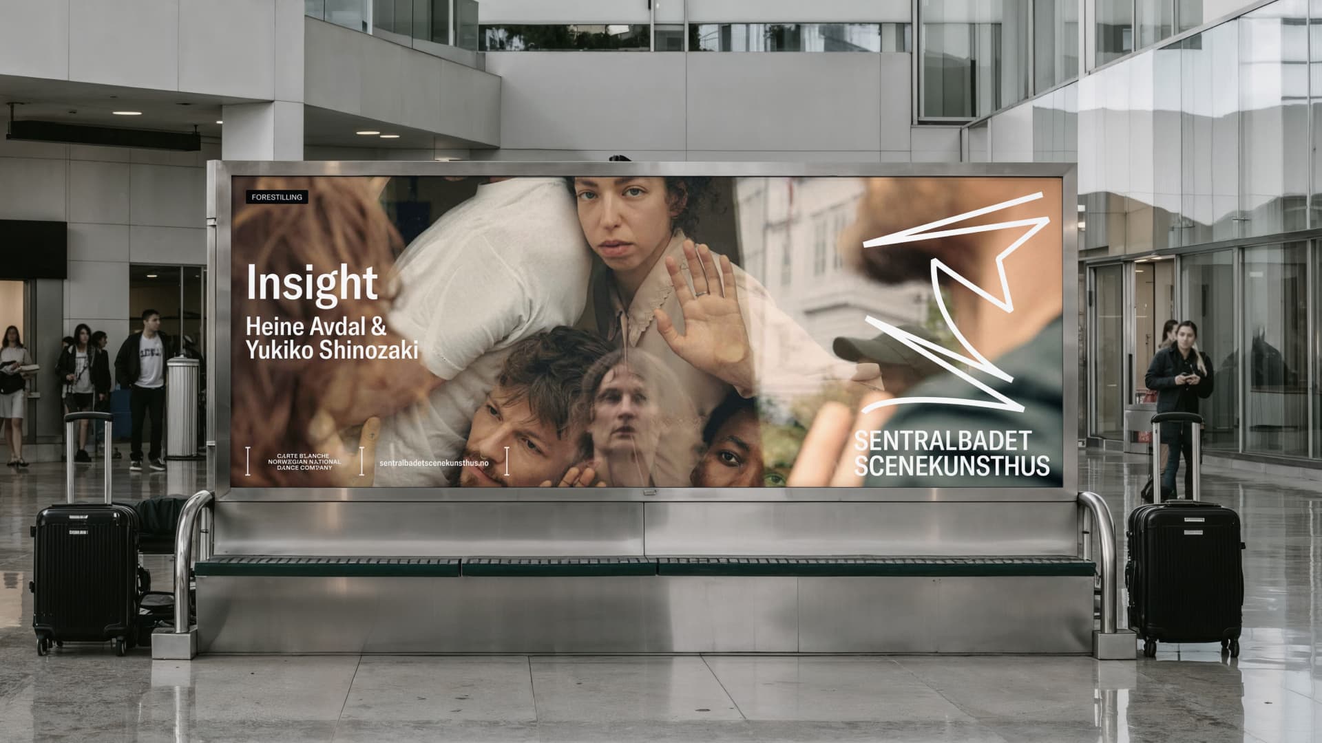
The interior architecture already leaned on the building's history, upcycling materials and repurposing old fixtures, which freed Nonspace to point the brand forward rather than backward. The studio drew its primary palette as a subtle cue to the swimming hall without naming it, and turned the black lane lines once painted on the pool floor into a framing device for content and an underlying grid for layouts. For signage, Nonspace echoed the building's heavy use of stainless steel, specifying powder-coated, bent sheet metal. The recreated facade sign became the single point where the two timelines meet.
“We were clear that the brand strategy needed to point to the future and not fall into obvious historical references — the facade sign being the one place that brings this history face to face with the future identity”
Mark Trzopek, Design Director at Nonspace


Lowering the threshold to performing arts
The remit was to present performing arts to a more everyday, commercial audience, not only the already-converted. Sentralbadet becomes the permanent home of Carte Blanche, Norway's national dance company, and BIT Bergen International Theatre — each arriving with its own audience — while the house works as a new channel between the art form and the wider city. Nonspace built the system around the brand idea "Performing Art Moves" and a dynamic S that can run hyper-playful and experimental on one job and drop into a quiet supporting role on the next, governed by a core/playground framework.
“Our remit was to first and foremost present the performing arts to a more commercial and everyday audience. The system is built to flex: when the brand can flex to its fullest volume, and when it needs to act more quietly.”
Mark Trzopek, Design Director at Nonspace


Share Your Work — or Your Take
Nordic Brief covers the projects shaping Nordic design, branding, and technology. Working on something you think we should know about? Disagree with how the industry talks about identity systems, design ops, or AI in brand work? We want to hear from practitioners and encourage Nordic agencies and designers to send in project submissions, op-eds, and sharp opinions.