How ANTI turned an Instagram account into a print magazine and type lab
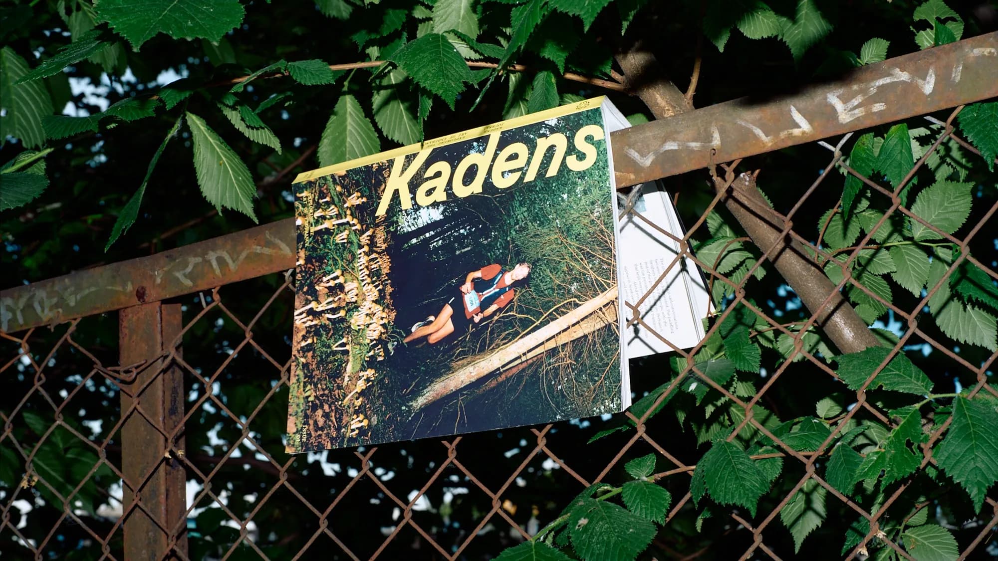
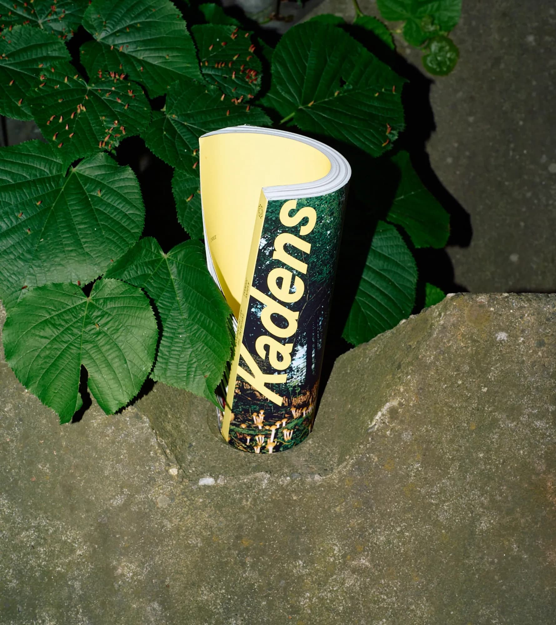
Endurance sport like running, cross-country skiing or orienteering has rarely received the kind of editorial treatment reserved for architecture or design culture. Oslo-based ANTI designed Kadens, a print magazine built around that gap, working with editor Henrik Rostrup to launch the first issue internationally during Paris Fashion Week in collaboration with Portal.
Nordic Brief spoke with three of the designers behind it – designer Tobias Larsen, senior designer Adrian Myklebust Sylejmani and type director Erik Johan Worsøe Eriksen – about interpreting endurance culture visually and building three custom typefaces from scratch.
Beyond running: designing for endurance culture
Kadens started as an Instagram project in 2025 before Rostrup and ANTI turned it into a physical magazine, distributed now in Norway, the US, Germany, the UK and South Korea. The brief covered a wide range of endurance disciplines rather than running specifically, which meant ANTI worked without a single reference brand to design against, including running-fashion labels like Satisfy, despite the overlap in cultural territory.
How did you relate to brands like Satisfy? Were there visual codes from today's fashion-oriented running culture that you deliberately used, reinterpreted, or avoided?
Brands like Satisfy are definitely part of the cultural landscape Kadens exists in. In fact, one of our articles was even written by a Satisfy runner, but from a runner's perspective and personal interests. As a brand, it really wasn't an inspiration for the magazine, nor was any other brand for that matter. Our references were more about the cultures and experiences being explored through the stories, whether it was fashion-oriented or about Nordic orienteering culture. Those stories, combined with our creative vision, helped us shape the magazine's look and feel, and we just hoped (counted on) readers would immerse themselves in them the same way we did.
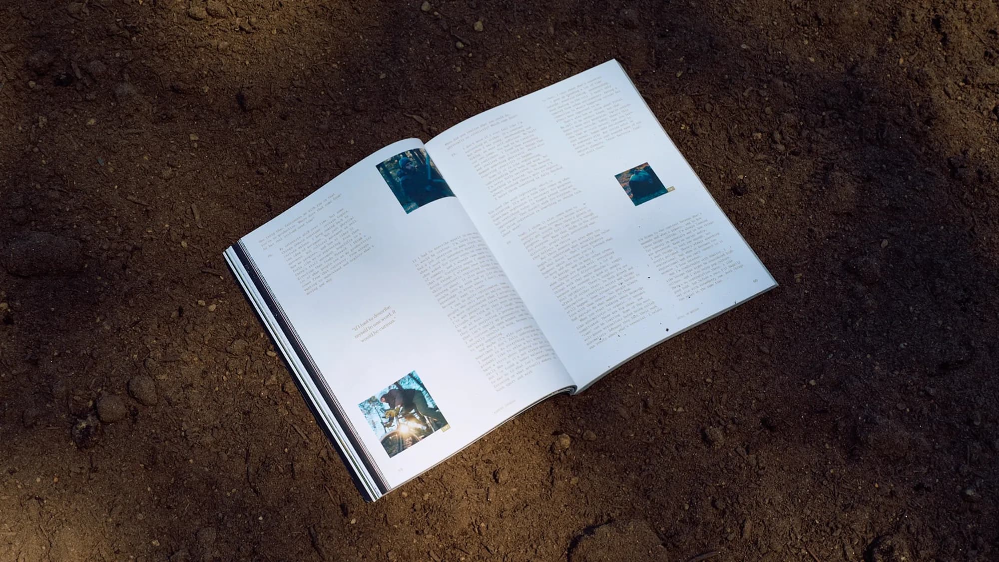
One thing we deliberately avoided was designing by templates, because we wanted the creative freedom to let each story be shaped by its contents in big or small ways. Not only does this make the reading experience more interesting, but it also makes the design challenge more rewarding. It was a luxury to work in this way, going with the flow, and it could have easily been a disaster if we didn’t have complete trust from Henrik. He had all the content well structured and curated before we got started, and basically watched us go nuts with it. Luckily our visions were aligned, and he was stoked with pretty much everything we showed him.
Can you give an example of the content shaped the choice of typography, image treatment, grid, or pacing?
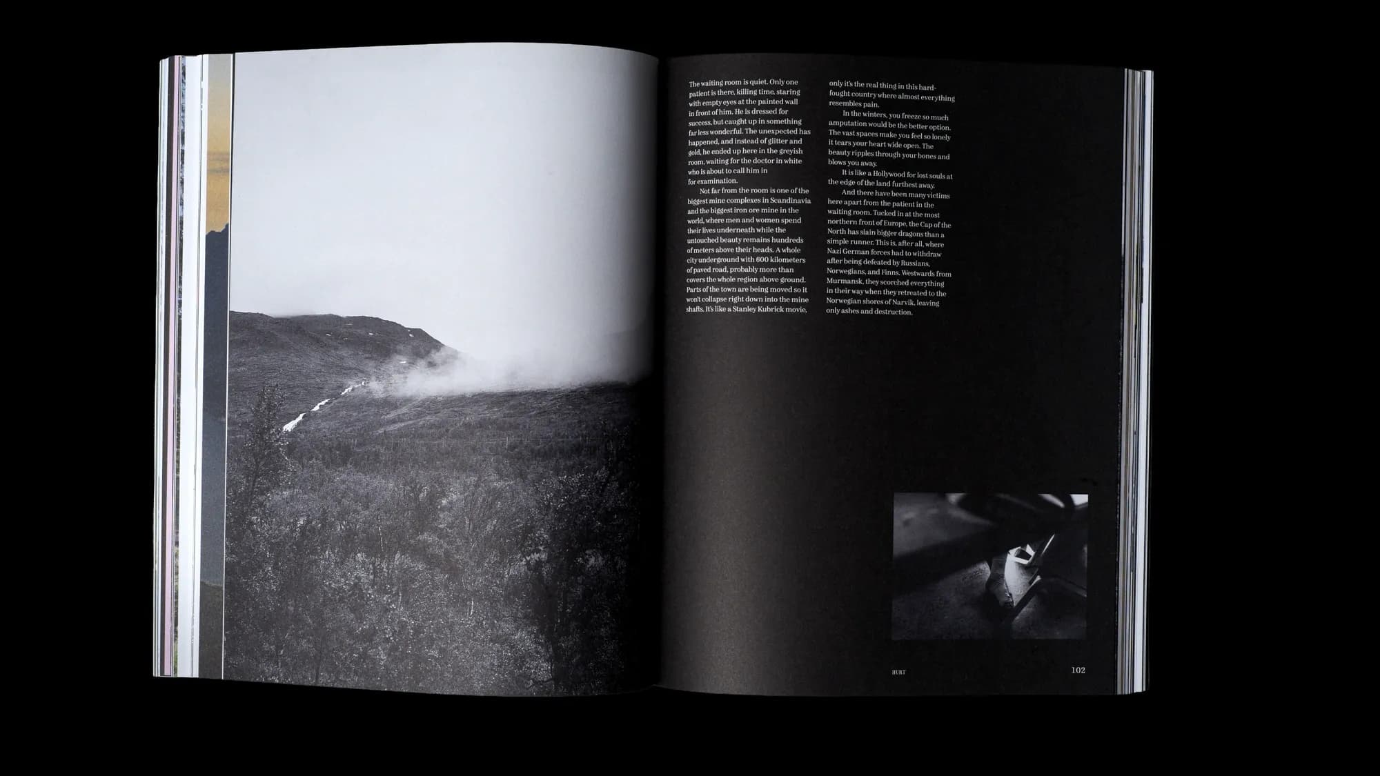
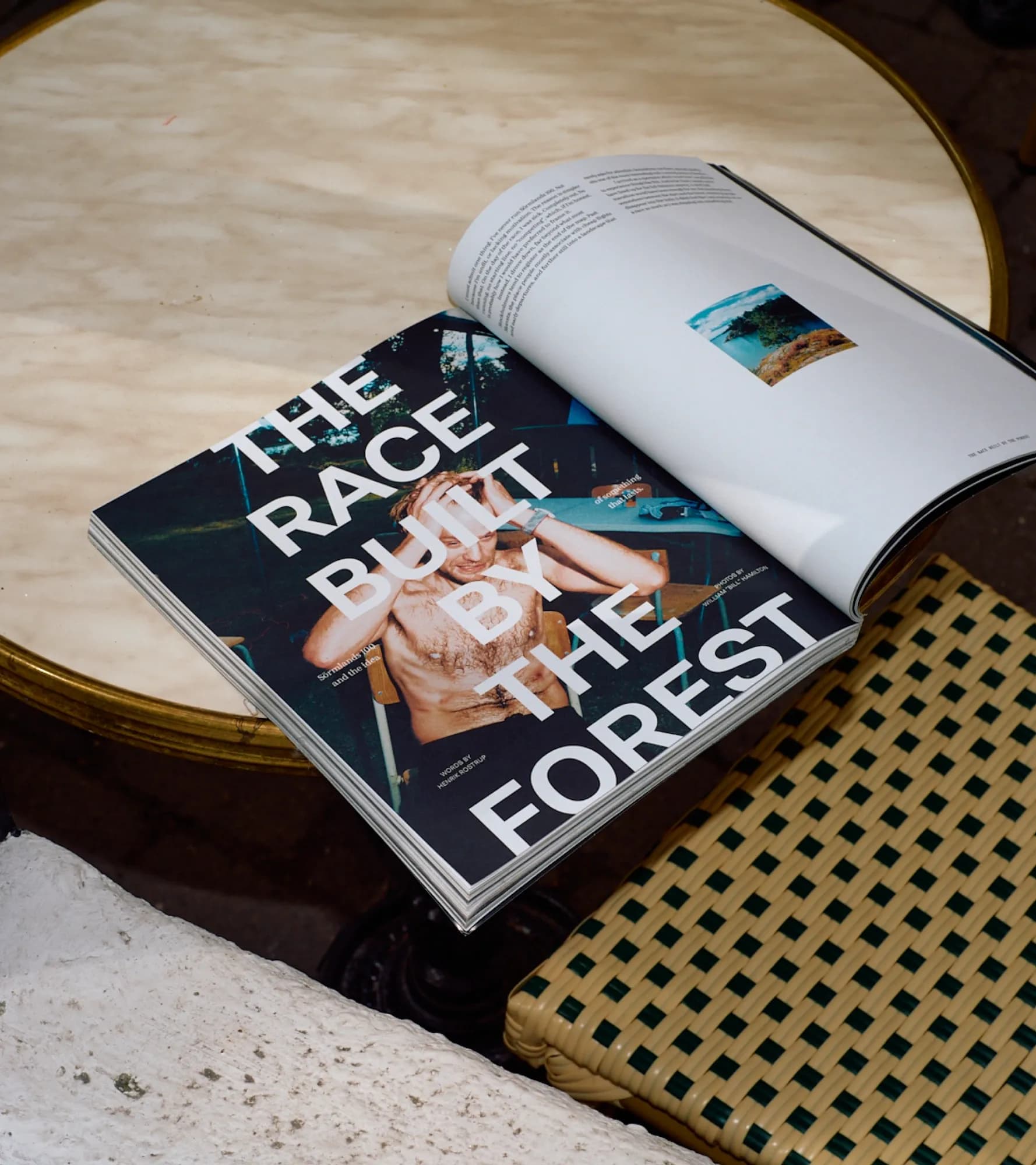
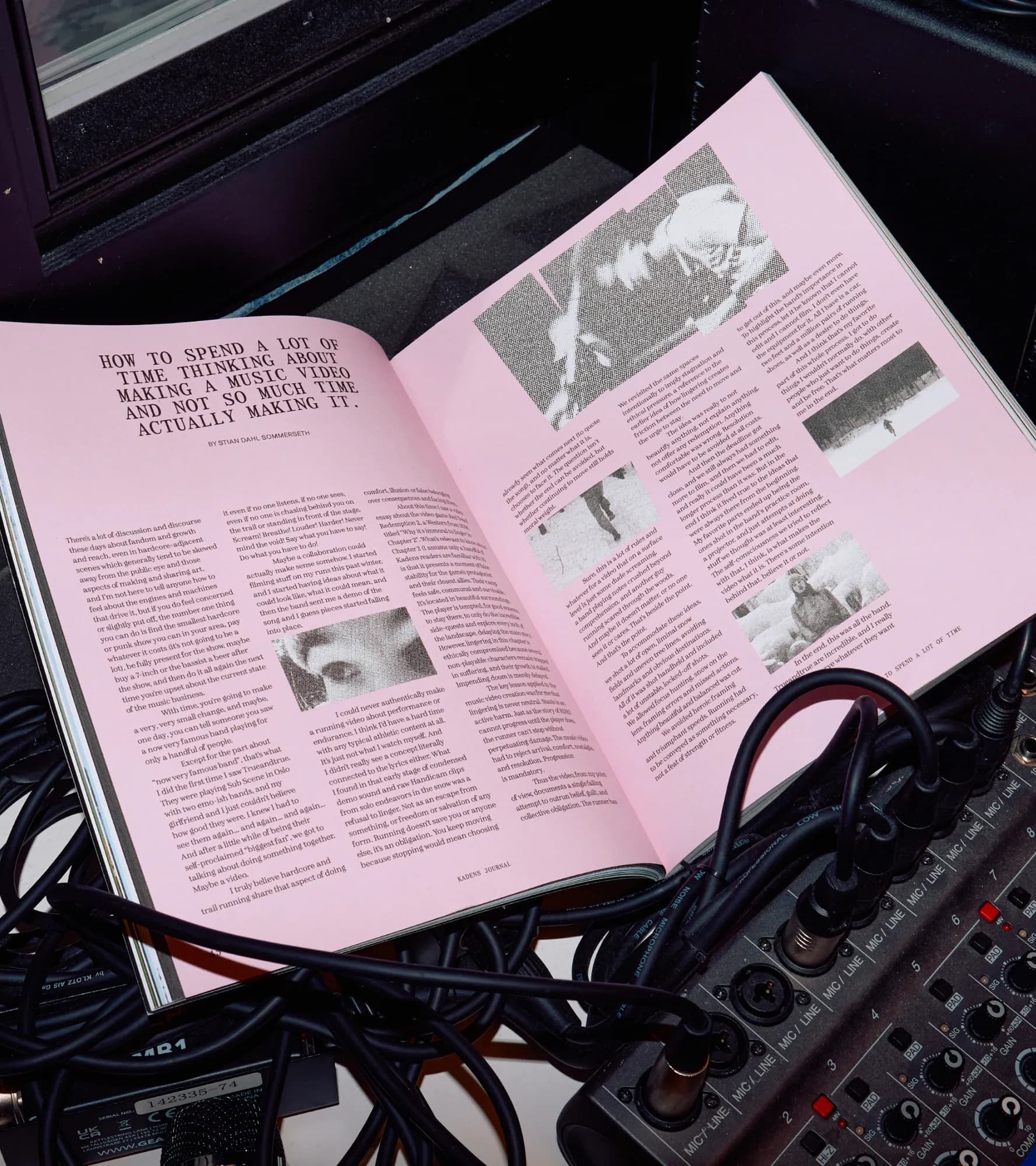
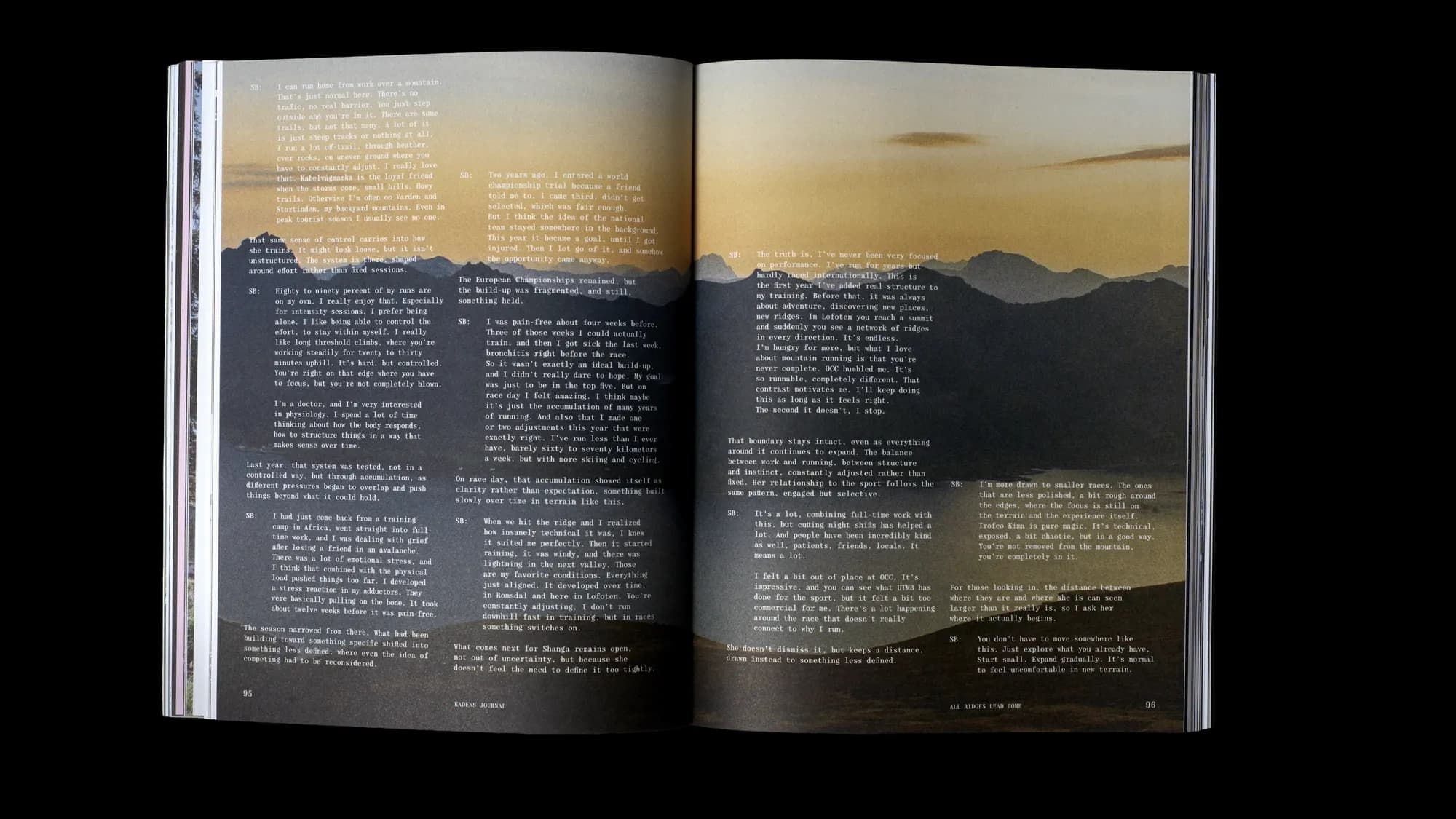
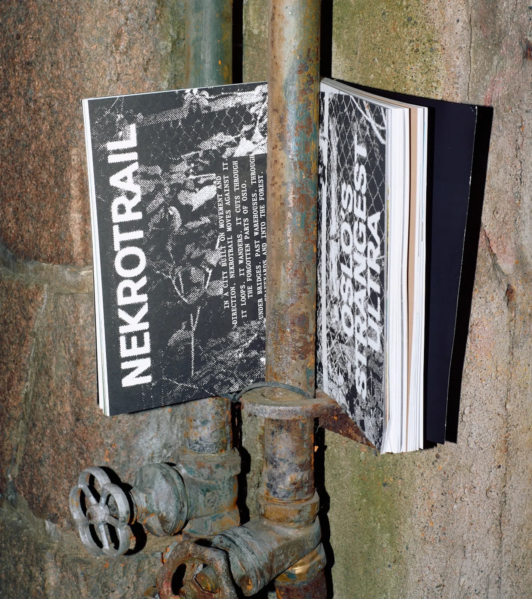
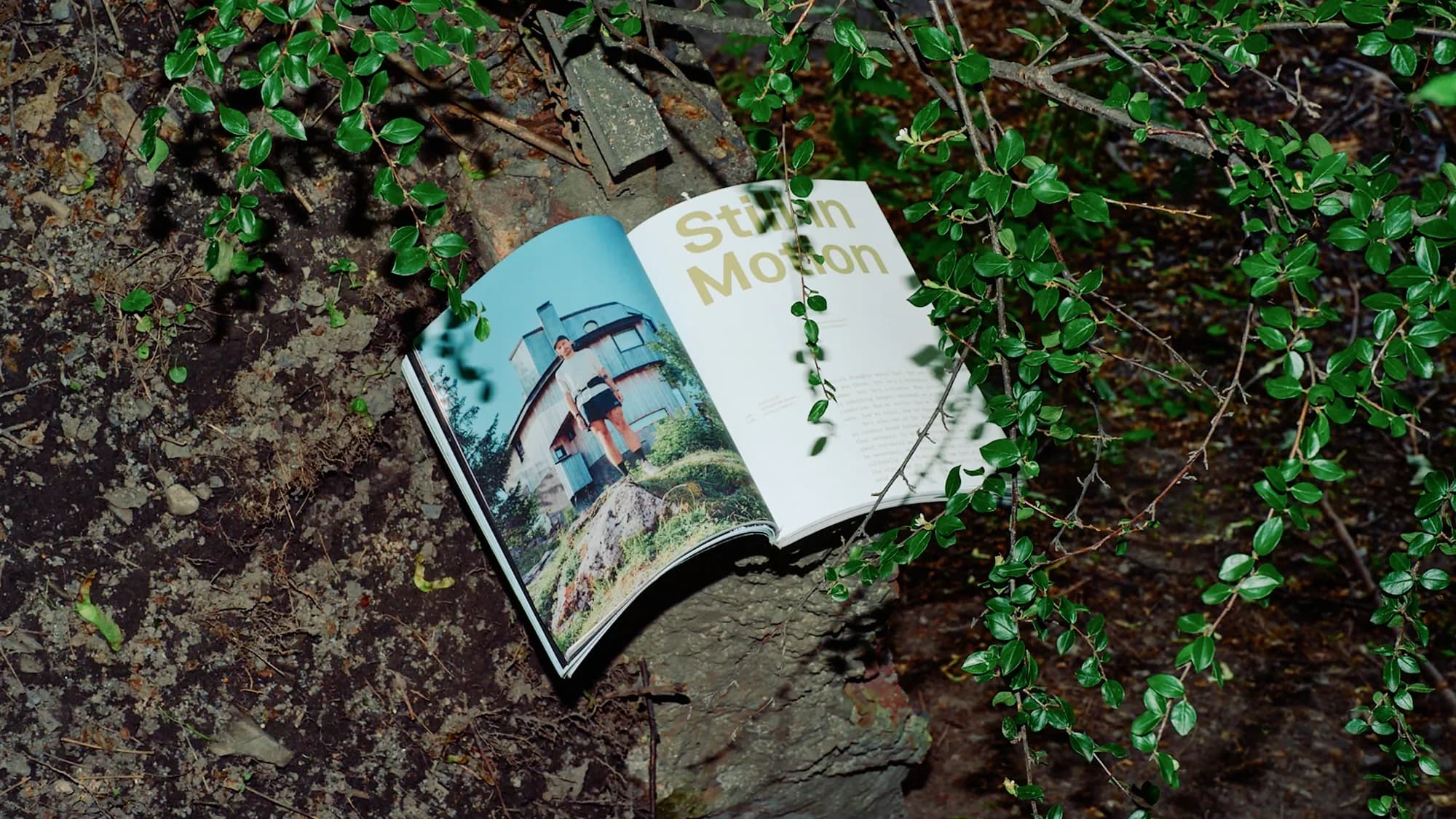
Whispers of Lapland and Nektrotrail are good examples of this, and represent two ends of the spectrum. The cold and quiet of Lapland is reflected in the use of white space, narrow paragraphs and full bleed images. Meanwhile Nekrotrail is dark and absurd, with gritty image treatments and off-beat layout choices. Another obvious example is Orienteering, the Outlier of Footsports, which makes you trace each heading like lines on a map.
Three typefaces built inside a live magazine
"We realised quickly that while we couldn't control every story or image, we had complete control over the pace, shape, and perception of the narrative," Adrian explain about how the magazine become a testing ground for its own type library rather than sourcing existing fonts. As well as a way to embed their own identity into the project. "So when Erik presented the drafts for his self-initiated typeface, Peat, during an internal design brunch, Tobias and I wanted to test it in the magazine immediately. Call it an ANTI perk, when you have the type designer sitting at the desk right behind you."
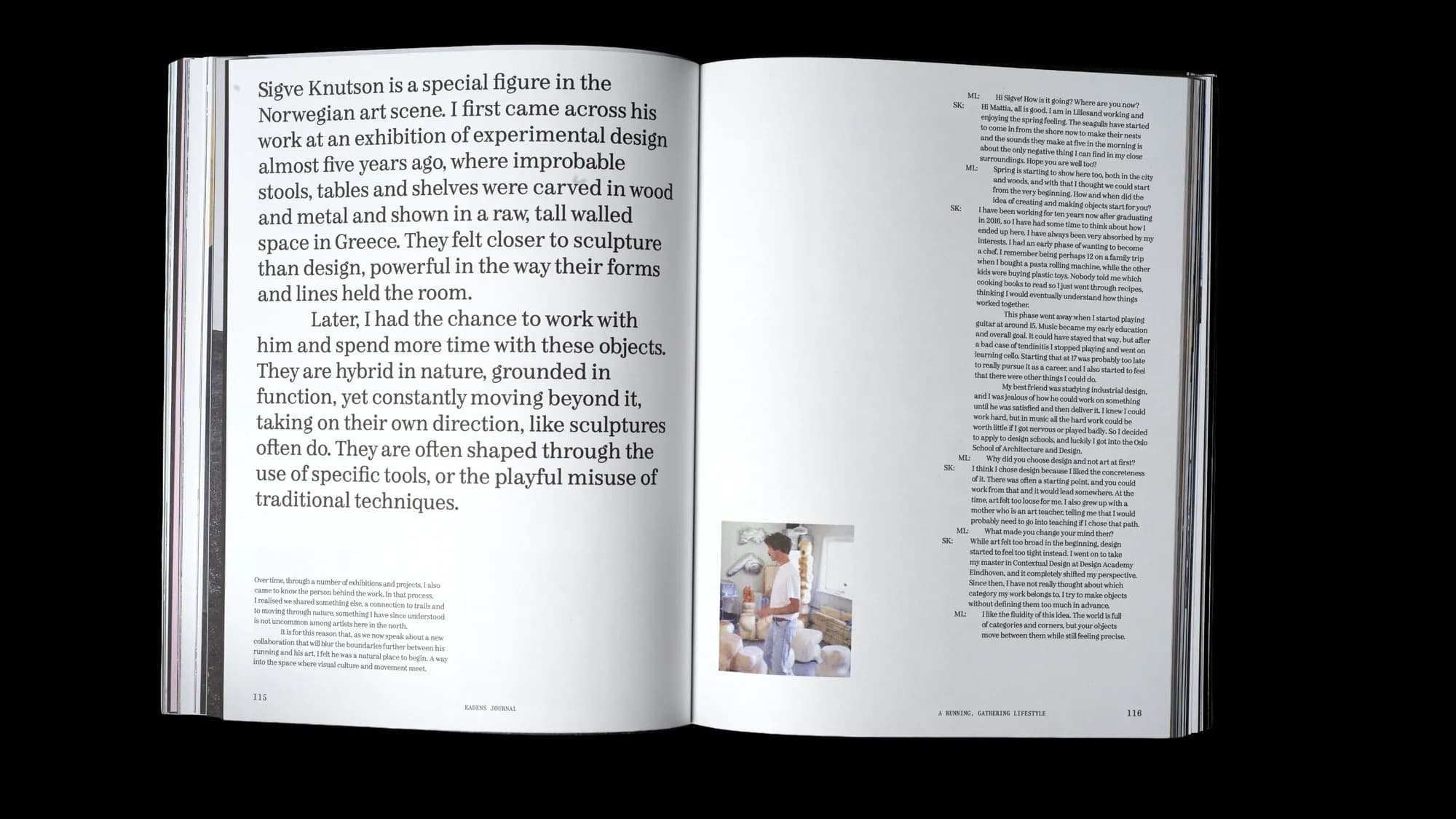
The magazine carries three custom families: A New Type, a grotesque that predates the project and functions as the studio's default typeface; and Peat, a Scotch Roman with regular and italic cuts plus a companion monospace, designed specifically for this issue by type director Erik Johan Worsøe Eriksen.
You developed a grotesque, a Scotch roman, and a companion monospace. What specific role was each of the three families meant to fulfill in the magazine?
A New Type, the grotesque, was an already finished typeface, and is what you can call ANTI's house red. It became fundamental for us that the grotesque was to be a part of the magazine, as it is such an integral part of our studio. It allows us to be rational, loud, expressive, or neutral, basically whatever we want it to be. Peat, a Scotch Roman, works really well for longer reads in smaller sizes, as well as in more graphic, large sizes. For more of a schematic and technical typesetting, we used Peat Mono; it gave the magazine more personality, precision and rawness.
In another interview, Erik mention uneven rhythm and the need for new characters. Can you point to one specific page or situation where a weakness in a typeface became visible?
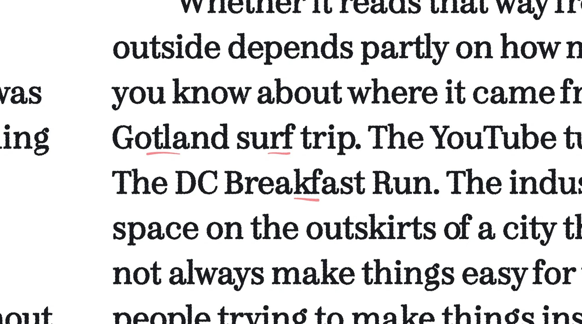
Peat has lived as a raw prototype on my drive for a long time, and even if I knew what I wanted from it, there were still design questions left open, and an infinite amount of inconsistencies due to the lengthy, on-and-off process. Lacking the grace of a proper production and engineering job implies that all kinds of issues pop up when it is put to real use. 90% of it is in the spacing and kerning, getting the balance between flow and texture and colour right.
What changes did you make to the letterforms after the test?
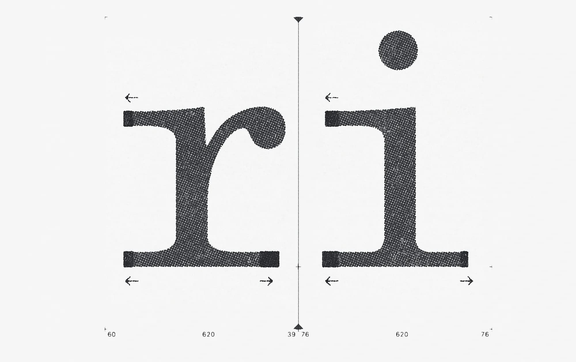
The roman was very much left unchanged, besides adjusting the length and prominence of the serifs. And the character set for this was mostly in place. The mono was whipped around, heavily, though. The width of small ‘r’ and ‘i’ grew wider and wider as we went, and I let the stem thickness vary a lot more to compensate for colour. There is still a lot more work to be done here, but then again, the raw form, the unrulyness stirs it up and adds a certain energy to the page. The italic is an another story all together. It hardly just got started. Half the letters are merely slanted, and the letters that take on an entirely new form, like lower case ‘w’ and ‘a’ etc., are in their infant iteration. To put this in the magazine in its current state feels a little bit embarrassing, to be true. But I like it like that.
Are the typefaces now finished products, or is Kadens continuing as an ongoing testing platform? If yes, are you going to turn them into a retail typeface?
I’m certainly not done with Peat, yet. I love keeping a type project open, as an ongoing discussion about form in general, and the specifics of type, of course. It’s the best. And as long as Peat can serve as part of Kadens’ toolbox I’m happy to gain from the feedback I get from seeing it in use. For now, we don’t do retail, in the future, maybe.
What can other editorial designers learn from letting a real project shape and test a typeface?
The design space expands significantly when editorial designers can engage directly in the design of the core tool they employ, the typeface itself. It changes your perspective when you are working with a dynamic/plastic/open/flexible element, as opposed to a fixed one, a ready and set typeface. More so, the type designer gains from sharing their precious baby earlier in the process, and gets valuable feedback from a real context, a ‘live’ use case, rather than the usual tests we set up. To instantly propose and test solutions for problems that arise during the design process is as effective as it is rewarding. In the case of Kadens, the rawness caused by the open process, and the fact that the font has not yet been properly processed, becomes a quality in the end.