Rebel in a bottle
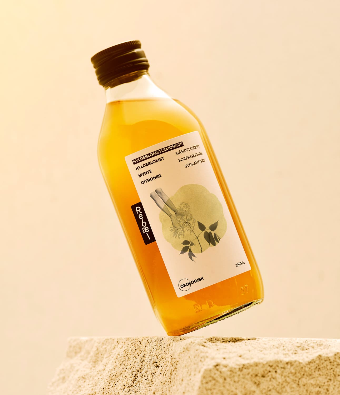
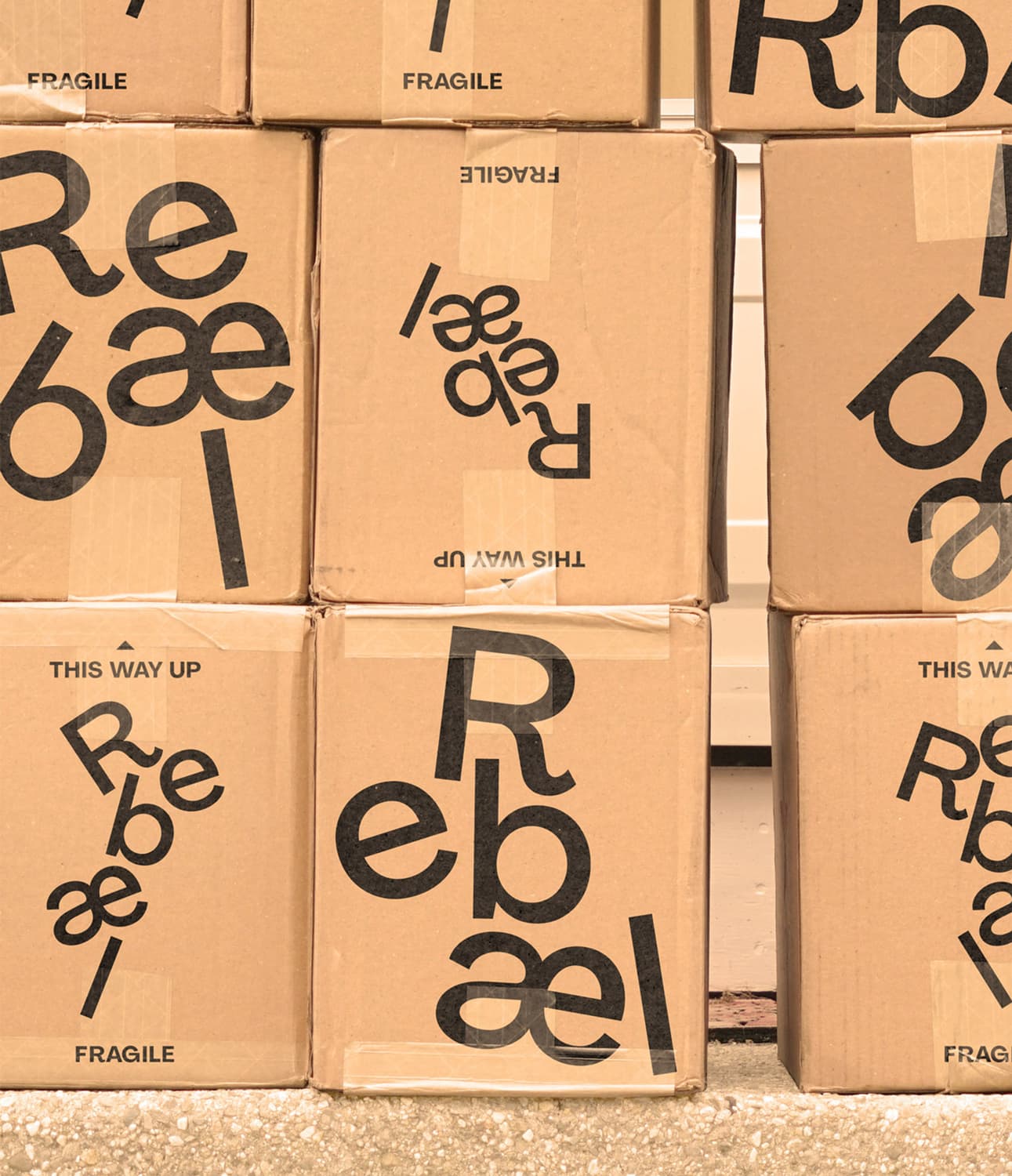
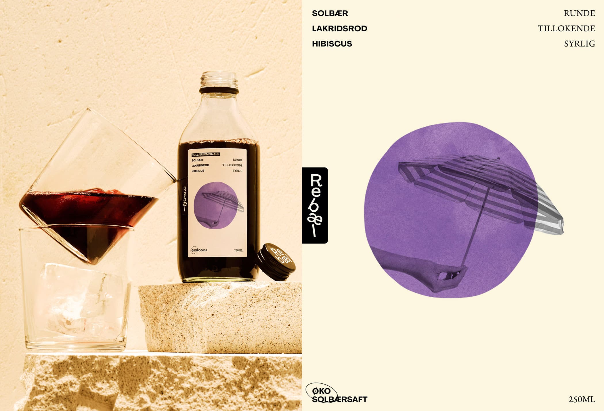
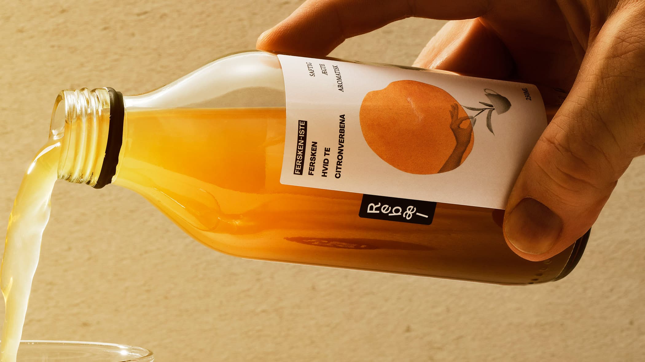
Rebæl's juices change slightly throughout the year. As the seasons come and go, the ingredients change, influencing the process and, ultimately, the product. Everland embraced this instability in the Danish juice maker's new brand identity and packaging design. The look is "fluid and ever-changing".
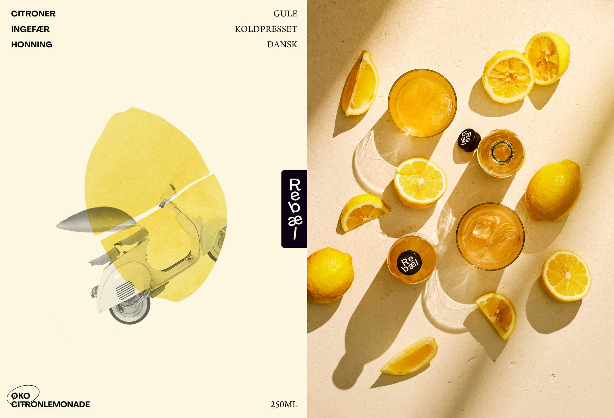
“The Rebæl brand design is alive, complex, yet straightforward. It reflects the flavours and fits the occasion. Only a true rebel would dare to embrace this design universe.”
Jonathan Faust, Design Director at Everland
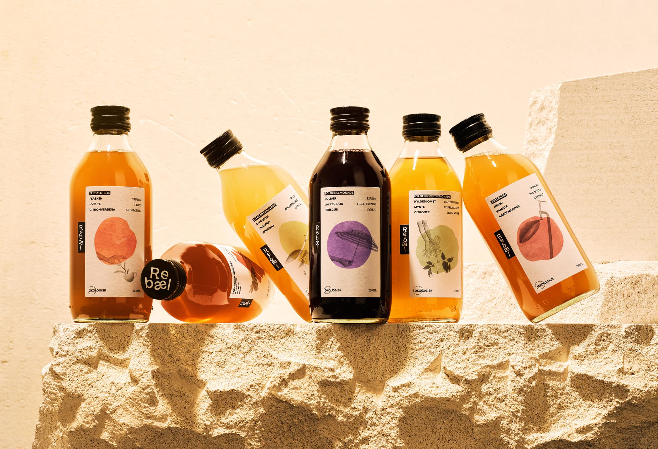
Art, collages and shuffled letters
Rebæl makes high-end (gastro) juices, soft lemonades, refreshing ice teas, or ready-to-drink cocktails. Every batch is tasted by their in-house sommelier, balancing flavours into a drinkable piece of art. The collages reflect "the culinary experience bottled up inside, and sparking associations." Likewise, the letters in the logo can be stacked as it seems fitting, keeping it alive, fluid and full of flavours.