DR Design built P1's new identity on the weight nobody else was using
Talk radio has a small and often exhausted visual vocabulary. And for years, DR, the largest public service broadcaster in Denmark, had drawn on one of them for its radio channel P1, the speech bubble. When the in-house design team at DR rebuilt the channel's identity, they put all cliches on a no-go list. From there, they built a new system on three elements: one typeface, a colour pair, and a host portrait.
Letting programmes lead instead of the channel
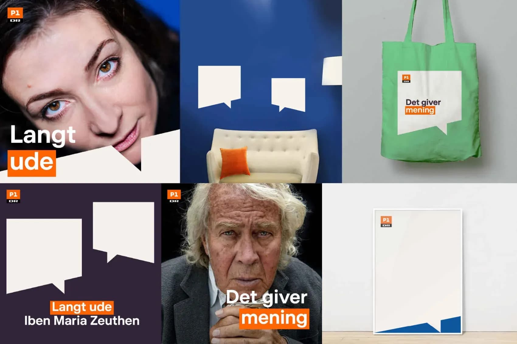
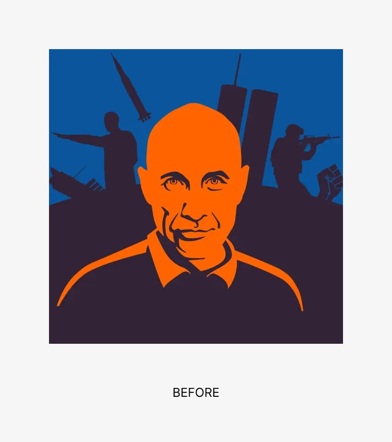
P1's previous identity rested on three brand markers: orange, blue, and a white speech bubble that appeared on bags, walls, and the bottom edge of imagery. DR Design's team mapped how listeners actually encounter the channel and concluded that P1 is rarely experienced "in its own right", rather listeners meet it through individual programmes like P1 Morgen, Ring til regeringen, and Orientering. That observation reshaped the brief: rather than a single channel signature, the system needed to give each programme its own visual register while keeping P1 recognisable across the schedule.
"The identity for the channel was generally fragmented and a little dusty," Julian Sonne Hansen, Senior Designer at DR Design, explains. "We were missing a consistent, modern identity that could pull P1 together across surfaces and stand strong inside the DR's podcast and radio universe, DR LYD. At the same time, the expression had to make P1 feel younger without losing quality and substance. P1 is aimed at informed, inquisitive listeners who want to be challenged and engaged with, never reduced to the lowest common denominator, and the new identity should reflect that level of ambition."
The team also drew up a no-go list of categories that dominate radio branding, like speech bubbles, microphones, sound waves and headphones, and removed them from the toolkit. The reasoning was that DR LYD as the parent brand can carry the audio story, leaving the channels free to communicate something more specific. That decision is what created the opening for typography to become the load-bearing element.
“Speech bubbles, microphones, sound waves and headphones were clear no-gos. P1's listeners know they're listening to radio. In a DR context, DR LYD as the main brand can carry the story of 'sound' as such – on the channels, we wanted to be more precise in our tonality.”
Julian Sonne Hansen, Senior Designer at DR Design.
A three-rule dogma stretched through testing
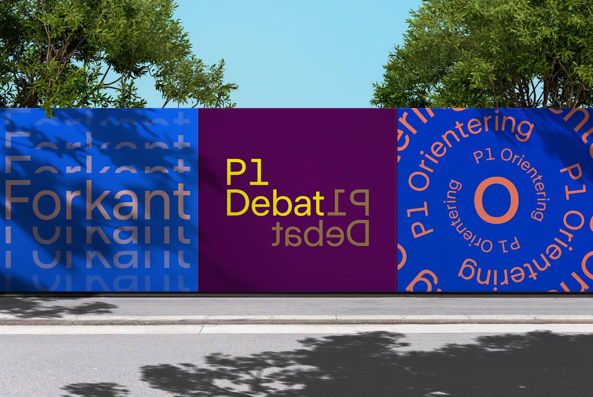
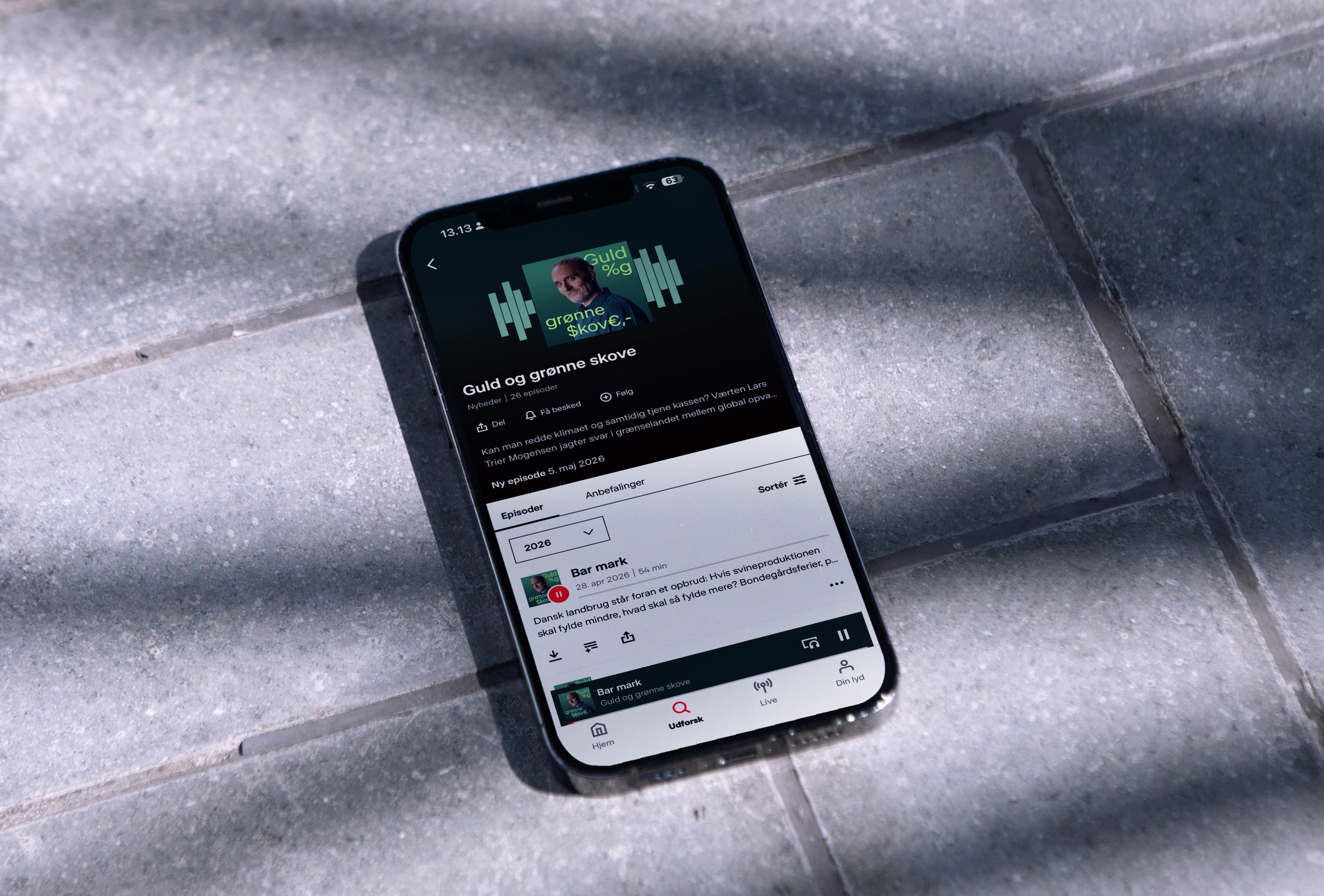
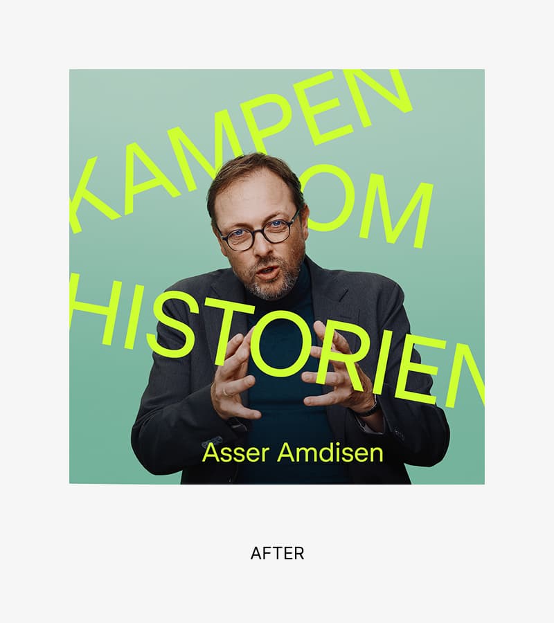
The system rests on and only uses DR Publik Regular – the most basic weight of DR's bespoke typeface, designed by Overtone with DR Design. Sonne Hansen describes Regular as nearly unused elsewhere in DR's cover landscape, which made it available for P1 to claim. Colour works in pairs rather than fixed brand colours. Portraits use direct eye contact, framed so that "typography leads, the portrait anchors," in Sonne Hansen's words. He adds, "The direct gaze creates an intensity that suits P1’s approach to the subject matter: generous with knowledge, yet also demanding and ambitious on behalf of the listeners."
The design process was deliberately split in two. DR Design first locked the dogmas, what P1 should and shouldn't be visually, then invited four designers in to work on a series of concrete covers. Those covers functioned as a shared laboratory for testing how far the rules could stretch before P1 lost recognisability. The steering group questioned whether Regular had enough character to carry a national channel; Sonne Hansen says convincing the group required showing, not arguing.
"A key decision is that the typography reflects the content and acts as an additional layer of storytelling. Together, the typography and colour schemes form a narrative layer which, alongside the portraits, provides an intuitive understanding of the world one is about to enter, whilst the typographical approach ties P1 together across touchpoints."
A reference point Sonne Hansen names openly is Tobias Røder's work on Radio 24Syv and RADIO IIII, which has shaped Danish talk radio branding for years. P1's brief was different in scope — a wider programme range, a public service remit – but one element carries over: the underplayed humour, what Julian calls 'a smile in the mind', where the viewer has to crack a small visual or conceptual puzzle.
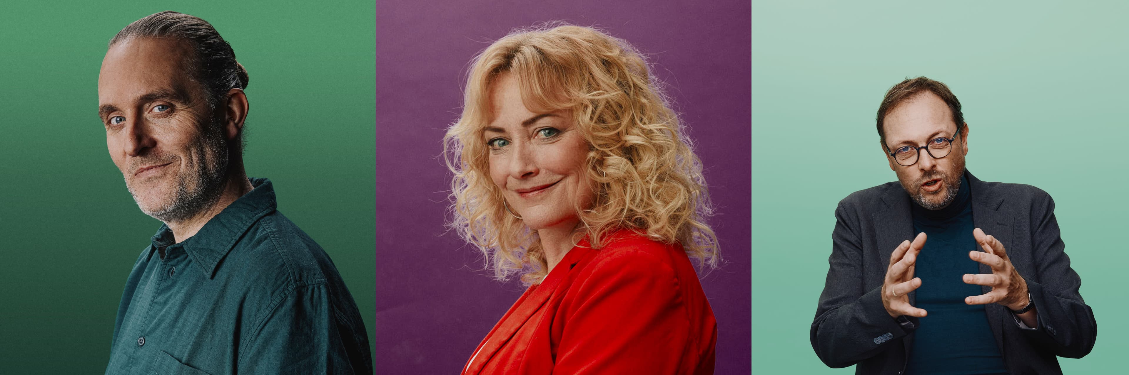
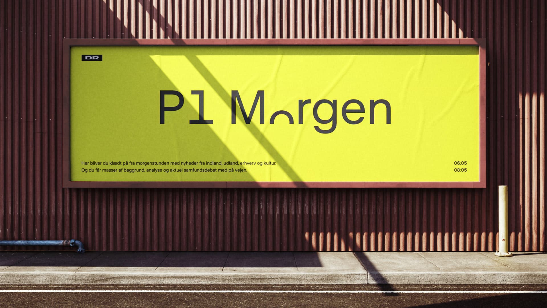
“Precisely because the weight is so basic, it demands more from the designers to become distinctive. That sits well with P1's values — taking time, doing the work, raising the bar with intelligence.”
Julian Sonne Hansen, Senior Designer at DR Design.
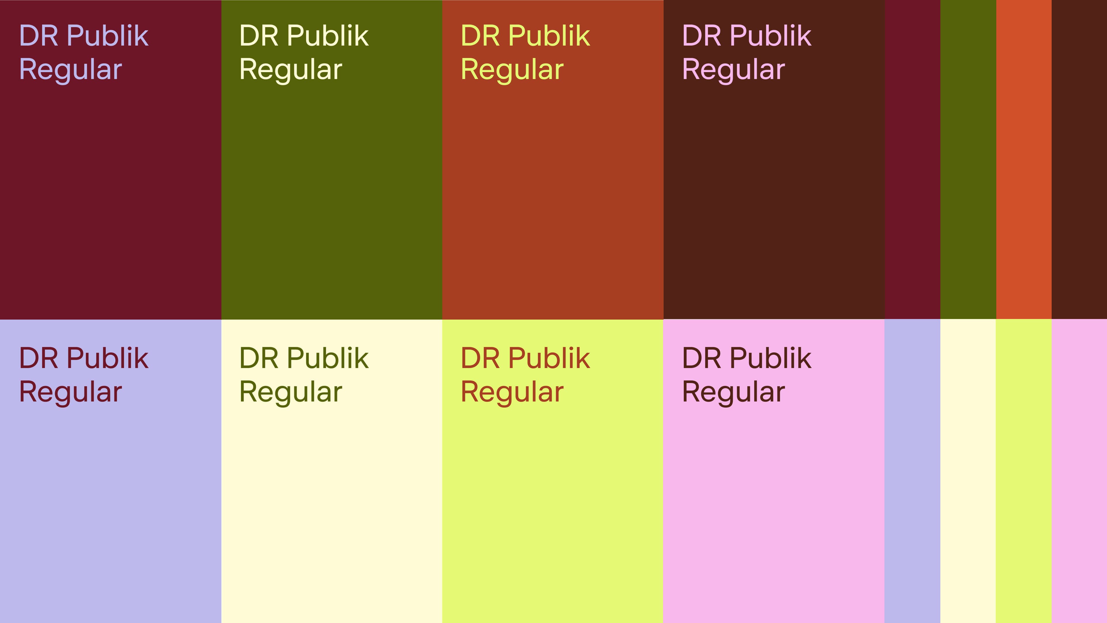
Eight colours, four pairs, no fixed code
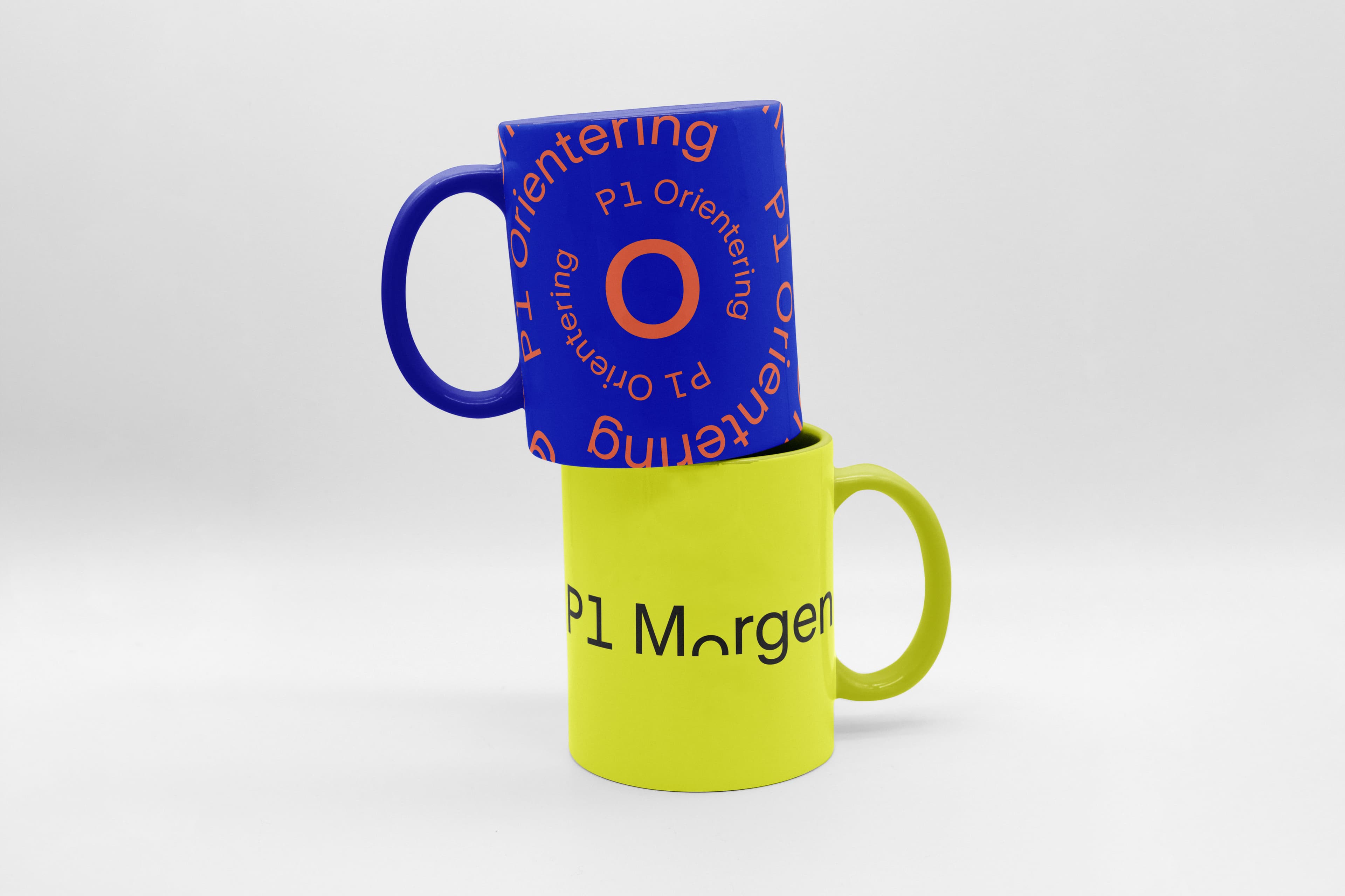
When P1 communicates as a channel, the system uses eight defined colours arranged in four pairs. Beyond that, each programme is free to set its own pairing. The team explicitly avoided hardcoding categories to colours, like news = X, culture = Y, because those systems demand that everyone using them remembers the code.
"We were quite taken early on with the idea of P1 as a kind of colour chameleon", Julian Sonne Hansen says. "The challenge was balance: the channel had to have a clear identity, while each programme got the best possible chance to visually signal what it's about. The colour pairs became the way to solve that – a clear, recognisable principle across the channel, two colours always thought together, but with real freedom for each programme to set its own mood."
Typography carrying the lead role also opened a second register: motion. Sonne Hansen points to the timing of the brief – a moment where producing animation across platforms has become technically possible and substantially cheaper than it was a few years ago – as the reason a typographic system made strategic sense beyond static covers. When the type is the identity, it can take on rhythm, pace, and movement, extending the same dogma from print covers into social formats and on-air motion graphics without the system breaking.