Cut ties, eat burger
Burger. Some say it’s a German intervention, others an American. Nevertheless, decades of burgers, fries and milkshakes have influenced our perception of the bun and patty combination as something deeply American.
But these strong ties to American culture can make it hard for a Swedish chain of fast and casual hamburger restaurants to create a place where everyone can feel invited. This was the exact challenge Tugg faced, so together with Kurppa Hosk, they sought to reframe the burger, making it universally appealing.
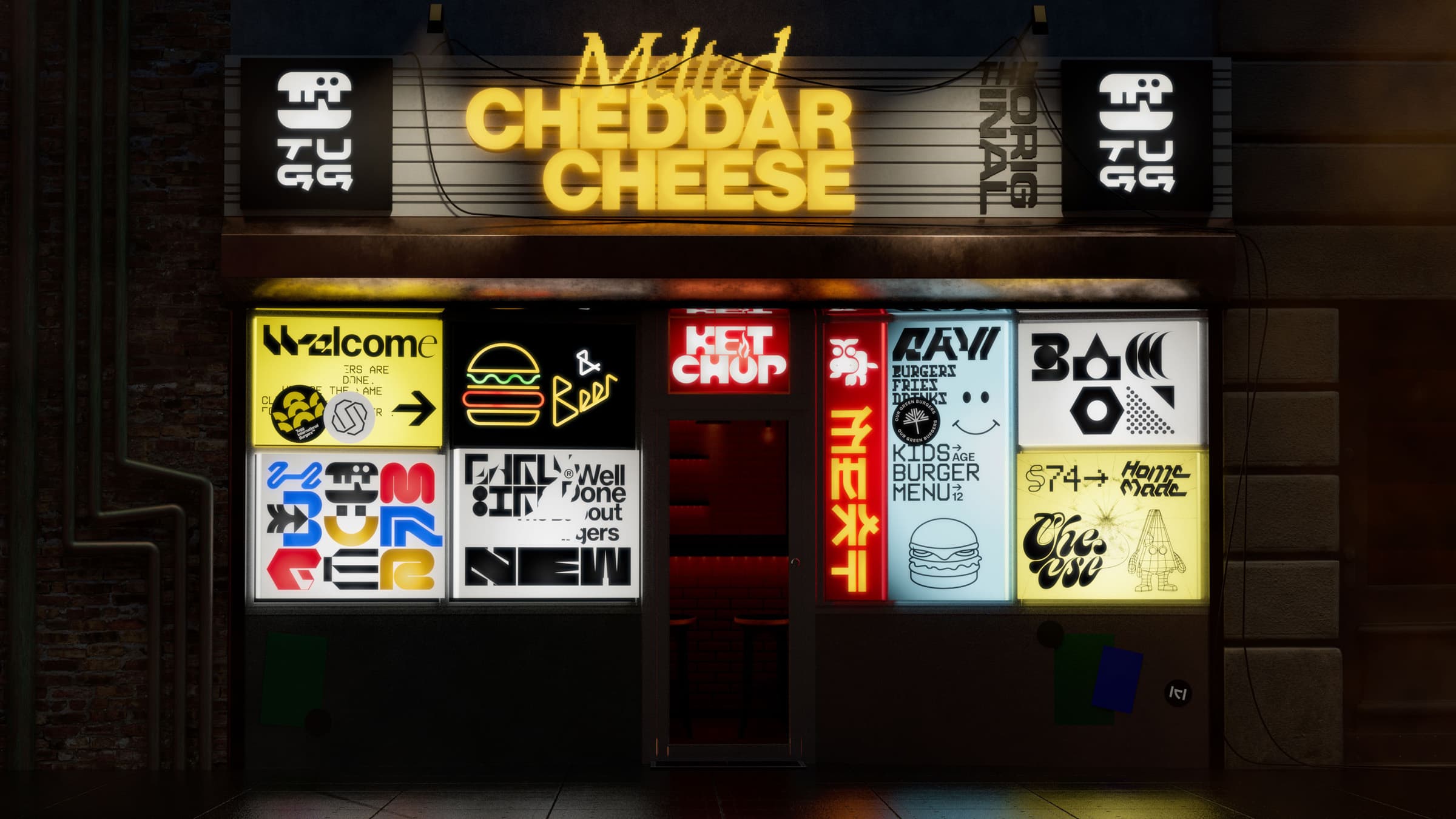
“We built more soul into the brand with storytelling and a new dimension. Something that you can relate to and that has personality.”
Lois Nygren, Motion Designer at Kurppa Hosk
Shock first, then love
At first, Tugg was shocked when they saw the new direction, Lois Nygren, Motion Designer at Kurppa Hosk, says. “But quickly, [they] got to love the bold expression and took a new fearless path.” Hamburgers should be more than just fast food, and the new brand identity reflects that idea.
Kurppa Hosk took the existing Tugg identity and built upon it. They added soul, dynamism and representation of global cultures—far from the traditional retro American burger language. Nygren explains, “Through skyscrapers and neon signs reminiscing of Shibuya and Piccadilly Circus, Tugg City brought this idea to life. But also staying true to the local burger joint in Borås. The modularity lets the identity be dynamic and present.”
Essentially, the new Tugg identity is about the universality of the hamburger. Tugg and Kurppa Hosk explored how it can be brought to life in new welcoming ways.
“Everyone knows what a burger looks like, and we were tired of dramatic photos of the perfect burger. We took a playful approach and created something different and confident that stands out from your good old kings, clowns and bastards,” adds Lois Nygren.
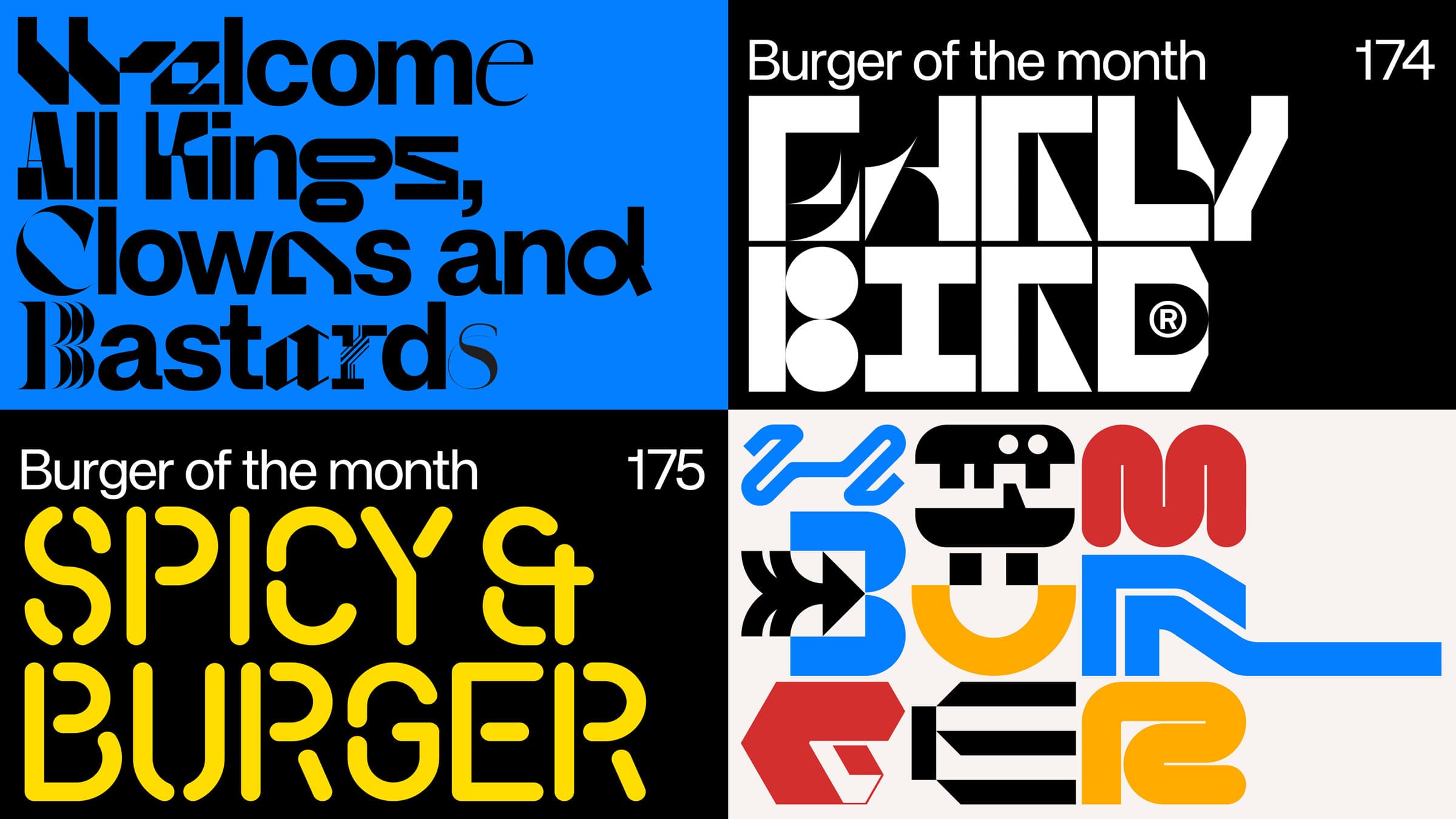
“The client was shocked at first but quickly got to love the bold expression and took on a new fearless path.”
Lois Nygren, Motion Designer at Kurppa Hosk
Balancing chaos and diversity
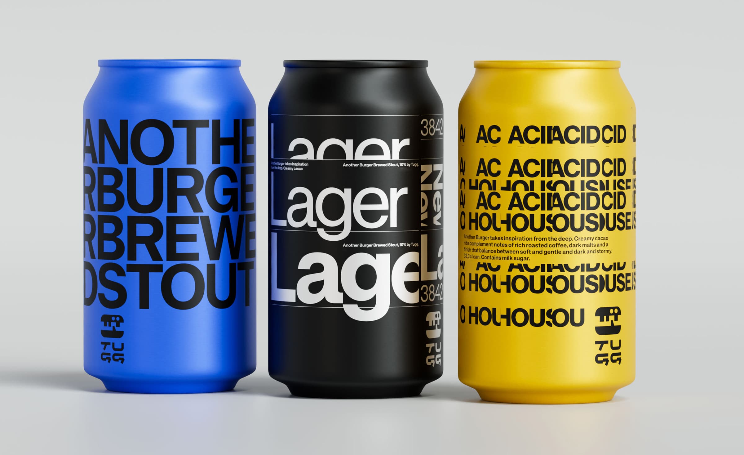
One key statement of the new Tugg identity is inclusivity and diversity. The chaotic typographic excess is an expression of this and makes up the black-and-white pattern used for the packaging.
“All typography - apart from the body text, which is KH Teka - is specially designed for the purpose and Tugg,” Lois Nygren says. “We hand-drawn all logos that primarily communicate ingredients and phenomena connected to hamburgers. As for the wordmark, we wanted a sense of personality that could ally easily with the happy hamburger symbol. Where the letterforms had details that were not too obvious, but anatomically distinguished from the conventional solutions.”
“We took a playful approach and created something different and confident that stands out from your good old kings, clowns and bastards.”
Lois Nygren, Motion Designer at Kurppa Hosk
Meet the Tuggs
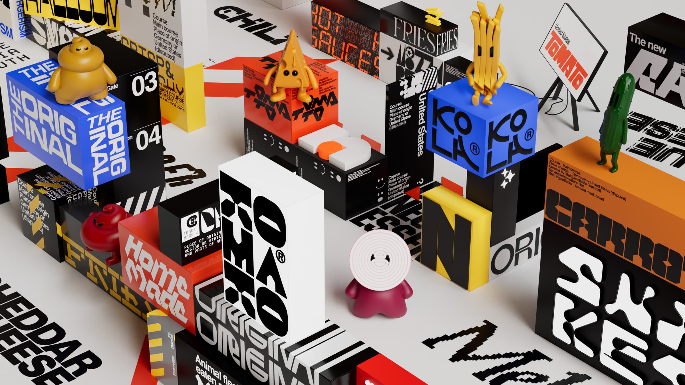
When you visit Tugg City, in the Burgerian nation, you’ll meet the Tugg family. Its six members are Cheesela (cheese), Fritte (fries), Gurra (cucumber), Mustafa (mustard), Shalotte (red onion) and Ketty (tomato).
“We let the actual food speak for itself,” explains Lois Nygren. “The characters bring personality to the brand and create another dimension. A playful way to do so was to let the ingredients shine through in their quirky way. They are likeable characters with attitude, who are your friend but also mischievous and rebellious. With minimalist character design and soft texture, they are kind but always with a trick up their sleeve. The Tugg family are citizens of the Burgerian nation and residents of Tugg City. This universe bridges the 3D characters and the graphical language.”