The typeface that took seven years, not seven weeks
A custom typeface takes weeks; a retail one takes years. After a decade drawing fonts for other brands inside other people's studios, Clara Jullien Isaksson, French type designer based in Sweden, has opened her own foundry to finish the ideas the deadlines never let her finish. The first is a monospace she has been building on and off since 2019, one that breaks its own rule.
What she carried from France to Copenhagen
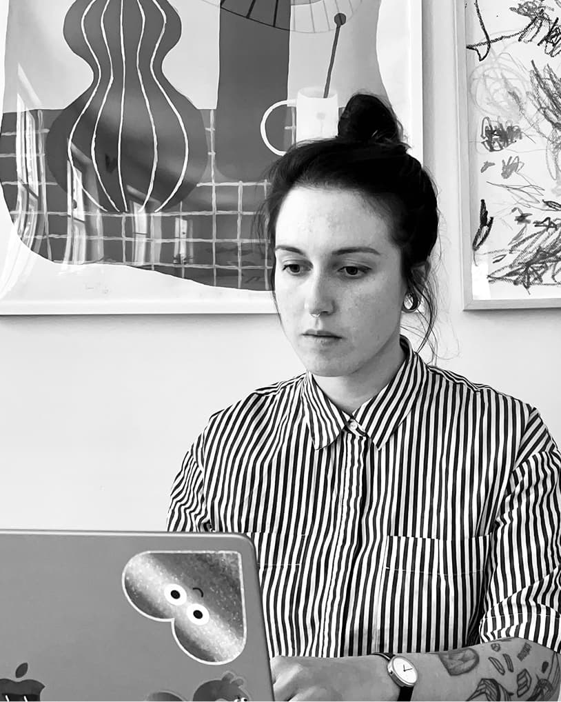
Clara Jullien Isaksson trained in the French craft tradition at École Estienne in Paris before moving to Copenhagen. At Kontrapunkt she worked on custom type for Maersk, Nissan, Shiseido and Danish Crown; at Playtype, for Air Canada, MobilePay, Tuborg, Vipp and the Novo Nordisk Foundation. Since going freelance in 2020, she has collaborated with agencies such as Design Bridge & Partners, Kurppa Hosk, Goods, Bold Scandinavia, N96, Overtone, Stone & Spear and more, on projects for clients like Skyirk, Max Burgers, Aros or Puck News. And that's ones not under NDA.
Isaksson's education gave her letter-drawing from first principles. Copenhagen gave her something else: a type culture rooted in architecture, with fewer quirks and a heavier weight on legibility. She describes the shift as a clean slate rather than a constraint.
"It was more of an exercise of going down to the essence, of minimal expression, just giving a hint, a visual suggestion or tone instead of something illustrative. Also the notion of movement was very different. French type has a dynamism, a sense of movement, whether it's swashes, ligatures or calligraphic hints. Danish lettershapes are more stable."
For all the technical apparatus, what she is after is harder to name. As Clara puts it, "Type leaves you with a feeling, something you can't quite put your finger on."
A foundry for the ideas that outlast the brief
What client work does not allow is time. Projects generate sketches that never find a home, and some of them Isaksson kept returning to. Maison Mere, launched in 2026, is where those get finished. The foundry doubles as a way to stay visible in a small Nordic type scene, which matters to a freelance practice built on being known.
The difference between the two modes is one she underestimated until she lived it.
"Back in the days when I heard type designers saying it takes years to create a typeface, I couldn't believe it. It takes a few weeks to make a custom font, but how could it take years for retail? Well, now I get it," Clara adds.
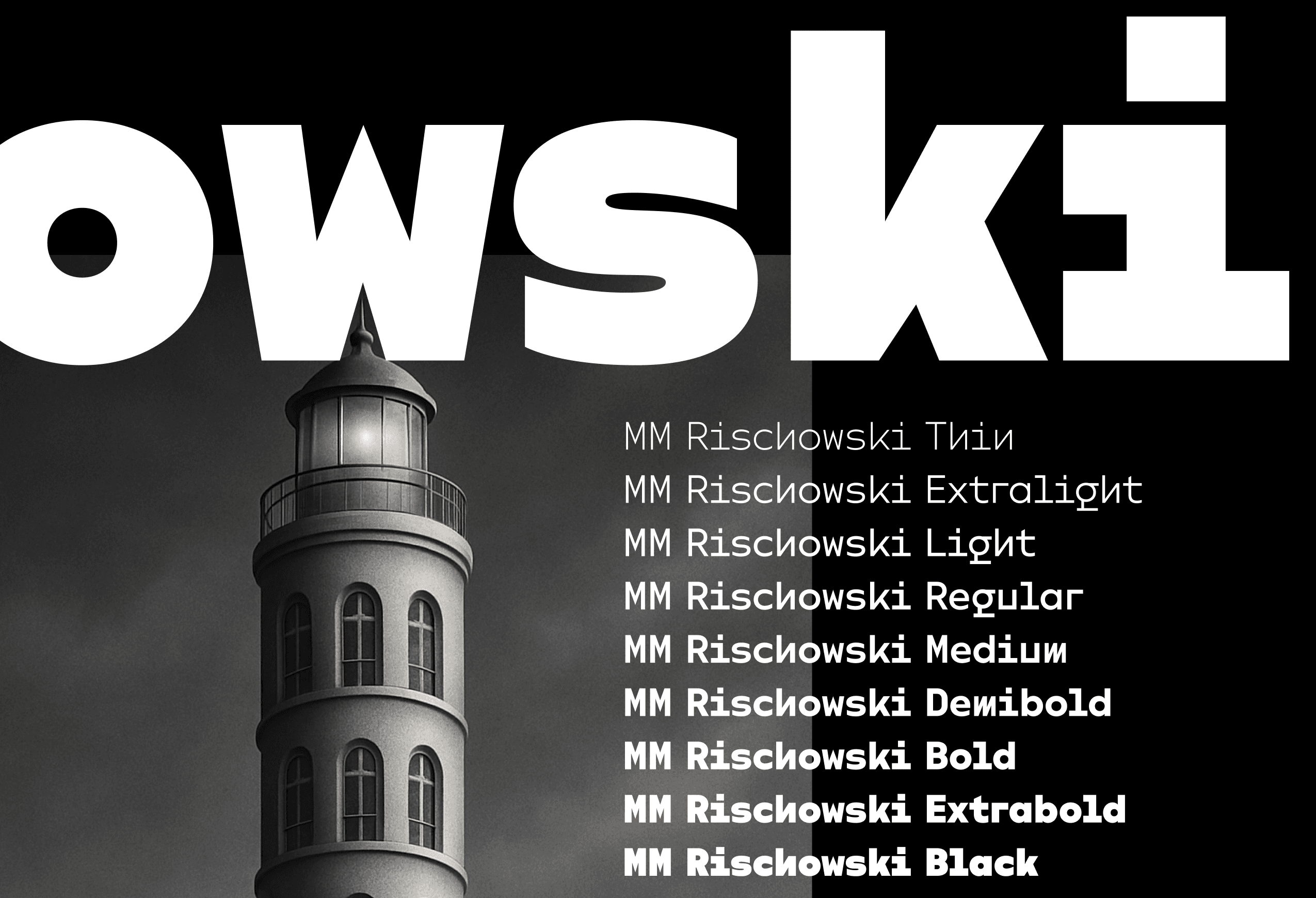
The first retail typeface to launch is Rischowski. But getting it to market took the one thing client work always supplies and personal work never does. A deadline. So, between projects, Isaksson set herself a deadline: finish the typeface, and put it up for sale.
Rischowski: a monospace, then kerned
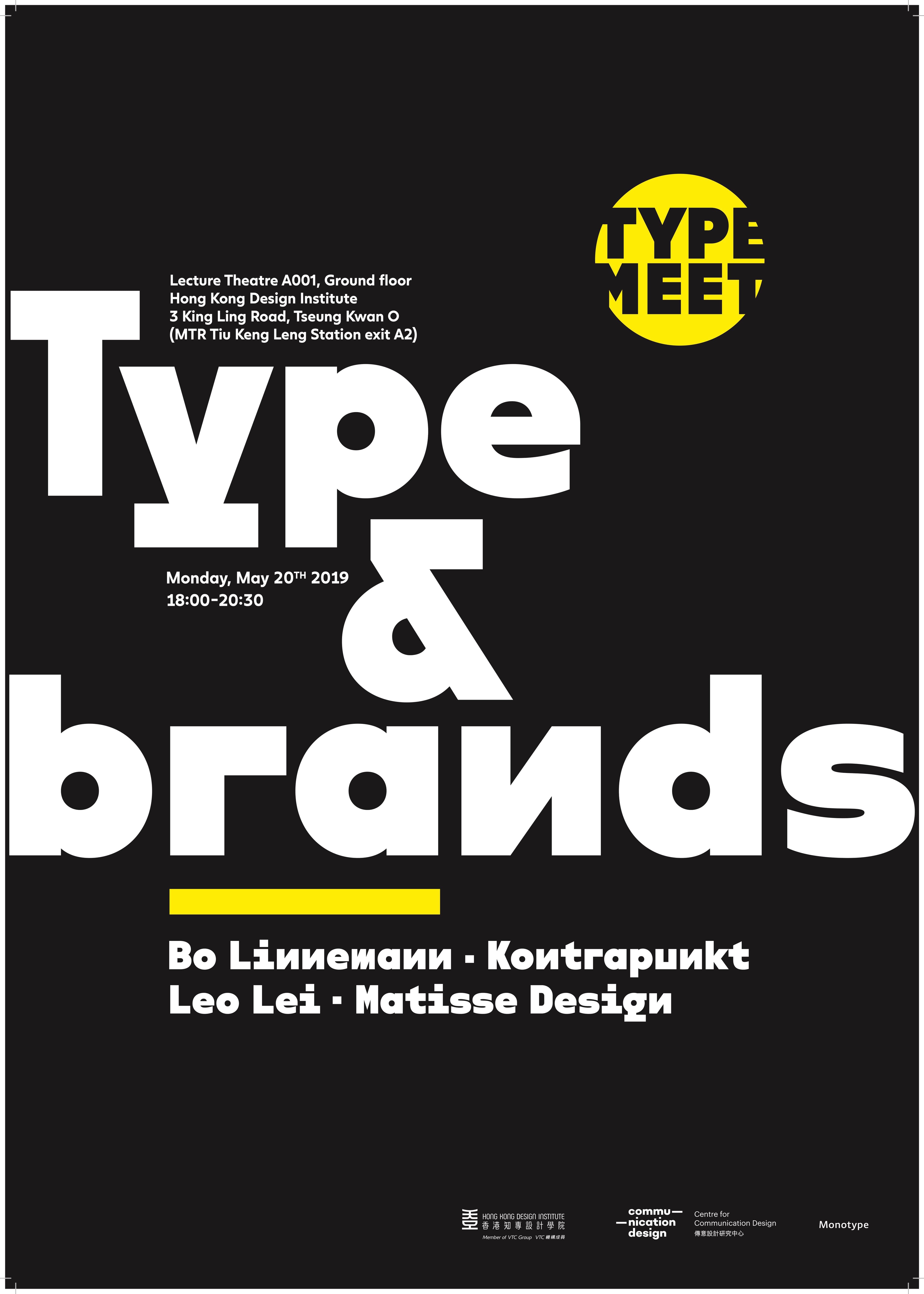
Rischowski started as a custom typeface for her husband's portfolio. Isaksson was sketching it when Bo Linnemann, co-founder of Kontrapunkt, asked her for a poster for a Type of Brands talk at the Hong Kong Design Institute in 2019. She showed him the sketches; he liked them, and they carried the line "Type that types." Seven years later the same drawing is the foundry's first release.
The sketch survived because it kept catching her off guard.
"I would not look at it for some months, and then coming back to it I would be like: oh yeah, that's right, that's a fun y, oh and the g, nice. The shapes were so unlike what I would go for initially. As if I was going away from the whole legacy and history of type that I always have in the back of my mind, and really trying to see the letters for the simple shapes they can be. It was kind of freeing."
It also drew the strongest reaction from other designers when she showed sketches, which she says is always encouraging.
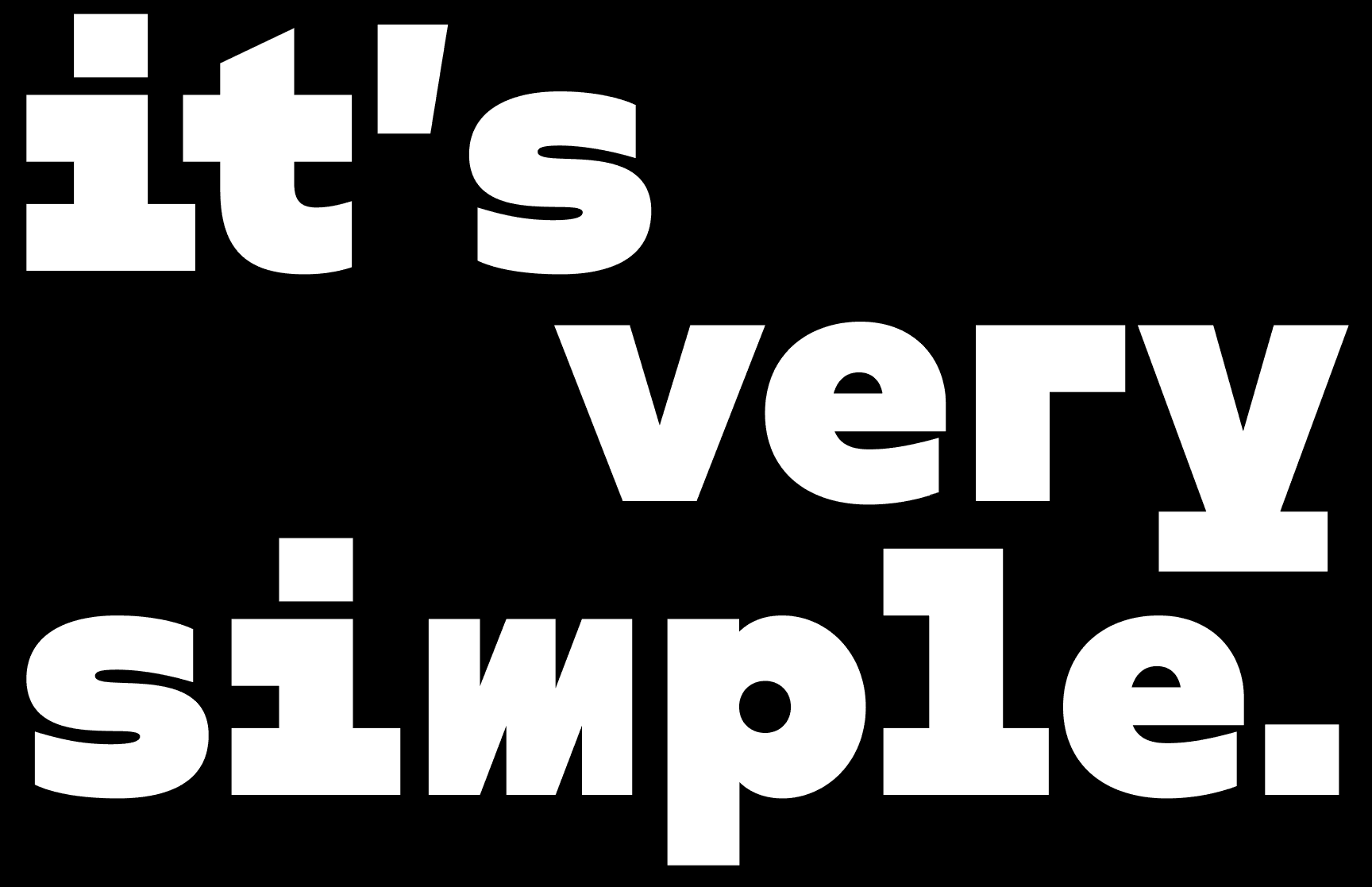
The construction sets up a contradiction. Every glyph is drawn on a single shared width. On its own that gives a monospace its uneven, vibrant texture. Isaksson then applies kerning on top, adjusting the space between letter pairs until the vibration settles into something you can set as text. The character set covers full punctuation, symbols and accented glyphs across more than thirty languages, among them Danish, Norwegian, Swedish, Icelandic, Faroese, Sami and Greenlandic.
It is built for display, not body text, though she notes it holds up at smaller sizes anyway. The priority was reduction:
"The idea is sculptural letters, not so much small-size legibility. When drawing it I was trying to make the letters as simplistic as possible. If you look at the lowercase r, it's pretty straightforward. That is what I prioritised."
Knowing when to stop is the part she describes as subjective.
"The perfect version of a shape you are doing doesn't exist. It's the same as saying the perfect poster, when do you know a poster is finished? I think it's when all the curves are smooth, the overall shape is balanced and fits well with the other glyphs, and then when you are happy with it enough, plus a little more work. Anyone looking at work they did a few years ago can see flaws in it. That doesn't mean the client wasn't happy, or that other designers didn't think it was a great tool."