My first project: Jonathan Faust
Published: 30.03.23
Author: Rasmus Vestergaard
Perhaps you know him for his fine-tuned left-handed typography skills. Or perhaps, you’ve spotted some of his packaging design work for Danish products like Tuborg Squash, Toms Guld Barre, Læsk kombucha or Stauning Whisky. Either way, Danish designer Jonathan Faust has made quite the name for himself thanks to his craft and outstanding attention to detail. He has worked at Danish design agencies like Kontrapunkt, Bessermachen, and, currently, Everland, as Design Director.
But where did it all start? How was it, and what did Jonathan learn? Nordic Brief sat down with the Danish designer for a Q&A about his first project.
Nordic Brief
What was your first commercial project?
Jonathan Faust
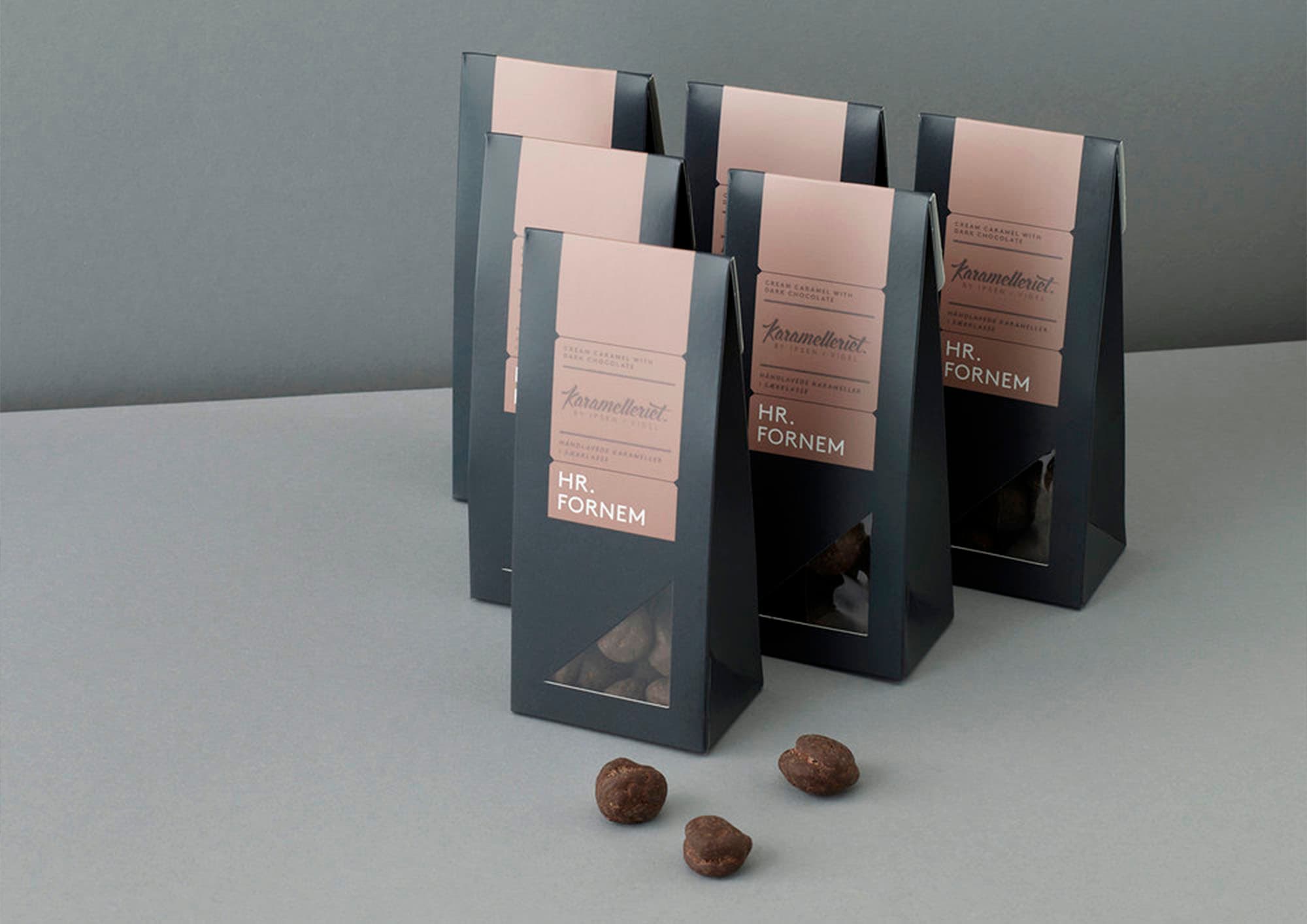
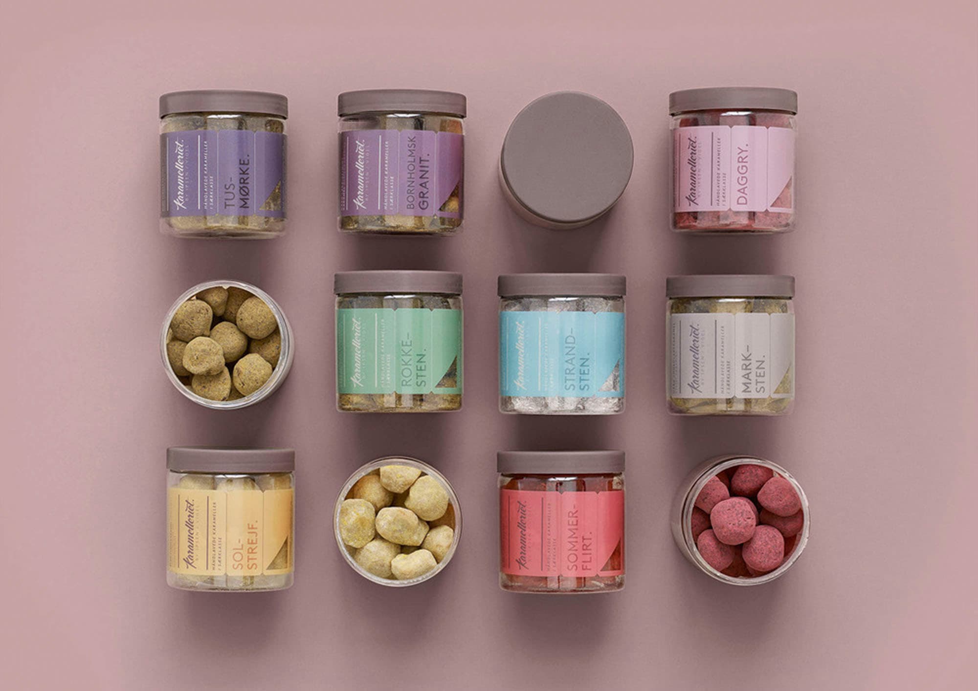
During my education, I worked on many different projects for Claus Due at Designbolaget and FBA in Portugal. I remember all of those projects clearly, but unfortunately there was no packaging design among them. My first real packaging project was for Karamelleriet, a small Danish caramel company with production in Copenhagen and roots in Bornholm. But to be honest, it might also have been a bag of gummy bears from Haribo, skincare products from Amazing Space, sausages from Aalbæk, Water from Kildevæld, etc. I had many tasks at the same time, so I don't remember which project I was first involved in.
Nordic Brief
How did it come about?
Jonathan Faust
I have always been fascinated by packaging, so it is no coincidence that I work with packaging today. My bachelor project at DMJX, which was a packaging project, became my entry point at Bessermachen–a Danish design studio. One of the first assignments was Karamelleriet. We were only two on the project, Kristin Brandt as a creative director, and me as a very young, untested junior designer.
Nordic Brief
How did it go?
Jonathan Faust
It was really fun. A small team where we were very close to the customer and decision-makers. A redesign where nothing was sacred and on top of that a really nice product. I remember just diving into the logo as the first thing. I wanted to make a logo that looked like it was made out of soft caramel. I was so excited about the idea of being able to work with calligraphy and get paid for it. It sounds silly, but calligraphy has always been a big passion, so being able to use it in my job was a very special feeling. When the logo was finished, we could start focusing on the packaging and just take it step by step. The advantage of being so close to the customer is that you can better sense where they want to go, so we quickly landed on a look we were happy with. A design they still have today.
Nordic Brief
Looking back, what have you learned since? What would you have done differently?
Jonathan Faust
The process itself was very simple, almost naive. When you are a small team, you have several roles and it is clear that you cannot lift all tasks equally well. I think the design has actually stood the test of time. The craftsmanship, attention to details and overall design approach is something that I still practice today. But there were also a lot of aspects I had not considered at all. Today, for example, I would have put much more emphasis on how it performs on the shelf, the naming part, and which products that should be in the portfolio.
Nordic Brief
What advice would you give to young designers embarking on their first commercial project?
Jonathan Faust
We all have our strengths. Bring it to the table, cultivate it and gain confidence from it, and remember that there are always people around you with a lot of experience you can draw on. And otherwise just enjoy it, have fun, carpe diem and all that. Before you know it, you have forgotten what your first project was.