Going vertical. Goods and Pond Design on branding the next generation of farming

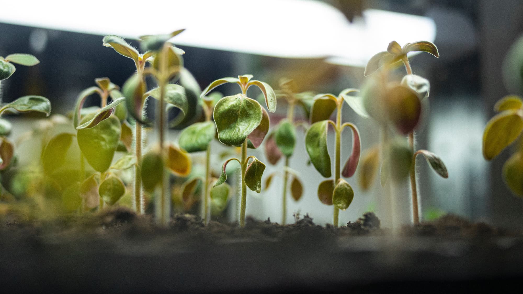
Vertical farming is growing in interest here in the Nordics. Nurtured by the ambition to make farming more sustainable.

This new technology can reduce the use of chemicals, shorten transportation, and minimise the land area needed. But this new technology could also make consumers feel anxious about trying something new. So how can branding make people more comfortable choosing these products?

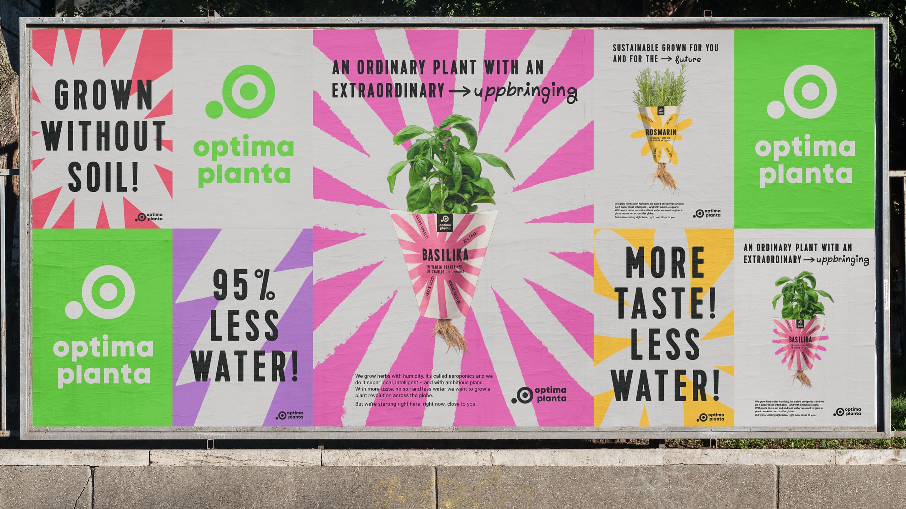
Goods and Pond Design recently worked on the branding of two companies building vertical farms. Goods has worked with Onna on its identity and packaging, and Pond Design has done similar work for Optima Planta. Nordic Brief asked the two agencies how they approached this challenge.
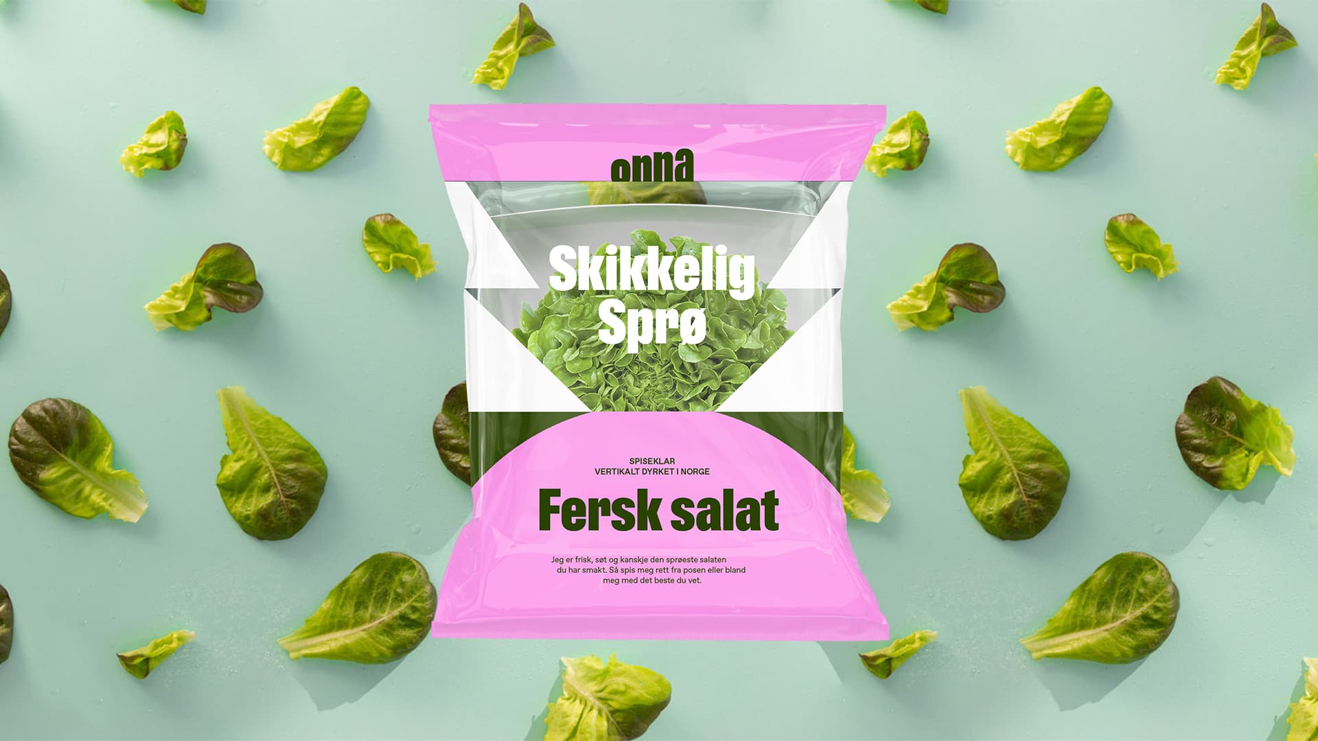
Author: Rasmus Vestergaard
Published: 29.06.22
Small plants in soil in-door with a lamp above
Packaging design for Onna by Norwegian design agency Goods
Nordic Brief
Vertical farming is a new exciting technology. How did you consider making this technology more consumer-friendly and the complicated and futuristic more accessible?
Goods
This was actually a discussion quite early on in the project. Being that this is one of the first and largest vertical farms in Norway, we had to consider where and how consumers should meet the technology aspect within the brand. During our workshops with the client, we concluded that we wanted to focus less on the technology itself and more on the fact that the technology, in tandem with a shorter distance to the consumer, produced a fresher, crunchier, and more flavourful product. At the end of the day, this is what we believe consumers were going to pick these greens up for. As a result of this decision, our concepts and creative platform took a more product-led approach to highlight the shapes of the greens, and we only hinted at the technology in more subtle ways, such as the signal tones in the palette, which are a reference to coloured lights used during the growing process.
Pond Design
We chose to focus the storytelling on something that you as a consumer and individual easier can relate to, and not speak so much about advanced detailed technology around aeroponic cultivation. Instead, we explained it as NASA technology, enabling a fast decoding and emotional apprehension of the extremely advanced AI-tech and future farming that lies behind Optima Planta… giving a sensation. As the next step, we decided to compare the Optima Planta aeroponic technology with traditional farming by highlighting the advantages vs aeroponic farming, such as" More taste"," 95% less water", "Grown without soil", Super local!, "Free from plastic" etc., all in all with the overarching superhero herbs statement of" An ordinary plant with an extraordinary upbringing".

Being that this is one of the first and largest vertical farms in Norway, we had to consider where and how consumers should meet the technology aspect within the brand.

Goods

Nordic Brief
How did you consider the category cues for the design?
Goods
As part of our insights and analysis, we looked at category codes in the Norwegian market and like-minded international brands. Since vertically farmed greens are more established in certain markets (North America, for example), it was interesting and useful to analyse how they express themselves both textually and visually. As a result of this work and the nature of the product itself, it became clear to us that the brand needed to really sit outside the residual and dominant codes of the category to signal to consumers that the product is something different (and better) than what they are currently buying.
Pond Design
We wanted to do something totally different than the rather stringent "rural farming charming" brown organic expression that dominates in the Nordics herb shelf. We wanted to create a new way of conveying sustainable and future / food tech - a happy, colourful, tasty and future postive expression. Super hero herbs that help save the world - free from plastic, intelligent and sustainable farming with extremely little use of water, no soil and in your neighbourhood.

We started to realise that these herbs are superheroes.

Pond Design

Billboard with packaging design and slogans for Optima Planta by Swedish design agency Pond Design
Nordic Brief
Where did you draw inspiration from for this design?
Goods
On a more conceptual level, the design draws its inspiration from a tension we identified early on in the process between the "extraordinary" aspects of the technology and "ordinary" relating to the humble yet important traits of the greens. This really informed our approach to crafting the shapes that permeate the identity, which feel like simple graphic distillations of the greens. We were also quite inspired by visiting Onna's location in Moss and seeing the tall "stacked" shelves which hold the greens. This simple idea gave the identity within the identity its most distinct feature, which is the vertical cuts below each shape, which allow them to be stacked on top of each other.
Pond Design
We started to realise that these herbs are superheroes. The technology is saving the world energy and waste, they grow in an optimised environment, becoming super charged with taste and energy and we ended up in doing an interpretation of classic comic book splashes like the WOW and the POW to celebrate the revolutionary technology and the extremely tasteful herbs.